|
| Group |
Round |
C/R |
Comment |
Date |
Image |
| 25 |
Dec 18 |
Reply |
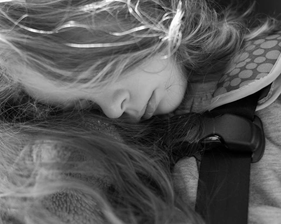
Thanks for the feedback and suggested edit, Marla. I think the darkening helps a lot! Thank you for that. |
Dec 27th |
| 25 |
Dec 18 |
Reply |
Thanks, Ruth! Yep that darned seatbelt. =) |
Dec 27th |
| 25 |
Dec 18 |
Reply |
Thanks, Eric!. Agreed that the seat-belt is jarring, but have to say the square crop feels too cramped for me in this one. |
Dec 27th |
| 25 |
Dec 18 |
Reply |
Thanks for the feedback, Audrey! The things one doesn't notice as the photographer until others point it out... =) |
Dec 27th |
| 25 |
Dec 18 |
Comment |
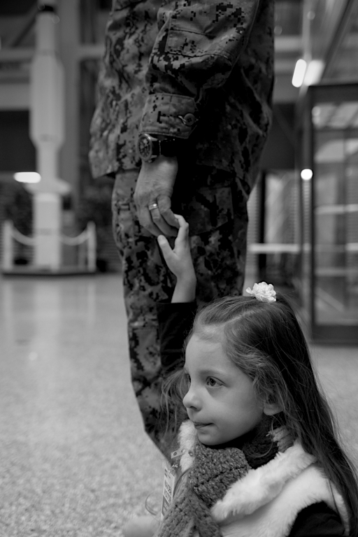
Agreed - that getting down low was a great choice. Your edits are good except for one small item...I would like to have kept a little more room on the left of the rider/horse. There is a beautiful mountain range in the background in the original that is cut off and I feel it helps the environmental portrait to keep a bit more of that mountain. |
Dec 27th |
| 25 |
Dec 18 |
Comment |
When reviewing our monthly images, I like to examine the image without any text/deion, then read the title followed by the description and see if my thoughts changed. Of course, I then read any comments already made.....and, I have to say, Audrey took the thoughts right out of my head before reading her review. The subject is amazing, nice lighting, pose, and great eye contact!!! That being said, I keep going back to the background; something just seems off with it. But really great bird! |
Dec 27th |
| 25 |
Dec 18 |
Comment |
I agree completely with the others that this image is wonderful in every aspect that they mention. The balloon's reflection ' just makes' it too. Nice job! |
Dec 27th |
| 25 |
Dec 18 |
Comment |
Yet another interesting find this month! You have such a keen eye for good images. I do agree with Eric that I find myself unsure of what to look at and, IMO, B&W conversion makes this image. In B&W, it has a Halloween-like feel to it! |
Dec 27th |
| 25 |
Dec 18 |
Comment |
I too find my eyes keep wandering off to the bright brown leaves near the top left. Maybe as Marla suggests, tone them down a touch. It's a good image, no doubt. Other than the leaves, I do find that I'm wanting to see this much lower towards the tracks, which would emphasize the 'walking down the tracks' aspect of it. |
Dec 27th |
| 25 |
Dec 18 |
Comment |
Good eye. The arrangements of the rocks along with your choice of composition is intriguing. I, too, wondered about converting to B&W, but then after seeing your second edit, I agree that pure B&W likely lacked something - probably because there isn't quite enough variation in the colors and textures. In the end, IMO, I prefer your first submission. |
Dec 27th |
6 comments - 4 replies for Group 25
|
6 comments - 4 replies Total
|