|
| Group |
Round |
C/R |
Comment |
Date |
Image |
| 25 |
Sep 18 |
Reply |
Wow - thanks, Eric. That's really helpful. I'll give it a try - with little ones, I have panning practice right in front of me....daily. =) |
Sep 26th |
| 25 |
Sep 18 |
Reply |
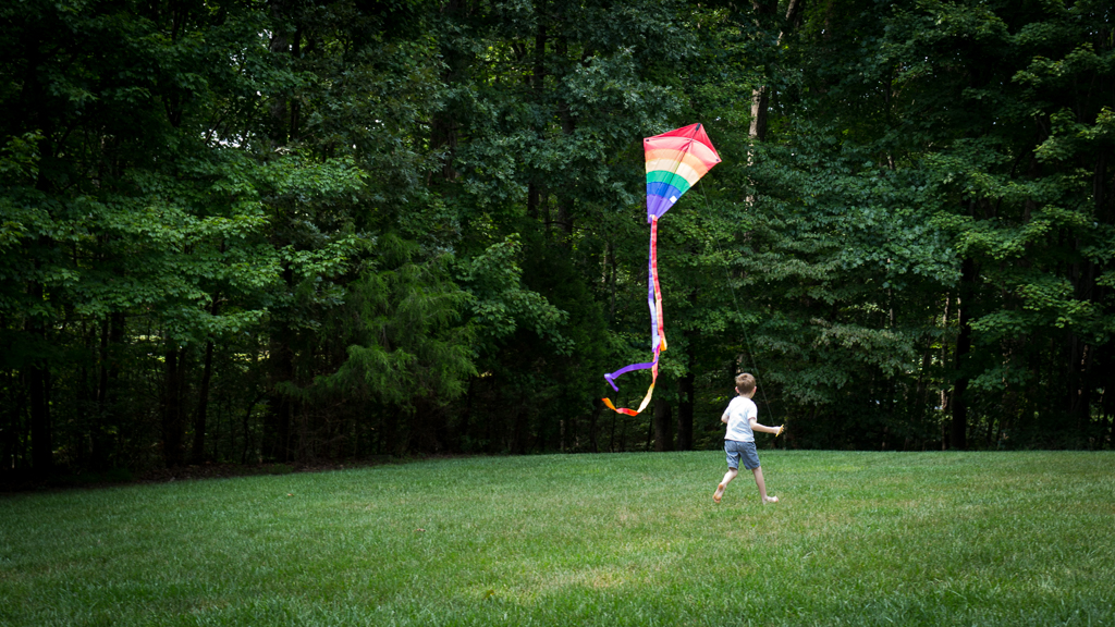
Hi Eric! I was at ISO 800, f/5.6, and 1/160" using my 35mm. I agree with the idea of motion blue - I'm definitely going to give that a try next chance I have. |
Sep 26th |
| 25 |
Sep 18 |
Reply |
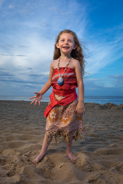
Thanks for the feedback, Audrey. As you may have seen above, the framing and how you interpreted it is exactly what I was going for. Thank you for the point about the motion blur - I was definitely panning a bit, but wasn't intentionally trying to add motion blur. If you think it helps - great! But you have definitely given me an idea I need to try for next time. |
Sep 26th |
| 25 |
Sep 18 |
Reply |
I imagine so! =) Thank you for the feedback, Ruth. I've been pretty 'tame' in my post-processing in the past, but lately I've been feeling more confident in 'kicking it up a notch'. I took a stab at some increased contrast, popping the colors more, and emphasizing the subject with exposure. I've attached v2. |
Sep 26th |
 |
| 25 |
Sep 18 |
Reply |
Thank you for your feedback, Marla! Audrey took the words right out of my thoughts - when I framed this I wanted something different then the standard "room to breath" (or run in this case) framing we are usually taught. I can certainly appreciate the perspective though! |
Sep 26th |
| 25 |
Sep 18 |
Comment |
Same as the others - congrats on the wins with this one! Is there a reason you need our opinion at this point - haha. (smile) I agree that the striking gold holds the viewers attention, but it also left me wondering why it's so gold/yellow. Maybe that conflicting interest is what helps. Nice job. |
Sep 26th |
| 25 |
Sep 18 |
Comment |
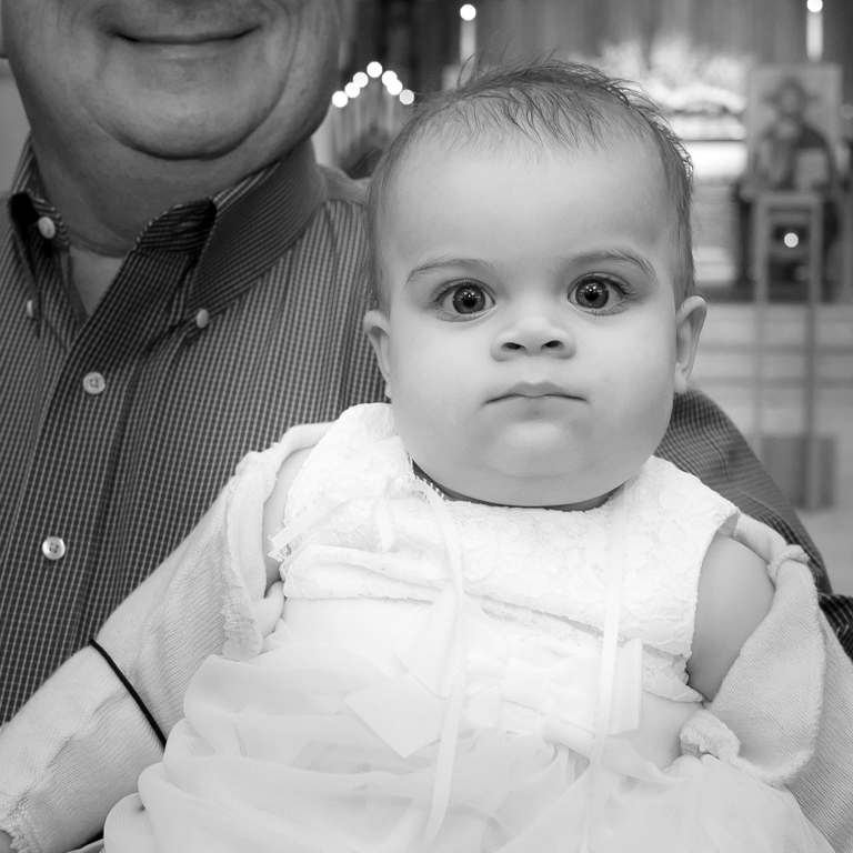
I tend to like vignettes, but have to agree with Audrey that this one is particularly heavy. A bit more than I think is necessary - it was the first thing I noticed. Normally, you want a clean image of your (living) subject looking at the viewer, but I really like this perspective....like he/she is looking at the day to come. |
Sep 26th |
| 25 |
Sep 18 |
Comment |
I agree with the other comments about the reflections, and especially Audrey's comment about the sense of perspective with the people. It's a nice image, and I, too, look forward seeing more. You mention cropping and I am wondering what the original aspect was - I am feeling like this needs a bit more room on the left and right. |
Sep 26th |
| 25 |
Sep 18 |
Comment |
Wow - I had no idea how garlic grew, let along that it grew tall. That's neat! I second the comment by Audrey - glass-glare is a pain and you handled it well! |
Sep 26th |
| 25 |
Sep 18 |
Comment |
I agree with the others in the beauty you captured with this image. I do think Marla's suggestion is good, but also realize that it may not depict what you saw - only you know what you saw! I wonder if you can brush in some pink in just the areas you saw it, since I'm missing the pink you mention. My favorite part is the one tree popping out from the bright sun. |
Sep 26th |
5 comments - 5 replies for Group 25
|
5 comments - 5 replies Total
|