|
| Group |
Round |
C/R |
Comment |
Date |
Image |
| 25 |
Aug 18 |
Comment |
Same here - I think a bit of a vignette would help a bit. Beautiful colors! |
Aug 26th |
| 25 |
Aug 18 |
Comment |
Same here - I think a bit of a vignette would help a bit. Beautiful colors! |
Aug 26th |
| 25 |
Aug 18 |
Comment |
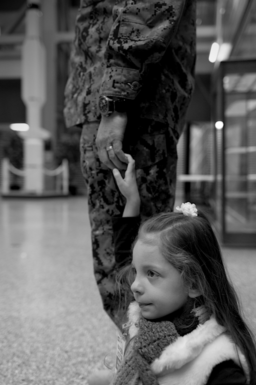
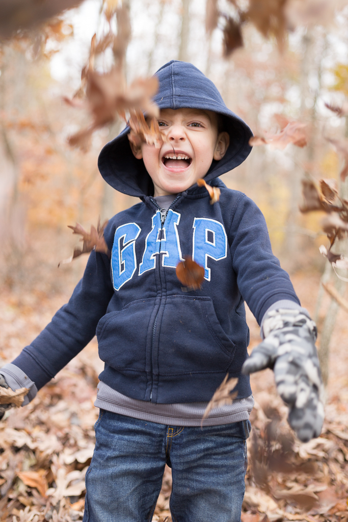
I agree that the choice of B&W is a good one. It allows the viewer to stay focused on the expressions and moment. Audrey hit is spot on about the arm. Most women tend to be quite sensitive to their arms, so it's certainly something to look out for. In couples posing, you'll often see the photographer use the man to "hide" portions of the women, even their arms. In this case, you could have had him wrap his arms around hers a bit, and if you had moved left just a bit, to frame them little more angled toward the front, her arm would have presented itself less. I'm sorry to say this, but I'm not quite convinced of the expressions. Your daughter looks like she's wary of him and pulling away a bit; her husband is looking in an odd direction. I learned a tip not too long ago for posing couples....pick a spot somewhere in the distance (whether out on the ground, or far away) and tell the woman that she is to stare at that spot no matter what...and make it into a bit of a joke - like "See that leaf? You own that leaf...like, really OWN that leaf. Not matter what, DON'T let your eyes off of it." Then tell the guy to smell her ear and tell her what it smells like. That always illicits great expressions and you'll get them looking at the right places, as if you captured an intimate moment. Attached you'll see an example of where I did this (please forgive the image quality - I'm not at my primary computer with my real images right now). |
Aug 26th |
 |
| 25 |
Aug 18 |
Comment |
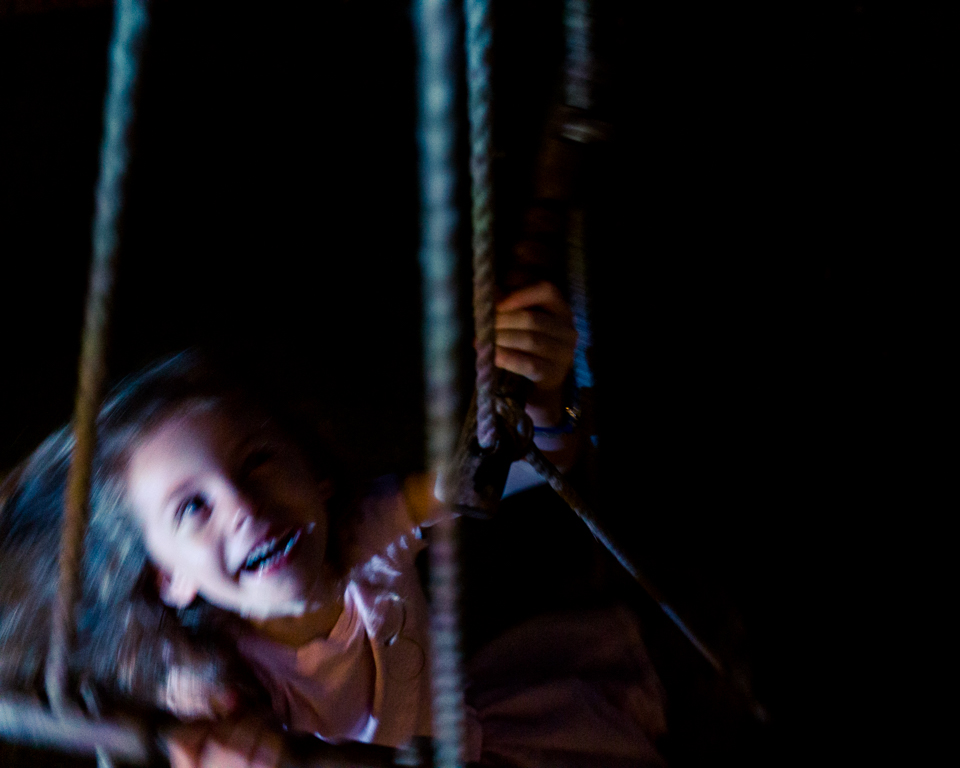
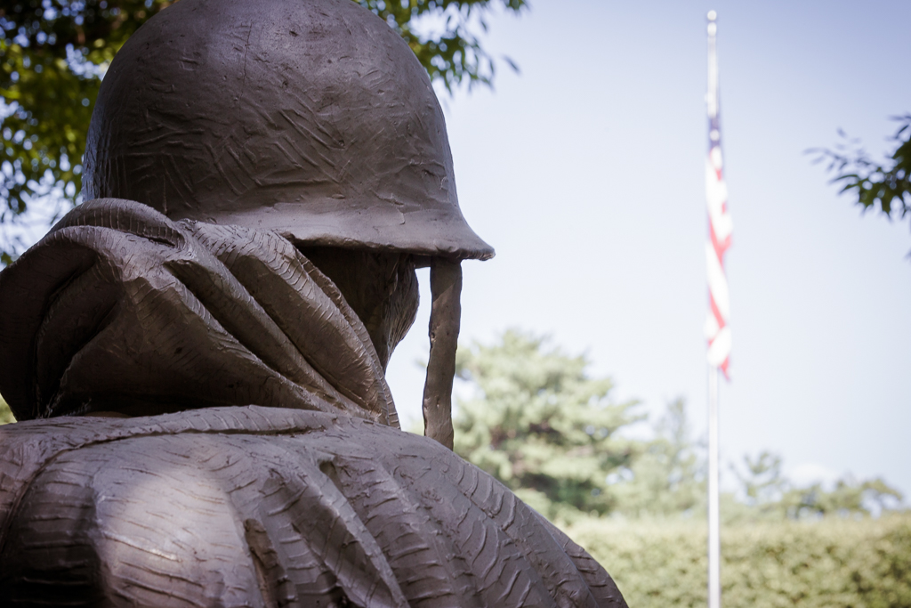
I like the idea, but have to say that my first reaction was wanting to be able to see the logo on the seat a bit more. Even with the title, I can hardly tell what I'm looking at. I think a bit more depth of field would have helped. |
Aug 26th |
| 25 |
Aug 18 |
Comment |
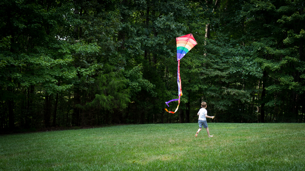
Reading your description and the dialogue so far, I have to admit that I'm a bit confused about how you made this. Is it a composite? If so, is it possible to keep the background of the original? It's much less distracting. Otherwise, the colors are bright and the image is crisp. I agree that the background does better darkened. |
Aug 26th |
| 25 |
Aug 18 |
Reply |
If I recall accurately, I think I did add a vignette, but it was probably very slight. I definitely try a bit more next time I'm editing. Thanks for the feedback, Audrey. |
Aug 26th |
| 25 |
Aug 18 |
Reply |
Thanks, Ruth! |
Aug 26th |
| 25 |
Aug 18 |
Reply |
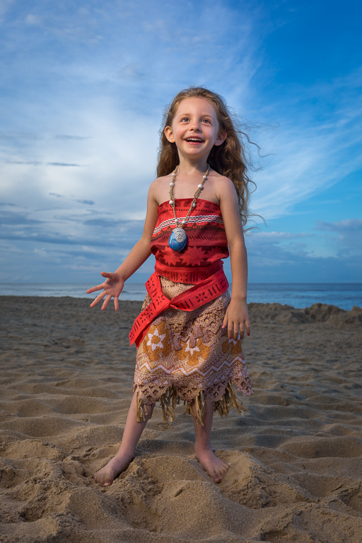
Thanks for the feedback, Marla. I'll definitely take a look at that next time I'm editing photos. Not sure if you're into watching Disney movies, but that one is one of my favorites. Great story and really good music. |
Aug 26th |
| 25 |
Aug 18 |
Reply |
Hi Darin - thank you for your feedback. It was a lot of fun to make. I agree with your suggestion. I recently printed this in 5x7 which required me to crop it along the top and bottom, and I prefer a little less on the top. |
Aug 26th |
5 comments - 4 replies for Group 25
|
5 comments - 4 replies Total
|