|
| Group |
Round |
C/R |
Comment |
Date |
Image |
| 25 |
Jul 18 |
Comment |
I've seen some great images with photoballs and agree with Vincent that sometimes it can be done gimmicky - this one is not. I really enjoy this image since it is a very different take on photographing a place that is quite saturated with images. The rusty 'frame' around the ball is a perfect compliment to the story of Venice. This is a framer for sure! |
Jul 19th |
| 25 |
Jul 18 |
Reply |
That's interesting to see the original. Are you able to get a bit more of the distant landscape at the top? The crop is a great selection yet I think it needs some breathing room at the top...now that I see this image is a crop, you might have some to add. |
Jul 19th |
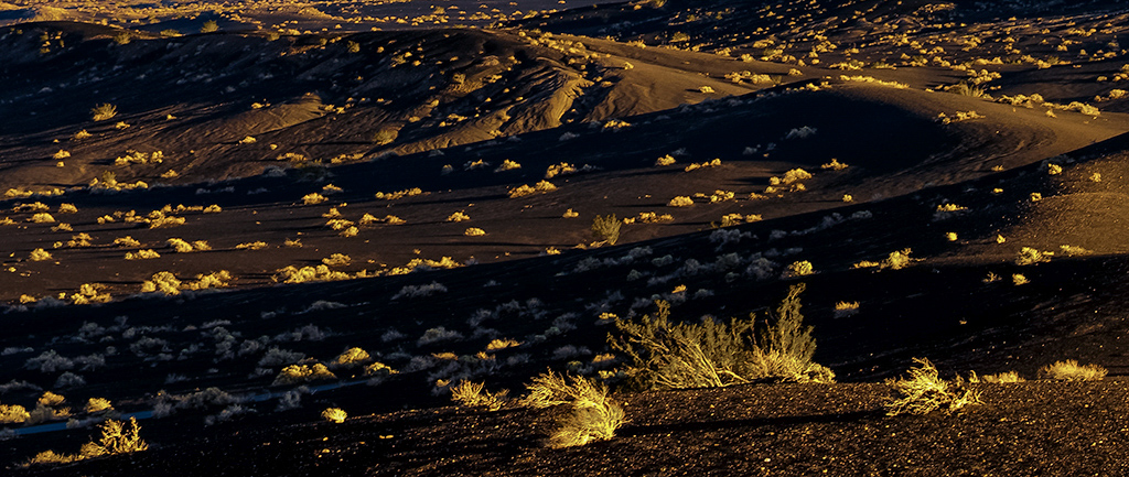
| 25 |
Jul 18 |
Comment |
The long curving, swooping lines with the contrast of yellow/black make this an interesting photograph. The image is just a bit too yellow, IMHO. I realize it was taken at sunrise, but the light just seems "off"...I played with it a bit in LR. See my VF and see what you think. I brought down the yellow in the shadows ever so slightly, turning it a slight blue which mimics how shadows typically look, but still keeps the pop of yellow in the highlights. It's really subtle, but see what you think. |
Jul 19th |
 |
| 25 |
Jul 18 |
Comment |
Great eye for seeing the leading/repeating lines on this dock. My initial impact was similar to Marla's - it's not quite symmetrical, but yet the off-angle is not quite strong enough either. I was a but torn about that part and, IMHO, I think taking a couple more steps to the right to take this image would have removed all doubt. Also, the horizon looks just a tad off, as if the right side needs to come up slightly. I like Darin's suggestion about trying this in monochrome. |
Jul 19th |
| 25 |
Jul 18 |
Reply |
Hi Eric - great point. I need to keep that in mind. I have a tendency to shoot wide open a lot (I love that look), but agree that sometimes you want the face to be the focus, not just one small section of it. Thank you for the feedback! |
Jul 19th |
| 25 |
Jul 18 |
Reply |
Thanks, Ruth! |
Jul 19th |
| 25 |
Jul 18 |
Reply |
Hi Darin - that's an interesting idea about the rays of light. I'll try that. Unfortunately, I don't have her full elbow...bad crop in camera. Thank you for the feedback! |
Jul 19th |
| 25 |
Jul 18 |
Reply |
Thanks, Marla. With everyone's positive reviews, I'll definitely do that! |
Jul 19th |
| 25 |
Jul 18 |
Comment |
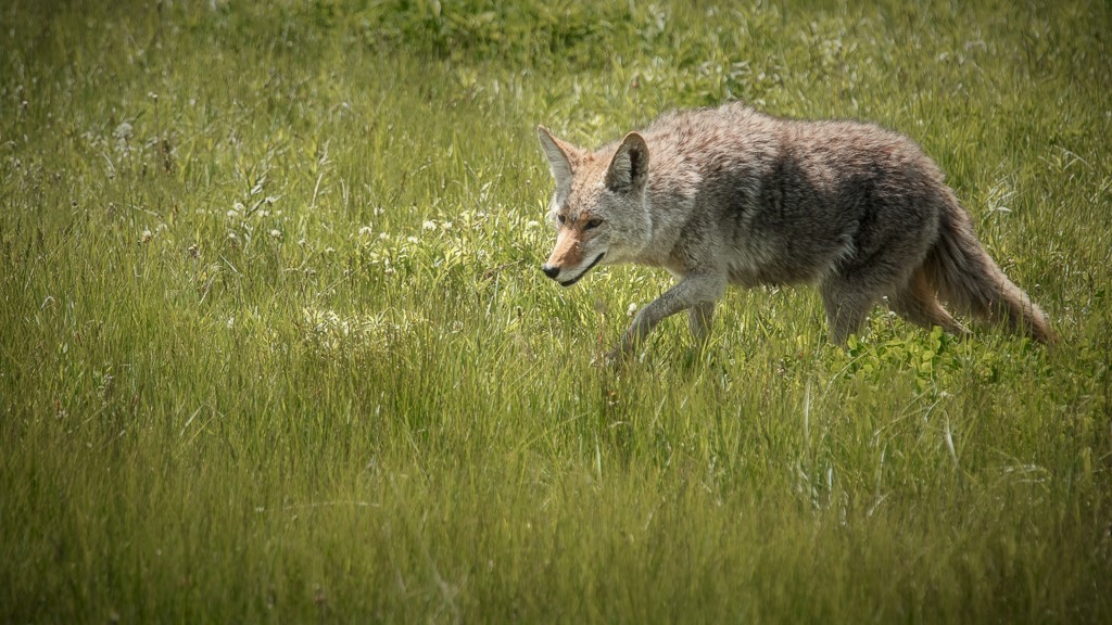
I agree with Audrey's assessment about the loss of detail in the coyote. I took your image and played with it a bit too and, in the process, I think I may have discovered a way to check for other potential distractions that I'd love to share. After flipping it horizontally, the pre-bloom, brownish dandelions on the foreground's bottom right and directly in front of the coyote became very apparent. When I flipped it back, I couldn't help but notice them now. Might be worth trying in the future! Not sure if you care for my edits, but just some ideas in my VF using a longer, pano-like format, adding a vignette, and roughly removing the potential distractions I mention. |
Jul 9th |
 |
| 25 |
Jul 18 |
Comment |
Brrrrrr - being arachnophobic, this makes me shudder thinking about getting so close to one of these 8-legged creatures (and I think I'll avoid raising tomatoes if that means I might have to come across one of these - yikes). Getting past my comfortableness (smile), you undoubtedly have a strong subject. with a square crop, I would recommend planting that guy (gal?) right in the middle by cropping down from the top a bit. In all honesty, it looks like the image is overly processed, maybe it's the sharpening? The leaf framing the spider is very well done. |
Jul 9th |
| 25 |
Jul 18 |
Comment |
Hi Audrey - I can see why it placed. To me, it exudes an initial sense of calmness with the soft, flowing water, yet hints at the 'life' that still exists in the water with the places where the water is bubbling. The colors are fantastic as well. The composition is done well with the brown rocks providing a good anchor and some interest. I can see this as a piece of art on the wall and might do well with an intentional water-color (no pun intended) effect too. After deeper review, I notice a few places where water drops jumped up during the exposure, creating a bit of a hair-like effect. Just being super picky, but I don't think they add to the image and, if you were to print this large, I would think it would help to remove them first. |
Jul 9th |
| 25 |
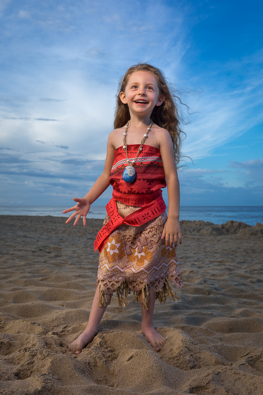
Jul 18 |
Reply |
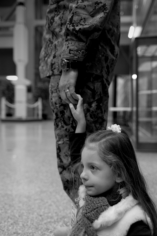
Thank you very much, Audrey. You're exactly right that it's tough staying objective with pictures of my children. Which is why I certainly appreciate your feedback. I definitly didn't notice those points, but now that you mention them, they're hard to miss! I will certainly update my file with those suggestions. Thank you! |
Jul 5th |
6 comments - 6 replies for Group 25
|
6 comments - 6 replies Total
|