|
| Group |
Round |
C/R |
Comment |
Date |
Image |
| 41 |
Sep 22 |
Reply |
Hi Nadia,
So I think your comments were in response to the title, and that you think it fits. Thanks.
|
Sep 22nd |
| 41 |
Sep 22 |
Reply |
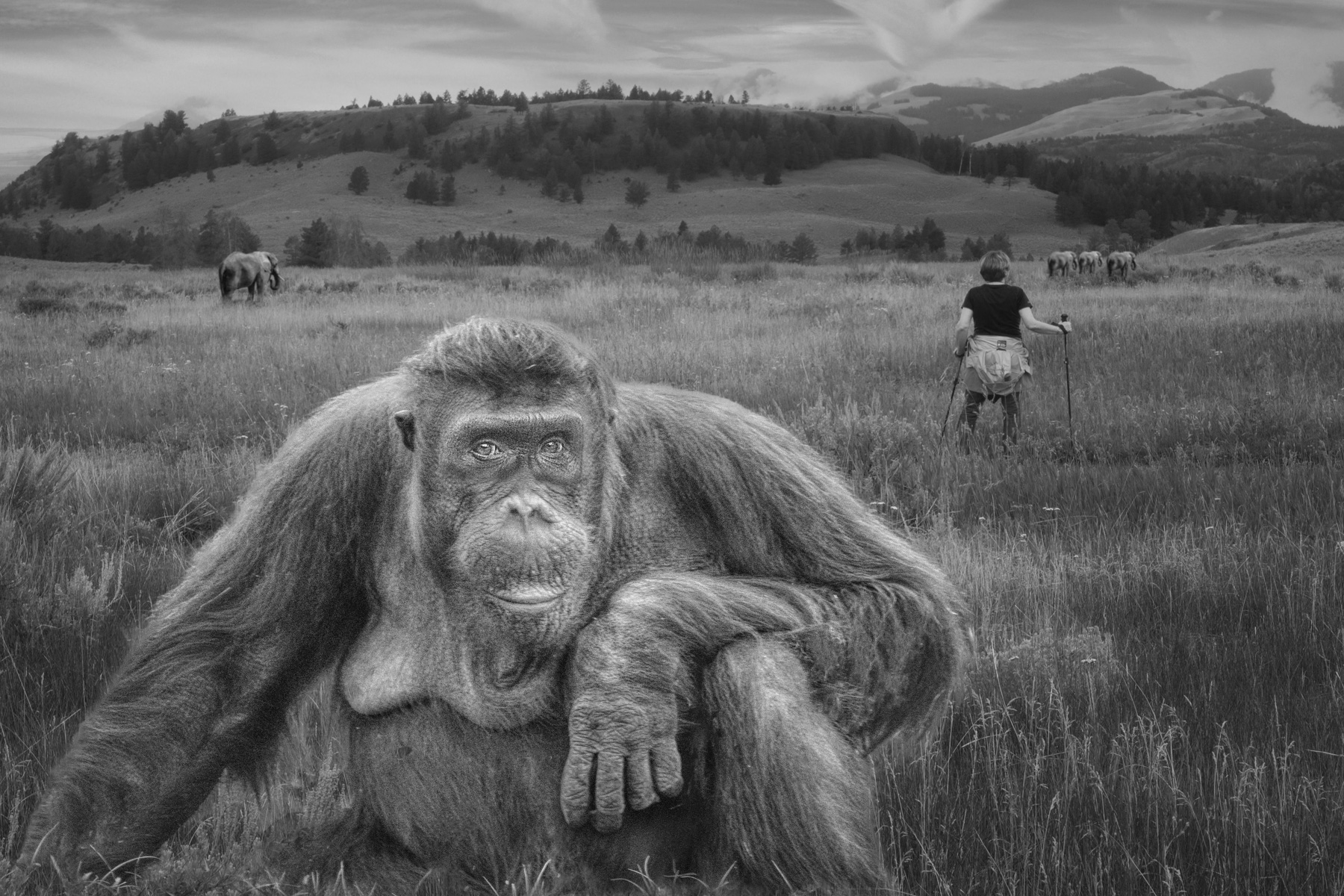
Hi Brian,
Thanks for the critique. Funny I did not see the marking on the elephant. That's what these forums are for. I decided to have the left elephant as it fills in the blank area on the upper left and forms a triangle with the animals. I see your point about more contrast, and I'll have to play with that a bit more. Thanks. |
Sep 22nd |
| 41 |
Sep 22 |
Reply |
Hi Henry,
Thanks for the title suggestion. I'm not sure Evolution Diversity works that well, but I see your point about Outback Odyssey not working either. Anyone else have a suggestion?
|
Sep 15th |
| 41 |
Sep 22 |
Comment |
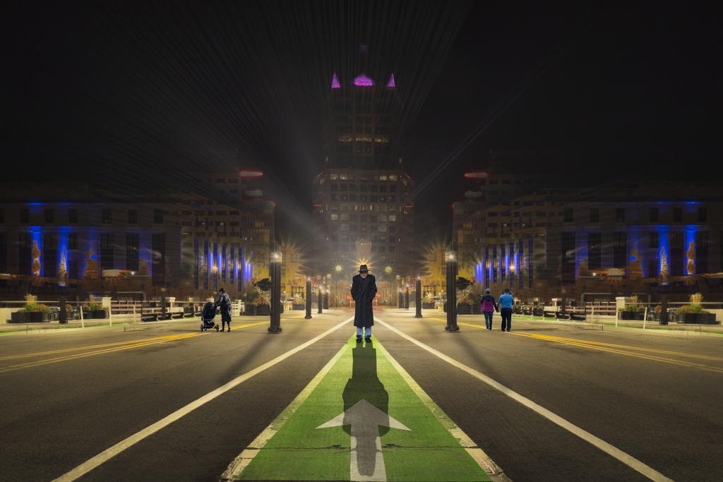
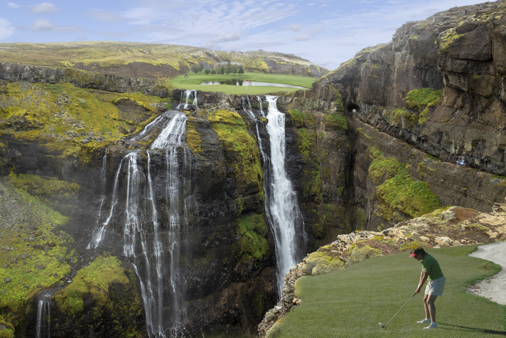
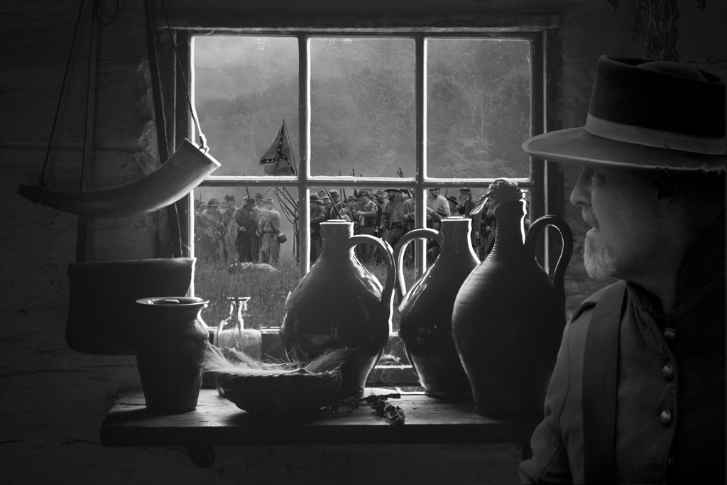
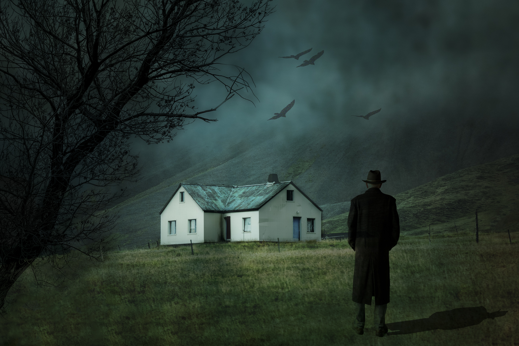
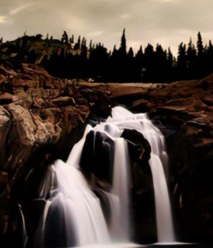
Hi Brad,
I would love to have been out on that campsite. Wonderful view of the falls. My take is that there is way too much dead space on the right side. It is just a blob of black with no details. So a different crop might be better to focus on the falls. See image. But in this case, I think this is more of a enhanced landscape image instead of a creative image. |
Sep 15th |
 |
| 41 |
Sep 22 |
Comment |
Hi Lisa,
Not much to comment on here, but good use of the PS tools to make a pleasing image.
Tom
|
Sep 14th |
| 41 |
Sep 22 |
Comment |
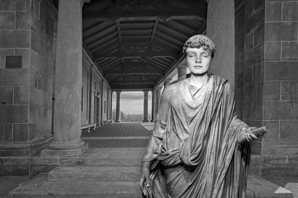
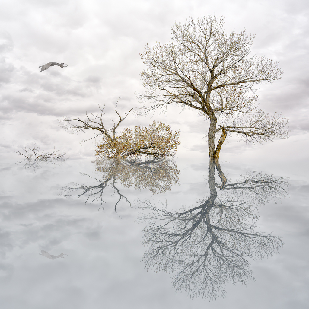
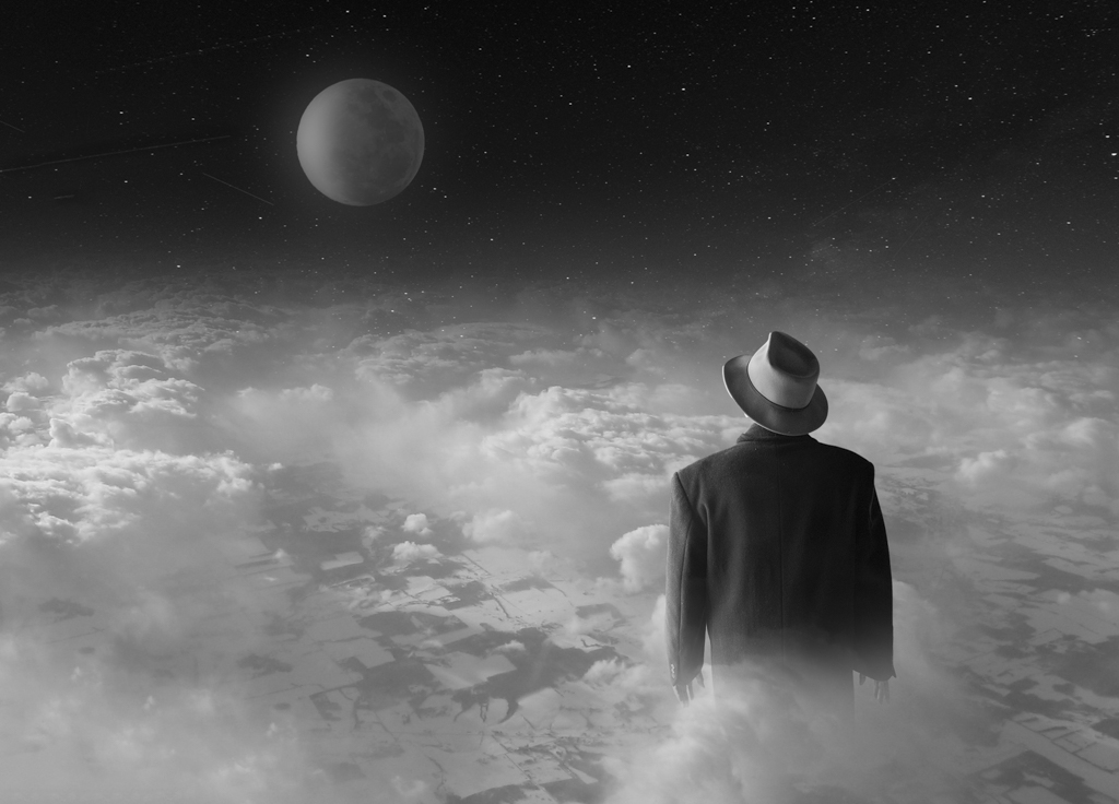
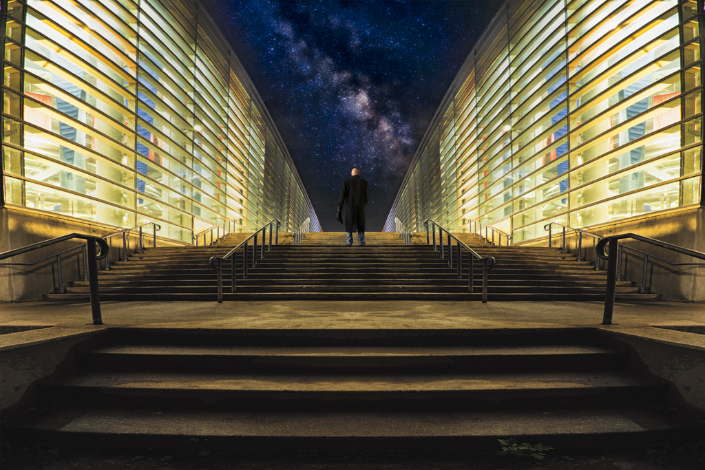
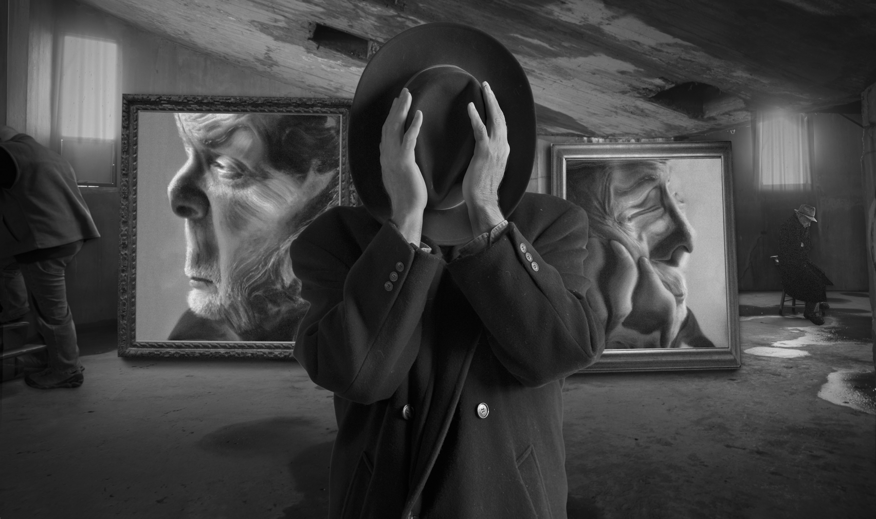
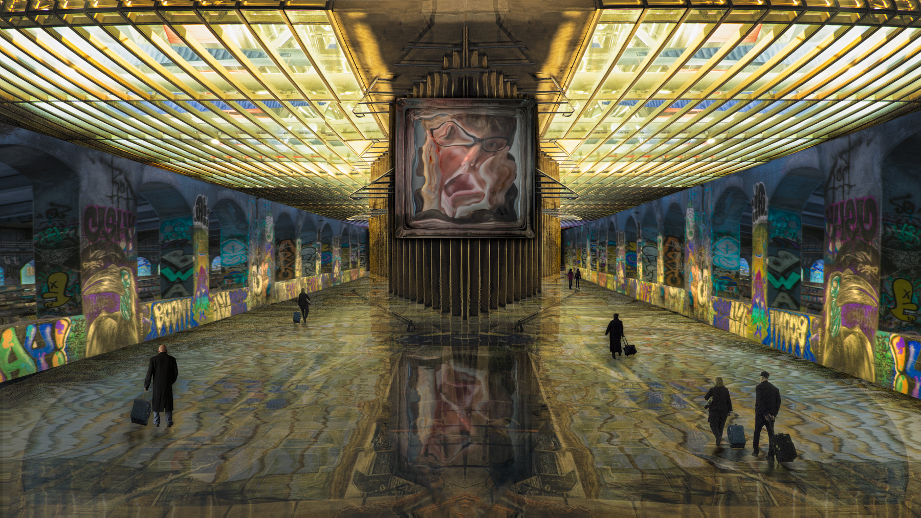
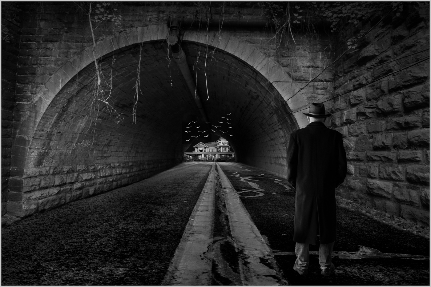
Hi Nadia,
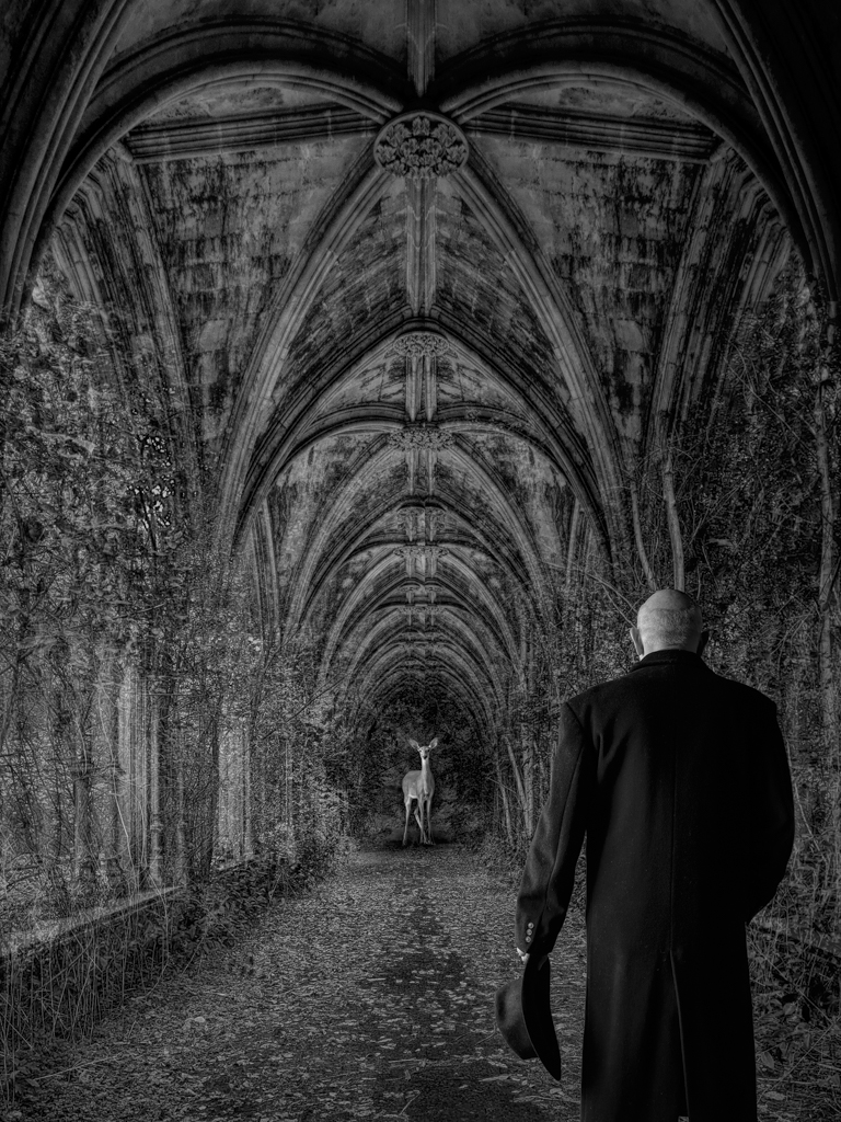
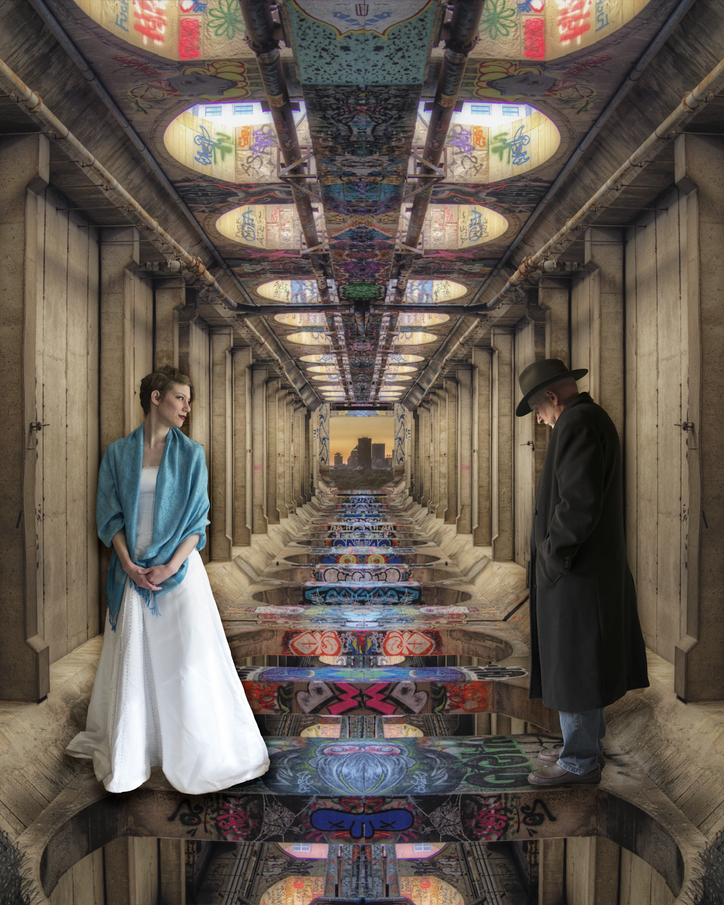
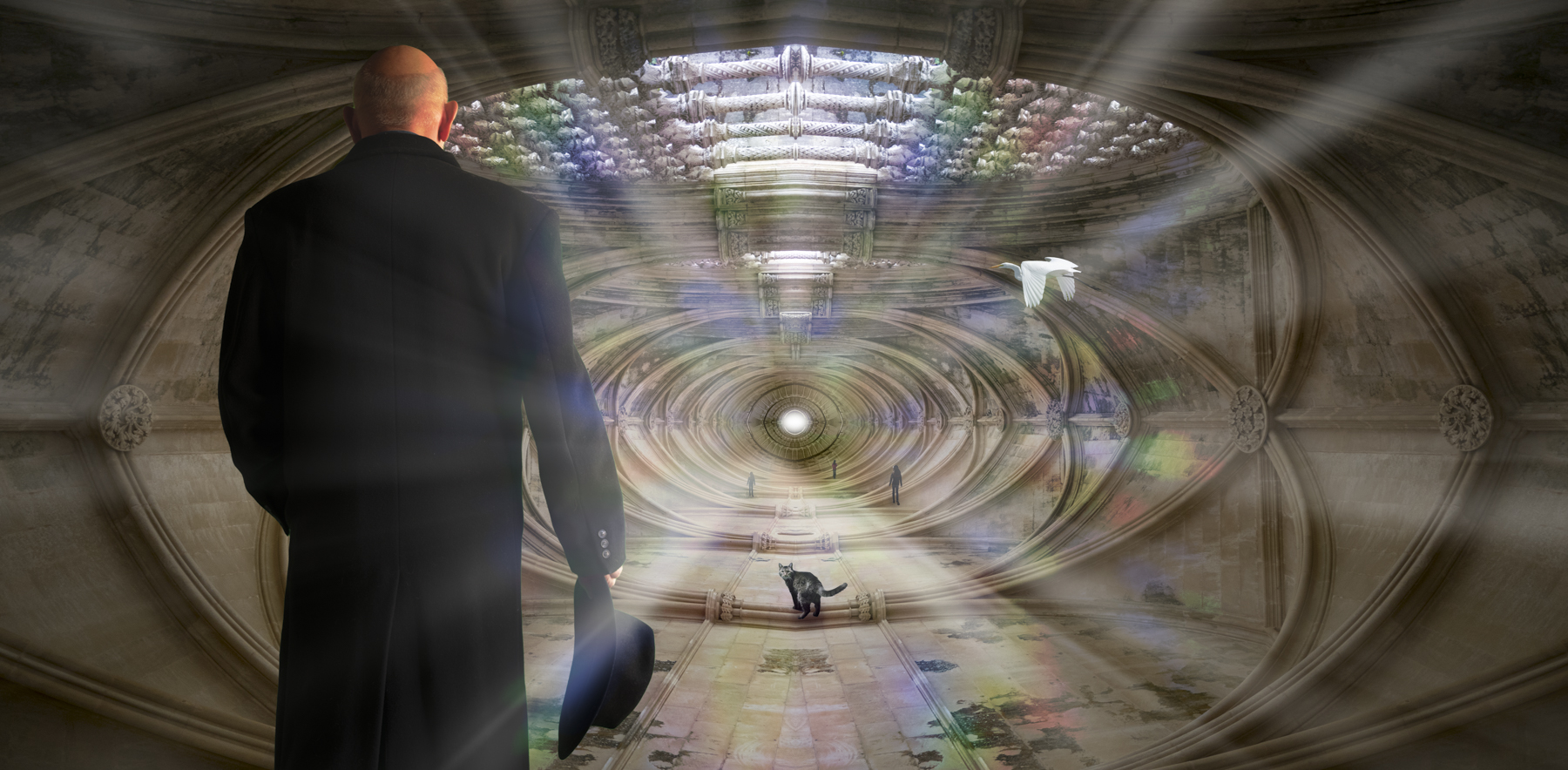
You are such a skilled photoshopper that technically your images are near perfect. So the only question is does the idea work for me? In this case, I'd say it doesn't. The part of the image inside the doorway seems confusing. So you can take this in a lot of different directions, but here is one idea. It would be fun to have a lot, I mean a lot, of depth, and perhaps to have a little person walking up the stairs. You could start with a totally black interior, and put a light (lamp and desk?) in the distance or have a child sitting at the desk with the lamp illuminating their face as they do homework perhaps?
Cheers,
Tom
|
Sep 14th |
| 41 |
Sep 22 |
Comment |
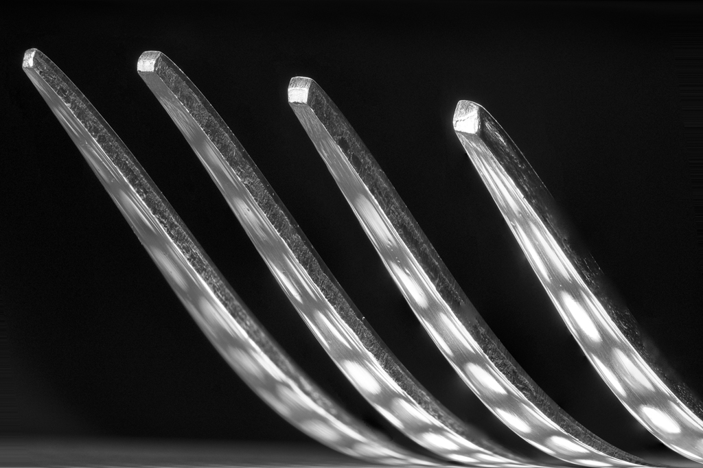
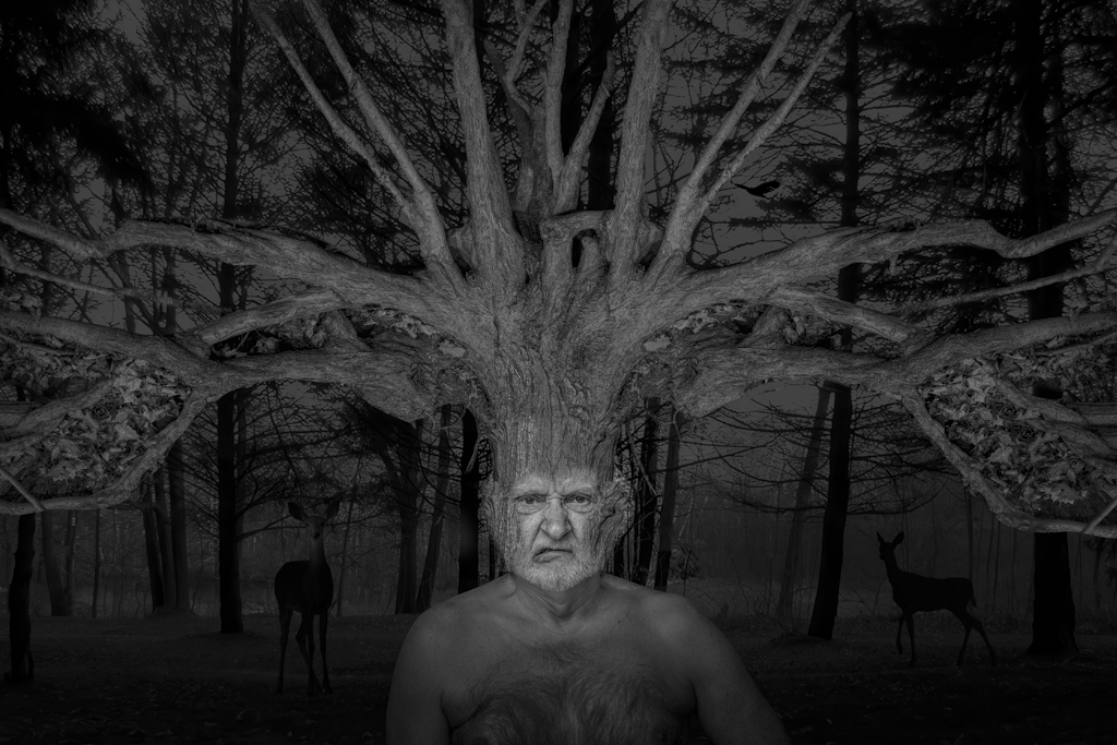
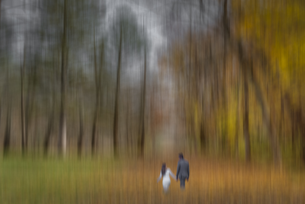
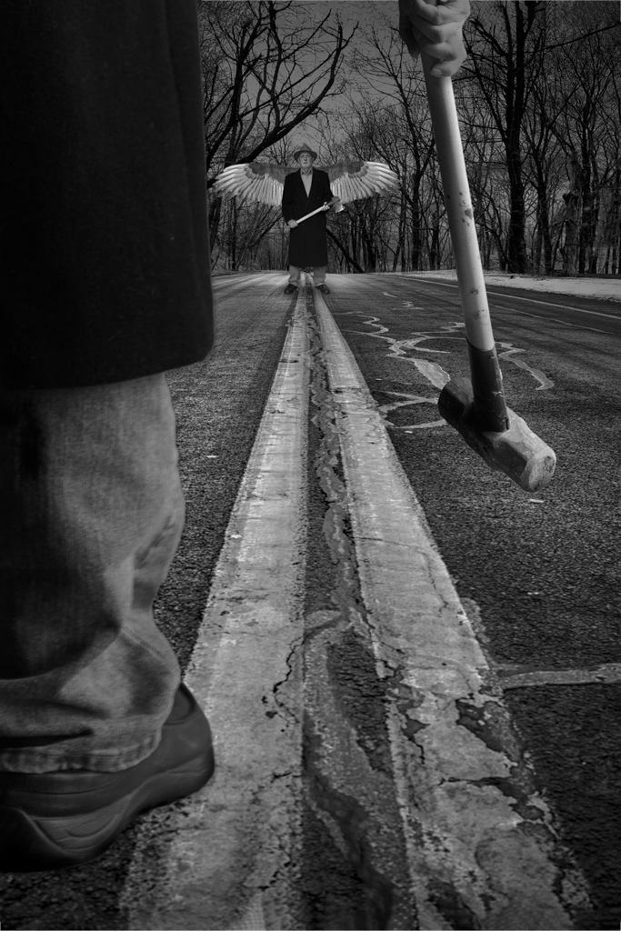
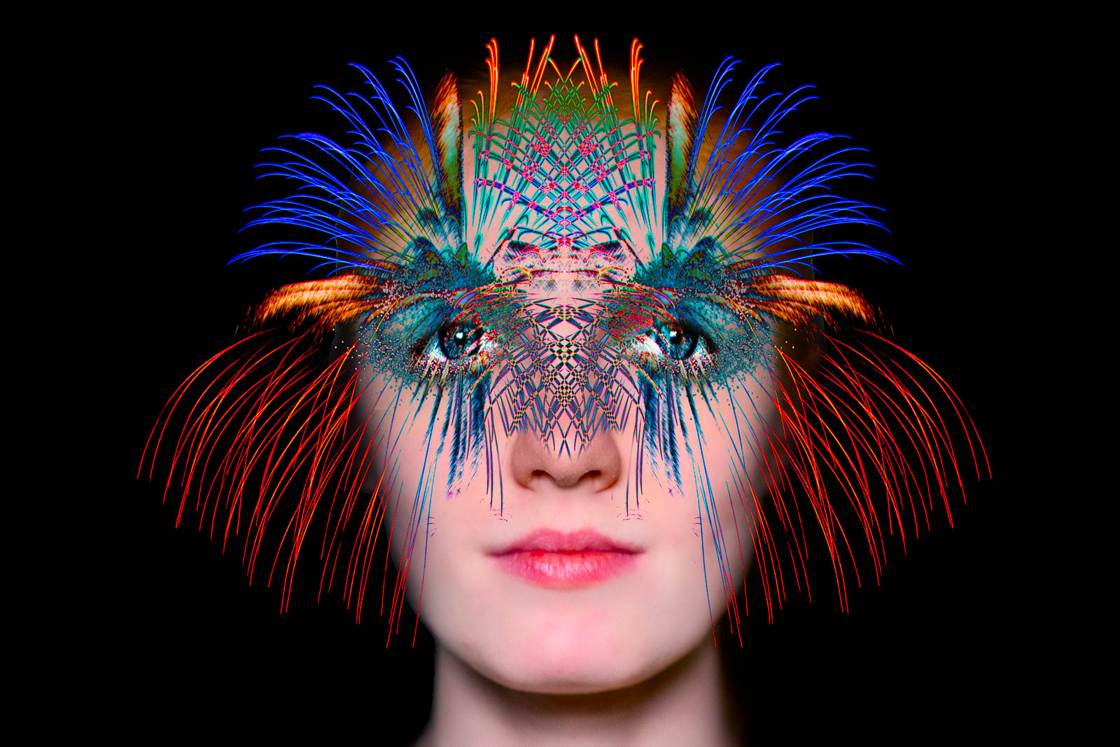
Hi Henry,
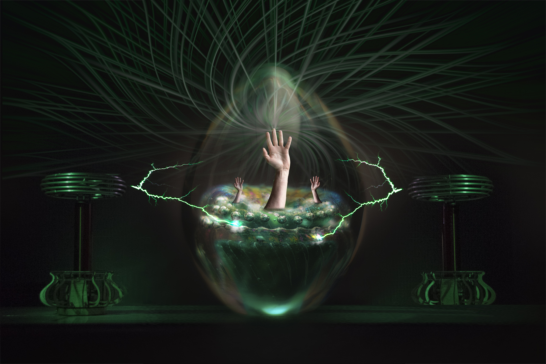
There really are a million ways, to play with this. For me, I don't see the flower anymore. It looks more like a mouth with teeth (sideways). Depending on how you want to go with this, you could make this a mouth opening and put it on an animal for example or a person. |
Sep 14th |
| 41 |
Sep 22 |
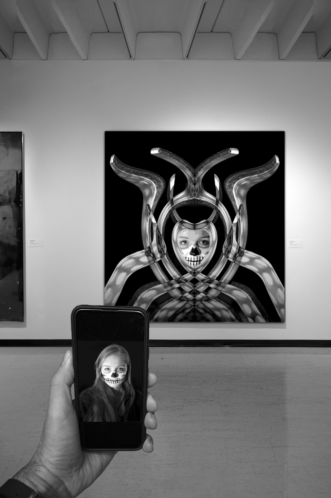
Comment |
Hi Julie,
Well done. Fun image. I have no suggestions to make this better.
Tom
|
Sep 14th |
| 41 |
Sep 22 |
Reply |
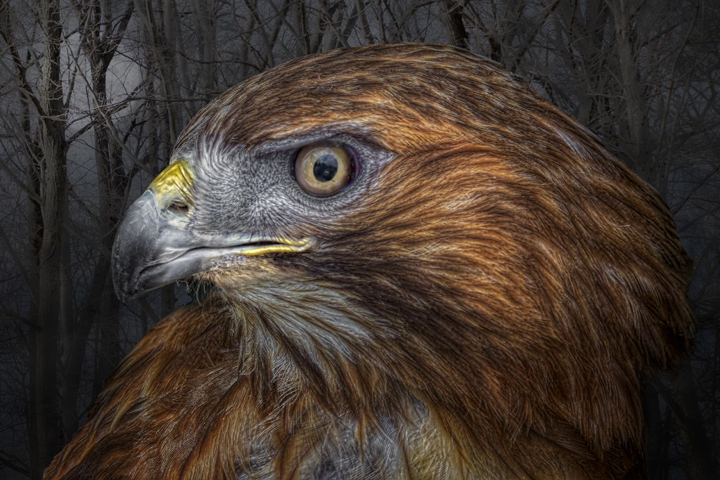
Hi Brad,
Good suggestion, but I'm not sure if I like the head at a tilt in Original 2. I wanted a strong portrait, and with both the shoulders, cheekbones, and eyes directly facing the camera, it makes for a stronger image. However, I agree that I like the face better, but just not in this context.
Cheers,
Tom
|
Sep 14th |
| 41 |
Sep 22 |
Reply |
Hi Julie,
Thanks for the comments. I appreciate them.
Tom
|
Sep 14th |
5 comments - 5 replies for Group 41
|
5 comments - 5 replies Total
|