|
| Group |
Round |
C/R |
Comment |
Date |
Image |
| 41 |
Aug 21 |
Reply |
Jan, Thanks for the feedback. I appreciate the group. |
Aug 24th |
| 41 |
Aug 21 |
Reply |
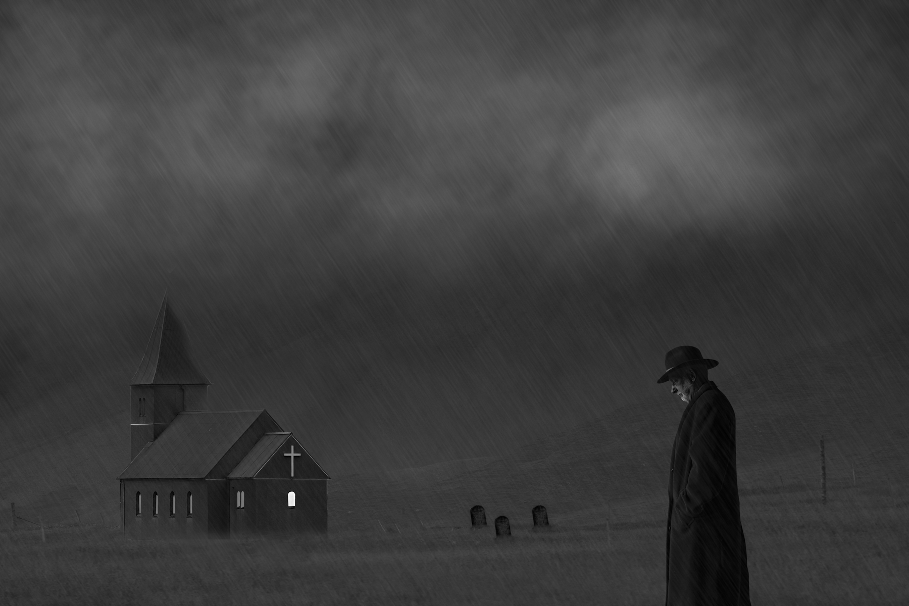
Hi Brad,
Good compromise suggestion that I will have to play with.
Tom
|
Aug 20th |
| 41 |
Aug 21 |
Reply |
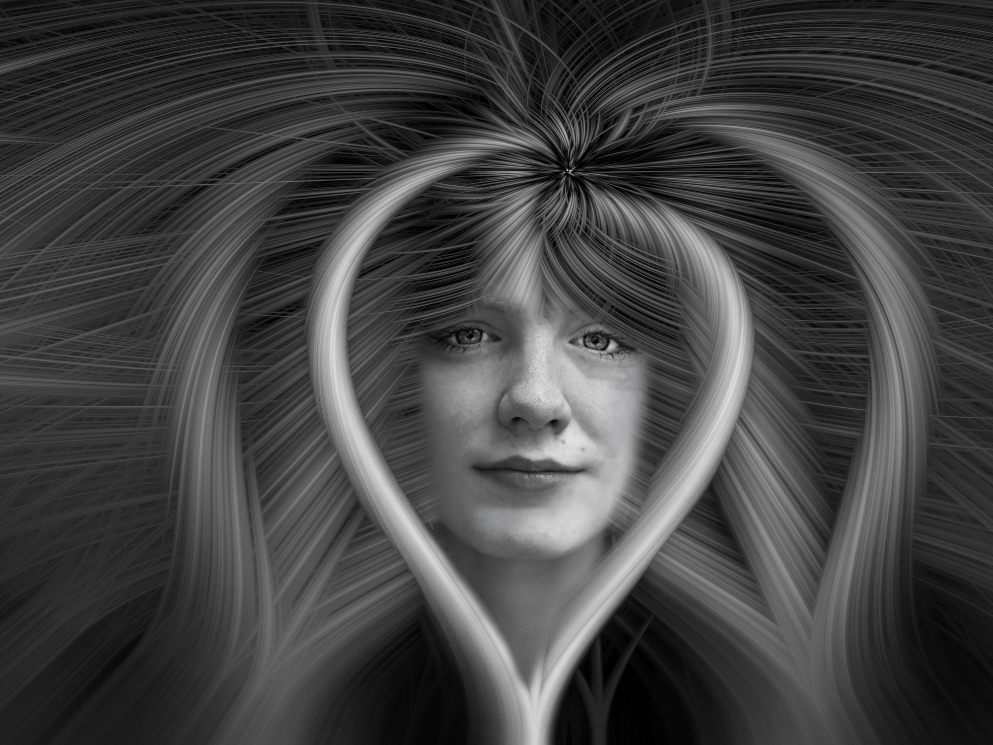
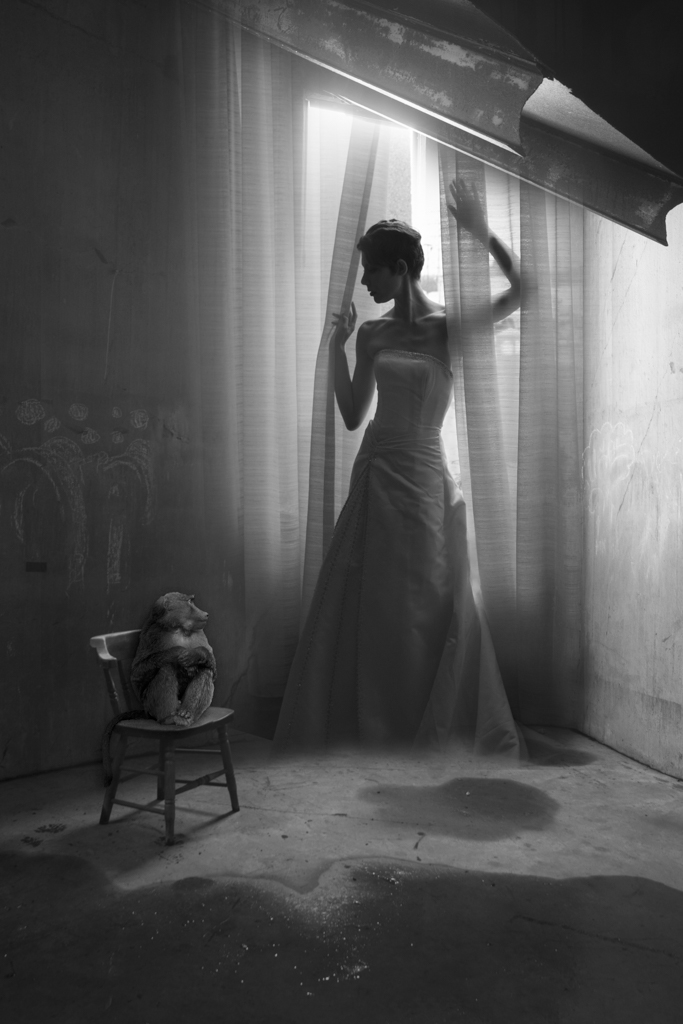
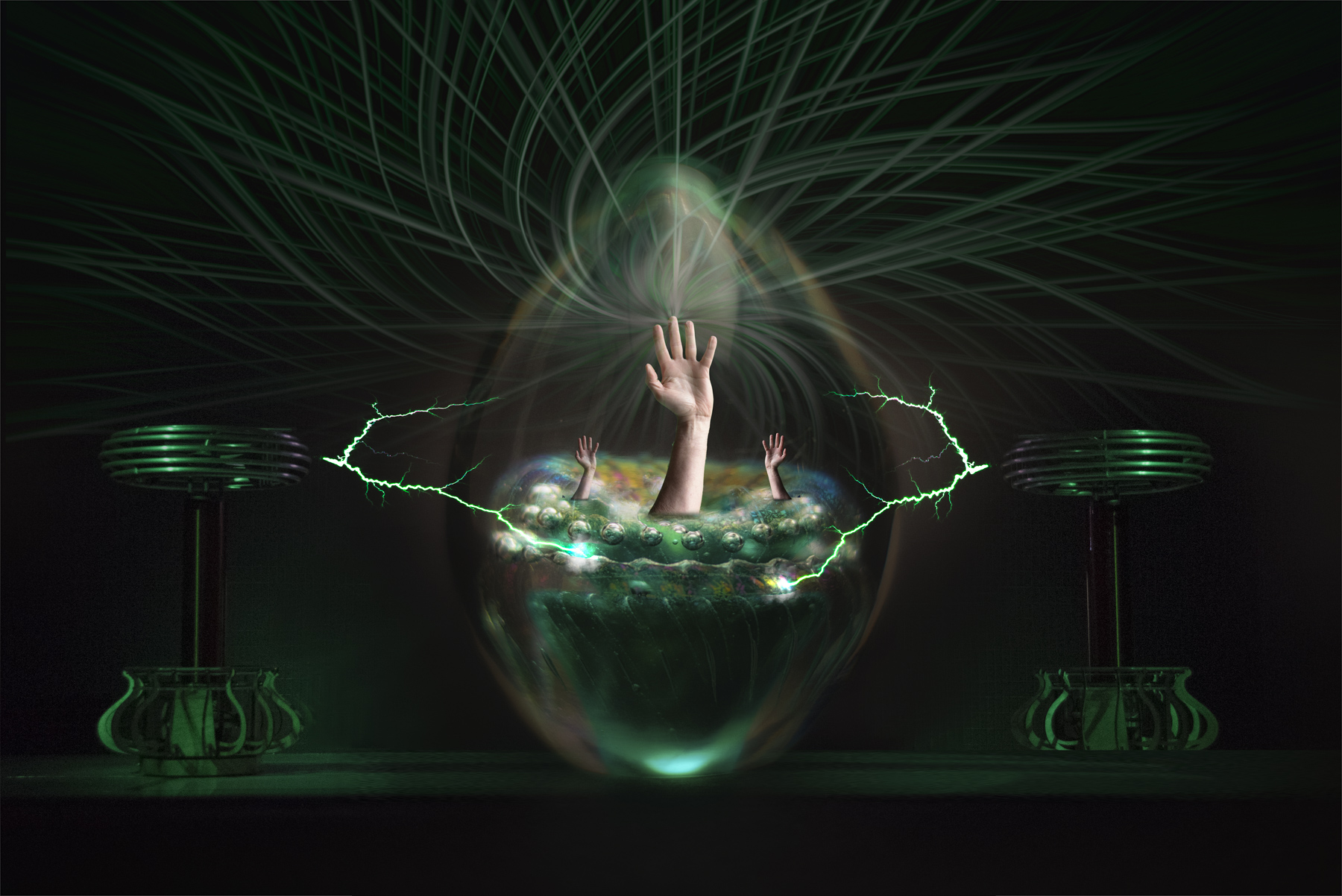
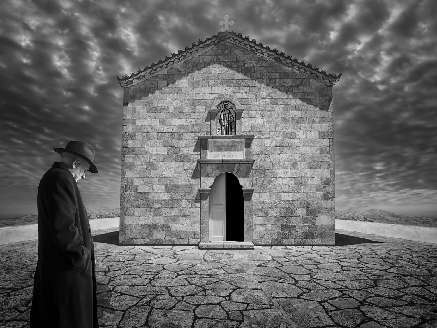
Thanks Henry,
My granddaughter hates all images of herself, so just barely tolerates my dabbling with her portraits. |
Aug 20th |
| 41 |
Aug 21 |
Comment |
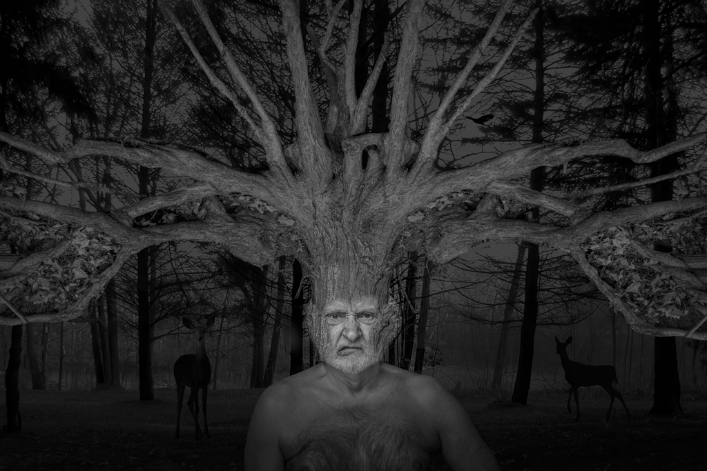
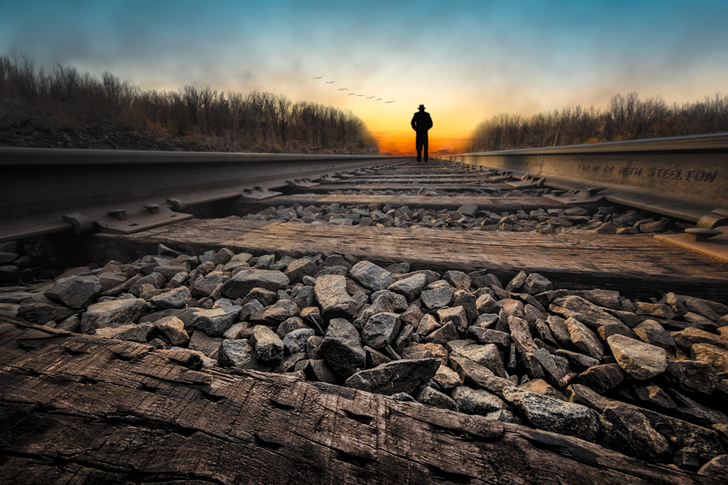
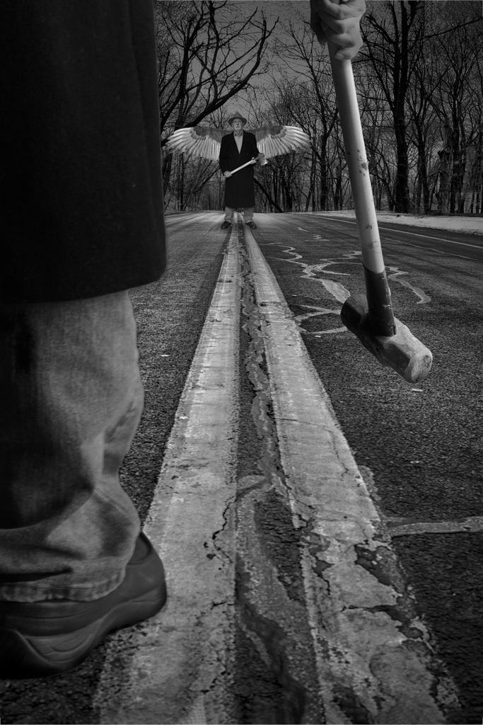
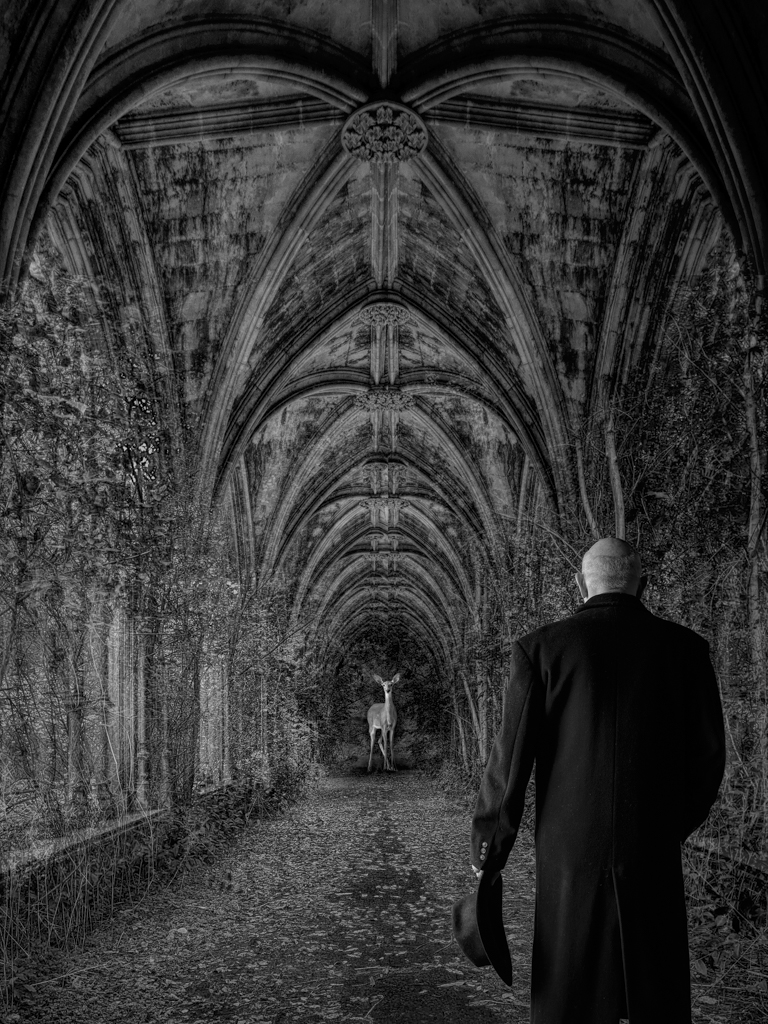
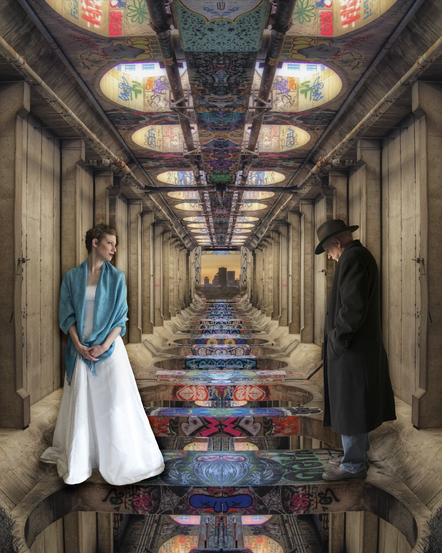
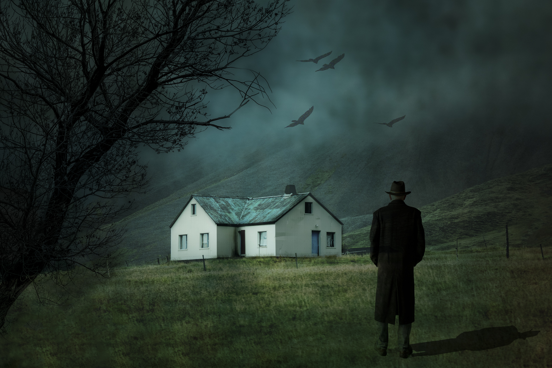
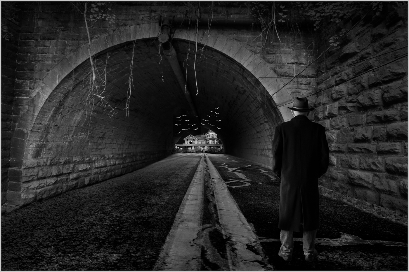
I find it so fascinating when I flip and mirror images. You never know what you are going to end up with. I have no idea what a LUT is and why I would use it. Clever image. One idea would be to use the blank space above the "bat's" wings. One idea would be to put a night sky to give it a more sinister look.
Tom
|
Aug 8th |
| 41 |
Aug 21 |
Comment |
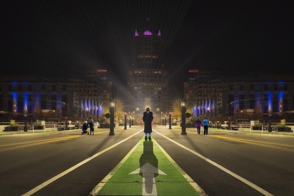
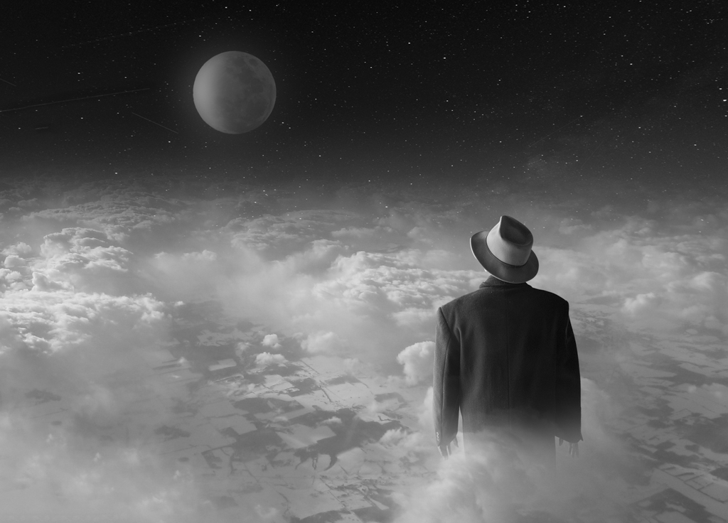
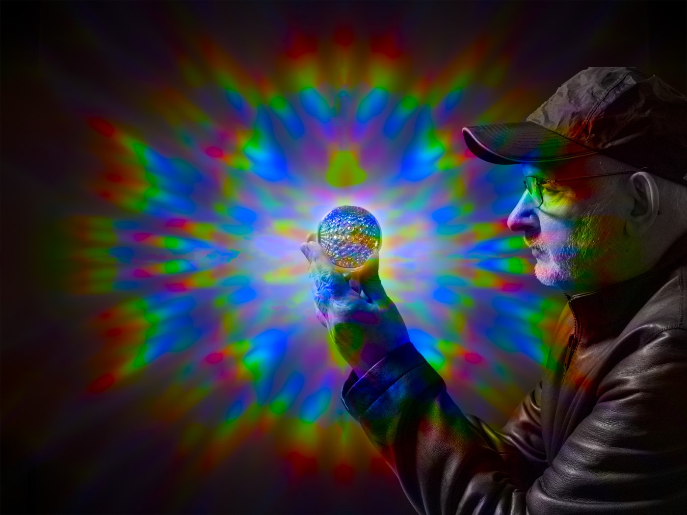
Hi Jan. Very cool shot. I feel that the strong shadow on the face doesn't fit with the rest of the lighting which is totally directionless, as you mentioned. Not sure if a lighten blend mode would work, but might be worth a try.
|
Aug 8th |
| 41 |
Aug 21 |
Comment |
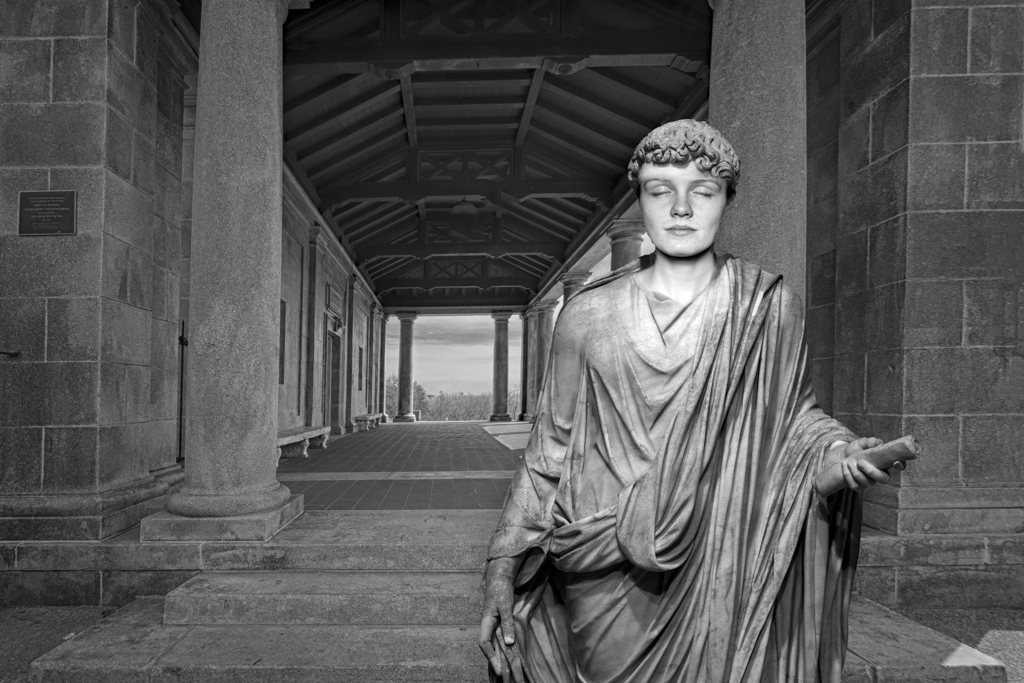
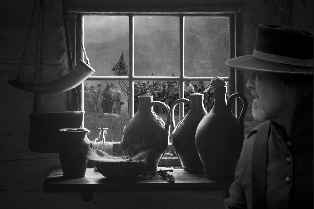
Henry, good selection of the texture and good job blending it into the image. I agree with Kathy on the distracting flower on the lower right.
Cheers. |
Aug 8th |
| 41 |
Aug 21 |
Comment |
Nice composite. Here's a trick. Add a layer above the person. Fill that layer with the warm color off of the tree. Use color blend mode and then tweak the opacity levels to warm up his color to better match the scene. |
Aug 8th |
| 41 |
Aug 21 |
Reply |
Hi Kathy,
I like your changes. Thanks for taking the time to do this. I think I like my original better as it seems cleaner to me, but this is a great version as well. Cheers. |
Aug 8th |
| 41 |
Aug 21 |
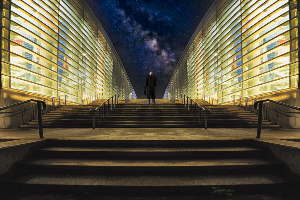
Comment |
Nicely done. Blending is excellent. I would just suggest working the lighting on the face to blend more with the body, and lighten the hands as they are too bright for the scene. |
Aug 1st |
5 comments - 4 replies for Group 41
|
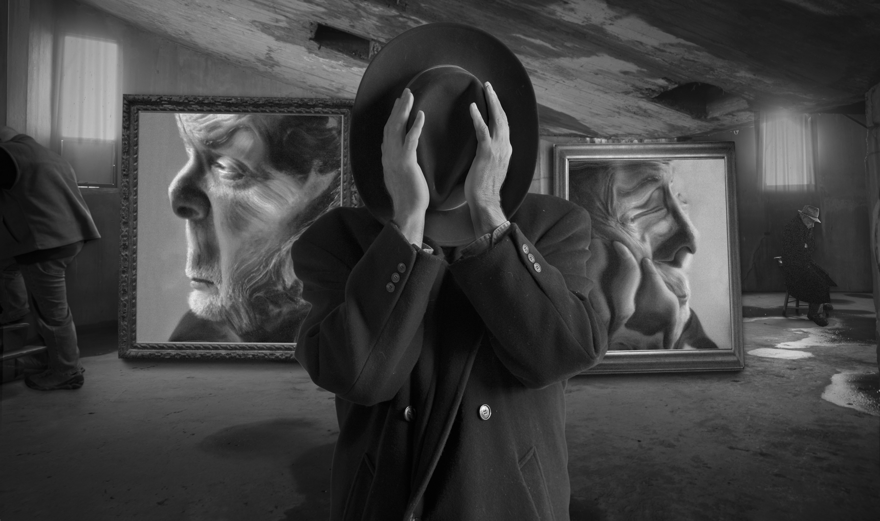
| 54 |
Aug 21 |
Comment |
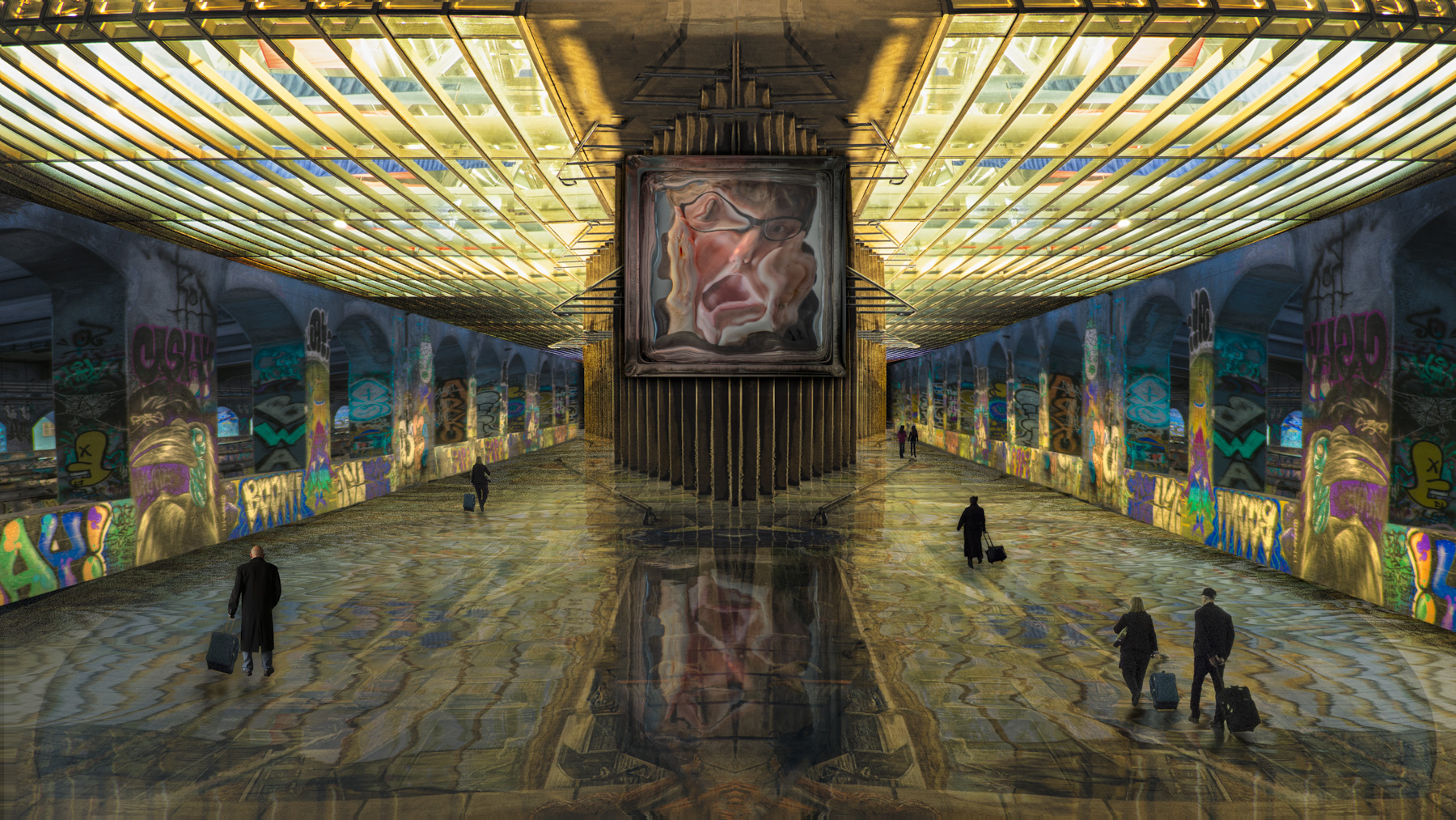
Hi Brad. Exciting image with lots of tension. For me, it would make more sense as a complete B&W. Peggy has an interesting suggestion as to the placement of the boat. If you go with that, then I would consider a different aspect ratio, maybe Vertical or Square.
Cheers,
Tom
|
Aug 8th |
| 54 |
Aug 21 |
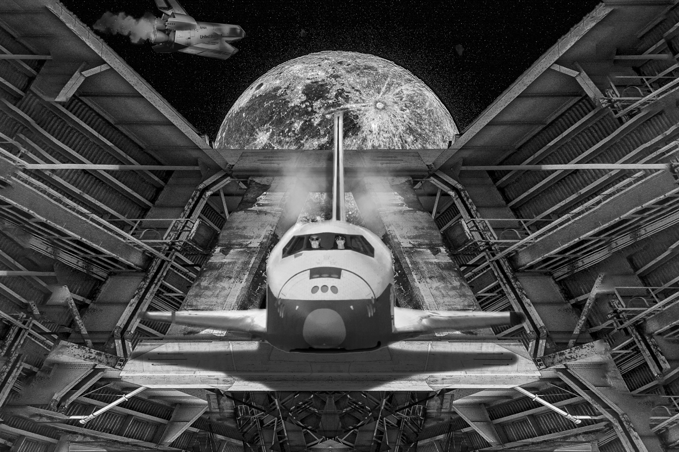
Comment |
Well done. You did a great blend of the images. I don't think it looks like the outside of a spaceship, so maybe if you took an head on image of the space shuttle and then put your image inside of that.
Cheers. |
Aug 8th |
| 54 |
Aug 21 |
Comment |
Hi Alan,
It's cute and has a story. Nice. You do well with your elements having depth. Kudos. Personally, I don't find the mixture of black and white with the color elements appealing, but well done just the same. |
Aug 1st |
| 54 |
Aug 21 |
Comment |
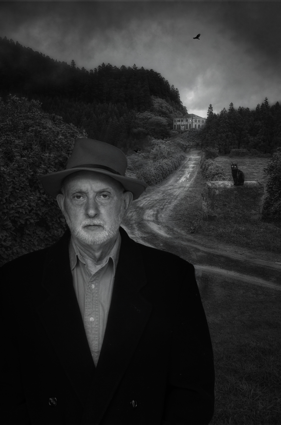
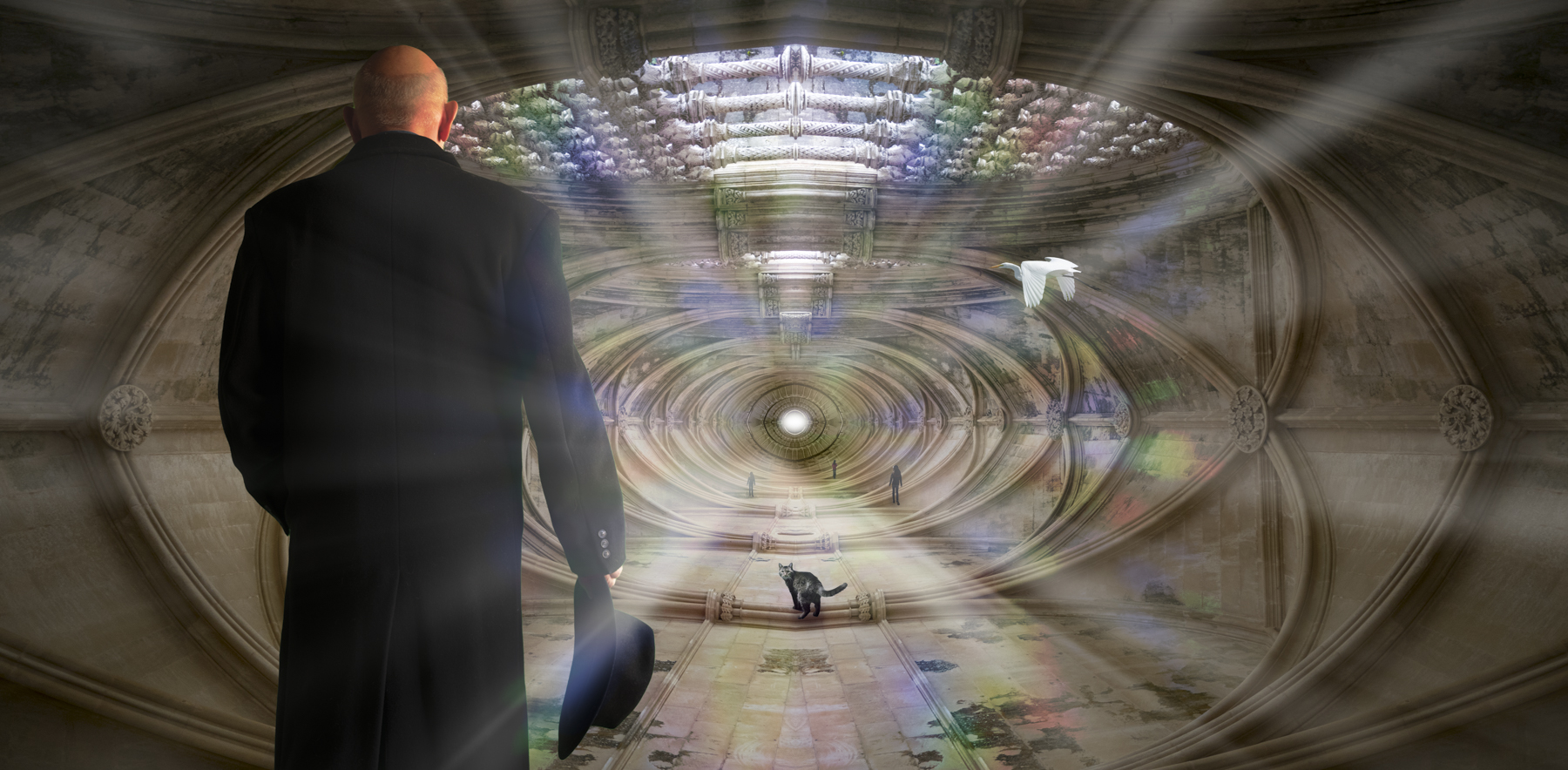
Hi Aavo,
Interesting image. Is there a meaning to this? If so, can you post it as it would help me interpret it. The elements look pasted on and lack some depth. Is that on purpose? Also there are many artifacts of the clone stamp on the desert, particularly above the skeleton, but also on the left as well. |
Aug 1st |
4 comments - 0 replies for Group 54
|
9 comments - 4 replies Total
|