|
| Group |
Round |
C/R |
Comment |
Date |
Image |
| 40 |
Nov 17 |
Comment |
I love stained glass and this picture has a lot of it. It's beautiful. I'm typically not a big fan of fisheye lenses. The distortion is difficult to make look good. The ceiling and windows on each side of the big arch don't really add much to the picture. I think I would prefer to see this taken with a standard lens and include just the big arch in the middle with all the stained glass. The contrast is very nice but I think I would possibly add a little vibrance and maybe raise the exposure just a small amount. |
Nov 12th |
| 40 |
Nov 17 |
Comment |
This is a very cool picture. I love the creative thought that went into this. You did a great job attaching the wings so they look real. It fits really well together as it looks like wings created the swirls in the background. It almost looks like the dog is flying over rainbow colored water.
I agree with Andrew that the white dots are a bit distracting but I don't know how you could effectively remove them all. Otherwise I don't really know of anything you could do to improve this. Very nice!
|
Nov 12th |
| 40 |
Nov 17 |
Comment |
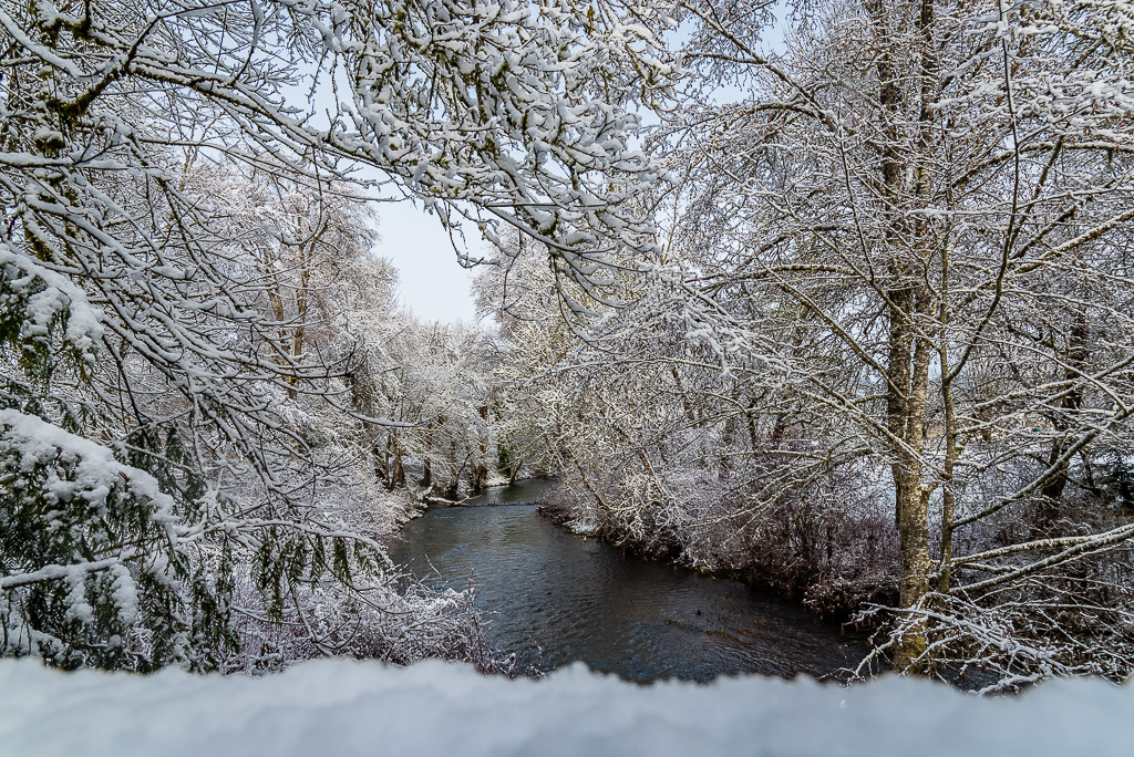
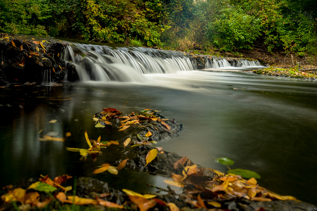
I really like the winding path vanishing through the woods. It gives you a feeling that winter is approaching. I don't feel the sky adds much to this picture. I think I would crop it down from the top to remove the sky. I personally like the darker, more drab look of the picture. It makes me feel like winter is near and I just want to light a fire and sip some hot chocolate. |
Nov 12th |
| 40 |
Nov 17 |
Comment |
I love the nighttime city pictures you create. They are beautiful. The first thing I noticed when I looked at this picture was that my eyes were immediately drawn to the bright white car lights on the left. As Andrew stated, the subject, which is the Taichung Theater, kind of gets lost in the picture. I think I would crop it in from the bottom left enough to remove those bright car lights. That should leave the light trails in the picture but would also make the theater more of the subject of the picture. |
Nov 12th |
| 40 |
Nov 17 |
Comment |
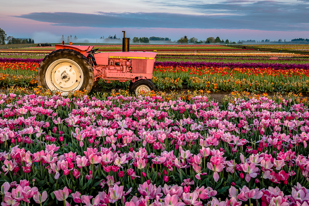
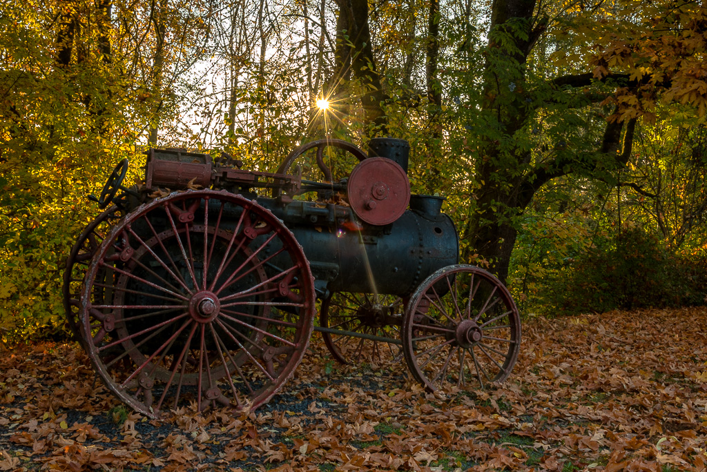
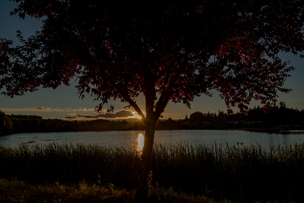
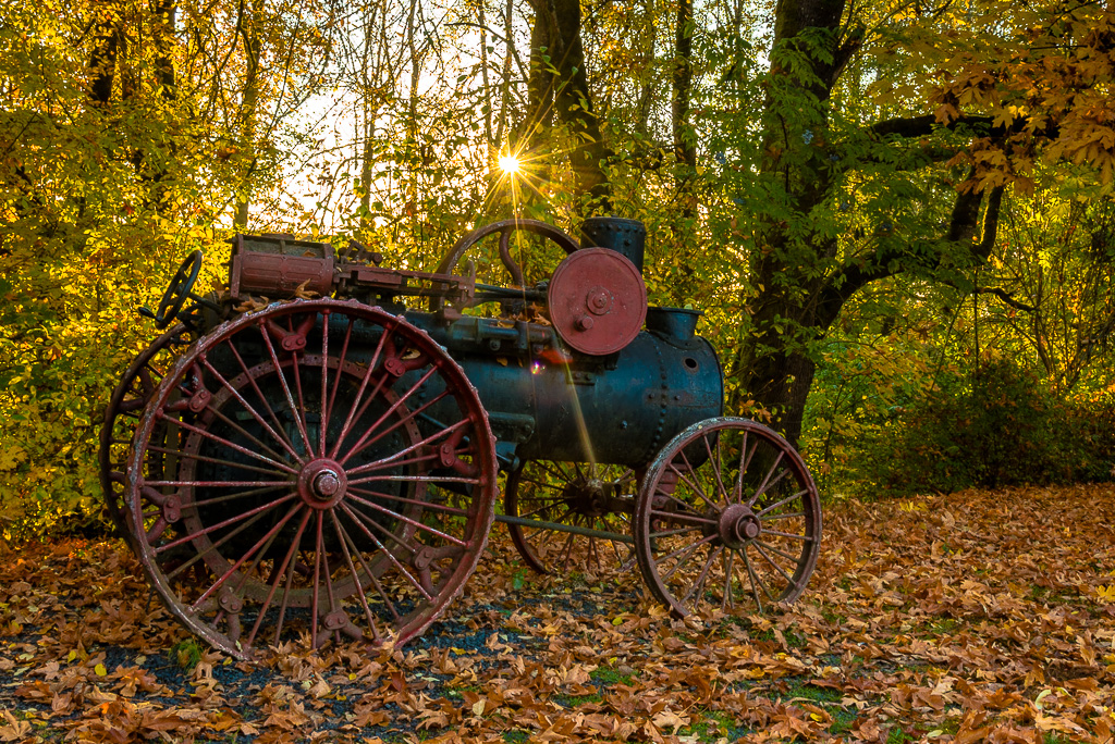
I'm typically not a big fan of filters but this one seems to work very well. I do also really like the original picture. I have only a couple post-processing recommendations:
1) I think I would increase the contrast a bit to give a little more definition to the flowers.
2) I would crop the top down to remove the sky and part of the trees, at least enough to remove the sun flare in the upper left corner.
Otherwise it's a very nice looking picture for a wall hanging. |
Nov 12th |
| 40 |
Nov 17 |
Reply |
Thank you for the recommendations Andrew. Unfortunately I'll have to wait for next year to try a better composition. Also I was a bit constrained with the composition as I wanted to get the spot where the sunburst was. If I moved either direction the sunburst disappeared. But I did make the Lightroom adjustments you recommended. Here is the result. |
Nov 12th |
 |
5 comments - 1 reply for Group 40
|
5 comments - 1 reply Total
|