|
| Group |
Round |
C/R |
Comment |
Date |
Image |
| 40 |
Jun 17 |
Reply |
Thank you very much. Those are very good points. Somehow I missed the out of focus leaf. |
Jun 18th |
| 40 |
Jun 17 |
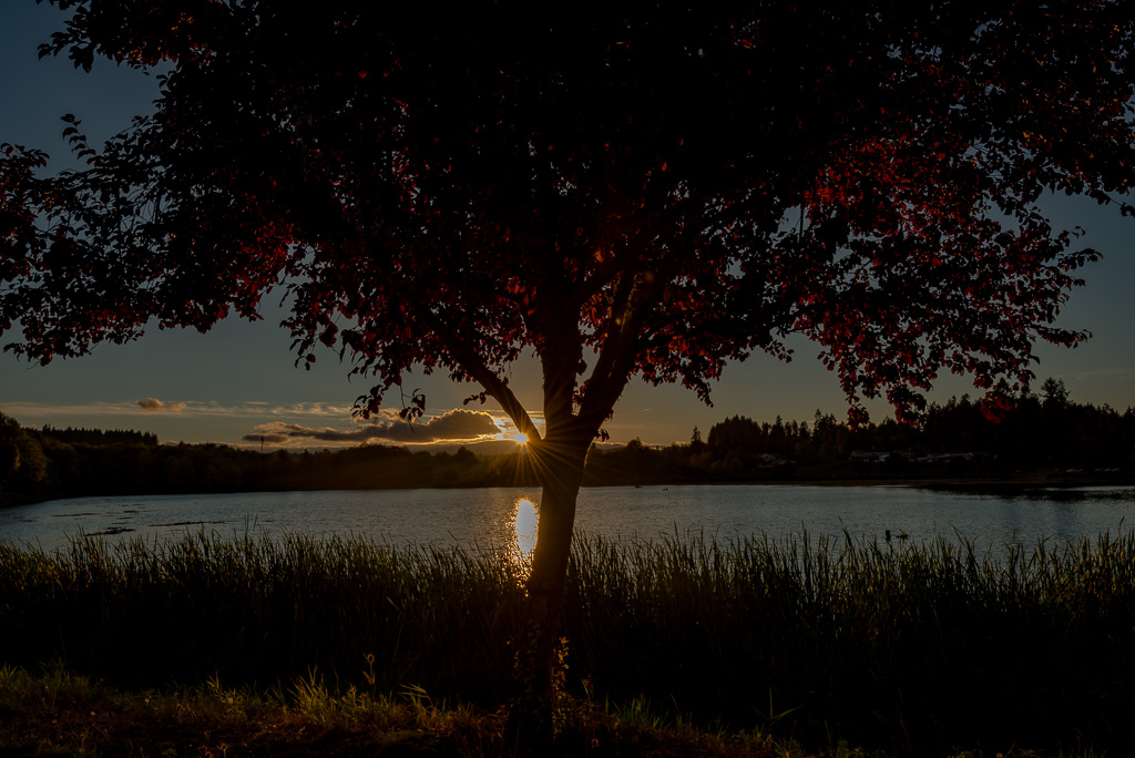
Comment |
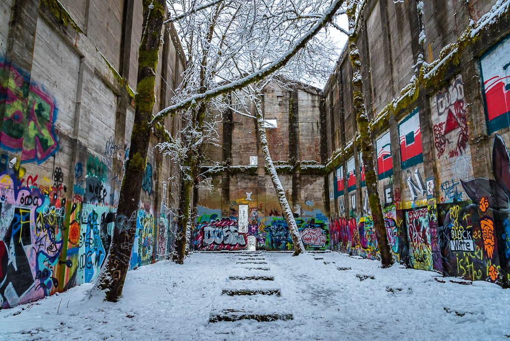
This is a very nice looking picture. I love the light stars. You have done a very nice job of adding the red car light trails to the mostly green image. This gives a nice color contrast as red and green are opposites on the color wheel.
I agree with Susan that the upper left corner looks a bit soft and could use some darkening by either burning it or giving it a little vignette.
It is a very nice picture that makes you want to be there. |
Jun 15th |
| 40 |
Jun 17 |
Comment |
These were the most fun to play with when I was a kid. We would blow on them and enjoy watching the little floaties. I still find them fascinating to see in photographs. I really like the way you have darkened the background and made it a black and white picture. It gives it a unique appearance. I like that.
I really like the idea that you noticed this small part of the world while out around the Belgium horses. Most people would be overwhelmed by the horses and would never think to look down.
This would look really nice on someone's wall.
|
Jun 15th |
| 40 |
Jun 17 |
Comment |
I love this. I'm a big fan of frogs. I really like the way you have captured that glossy, slimy look in her appearance. The eye is nice and sharp and shows a catchlight. I honestly don't know of any way you could improve this picture. It looks great as is. |
Jun 15th |
| 40 |
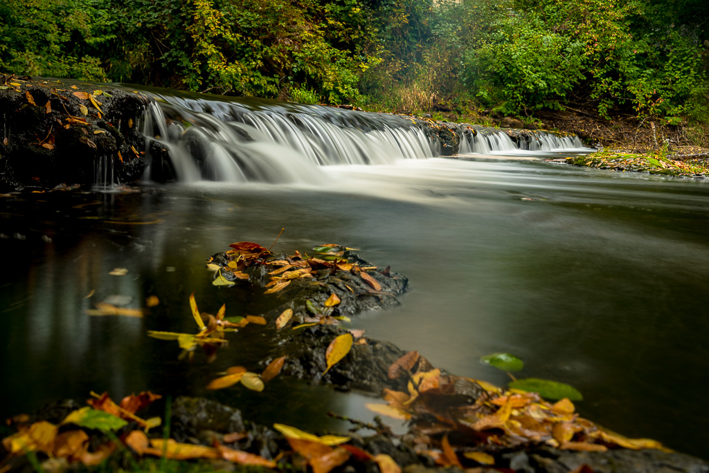
Jun 17 |
Comment |
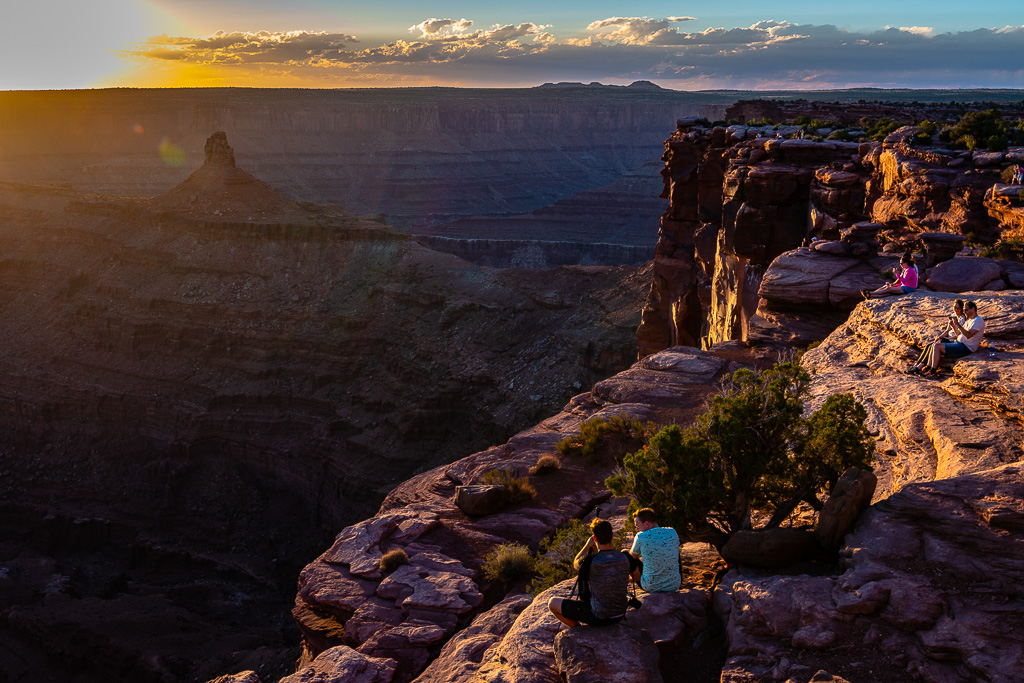
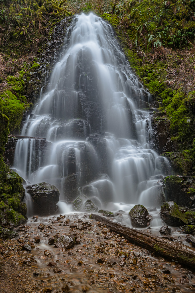
I am a landscape fanatic so I love this picture. The rocks are beautiful and really contrast nicely with the sky. This may be more of a personal preference than anything but I think I would darken the sky a bit so it looks a little closer to the original to give it a little more drama. Otherwise the picture looks great. |
Jun 15th |
| 40 |
Jun 17 |
Comment |
This picture looks very nice. You cropped it down nicely to make a good composition. I think I would like to see some of the warm tones back from the original image. It is cropped a bit tight on the left. The point is touching the left edge of the picture. I would give that a little more space to make it equal to the space on the right side. Finally I think I would give it a little vignette to draw the eyes toward the center. |
Jun 15th |
| 40 |
Jun 17 |
Comment |
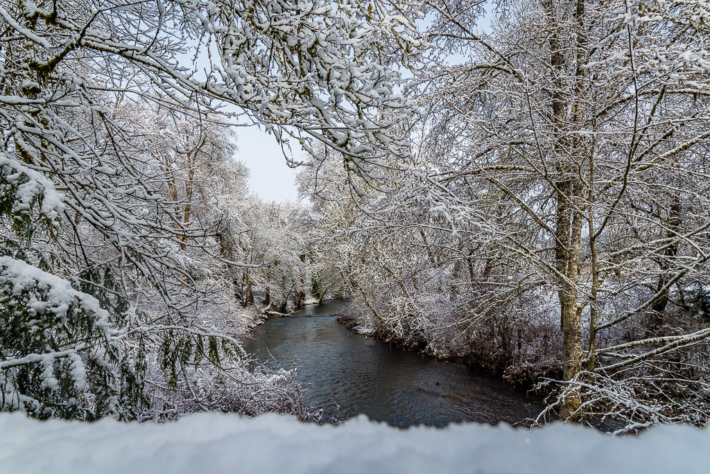
I love this image. It makes you want to look at it and to read the increasingly smaller letters. You have done a nice job of improving the lighting and composition. It looks to me like it has a fair amount of noise. I'm not sure if that was intended as a creative direction or not but it looks great even with the noise. |
Jun 15th |
| 40 |
Jun 17 |
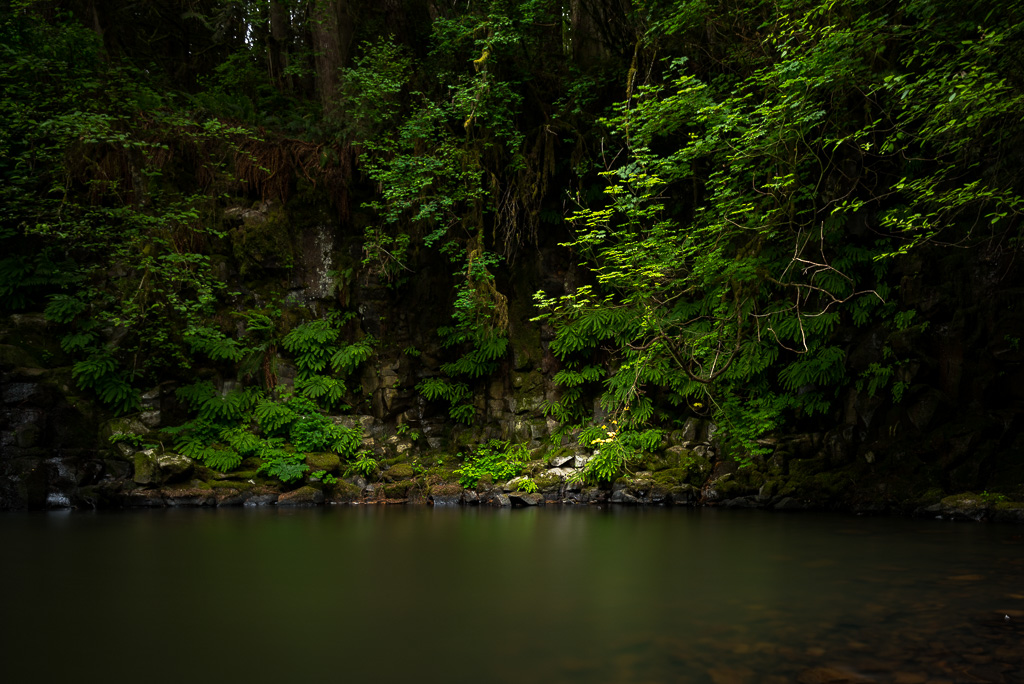
Reply |
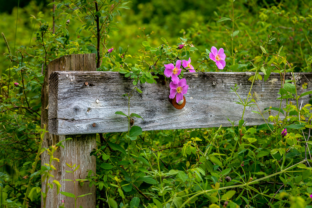
Thank you very much. I am really enjoying the group. I actually really like your explanation, "Invitation to a Secret Garden", as a potential title to the picture. Do you mind if I use that as the picture title? |
Jun 15th |
| 40 |
Jun 17 |
Reply |
Thank you very much. You are very good at critiquing. I appreciate the kind words as well as the suggested changes. You are right that the white vine needs to go. I told my wife of your suggestion of the companion images and she loved the idea so I'll likely be doing that this weekend. Thank you very much for the suggestions. |
Jun 15th |
6 comments - 3 replies for Group 40
|
6 comments - 3 replies Total
|