|
| Group |
Round |
C/R |
Comment |
Date |
Image |
| 11 |
Nov 24 |
Comment |
I like the image, interest and composition. A minor suggestion is to straighten the two trees in the background as they seem to me to be tilting inward. |
Nov 12th |
| 11 |
Nov 24 |
Comment |
A very interesting image with great composition. I agree with Peter in that seeing more of the face would be an improvement. I also suggest eliminating the bright white area in the top left of the image. |
Nov 12th |
 |
| 11 |
Nov 24 |
Comment |
Peter your image is wonderful. I can't hardly believe that you were able to straighten all those curves in the original. My only suggestion is to darken the bright vertical areas to emphasize the walls in the background. In my revision I also cropped some off the left and right sides. |
Nov 12th |
 |
| 11 |
Nov 24 |
Reply |
Mayb e something like the following |
Nov 12th |
 |
| 11 |
Nov 24 |
Comment |
The terrace veins are very interesting but, to me, I don't quite see how they relate very well to the background. In my revision I emphasized the veins but now am wondering if the image should be nothing but the veins. |
Nov 12th |
 |
| 11 |
Nov 24 |
Comment |
Peter Shore added the following: She was looking at her friend a few feet away making a sale. She was also aware of my presence. |
Nov 4th |
5 comments - 1 reply for Group 11
|
| 78 |
Nov 24 |
Comment |
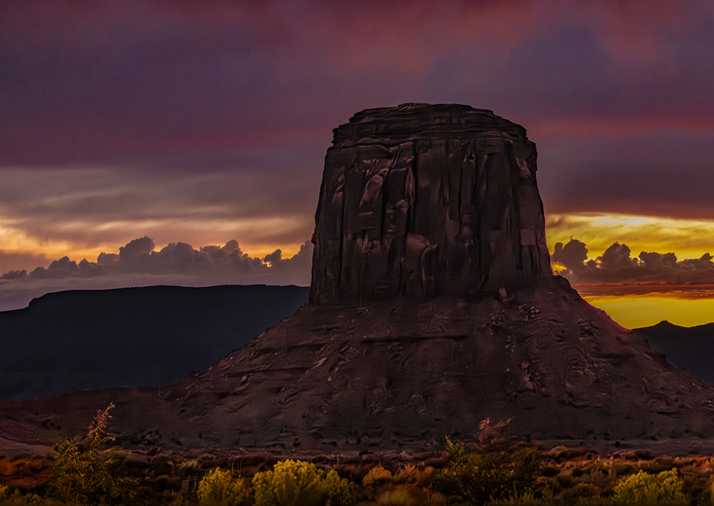
I like your image and especially the way you highlighted the vegetation in front of the monument. A minor suggestion is to crop some off the right side, so the monument is not so centered in the composition. |
Nov 12th |
 |
| 78 |
Nov 24 |
Comment |
I like your image and the composition. A minor suggestion is to slightly increase the dark shadows in the bottom right corner and to slightly increase the saturation. |
Nov 12th |
 |
| 78 |
Nov 24 |
Comment |
An outstanding conversion from the original. The final image is wonderful. The composition is great. I have no suggestions. |
Nov 12th |
| 78 |
Nov 24 |
Comment |
The wires, expressway, houses and ocean don't seem, to me, be a consistent story. I especially like Sunhil's image as, to me, it suggests a nice quiet village. However, in my revision I cropped some off the left side to further emphasize that feeling. |
Nov 12th |
 |
| 78 |
Nov 24 |
Comment |
I like your image. My only suggestion is to increase the contrast of the heron which I did in my revision. I also increased its contrast and cropped some off the right side. |
Nov 12th |
 |
| 78 |
Nov 24 |
Comment |
I like your revised image as it is. The blue light on the railings in the upper right corner doesn't bother me because I feel it is probably from some outside light source (such as a window) and not from the lamp that was removed. There is also a similar blue cast along the railing at the bottom of the image. |
Nov 12th |
6 comments - 0 replies for Group 78
|
11 comments - 1 reply Total
|