|
| Group |
Round |
C/R |
Comment |
Date |
Image |
| 11 |
Oct 24 |
Reply |
Dee, yes CS6 was great. I am so old that I started using Photoshop even before CS1 and have no idea as to how I learned whatever it is that I do know about Photoshop. I often feel like Moses wandering around in the wilderness as I am trying to figure how to improve my photos.
I doubt that I will ever use Generative Fill. Generative Fill is amazing but I feel my images should be my creation and not a creation by AI.
|
Oct 22nd |
| 11 |
Oct 24 |
Comment |
What a remarkable image. And how clever to think of using the hot tub pool reflection to capture the scene. And the addition of a moon is great. A wonderful mage. I have suggestions. |
Oct 22nd |
| 11 |
Oct 24 |
Comment |
Jim, I like your conversion from the color image but am bothered by the large stem being so centered in the composition and, to me, I feel it needs a little more space above it. In my revision I cropped some off the right side, added a little space to the top but I am bother by the vegetation at the bottom of the image. I have no suggestions on how to remove that vegetation. |
Oct 22nd |
 |
| 11 |
Oct 24 |
Reply |
Dee you are right about the clouds. When I reduced the image size to a JPEG, I should not have sharpened the clouds which gave them that strange edge. Following is my revision in which I also brightened the clouds a little. Thanks.
I did not use Generative Fill in removing the tomb on the left side. Instead, I just used Photoshop's selective tools.
|
Oct 22nd |
 |
| 11 |
Oct 24 |
Comment |
Christian, a very nice image. My suggestion is to increase both the brightness and contrast which I have done in my revision.
Christian has informed me that because of new interests and priorities in his life he is leaving our mono group. His October image will be his last. He has been a great contributor with many wonderful images. We will miss him.
|
Oct 12th |
 |
| 11 |
Oct 24 |
Comment |
Peter, your image is superb. The composition, the action, the interest, the sharpness are all great. A minor suggestion is to darken the ropes on the right side and the boxing floor at the bottom which I did in my revision. I also cropped a little off the right side. |
Oct 12th |
 |
| 11 |
Oct 24 |
Comment |
A wonderful image and a great mono conversion from the original. To me the main area of interest is the flowing river so in my image I cropped much off he top and left side to make the river more prominent. |
Oct 12th |
 |
| 11 |
Oct 24 |
Reply |
I might be able to but instead I think I will post another image with the full ornamentation so that group members can compare. Thanks, Jim |
Oct 1st |
5 comments - 3 replies for Group 11
|
| 78 |
Oct 24 |
Reply |
I agree that more space at the top would have been better. And, a brighter steam would have been better. But, I am not sure how I can do so. But, thanks for the suggestion. |
Oct 22nd |
| 78 |
Oct 24 |
Comment |
I like the image and the composition. But I feel the wide angle lens made the foliage curve in towards the subject. In my revision I reduced those sloping lines. I also darkened the background, increased the size of the subject, and cropped some off the right side to improve the composition by not having the subject so centered |
Oct 12th |
 |
| 78 |
Oct 24 |
Comment |
A very nice image. I agree with Ed's suggestion to slightly increase the brightness. In my revision I also increased the sharpness (perhaps too much) and eliminated the white areas in the background. It is amazing to me that you can get so much depth of field with the camera being hand held and also that you can stack 42 hand held images. |
Oct 12th |
 |
| 78 |
Oct 24 |
Comment |
I love your image. It is outstanding with great curving lines, color, human interest and composition. I have no suggestions. |
Oct 12th |
| 78 |
Oct 24 |
Comment |
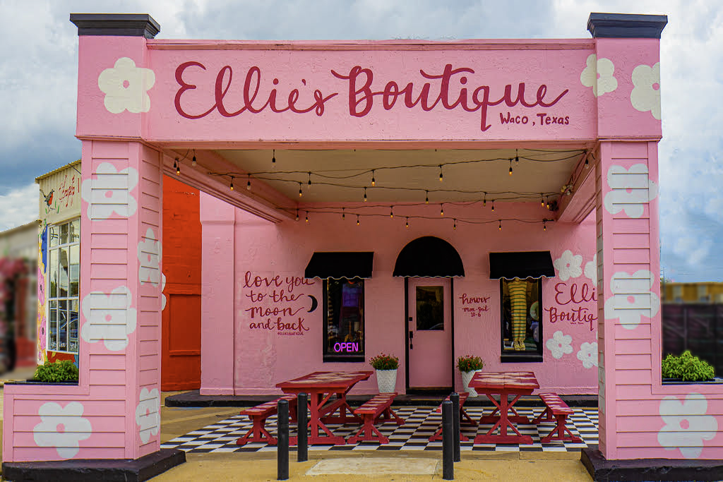
A wonderful image. Great color. Great composition. So much interest. A very minor suggestions is to slightly darken and blur the background objects on each side as I feel they are a minor distraction from the boutique. In my revision I also eliminated the street lamp and foliage on the upper left side. Great image. |
Oct 12th |
 |
| 78 |
Oct 24 |
Comment |
Your conversion from the original is great. And, the completed image is so much more interesting than the original. I agree with the comments of others about the lamp. My suggestion is to clone it out of the image as it is a distraction. |
Oct 12th |
5 comments - 1 reply for Group 78
|
10 comments - 4 replies Total
|