|
| Group |
Round |
C/R |
Comment |
Date |
Image |
| 11 |
Sep 24 |
Reply |
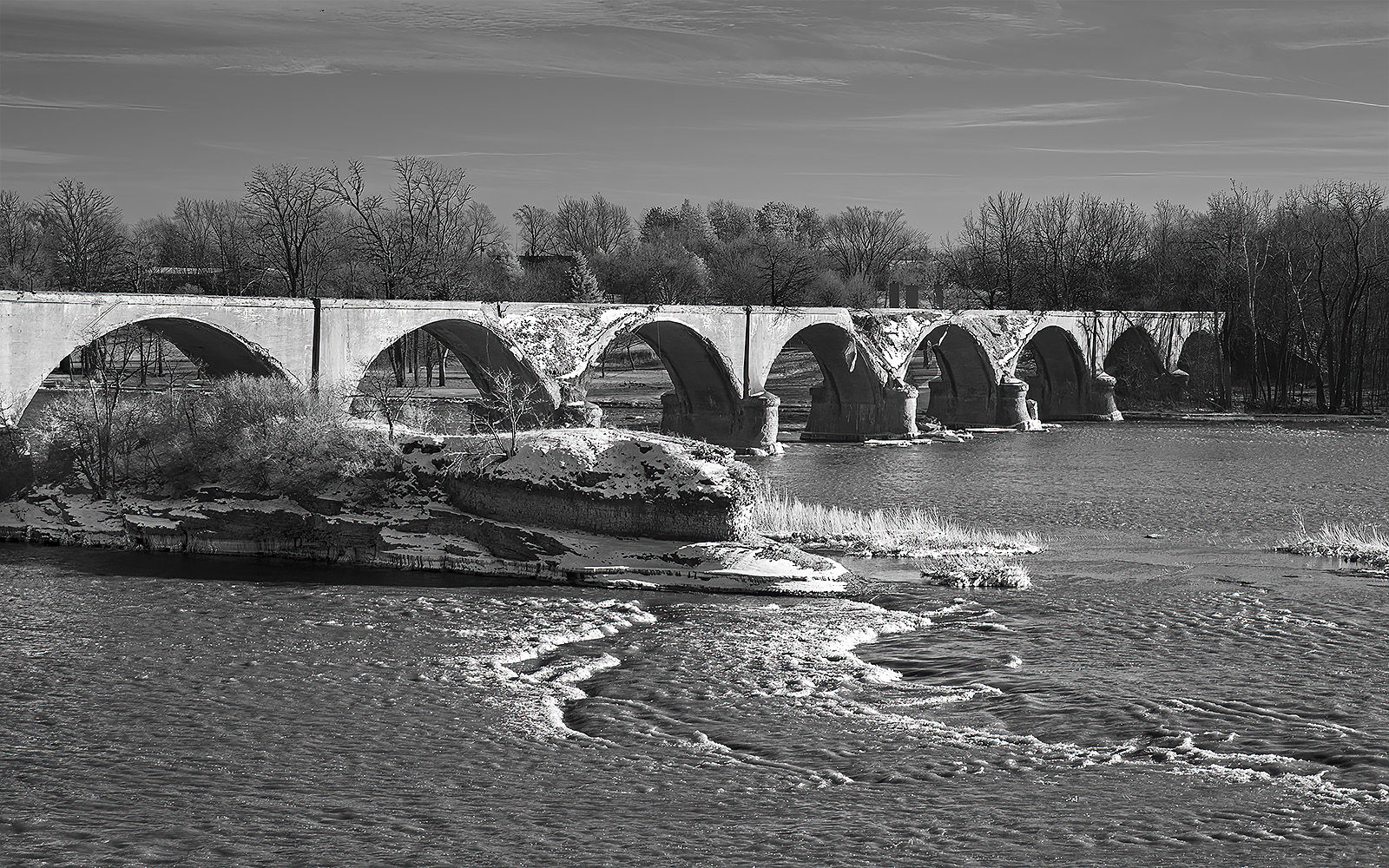
Dee and Jim, I like both of your suggestions. In my revision I darkened the background and I also slightly darkened the arches except those showing the most damage. I like my revision much more than my first image. Also, my revised image now appears to be more of a late afternoon photo. I looked at the time the photo was taken and see it was in the late afternoon in February. Many thanks. |
Sep 28th |
 |
| 11 |
Sep 24 |
Reply |
Dee and Jim, I like both of your suggestions. In my revision I darkened the background and I also slightly darkened the arches except those showing the most damage. I like my revision much more than my first image. Also, my revised image now appears to be more of a late afternoon photo. I looked at the time the photo was taken and see it was in the late afternoon in February. Many thanks. |
Sep 28th |
 |
| 11 |
Sep 24 |
Comment |
I like Darlene's revision, much better than mine. My revision is just dark and flat. Her revision has much more contrast and interest. |
Sep 24th |
| 11 |
Sep 24 |
Comment |
I like the composition, the interest and the wonderful curves. Great image. I have no suggestions. |
Sep 24th |
| 11 |
Sep 24 |
Comment |
I like your image just as it is. Your crop focuses attention on the intensity of the face and eyes. To me if anything else was added it would detract from that attention. I have no suggestions. |
Sep 24th |
| 11 |
Sep 24 |
Comment |
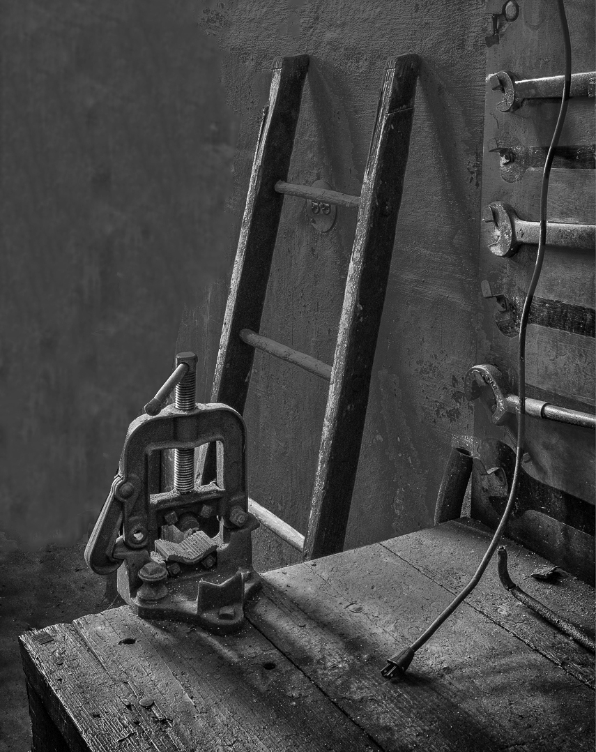
I like your image of the workbench but feel the items in the background detract from the subject i.e. the workbench. In my possible revision I eliminated these background items. |
Sep 3rd |
 |
| 11 |
Sep 24 |
Comment |
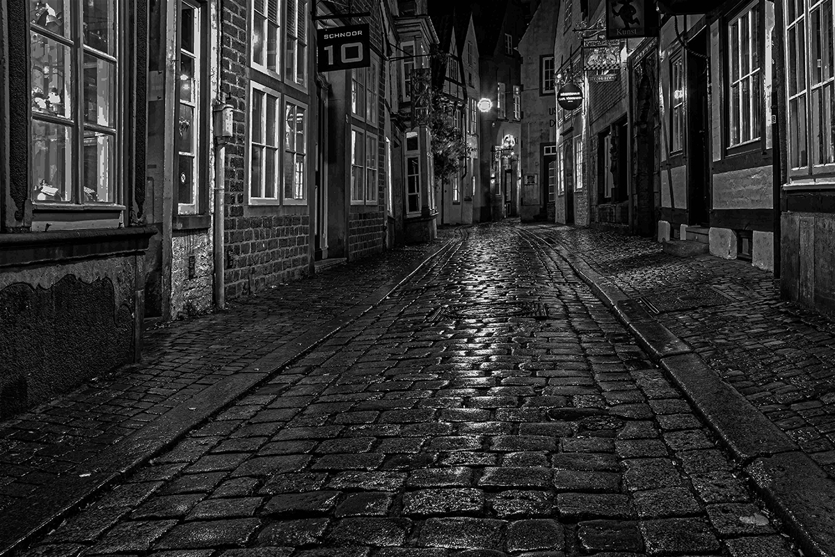
I really like your image. And, I like your conversion from the original where you straightened some of the diagonals. But, to me your finished mono seems too bright to be a night time image. In my revision I reduced the brightness.
I also feel that the color image, with some corrections, could also be outstanding. |
Sep 3rd |
 |
| 11 |
Sep 24 |
Comment |
I like your image with its very nice composition. And, the reflections on the globe add a lot of interest to the image. I have no suggestions. |
Sep 3rd |
6 comments - 2 replies for Group 11
|
| 78 |
Sep 24 |
Comment |
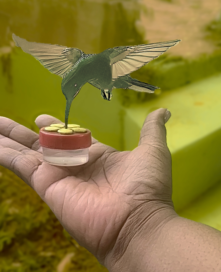
Jo Ann I like your revised image where you cropped to the more important elements of the image. In my revision I first selected just the hand and adjusted the color and brightness. Then I did the same in selecting just the bird but somehow in my process I lost sharpness. Then I selected just the background and cloned in some areas, reduced the brightness and then blurred. Then, as you did, I cropped to just the important elements of the image. |
Sep 27th |
 |
| 78 |
Sep 24 |
Reply |
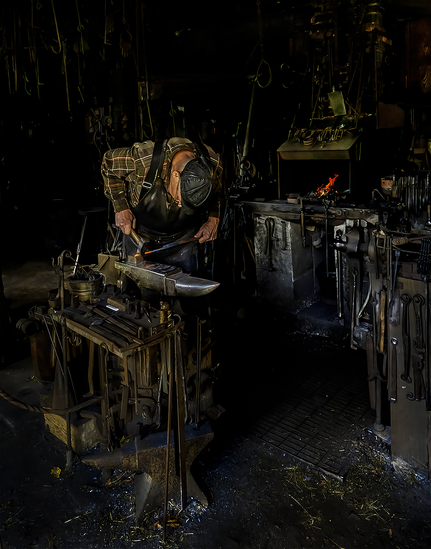
I felt the warmer anvil and other areas on the floor were a big improvement, much better than my original. |
Sep 27th |
| 78 |
Sep 24 |
Reply |
Much better. Great image. |
Sep 24th |
| 78 |
Sep 24 |
Comment |
Thanks for the suggestions. I've reduced some of the bright spots and changed the color of the anvil. |
Sep 24th |
 |
| 78 |
Sep 24 |
Comment |
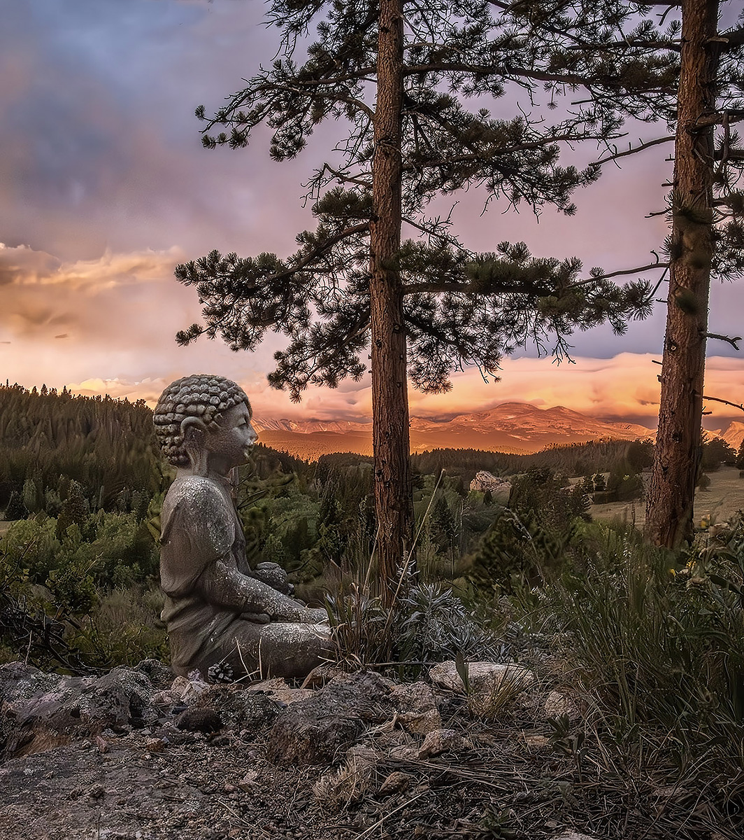
Ed a like your image a lot. Your conversion from the original is superb. The only thing that bothers me are the branches that are touching the statue's head. In my revision I eliminated those branches and I also cropped some off the bottom and the top and I also brightened the face of the statue. |
Sep 3rd |
 |
| 78 |
Sep 24 |
Comment |
Robert, your image is incredible. I can't hardly believe that your finished composition was the result of separate images taken with your phone. Great work. I have no suggestions.
Bob, I switched to a Sony 6000 mirrorless camera about 10 years ago. It has the smaller sensor. I tried the Sony mirrorless with the full frame sensor but found the lenses were to heavy. When I go out shooting, I take 2 Sony small sensor mirrorless comers, each strapped around my neck. One with a wide angle zoom and the other with a much longer zoom range. Canon probably as mirrorless cameras with a smaller sensor and lenses that weighs much less that your present Canon R5.
|
Sep 3rd |
| 78 |
Sep 24 |
Comment |
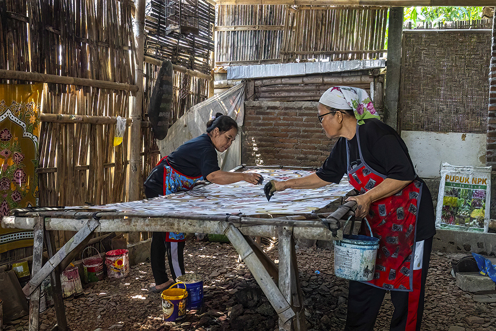
I love this image and everything about it. The composition is great as are the colors and human interest. However, I feel the image suffers from lack of sharpness and noise. In my revision I increased the sharpness and reduced the noise.
Pei, I think the lack of sharpness results from the way you submitted your JPEg image. I notice that your original file size is 3000 x 2000 and to reduce the JPEG size to below 1000K you reduced the image quality to 3 which is very low. I suggest you should have reduced the file size to 1000 x 667 and then use an image quality level of 10 or 11. Try to never use an image quality below the level of 10. Please let me know if my explanation is not clear and I will try to make my explanation clearer. |
Sep 3rd |
 |
| 78 |
Sep 24 |
Comment |
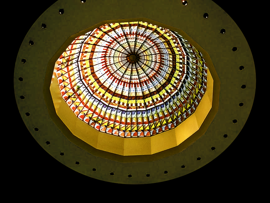
The dome is beautiful but I wonder if your image would be improved without the bright white areas around he dome. I've eliminated them in my revision. |
Sep 3rd |
 |
| 78 |
Sep 24 |
Comment |
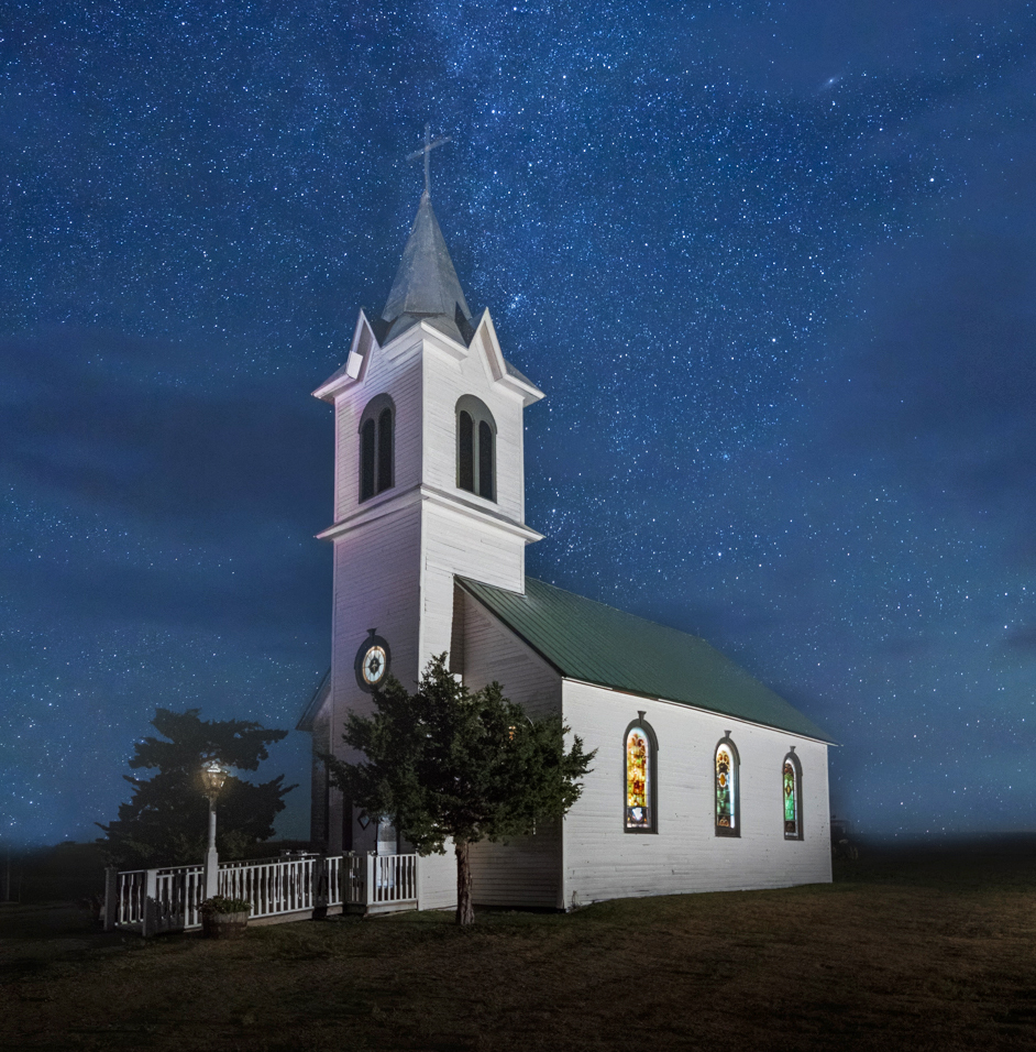
A wonderful image. I know the subject is the Milky Way but I suggest the church is really the subject. In my revision I cropped much tighter and lightened the dark grass area to the side of the church |
Sep 3rd |
 |
7 comments - 2 replies for Group 78
|
13 comments - 4 replies Total
|