|
| Group |
Round |
C/R |
Comment |
Date |
Image |
| 11 |
Aug 24 |
Comment |
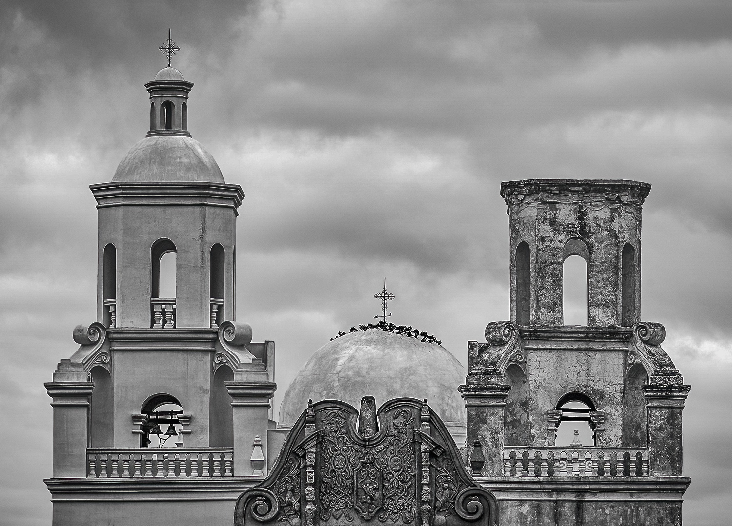
A wonderful image with a great composition and a lot of interest. I have no suggestions. |
Aug 13th |
| 11 |
Aug 24 |
Comment |
Kudos on your award and for your very interesting image and explanation. I have no suggestions. |
Aug 13th |
| 11 |
Aug 24 |
Comment |
I like your ethereal image and your composition. But, my preference is for a darker image with more contrast as in my revision. |
Aug 13th |
 |
| 11 |
Aug 24 |
Comment |
I love everything about this image - the composition, eliminating the fence, blurring the background, and brightening the horse with just the right amount of brightness in the background. I have no suggestions. |
Aug 13th |
| 11 |
Aug 24 |
Comment |
INFO ABOUT THE BP AWARD by Jim Bodkin
It is only offered 2-3 times a year entry (or when they hit 20 entries) for a lifetime award that allows the member to attach the letters after their name. The Bronze level (BPSA with ten images), is succeeded by the Silver level (SPSA with 15 images), which is then succeeded by the Gold level (GPSA with 20 images), so it is progressively more difficult to achieve, and the judges are stricter. When you get each higher level, you drop the lower level letter designation. You have to start with the Bronze and work your way up. A big part of it is selecting the proper images for your intent (theme) and arranging them in your overview image in a cohesive manner. It is fun, educational and sole trying. I think you would enjoy it. Most portfolios are in color, but I thought I would use my B&W skills (while not having to deal with the complexities of color matching). All the details are on the PSA website.
|
Aug 6th |
5 comments - 0 replies for Group 11
|
| 78 |
Aug 24 |
Comment |
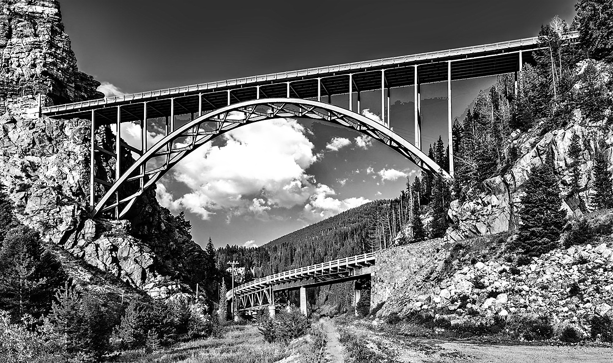
Very nice image with nice composition. My suggestion is to darken the bright pathway, darken the sky, lighten the dark shadow areas and crop a little tighter. |
Aug 13th |
 |
| 78 |
Aug 24 |
Comment |
A wonderful image with great interest and composition. My minor suggestion is to slightly reduce the brightness of the image. |
Aug 13th |
 |
| 78 |
Aug 24 |
Comment |
I like the composition as presented as it focuses your attention on the rider. My only minor suggestions are to brighten the face of the rider and to darken and blur the people on the top left and also to reduce the saturation of the bright red signs. |
Aug 13th |
| 78 |
Aug 24 |
Comment |
I like the composition and the colors and also feel that eliminating some of the people helps the image. |
Aug 13th |
| 78 |
Aug 24 |
Comment |
I also felt the image looked stretched but also agree that is the way the horse looks in the original. I do like Ed's image and also felt that the composition of Brenda's image was improved by eliminating the cropped head of the second horse. |
Aug 13th |
| 78 |
Aug 24 |
Comment |
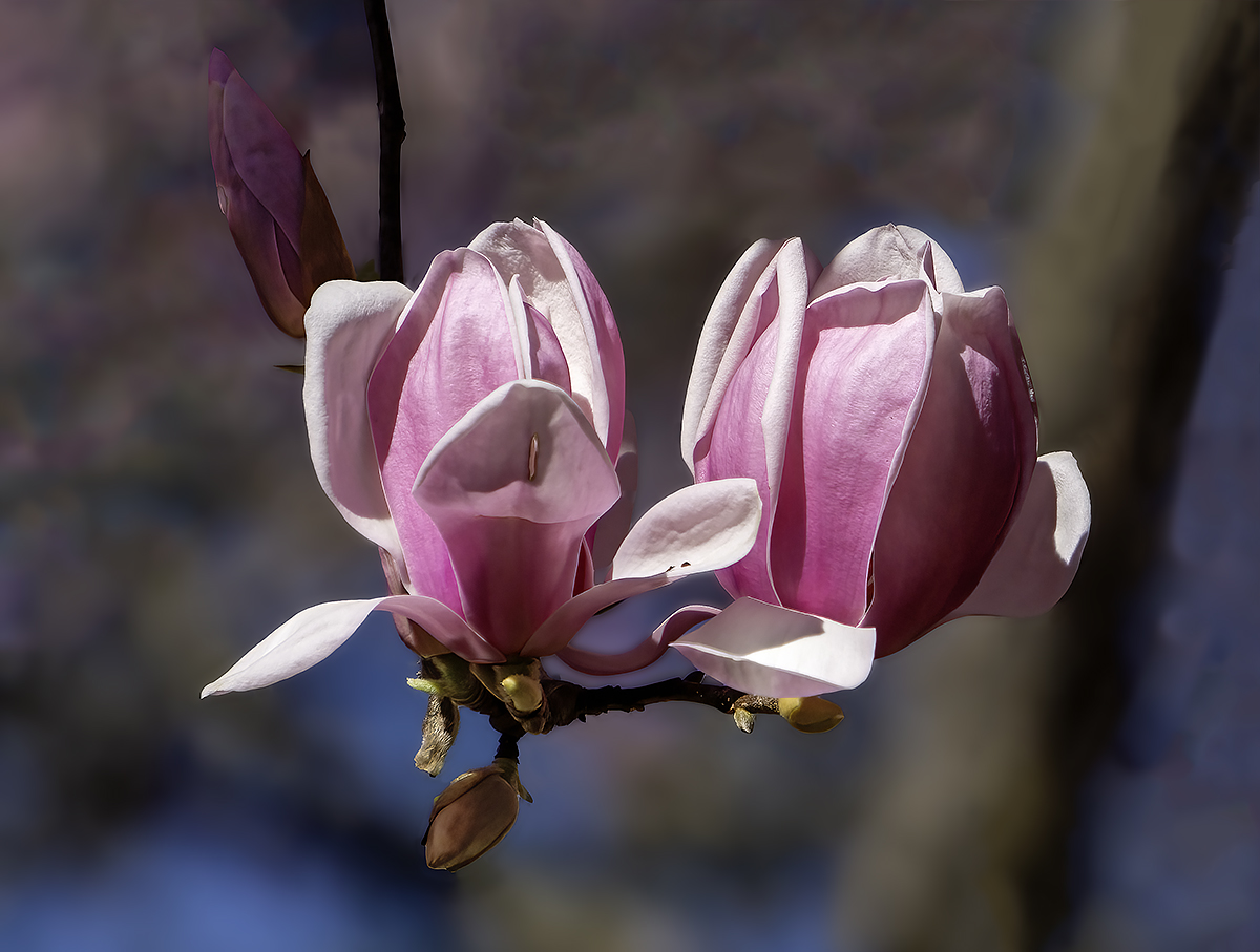
I agree that the blurred blossom is a distraction. But, I don't think the stem should be removed as it leaves the blossom hanging in mid air. My revision follows. |
Aug 13th |
 |
| 78 |
Aug 24 |
Comment |
Very nice image with great composition. My only minor suggestion is to crop off just a little of the bottom to reduce the blurry grass at the bottom. |
Aug 13th |
7 comments - 0 replies for Group 78
|
12 comments - 0 replies Total
|