|
| Group |
Round |
C/R |
Comment |
Date |
Image |
| 11 |
Jul 24 |
Comment |
I like your mono image, much more interesting than the color image. I especially like the sloping curved pipes. However, I find the ceiling distracting. In my revision I reduced the inward sloping angles at the top of the image. And, I eliminated the distractions in the background. |
Jul 21st |
 |
| 11 |
Jul 24 |
Comment |
I like the mono image. Nice conversion. Nice contrast. No suggestions. |
Jul 21st |
| 11 |
Jul 24 |
Comment |
A wonderful image, so much better than the original. I have no suggestions, except as Darlene mentioned, to darken the top left corner. |
Jul 21st |
| 11 |
Jul 24 |
Comment |
Peter, welcome to our group.
I like your image and especially the actor's expression but the door handle (by his elbow), the ceiling and the doorway are distractions. In my revision I eliminated those distractions, straightened the image, cropped and increased the brightness and sharpness.
|
Jul 21st |
 |
| 11 |
Jul 24 |
Comment |
I like your composition. Your cropped image is much more interesting than the original. And, I agree that the area around the eyes should be lightened as has already been suggested. |
Jul 21st |
| 11 |
Jul 24 |
Comment |
As I mentioned I love your composition. And, I like the mono version as well as the color version. But, in the mono version I feel the shadows should be lightened and the boat darkened. |
Jul 21st |
 |
| 11 |
Jul 24 |
Comment |
I love your image. The composition is great. I like the original color version but, to me, I feel it is too dark and too orange. In my revision I changed the color a bit, lightened the shadows and burned in the hot spots on the boat but I don't think my color is quite right; oh well, just a thought.. |
Jul 21st |
 |
7 comments - 0 replies for Group 11
|
| 78 |
Jul 24 |
Comment |
I think the image should be cropped much tighter to feature the eagle. In my revision I did so and also sharpened and brightened the eagle. And, I added a little color to the bright sky. |
Jul 21st |
 |
| 78 |
Jul 24 |
Comment |
My revised image did not post along with my earlier comments.
So I am trying again to do post my suggested revision. My attempt was to simplify the image. |
Jul 21st |
 |
| 78 |
Jul 24 |
Comment |
I like your revision - much better than mine. |
Jul 21st |
| 78 |
Jul 24 |
Reply |
|
Jul 13th |
 |
| 78 |
Jul 24 |
Comment |
Ed, you did an amazing job in creating such a detailed image of a Queen Anne's lace looking up. But, to me there are so many lines in the image that they detract from the composition. In my revision I made a rough attempt at minimizing the number of lines. You might consider shooting the flower again but pruning it to improve the composition. Posted: 07/13/2024 08:41:56 |
Jul 13th |
| 78 |
Jul 24 |
Comment |
What an amazing image with such incredible detail. Great image. No suggestions. |
Jul 13th |
| 78 |
Jul 24 |
Comment |
When I look at one of my photo's I ask myself, if I was an artist how would I paint that image. Then I remove from my image those things that an artist would not have included in his painting. Then I think is there anything else in my revision that an artist would have changed. If so, I change them.
When I look at Pei-Fan's image I see a bird but an artist would not have included so much of the background in his image so I cropped much tighter. But I left much of the rock to the right of the bird and also the branch of the tree as it wonderfully frames the bird.
My attempt was to show the bird standing tall, strong, and perhaps defiant and looking outward toward the right of the image.
|
Jul 12th |
 |
| 78 |
Jul 24 |
Comment |
Sunil, kudos on an outstanding image. I love the composition. The large globe in the foreground and the bright images in the background add so much interest to the photo. I have no suggestions. |
Jul 11th |
| 78 |
Jul 24 |
Comment |
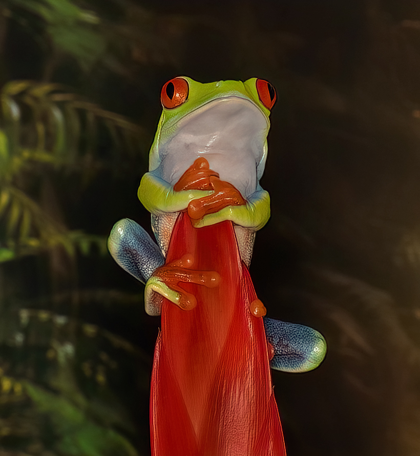
I like the image but to me it needs to be cropped tighter since the frog is the main subject it should be a larger part of the composition. Also, the top part of the frog should be brighter and the hot spots on the stem reduced. In my revision did those suggestions. I like the background as I think it compliments the frog image. |
Jul 11th |
 |
| 78 |
Jul 24 |
Reply |
Brenda, at first I did not like your crop but the more I look at it the more I like it. I think it does improve the composition. And, I also like a like your warmer color a lot. Thanks.
|
Jul 11th |
8 comments - 2 replies for Group 78
|
15 comments - 2 replies Total
|