|
| Group |
Round |
C/R |
Comment |
Date |
Image |
| 11 |
Jun 24 |
Reply |
Christian, I like your crop better than mine. I like the way the figure is much more prominent in your image. |
Jun 19th |
| 11 |
Jun 24 |
Comment |
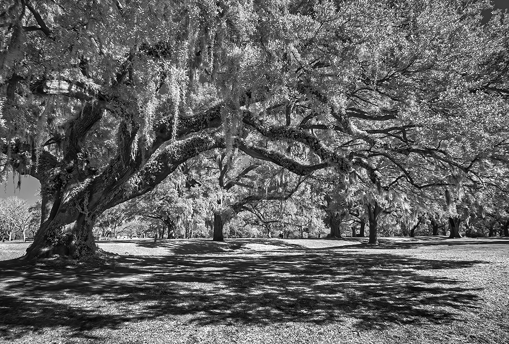
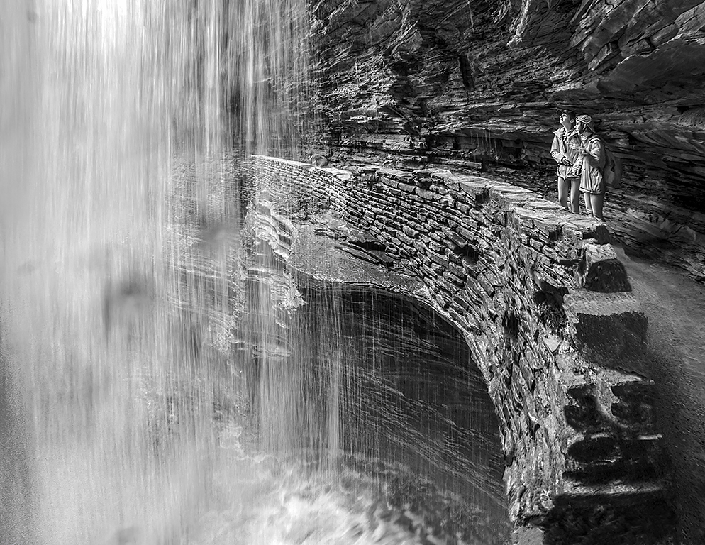
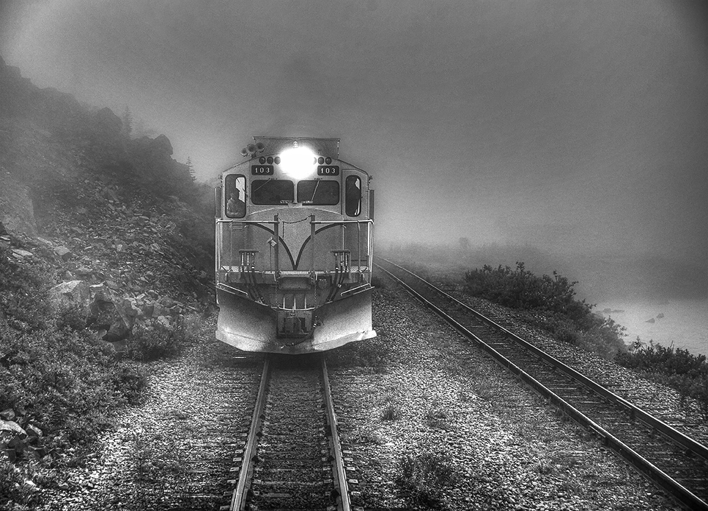
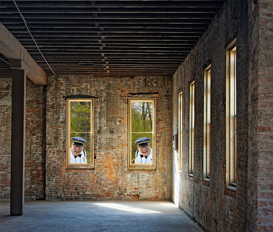
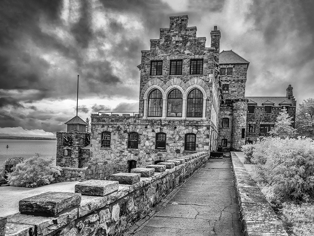
A very nice image with great composition, great range of tones and great interest. No suggestions. |
Jun 15th |
| 11 |
Jun 24 |
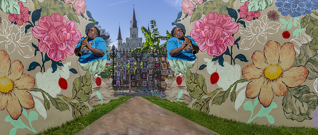
Comment |
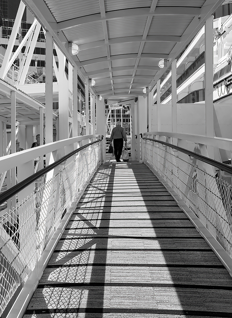
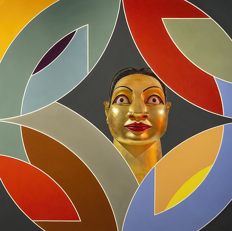
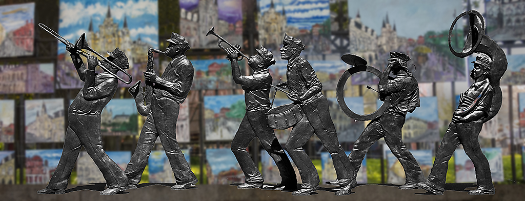
A great conversion from the original and a great crop resulting in an outstanding image. I have no suggestions. |
Jun 15th |
| 11 |
Jun 24 |
Comment |
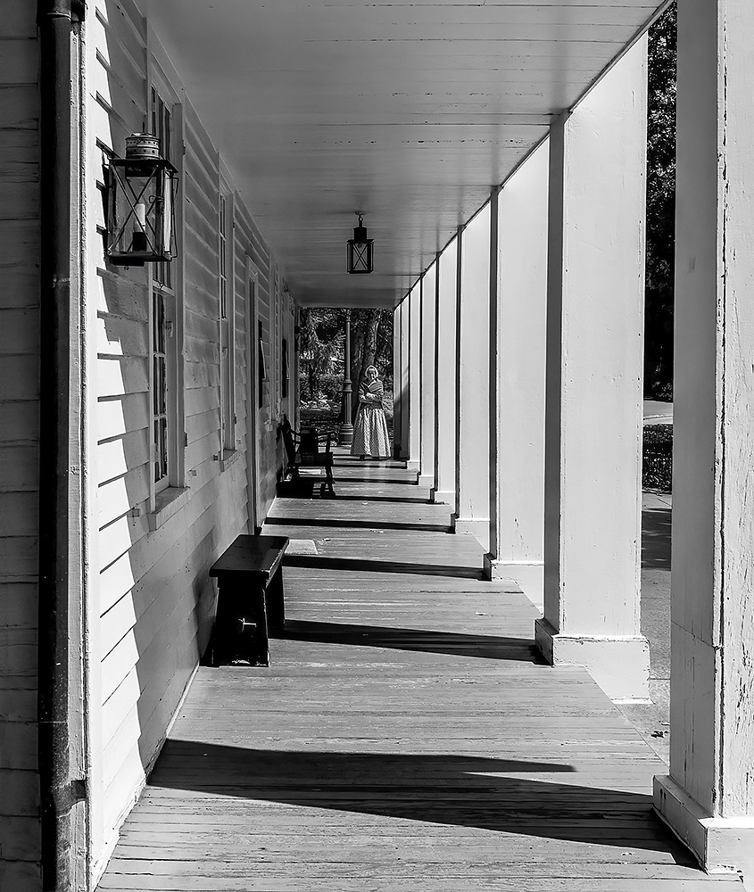
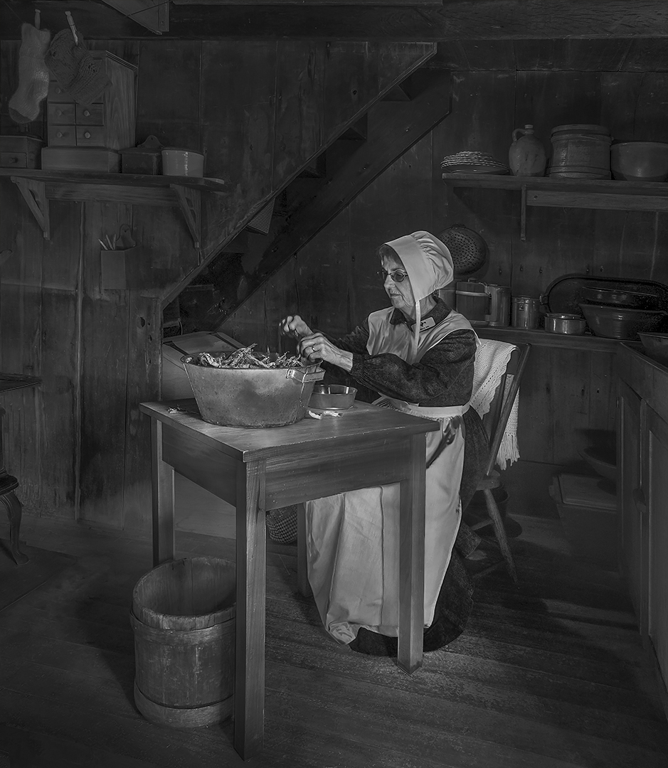
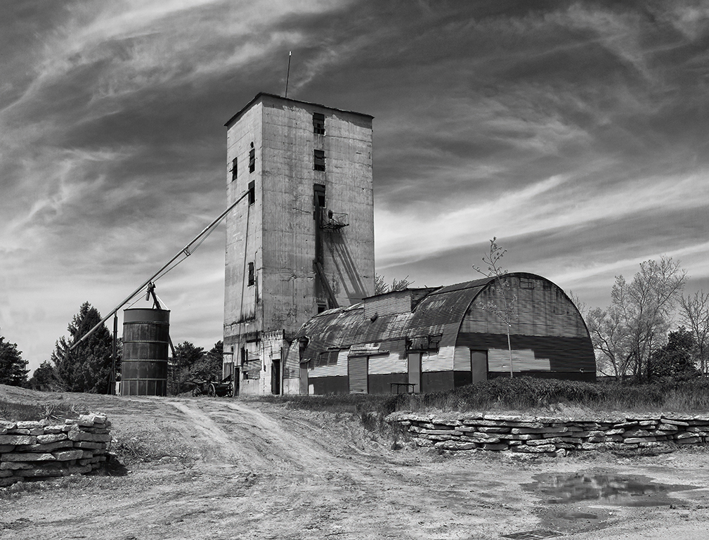
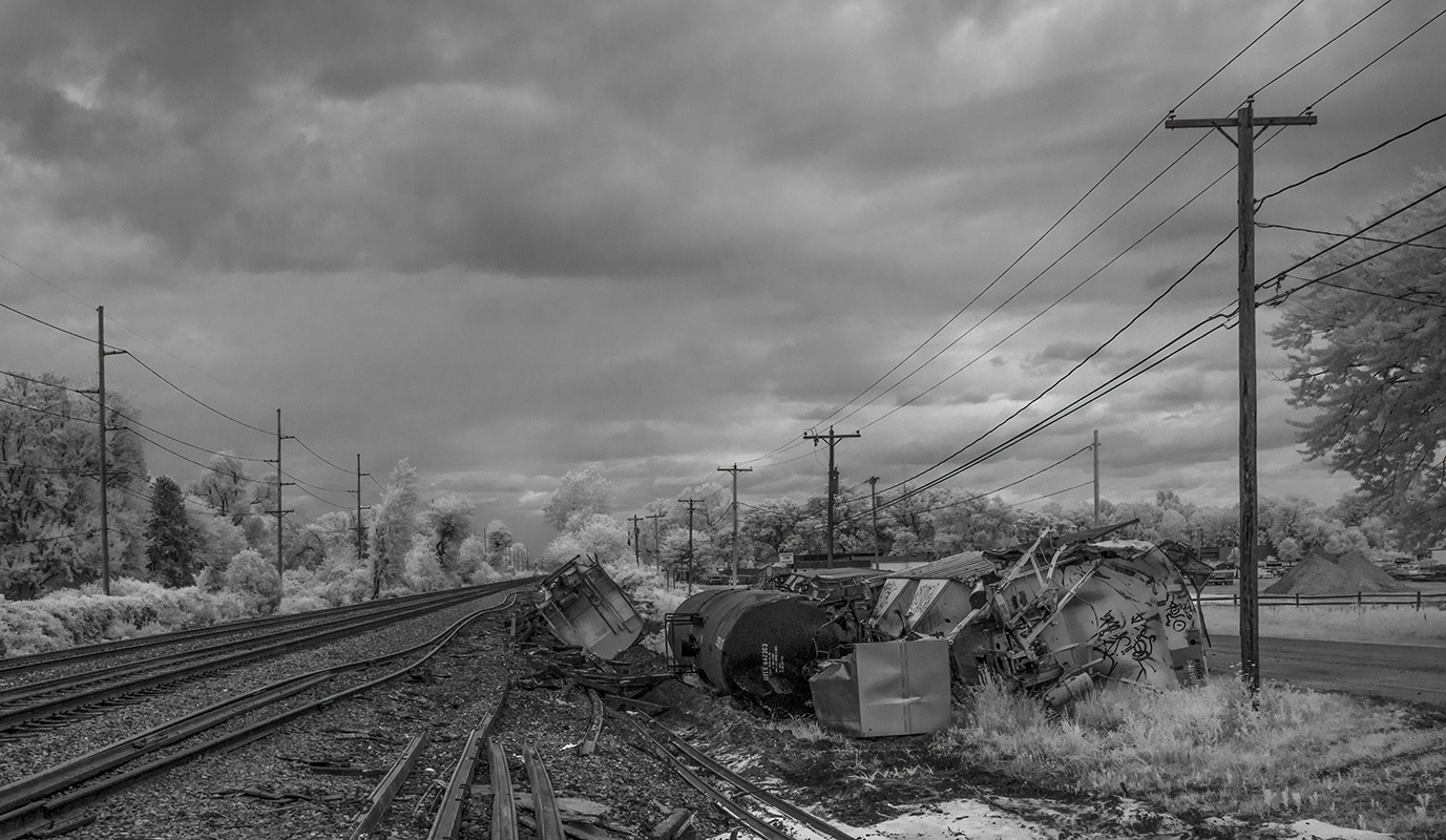
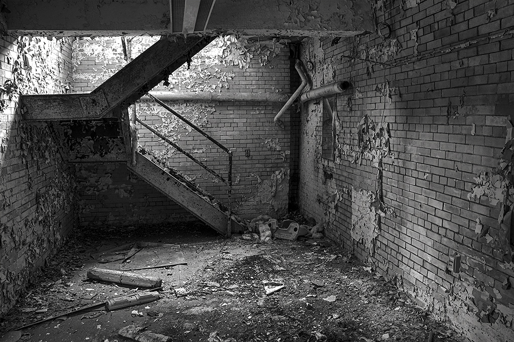
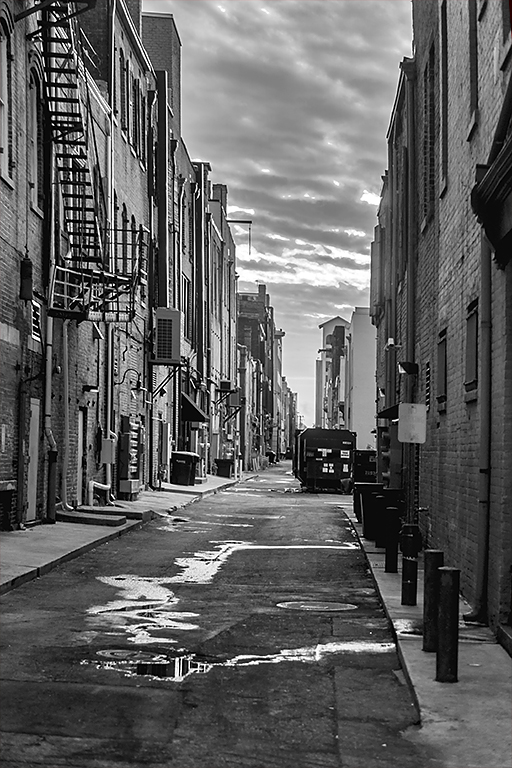
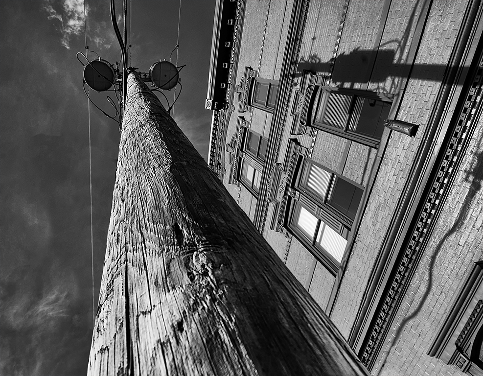
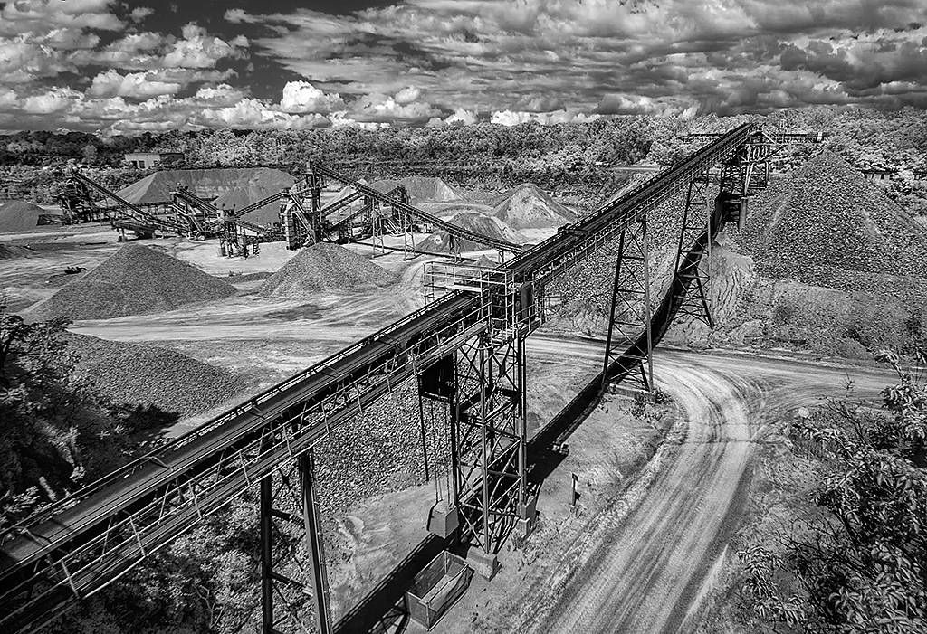
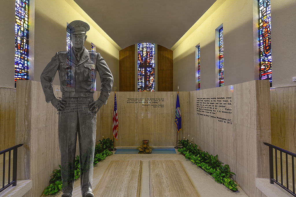
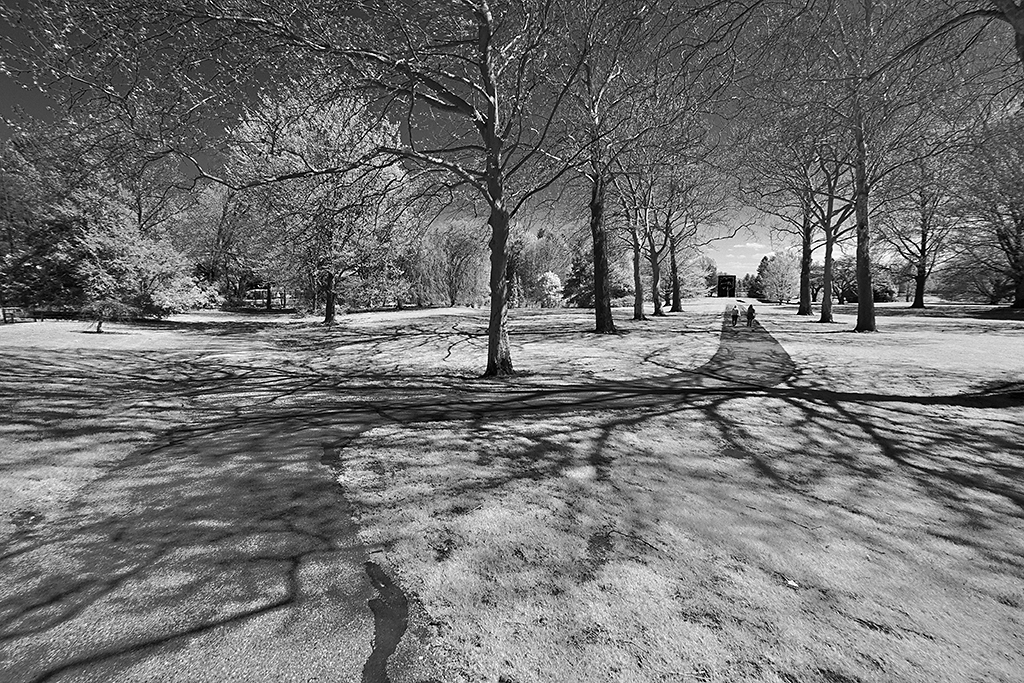
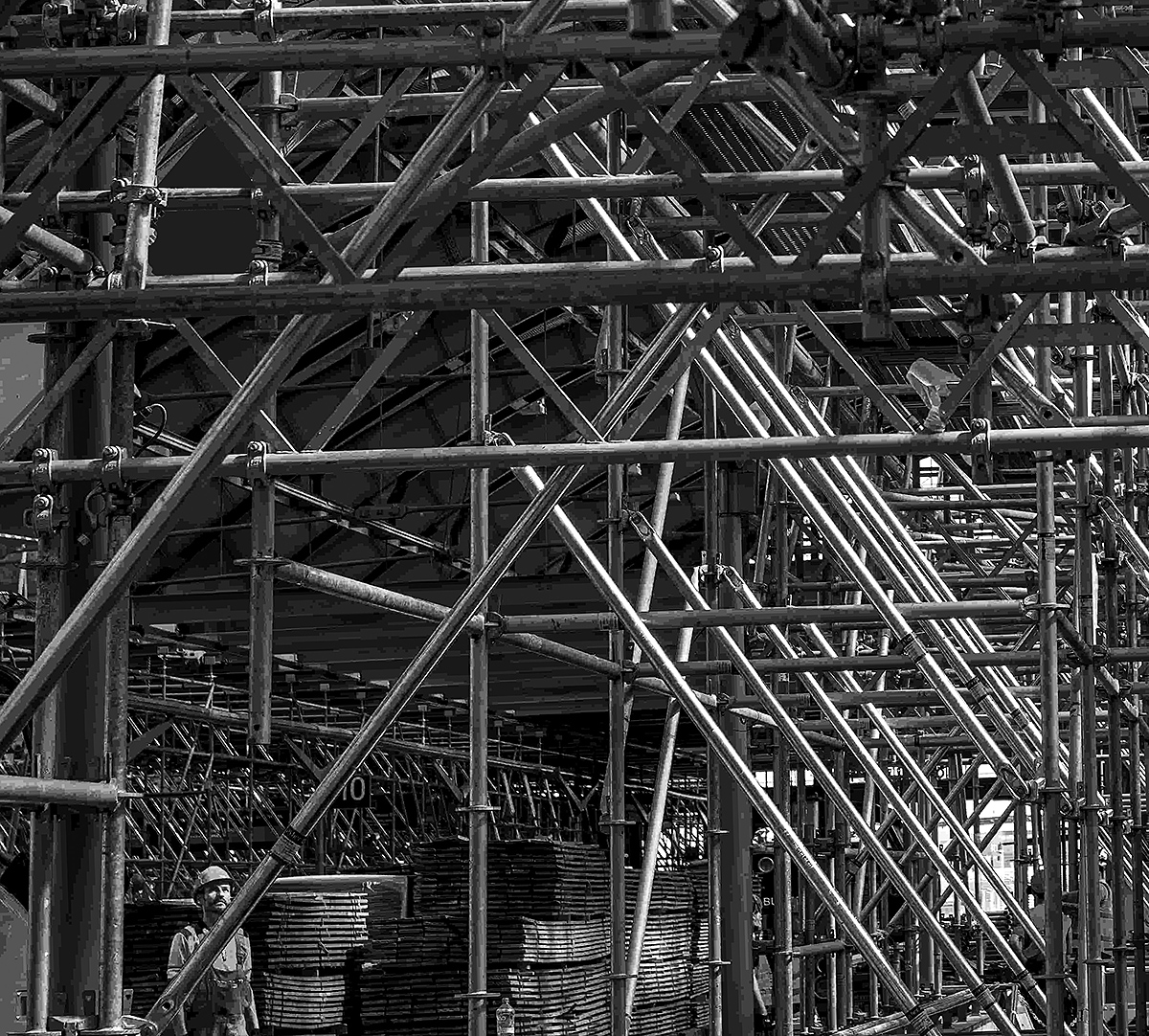
A very nice conversion to mono from the original color. To me I feel that there is no center of interest in the image. In my revision I cropped down to the bottom left corner to feature the worker looking upward. |
Jun 15th |
 |
| 11 |
Jun 24 |
Comment |
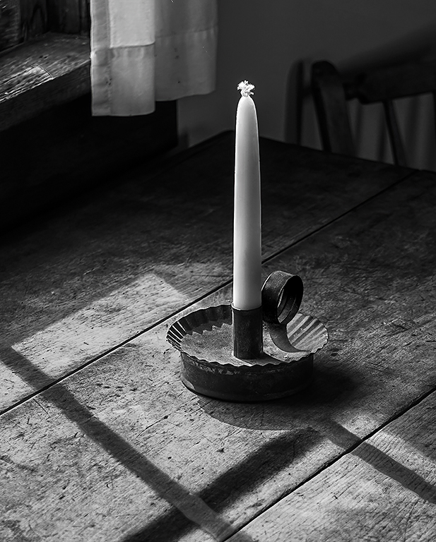
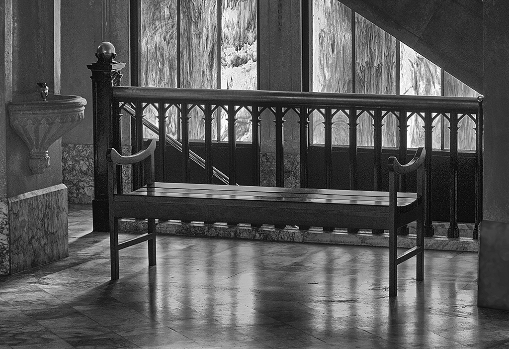
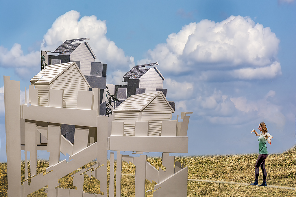
A wonderful creation and a wonderful image. I have no suggestions. |
Jun 15th |
4 comments - 1 reply for Group 11
|
| 18 |
Jun 24 |
Reply |
Gunter, I agree with your comments. I have been in this group for 4 years and it is just lately that I have been more than annoyed by constant criticism and suggestions that my images are not creative, that I should go to another group and that we should ask PSA to define creative. |
Jun 20th |
| 18 |
Jun 24 |
Comment |
My final comment.
I belong to another study group. One member had a photo of his camp site. He darkened that image so that it looked like a night photo with just dark shadows and combined it with his image of the Northern Lights. I think the combined image is outstanding but apparently not suitable as being "creative" as it does not have an out of this world appearance.
|
Jun 20th |
| 18 |
Jun 24 |
Reply |
Many thanks for your kind comments and also for sharing your incredible knowledge and skills. You are an amazing photographer. |
Jun 18th |
| 18 |
Jun 24 |
Reply |
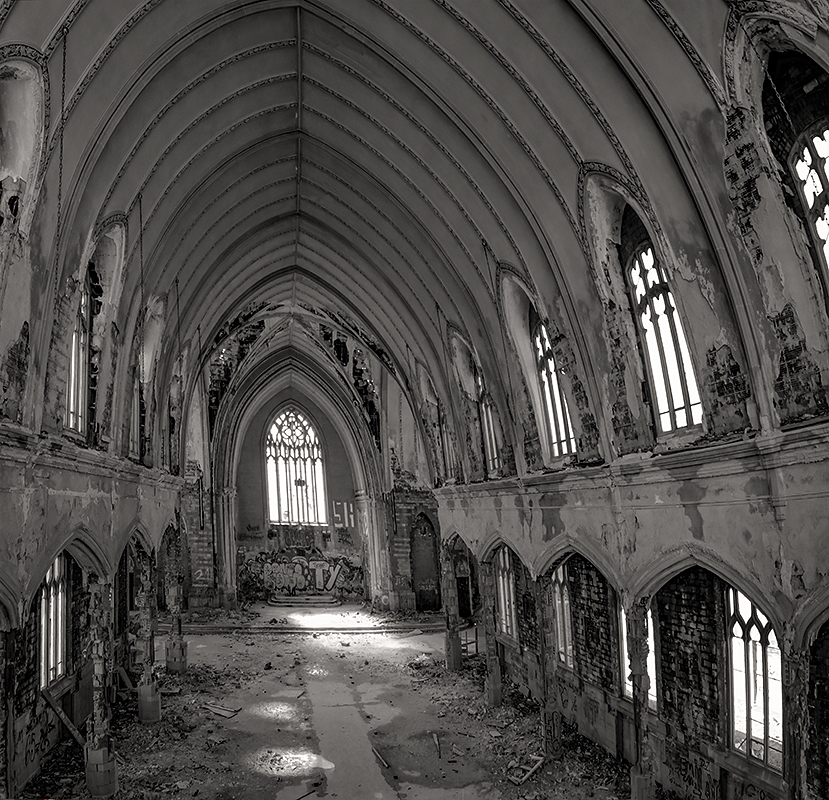
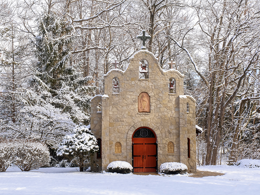
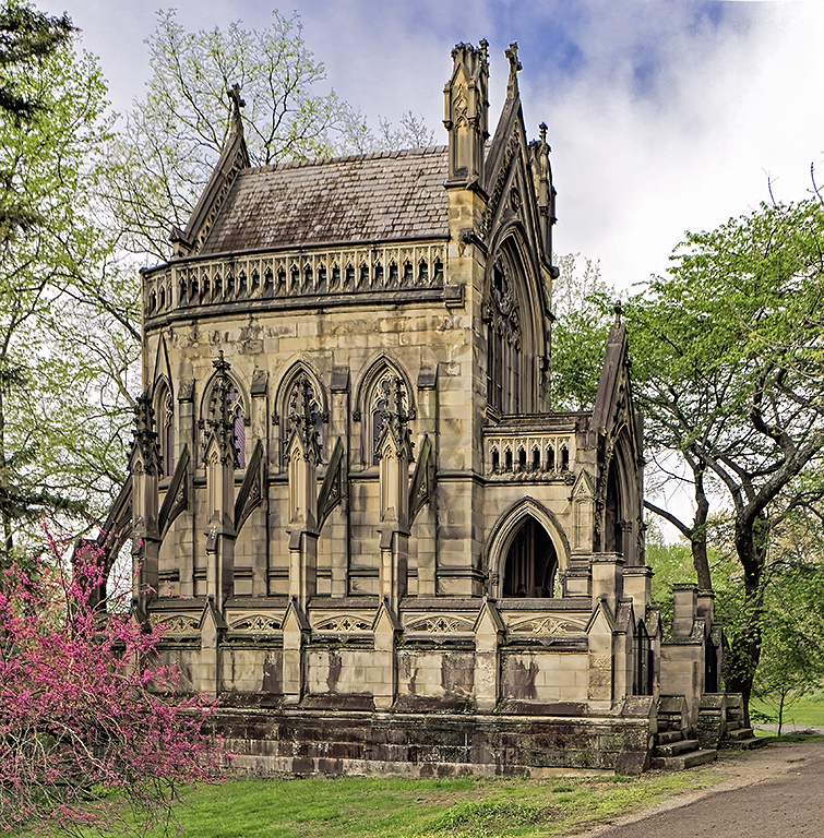
Ian, you suggested that in creating The Chapel all I did was to clone out a sign therefore the image should belong in the regular color category. However, in created "The Chapel" I darkened the sky, filled in vacant sky areas with cloned branches, removed numerous distracting specks and used a Topaz filter to warm up all the branches which had a dark black appearance. And, I used 4 layers in Photoshop to create my image. Thus, I feel I was creative in my photographic process.
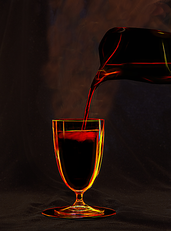
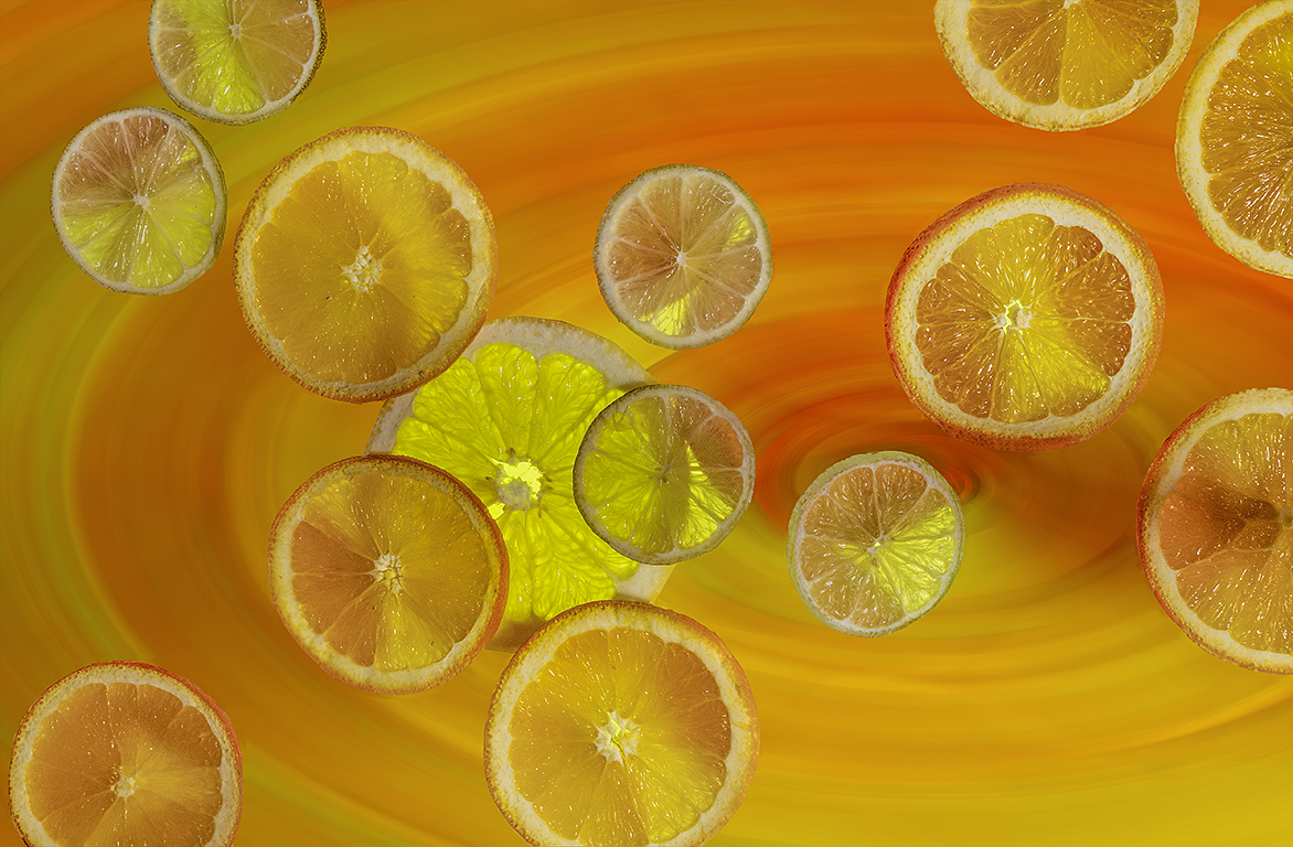
And, I don't feel that photographing a bowl of candy and adding a swirl filter is particularly creative. But, since PSA seems to require a "creative" image to be something that does not exist in reality perhaps PSA should use a title such as chimerical, illusory, or fanciful instead of creative.
|
Jun 17th |
| 18 |
Jun 24 |
Comment |
I was mistaken about the purpose of the Creative Study Group. I thought the idea was to share various creative techniques in improving your images. I did not understand that the completed project had to have a Salvador Dali appearance.
I have withdrawn from this study group. |
Jun 16th |
2 comments - 3 replies for Group 18
|
| 78 |
Jun 24 |
Reply |
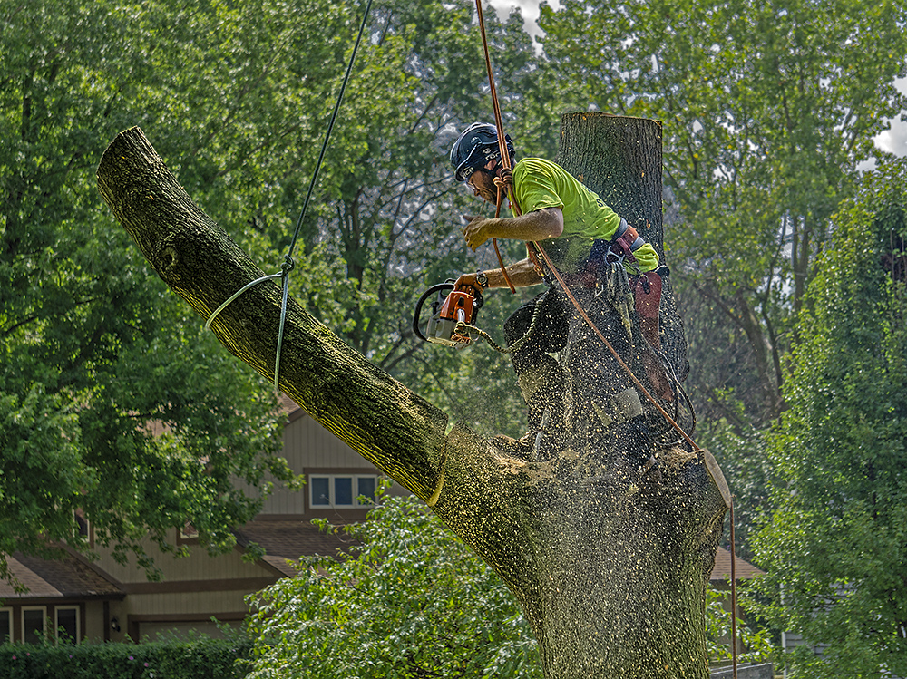
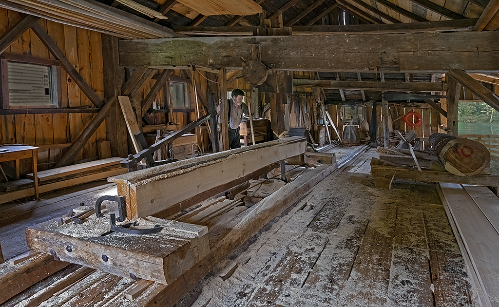
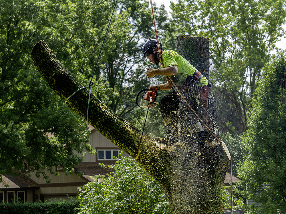
The photo was taken with a shutter speed of 400 and if you are referring to the action of the saw blade, more detail is not possible. If you look at the original you will see that there is no saw blade in the image because the saw blade is facing to the right of the worker and is hidden by the body of the saw. The saw blade you see in the revised image was created by myself in Photoshop using the line tool. But, thanks for the suggestion. |
Jun 21st |
| 78 |
Jun 24 |
Reply |
Brenda, I think it really should get an acceptance. It looks great to me. |
Jun 20th |
| 78 |
Jun 24 |
Reply |
Also very nice. |
Jun 20th |
| 78 |
Jun 24 |
Reply |
Big improvement. I really like it. |
Jun 20th |
| 78 |
Jun 24 |
Reply |
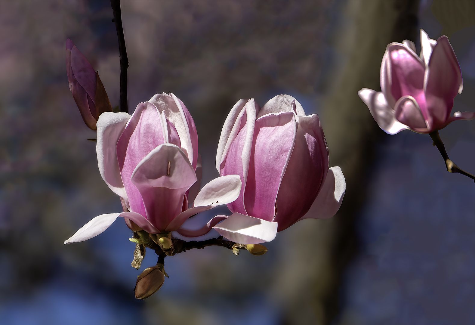
Years ago I did some focus stacking indoors and used an automatic railing system to change the focus point. When shooting outdoors do you manually change the focus point? And, how many images did you use for your magnolia shot? Well, for however you
did it, kudos for a wonderful image. |
Jun 16th |
| 78 |
Jun 24 |
Comment |
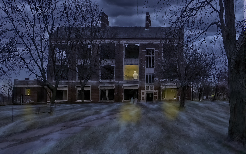
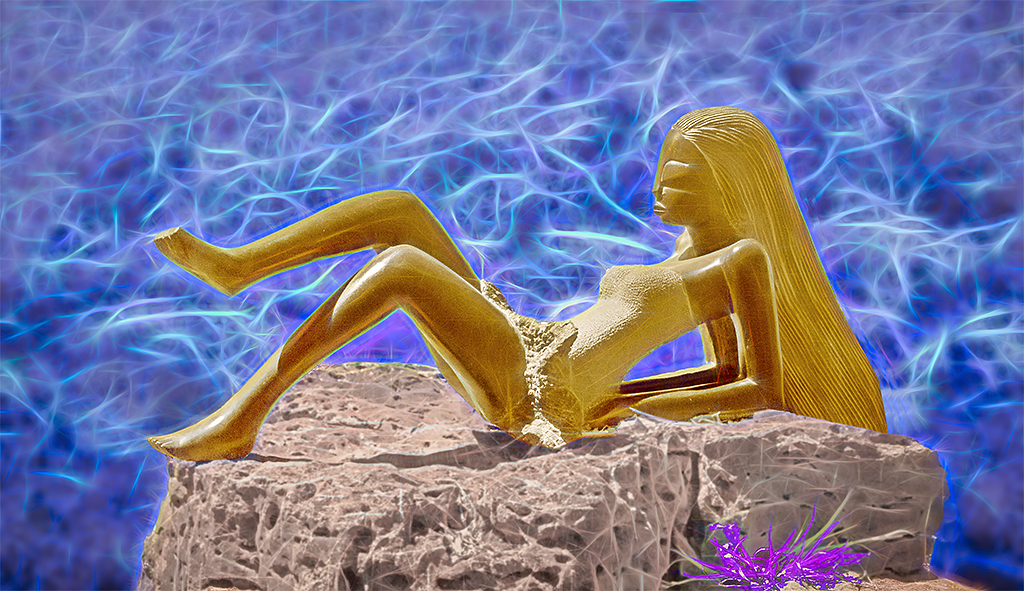
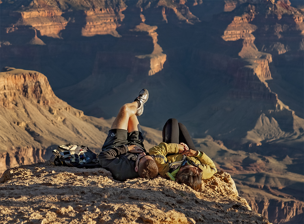
Ed, I believe you took the trees from your original image 1 and the aurora from your image 2. You then did a great job in combining those images in your wonderful creation.
However, I find the blue and green colors in the bottom right corner to be distracting. After looking at those colors I realize that they are a tent. I feel the image would be improved by either cloning out those colors or doing something to make the tent more visible and recognizable and perhaps smaller. |
Jun 16th |
| 78 |
Jun 24 |
Comment |
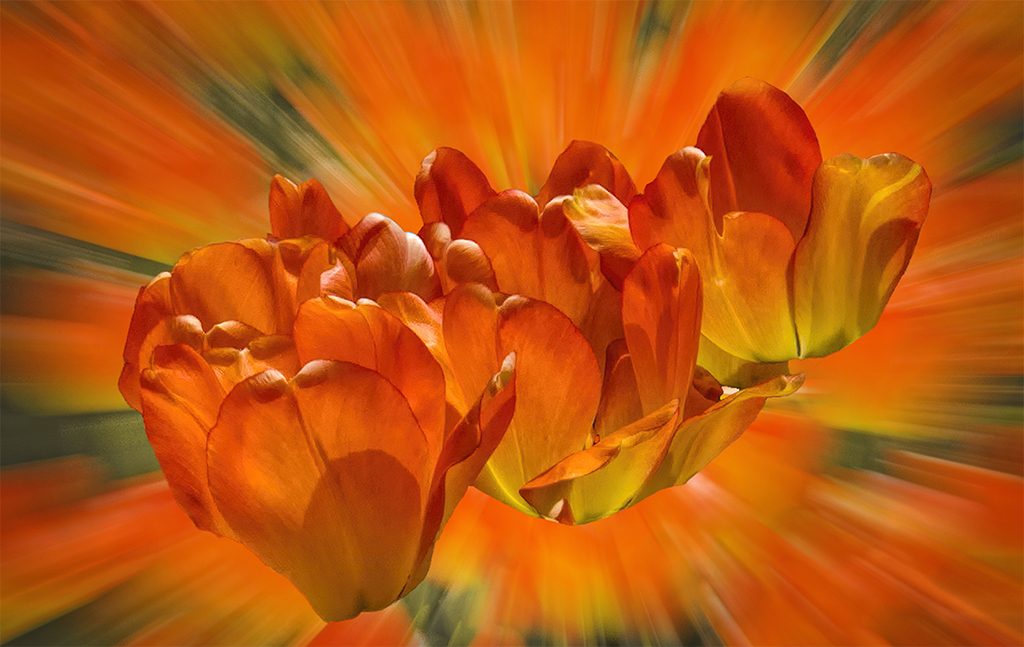
An outstanding and beautiful image with an amazing depth of field. I have no suggestions.
Isn't it difficult to do focus stacking of an image outdoors? I would have guessed that movements of the blossom would not have allowed the images to line up in focus stacking |
Jun 16th |
| 78 |
Jun 24 |
Comment |
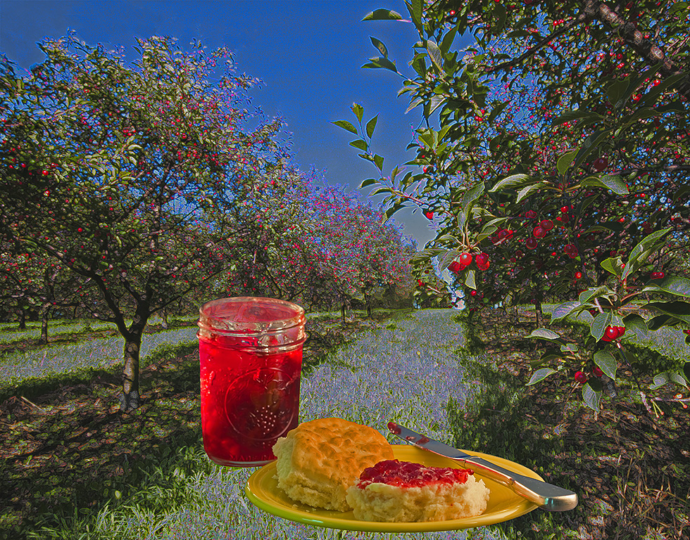
I really like this outstanding image. The colors and the composition are great. I have no suggestions. |
Jun 16th |
| 78 |
Jun 24 |
Comment |
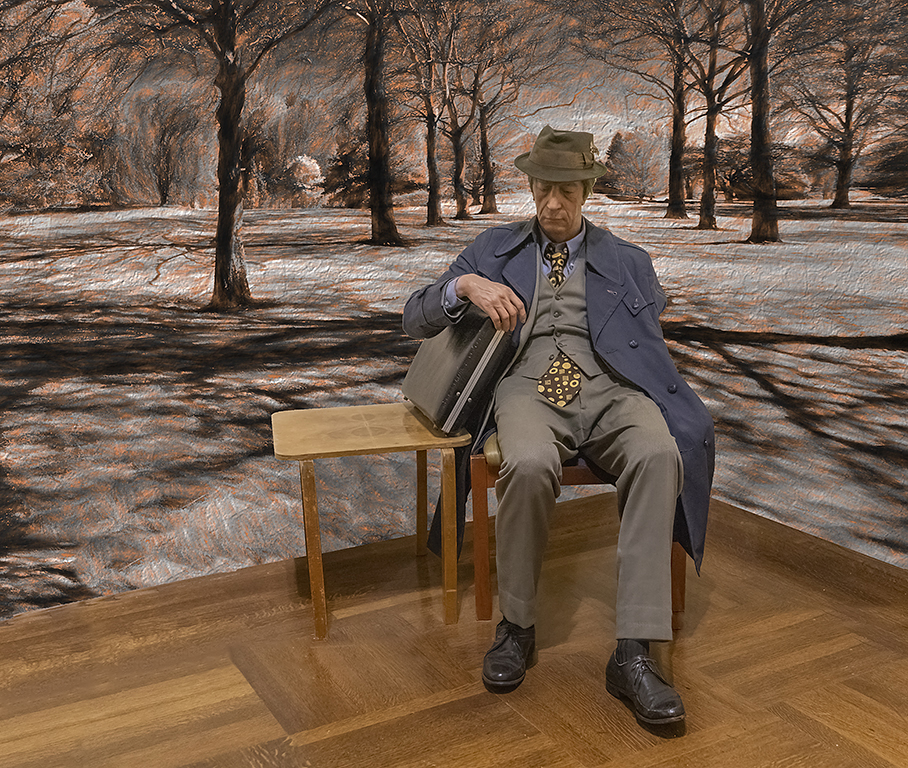
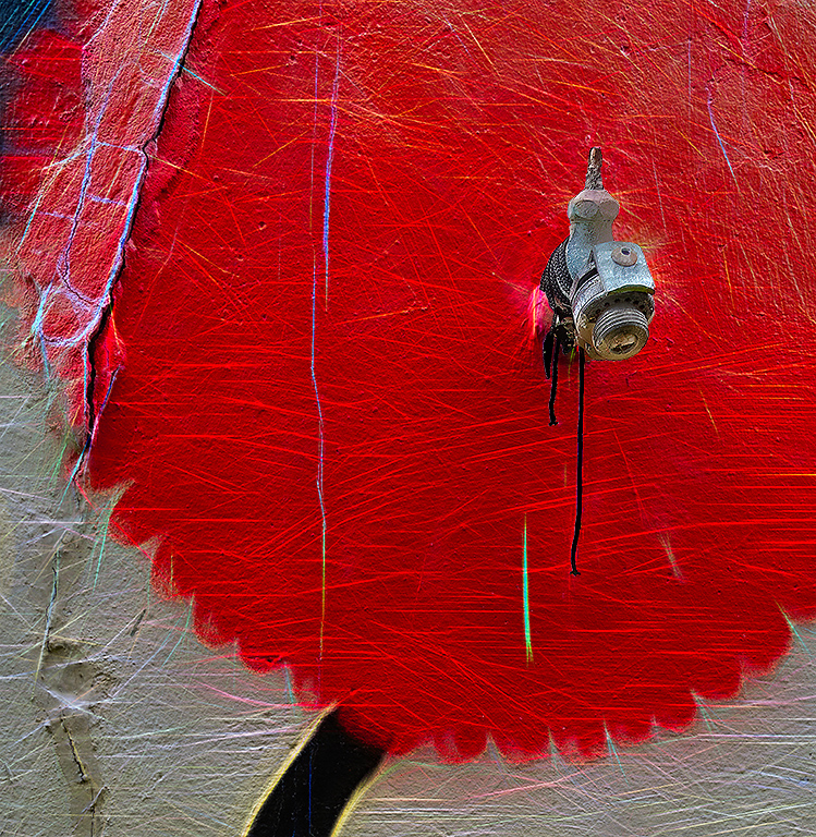
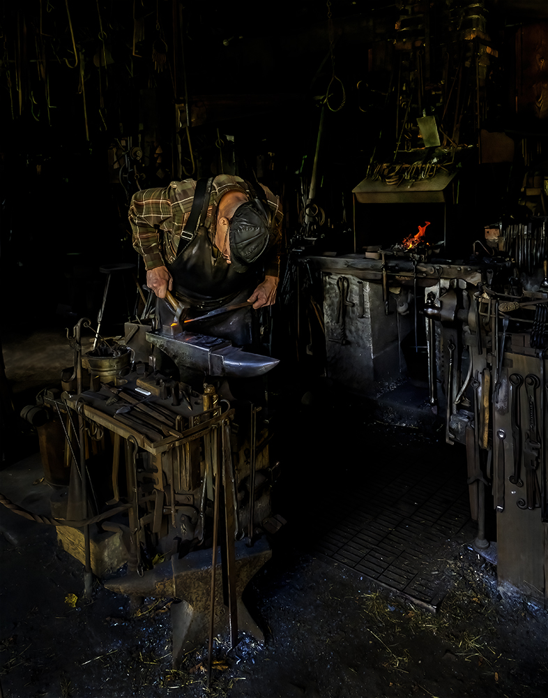
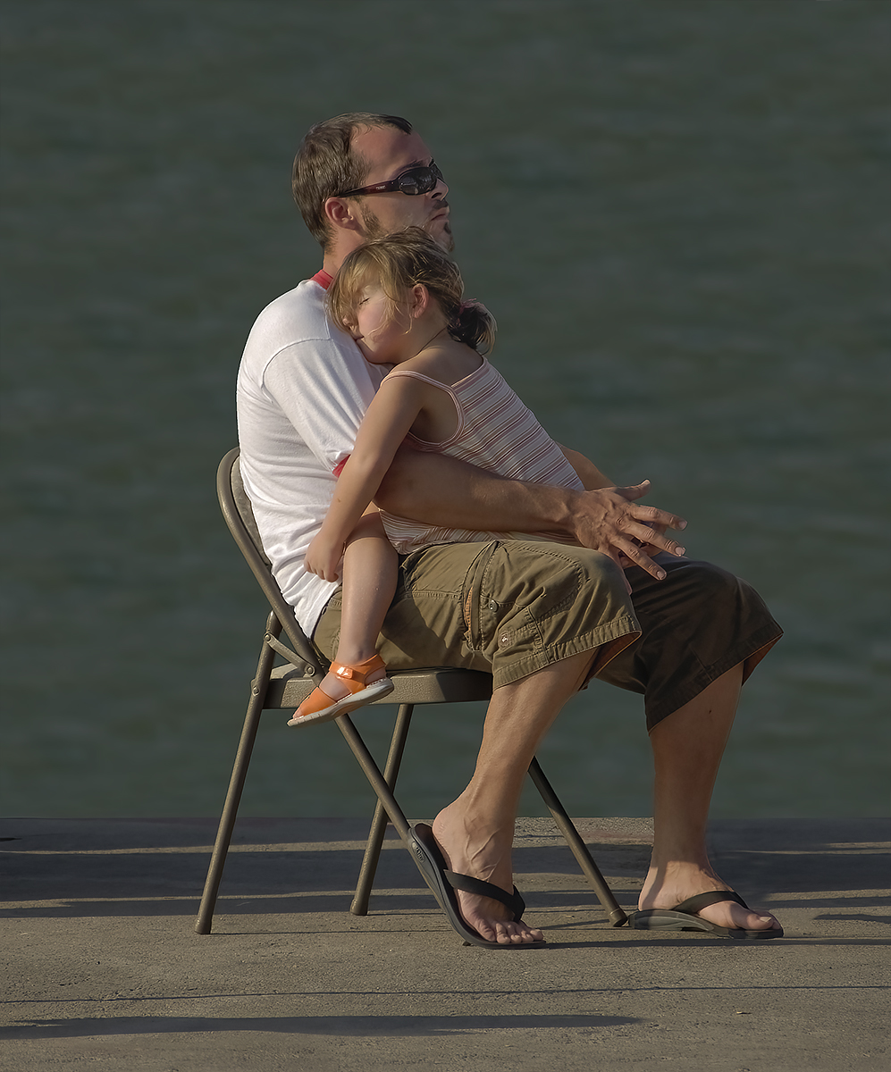
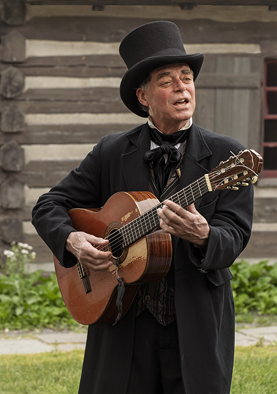
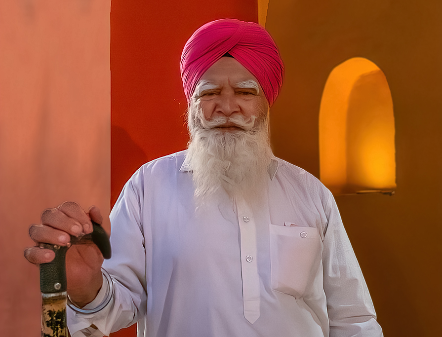
I think this is an outstanding image. I like the colors and the composition. However, to me, the brick work above his cane and elsewhere is distracting. In my revision I eliminated the brickwork, darkened the orange color, cropped tighter, brightened the face and beard and increased the sharpness. |
Jun 16th |
 |
| 78 |
Jun 24 |
Reply |
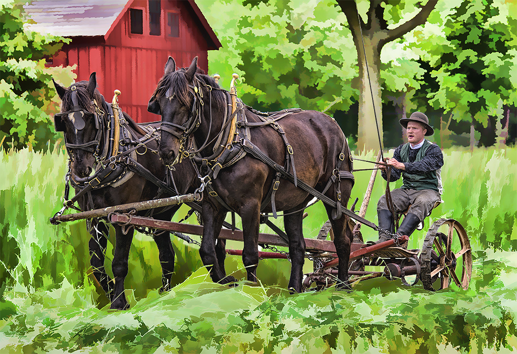
I went back to the original and added a blade to the chain saw but then the blade did not line up with the cut in the limb. So, it took quite a bit of work but I reduced the length of the lumberjack's arm to get the saw blade in line with the cut. But after I shortened his arm some of the ropes did not line up so I had to clone them out of the image. I also eliminated the yellow cast and reduced the sharpness. But, I kept all the saw dust flying around as I feel it is needed to capture the action of the image. |
Jun 15th |
 |
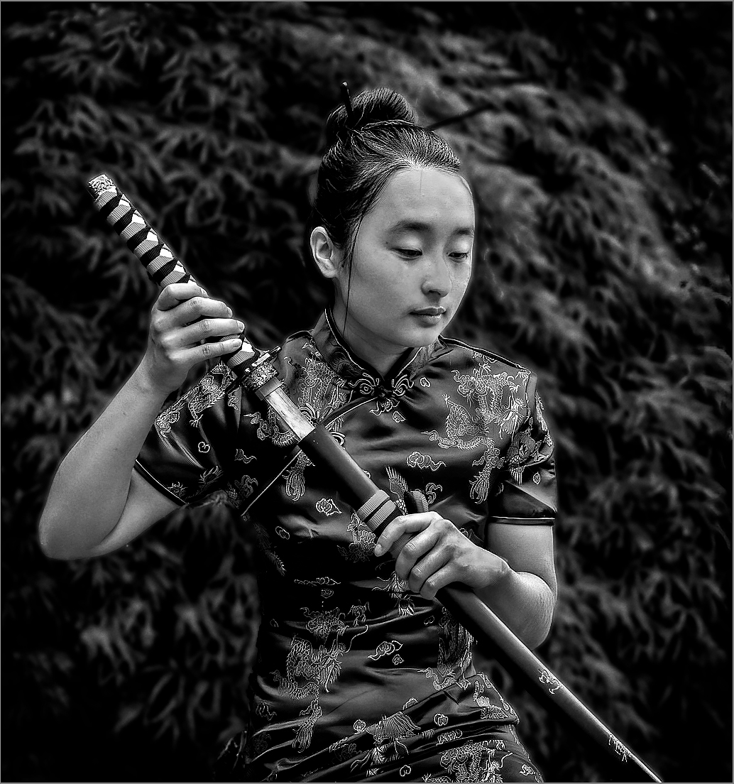
| 78 |
Jun 24 |
Comment |
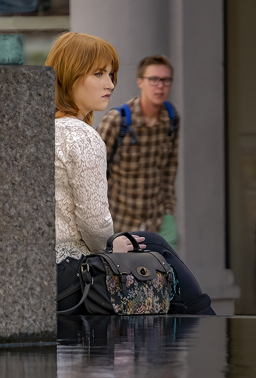
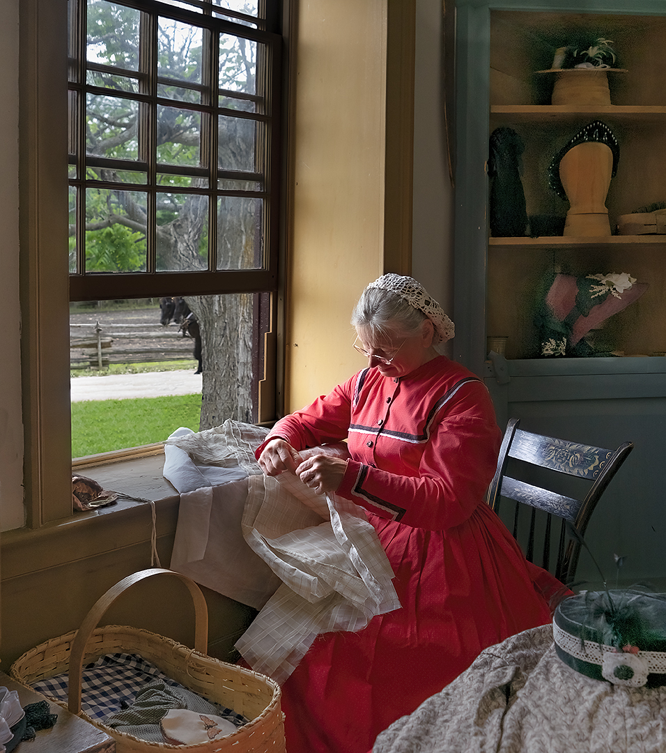
I like the image a lot. Cropping out the stone the subject is sitting on makes the composition great. Although the mono version is good, I prefer the color image. I made some changes in my revised mono revision. I removed the blemishes from the lady's face. I reduced the bright areas especially her left hand. I brightened some of the dark shadow areas of the background and then slightly blurred the entire background. I sharpened the subject. I changed to tone to a purer black. And, finally I added a small border. |
Jun 15th |
 |
5 comments - 6 replies for Group 78
|
11 comments - 10 replies Total
|