|
| Group |
Round |
C/R |
Comment |
Date |
Image |
| 11 |
May 24 |
Reply |
Thanks for your suggestion. I will have to go back and try to include them. |
May 15th |
| 11 |
May 24 |
Comment |
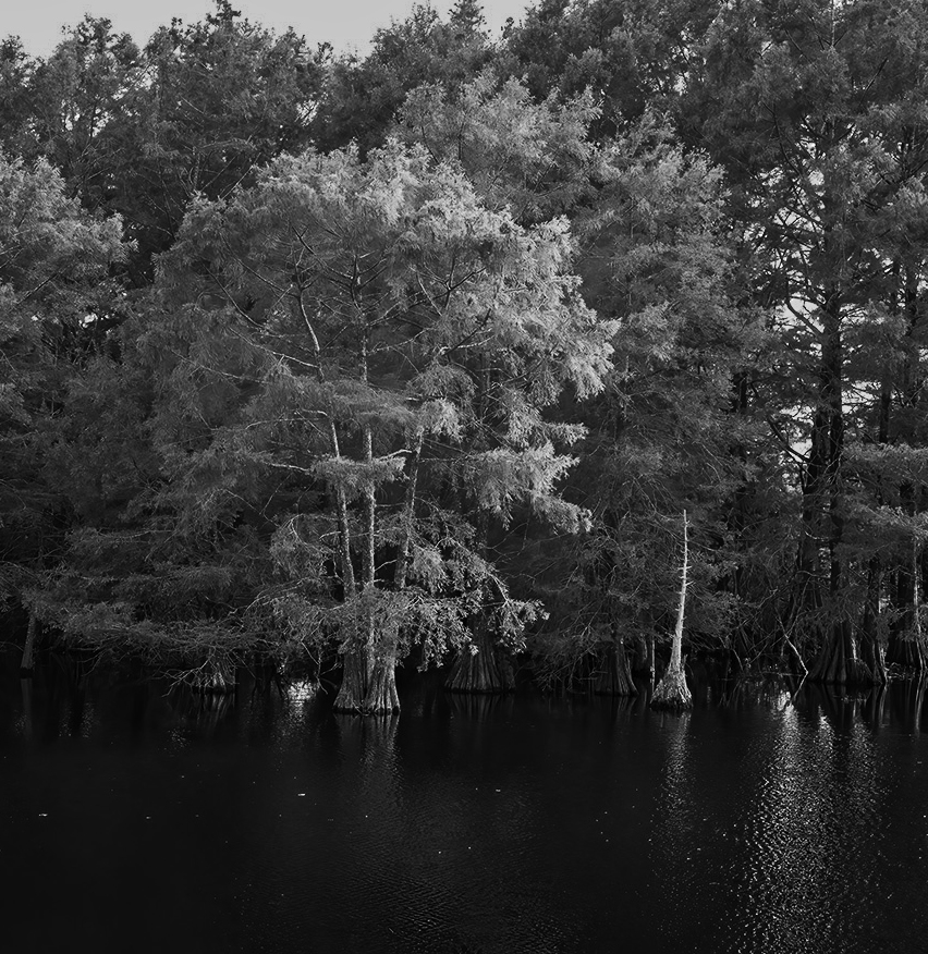
Jim, when I look at your image my eye is focused on the middle of the image because that area is not only centered but also because it is brighter than most of the other areas in the image. Would the composition be more interesting with a different crop? In my possible revision I've focused on the three trees in the middle of the image. |
May 15th |
 |
| 11 |
May 24 |
Comment |
Peter, your mono image is so much better than the original. The mono version has a great tonal range with detail in the shadow areas. Wonderful vanishing point. Great composition. Great conversion. No suggestions. |
May 15th |
| 11 |
May 24 |
Comment |
Darelene, I don't know what to suggest. The ocean is beautiful. The driftwood is interesting. Everything is sharp. The tonal range is great. But, at least to me, the two elements don't seem to mesh and I don't have any suggestions. Sorry. |
May 15th |
3 comments - 1 reply for Group 11
|
| 18 |
May 24 |
Reply |
I have no other suggestions and look forward seeing your future images. |
May 16th |
| 18 |
May 24 |
Reply |
Debby, are familiar with Photoshop and layers? If you are and still have a layer without the blur effect you could put that unblurred layer below the blurred layer. Then, in Photoshop you could, by using layer mask, allow some of the lower layer to show up in the top layer. |
May 15th |
| 18 |
May 24 |
Comment |
Wonderful. Creative. Great image. No suggestions. |
May 15th |
| 18 |
May 24 |
Comment |
Very nice image. Very nice creation. And, I agree with Ian that reducing the filter effect on the basket works quite well. I wonder if a little shadow under the basked would make it seem to be not so floating. |
May 15th |
| 18 |
May 24 |
Comment |
Wow! What a wonderful, colorful, and creative creation. I have no suggestions.
|
May 15th |
| 18 |
May 24 |
Comment |
Your revision has a lot more interest than does the original. I wonder if the image would be more interesting if the blurring effect was not quite so strong and also if there was minimal blurring in the central trunk area of the tree (to draw you eye to that area).
|
May 15th |
| 18 |
May 24 |
Comment |
There is not much of interest in the original image. I like your minimalistic revision and have no suggestions. |
May 15th |
5 comments - 2 replies for Group 18
|
| 78 |
May 24 |
Reply |
Thanks for sharing your images on Facebook. It looks like you had a great week.
|
May 16th |
| 78 |
May 24 |
Comment |
Many thanks for the suggestions. I removed the partial sky light. I eliminated the guy at the top of the stairs. And, I removed the numerous defects in the ceiling. And, I really like the mono versions as well as the color version. Following is my revised color version with the bottom handrail. I am thinking my preference is color without the handrailing and mono with the handrailing. |
May 9th |
 |
| 78 |
May 24 |
Comment |
Very nice image. Great colors. Sharp. And your background treatment was also great. I have no suggestions. |
May 9th |
| 78 |
May 24 |
Comment |
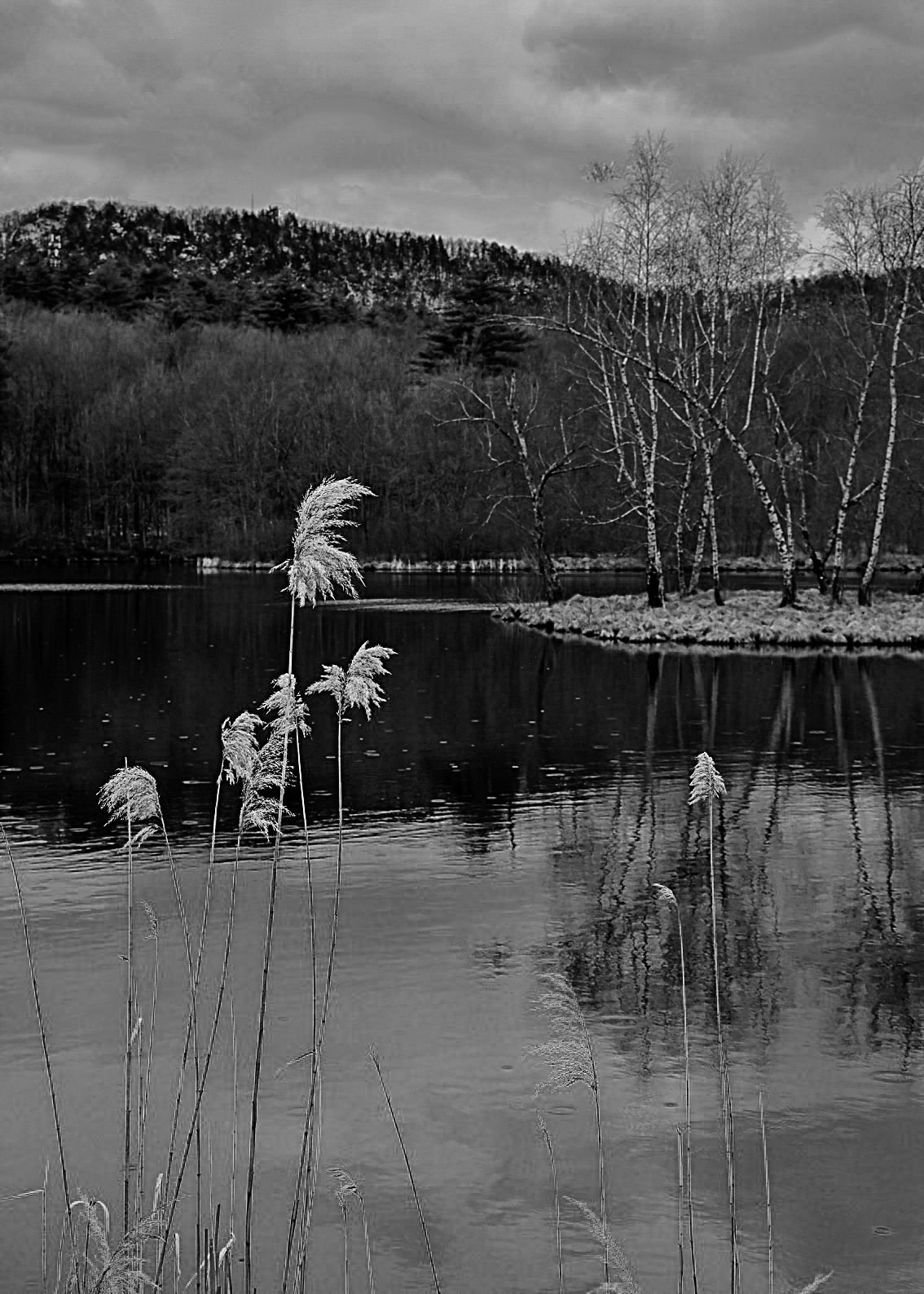
I also like both versions but prefer the mono. I especially like the grasses in the foreground as they add so much to the composition. I also felt the dark areas needed to be lightened and the sky darkened. Great image. |
May 9th |
 |
| 78 |
May 24 |
Comment |
A wonderful image. My only suggestion is the same as has been mentioned - slightly tighter crop especially from the bottom of the image. |
May 9th |
| 78 |
May 24 |
Comment |
Outstanding image. Great creation. Great color. Great composition. My only minor suggestion is to add a small colored border. |
May 9th |
 |
| 78 |
May 24 |
Comment |
Great shot. Great composition. No suggestions. |
May 9th |
6 comments - 1 reply for Group 78
|
14 comments - 4 replies Total
|