|
| Group |
Round |
C/R |
Comment |
Date |
Image |
| 11 |
Apr 24 |
Reply |
Thanks for the update. Very interesting. Again, nice image. |
Apr 4th |
| 11 |
Apr 24 |
Comment |
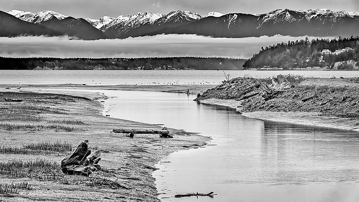
A very nice image with a great leading line and composition. My only suggestion is to add more contrast to the background as I have tried to do in my suggested revision. |
Apr 4th |
 |
| 11 |
Apr 24 |
Comment |
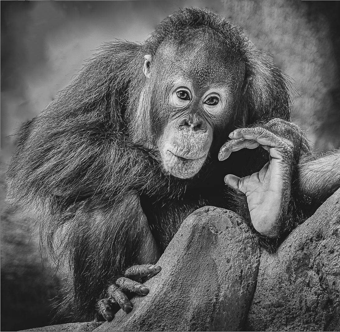
I like the image and your composition. But, the background is disturbing especial the diagonal line on the top left. So, in my revision I removed the competing background elements and also darkened the rocks in the front to make the orangutan more prominent. |
Apr 4th |
 |
| 11 |
Apr 24 |
Comment |
Wonderful image. Nice composition and range of tones. No suggestions but I do wonder what is below the bottom of the door. |
Apr 4th |
| 11 |
Apr 24 |
Comment |
Peter, wonderful image and wonderful composition. The mono is great but I also like the color version. |
Apr 4th |
| 11 |
Apr 24 |
Reply |
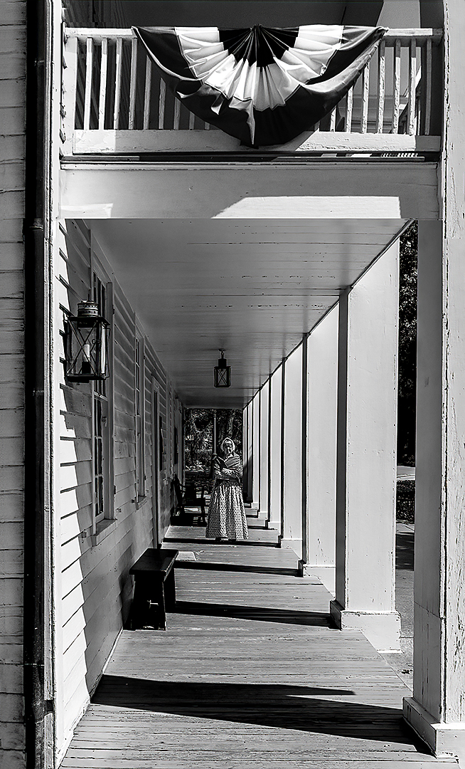
Christian, many thanks for the suggestion to crop the original image higher which I've done. Including the flag adds much to the image. |
Apr 3rd |
 |
| 11 |
Apr 24 |
Reply |
Peter, many thanks for your suggestion to increase the size of the woman. My image looks much better now. |
Apr 3rd |
 |
4 comments - 3 replies for Group 11
|
| 18 |
Apr 24 |
Comment |
A great creation with nice curving lines and composition. I have no suggestions. |
Apr 13th |
| 18 |
Apr 24 |
Comment |
Wonderful image, great color, great composition and a lot of interest. I have no suggestions. |
Apr 13th |
| 18 |
Apr 24 |
Comment |
Like others I have no idea how you could have created such a wonderful image from a photo of a bridge. Your image reminds me of waves. Very nice image. I have no suggestions. |
Apr 13th |
| 18 |
Apr 24 |
Comment |
The original color image is okay. The converted mono image with the Topaz filter applied is great as is the composition. I have no suggestions. |
Apr 13th |
4 comments - 0 replies for Group 18
|
| 78 |
Apr 24 |
Comment |
I like your image but has been suggested the pillars are distracting. I like your revision without the pillars, much improved. |
Apr 4th |
| 78 |
Apr 24 |
Comment |
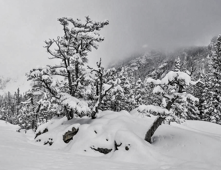
I love your image with one exception, the blur at the sides. I love the composition and the overall feeling of your image but the out of focus areas caused by the vignetting is annoying. I went back to your original and made my own conversion. In my image I cropped some off the bottom and I eliminated the blurred areas but it lacks the feeling of your image - perhaps my image has too much contrast.
|
Apr 3rd |
 |
| 78 |
Apr 24 |
Comment |
A great image with wonderful composition, colors and sharpness. I agree with Brenda that a little more space at the top and bottom is a good idea. I have no suggestions. |
Apr 3rd |
| 78 |
Apr 24 |
Comment |
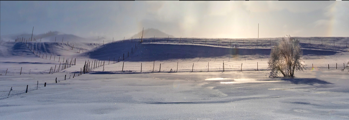
Your image does portray the halo quite well but I feel a more interesting aspect of your image is the bottom portion. In my image I've attempted to create a feeling of cold, of winter and perhaps an oncoming storm. |
Apr 3rd |
 |
| 78 |
Apr 24 |
Comment |
Wonderful image. Well composed, sharp with great colors. No suggestions. |
Apr 3rd |
| 78 |
Apr 24 |
Reply |
Many thanks for your comments. The green foliage in my foliage is perhaps brighter than it is in reality. But, in my image I am trying to portray a feeling of Spring in the Smoky Mountains. Spring in the Smokies is bright, lush, green, and verdant. I feel the greens in my image help portray my feeling so I am not inclined to dull my green foliage.
|
Apr 3rd |
5 comments - 1 reply for Group 78
|
13 comments - 4 replies Total
|