|
| Group |
Round |
C/R |
Comment |
Date |
Image |
| 11 |
Feb 24 |
Reply |
Yes, much sharper. Big improvement. Great! |
Feb 17th |
| 11 |
Feb 24 |
Reply |
Darlene, you are correct. I could not imagine my so so ocean photos could be as dramatic as yours. But, thanks to your image I am going to try to resuscitate some of my images. |
Feb 17th |
| 11 |
Feb 24 |
Comment |
I don't know what to suggest. There are various areas of the image that are very interesting but overall there does not seem to be any area of interest or focus. |
Feb 12th |
| 11 |
Feb 24 |
Comment |
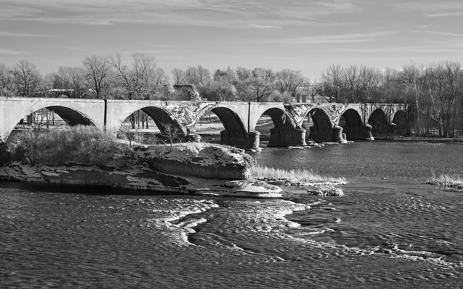
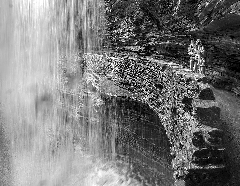
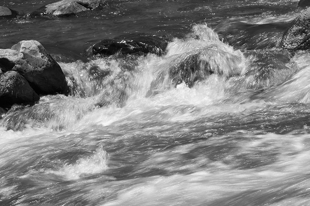
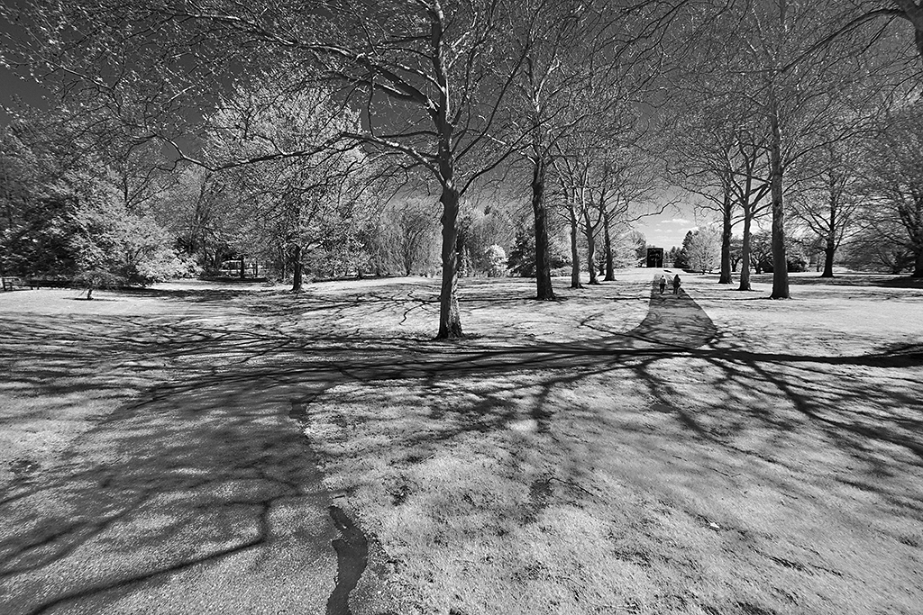
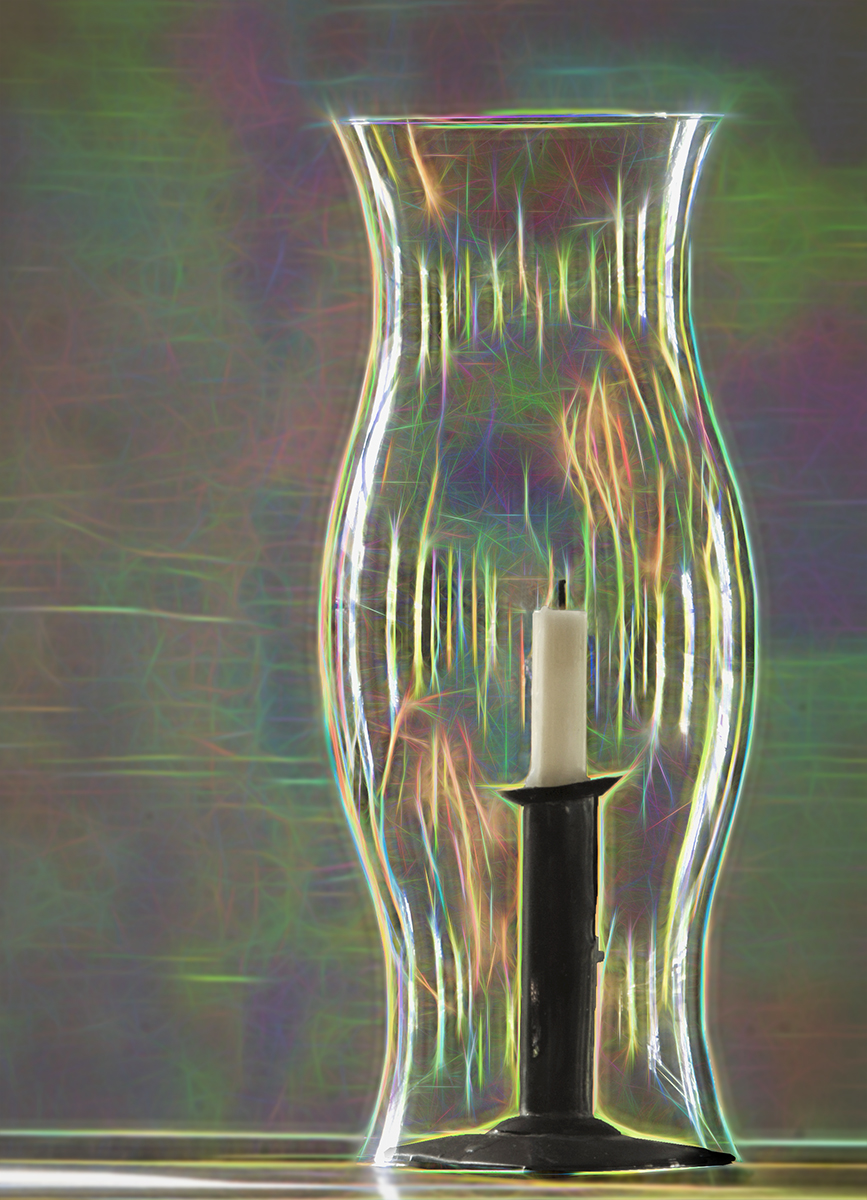
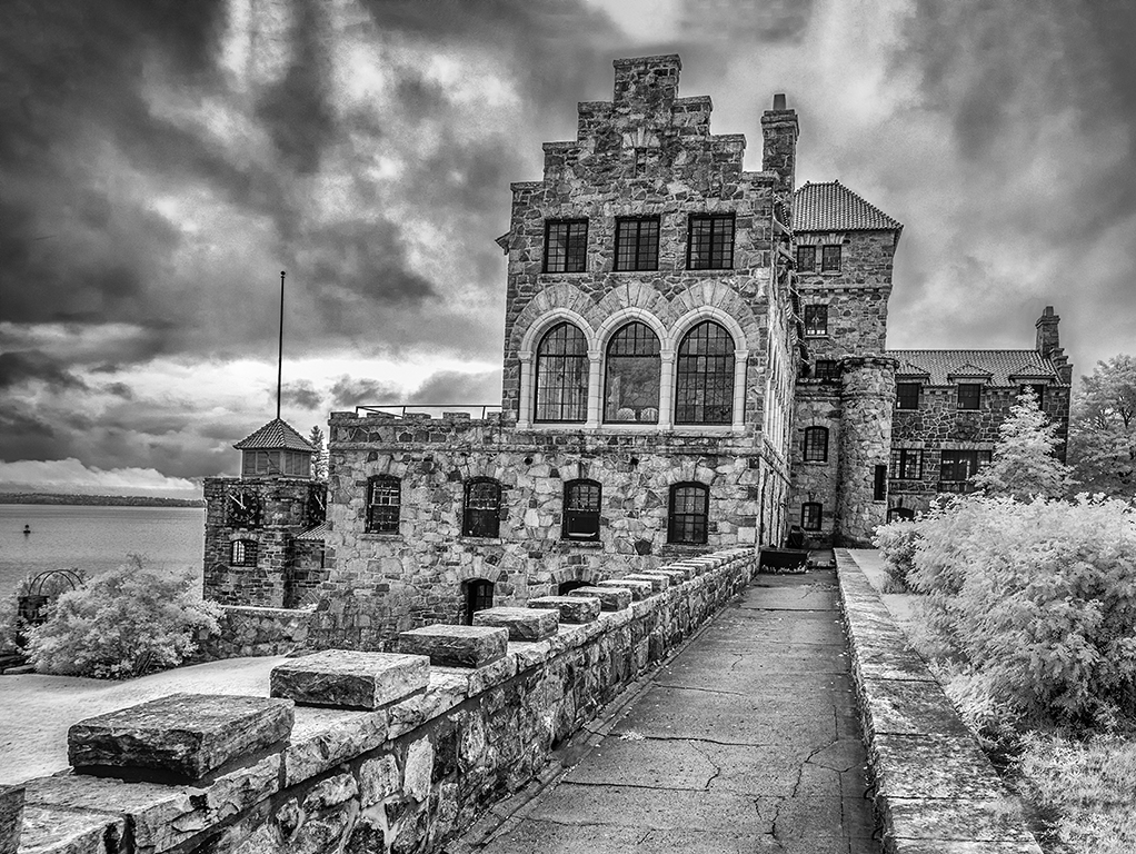
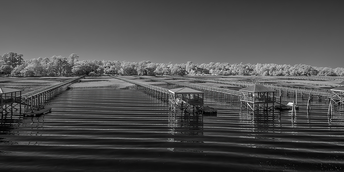
A wonderful mono image, so much better than the original. I am especially impressed with the way you darken and lightened various sections of the waves in creating Fury. I am no suggestions. |
Feb 12th |
| 11 |
Feb 24 |
Comment |
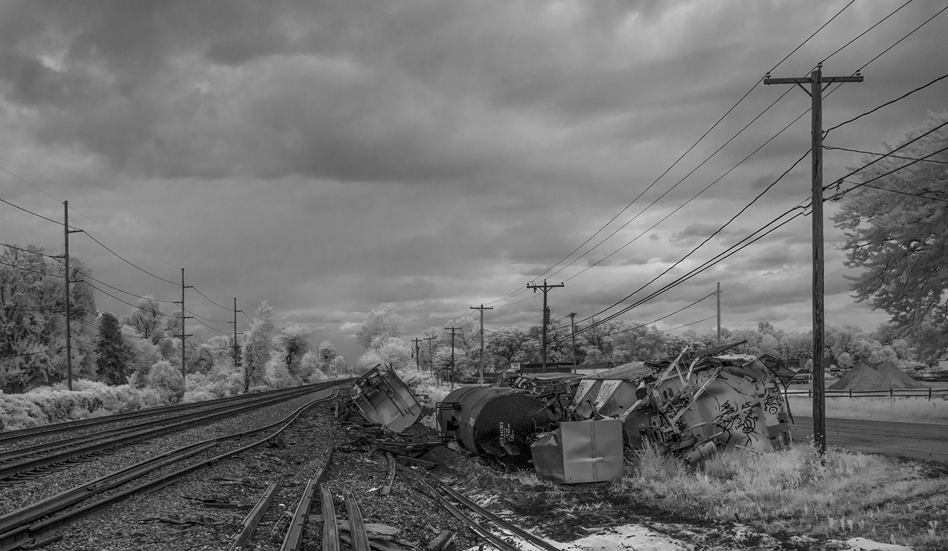
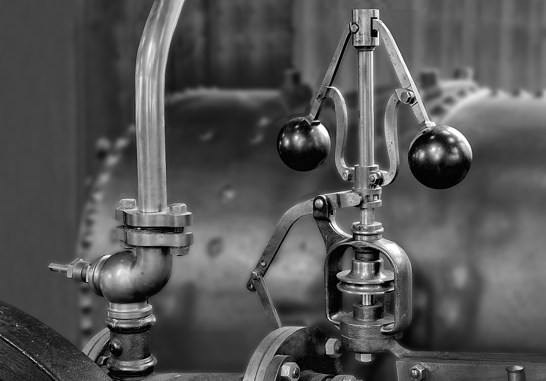
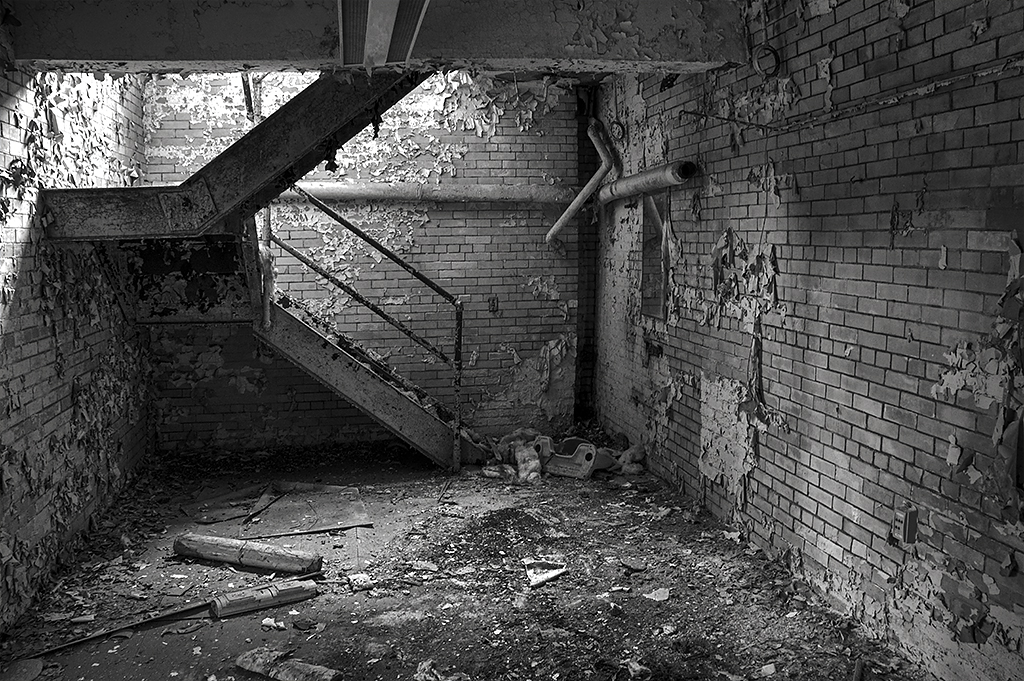
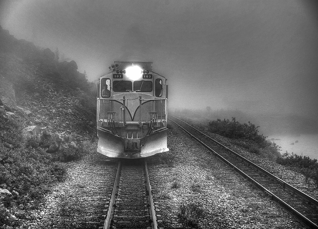
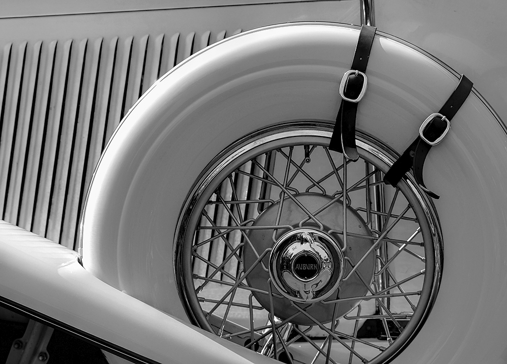
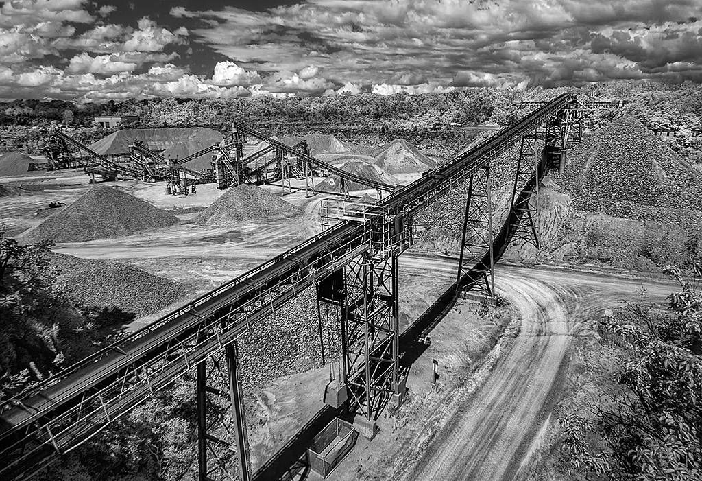
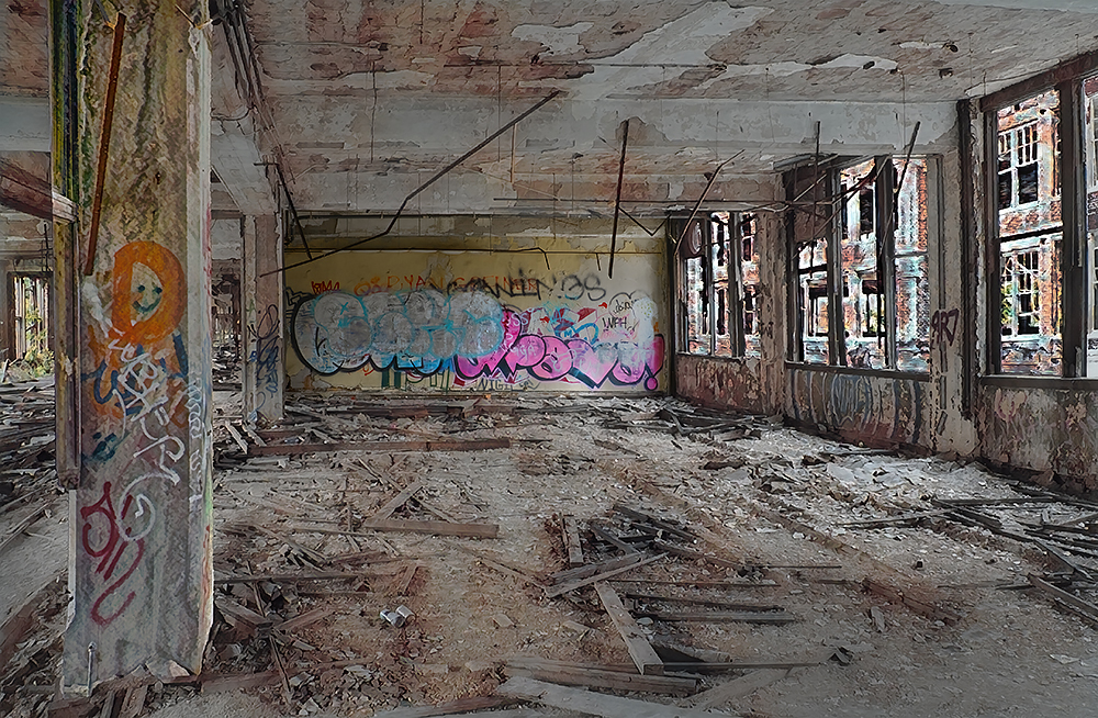
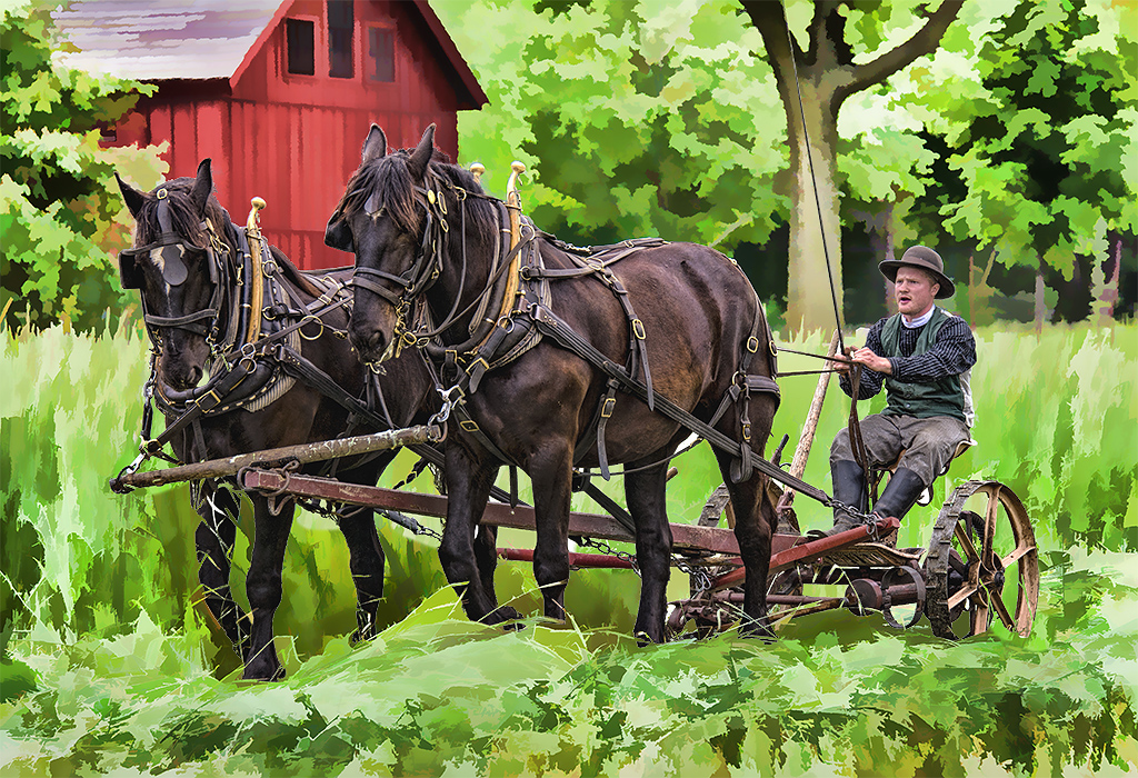
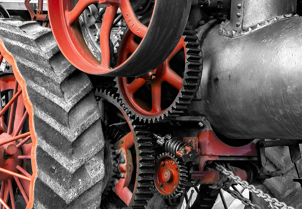
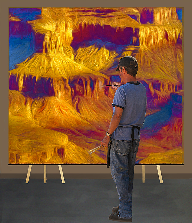
I also think the hydraulic hoses are the most interesting part of the image. And, I like Christian's suggestion that some of the tracks should be in the image. So, I went back to the original, and in my revision I darkened most of the areas that were not part of the frame, shifters or tracks. I then cropped some off the top and front of the image. |
Feb 7th |
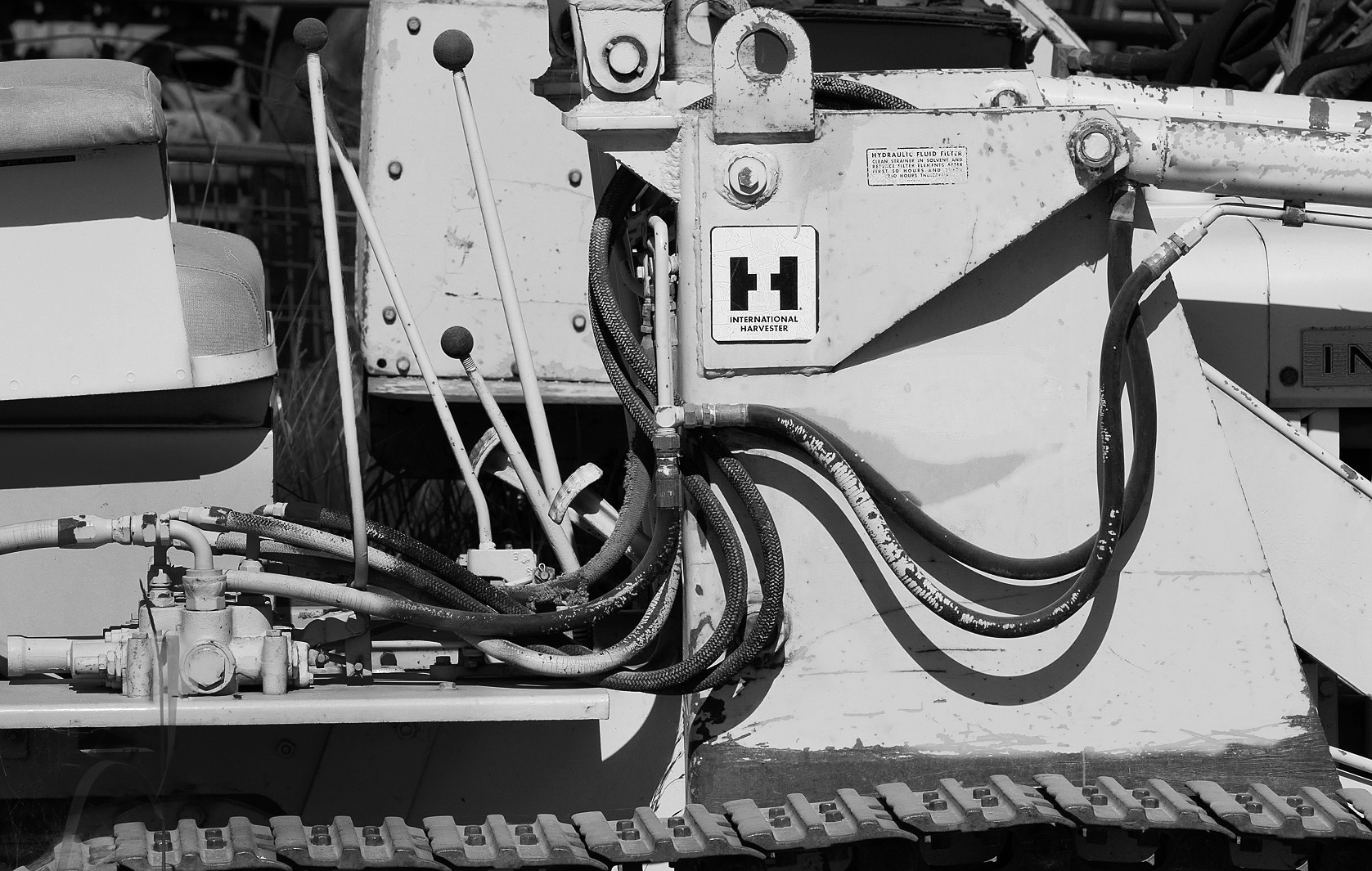 |
| 11 |
Feb 24 |
Comment |
Christian, very nice conversion from the color. I like the mono version much more. very nice composition. I suggest that the image might be just slightly brighter which I've done in my revision. I also sharpened slightly. |
Feb 7th |
 |
| 11 |
Feb 24 |
Comment |
I agree with Henry that both versions of Frog look great. But, there seems to me too much "space" around the mono frog. In my revision I increased the contrast of the mono image and cropped it much tighter. I also placed a black border around the image to make it more visible. |
Feb 7th |
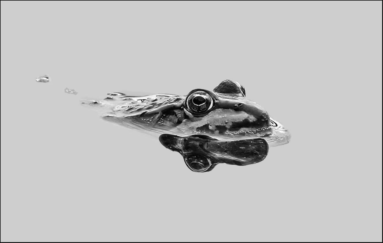 |
| 11 |
Feb 24 |
Comment |
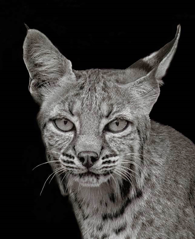
Henry, thanks for your suggestion. Your cleaner version does look much better with your corrections. |
Feb 7th |
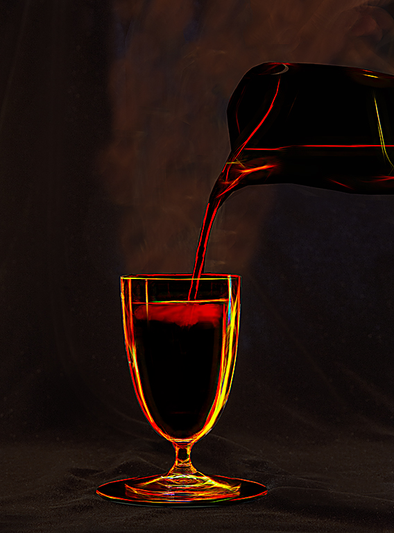
| 11 |
Feb 24 |
Reply |
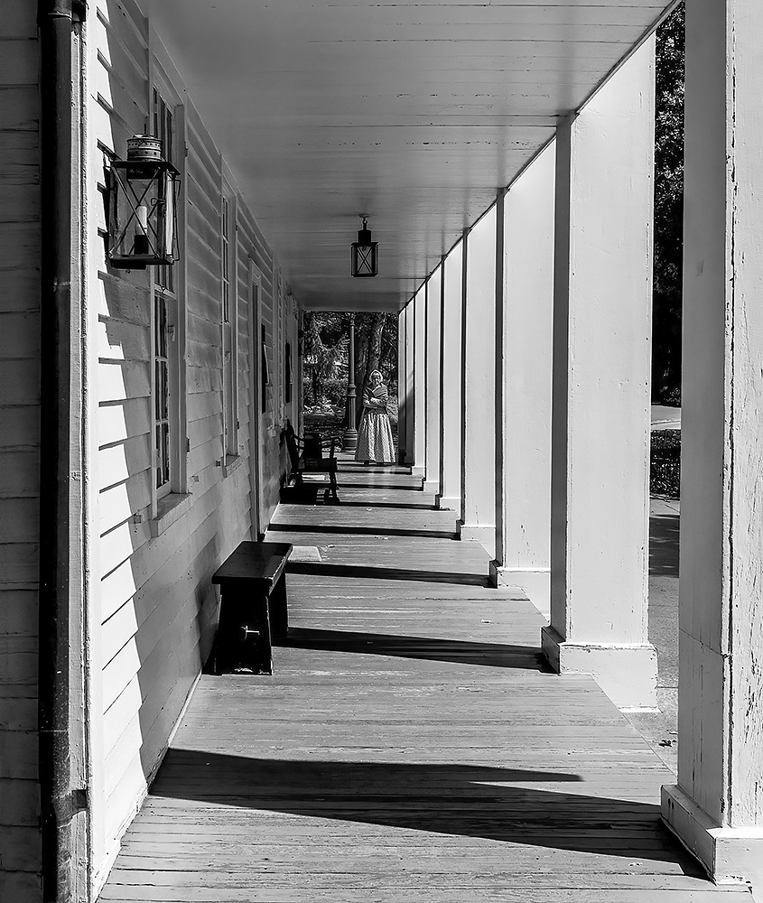
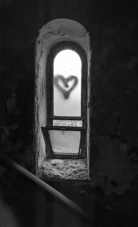
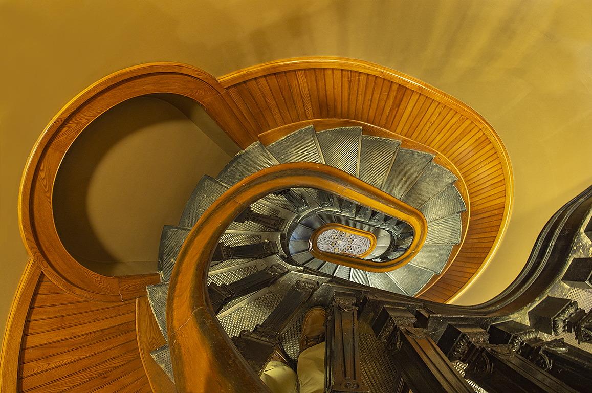
Christian many thanks for your comment. I do not know why my revised image is sloping, it was not intentional. Following is my revised image. |
Feb 6th |
 |
6 comments - 3 replies for Group 11
|
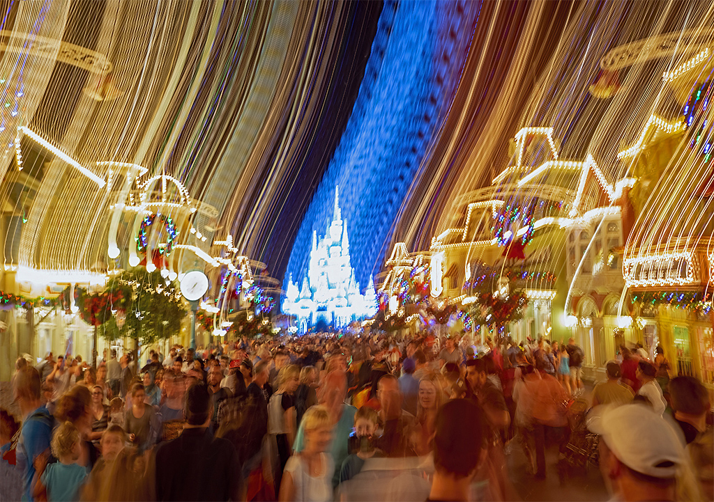
| 18 |
Feb 24 |
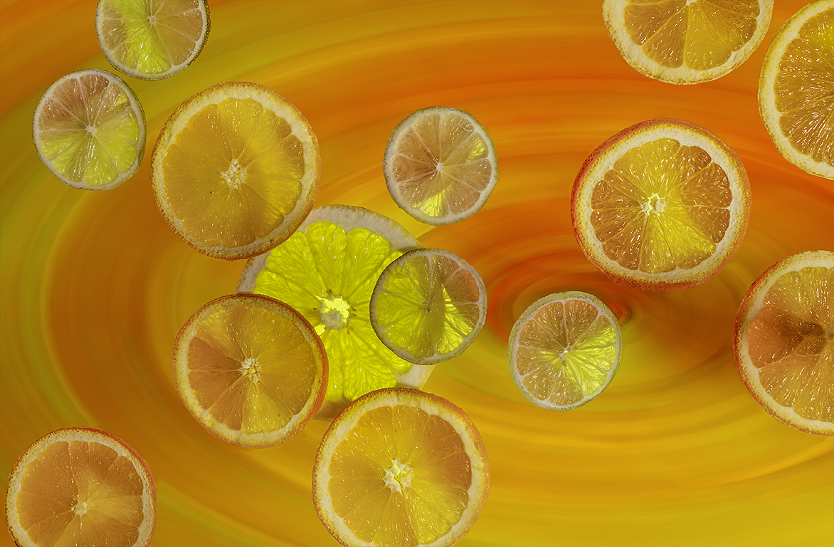
Comment |
Very interesting flowing lines. I have no suggestions. |
Feb 17th |
| 18 |
Feb 24 |
Comment |
A wonderful and creative image. I have no suggestions. |
Feb 12th |
| 18 |
Feb 24 |
Comment |
I like the image. It is a wonderful creations. My suggestion is to eliminate the frames and especially the top one. And, I don't mind the blue as I think it creates a feeling or mood for the scene. |
Feb 12th |
| 18 |
Feb 24 |
Comment |
Well photography is an art form so everyone can have their own opinion. I prefer the original as, to me, the revised image just looks like a photo than is out of focus. But, in both images I would have preferred some color in the sky. |
Feb 12th |
| 18 |
Feb 24 |
Comment |
A wonderful creation with so much more interest than in the original. I have no suggestions. Many thanks for sharing. |
Feb 12th |
5 comments - 0 replies for Group 18
|
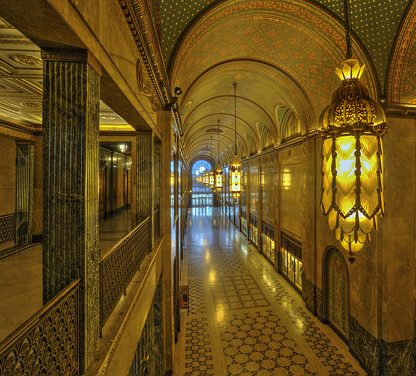
| 78 |
Feb 24 |
Comment |
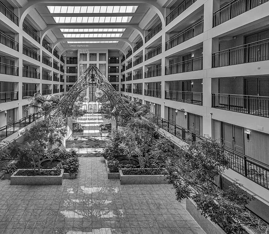
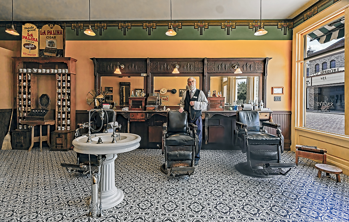
Thanks to everyone for your comments. I do agree that the floor pattern should be darker as its brightness is a distraction. I have now darkened it somewhat as can be seen in my revision. |
Feb 16th |
 |
| 78 |
Feb 24 |
Reply |
Ed, I am glad that we both can enjoy your image and you will allow me to enjoy my interpretation. |
Feb 8th |
| 78 |
Feb 24 |
Reply |
One other point. When I am trying to "revise" one of my images I sometimes think, "If I was an artist what is my subject and what should I include in my painting?" |
Feb 5th |
| 78 |
Feb 24 |
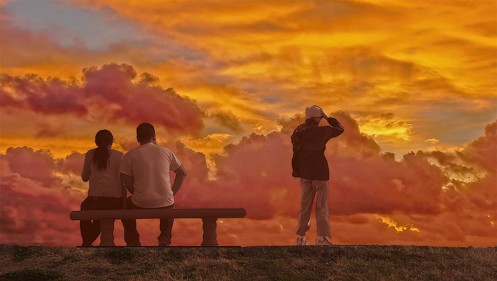
Reply |
Wow! Now that is exactly what I was thinking of when I saw your original image. It would have been better if the guy on the left was looking out instead of down. |
Feb 4th |
| 78 |
Feb 24 |
Comment |
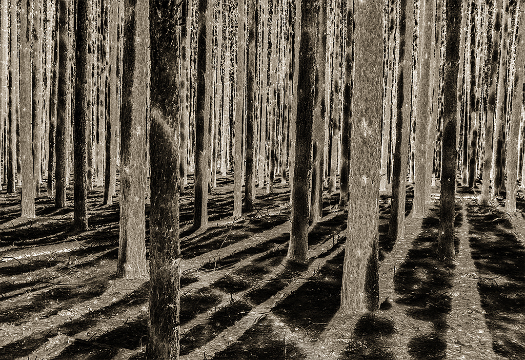
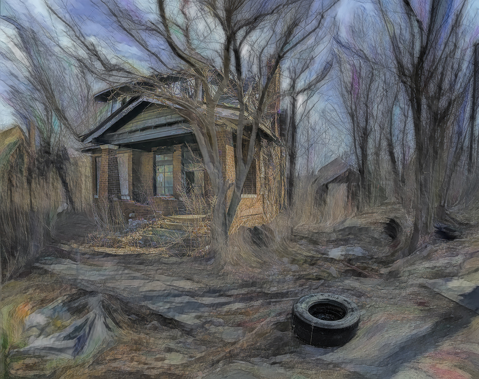
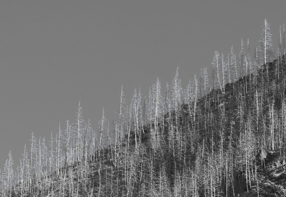
Ed your original image is an excellent capture of an unusual event but, to me, not as a photograph. I feel every photo should attempt to tell a story and I wonder what is the relationship of the moon to the trees. To me the story is the devastation of a forest fire which I've tried to capture in my revision. A possible title could be "After The Forest Fire." |
Feb 4th |
 |
| 78 |
Feb 24 |
Comment |
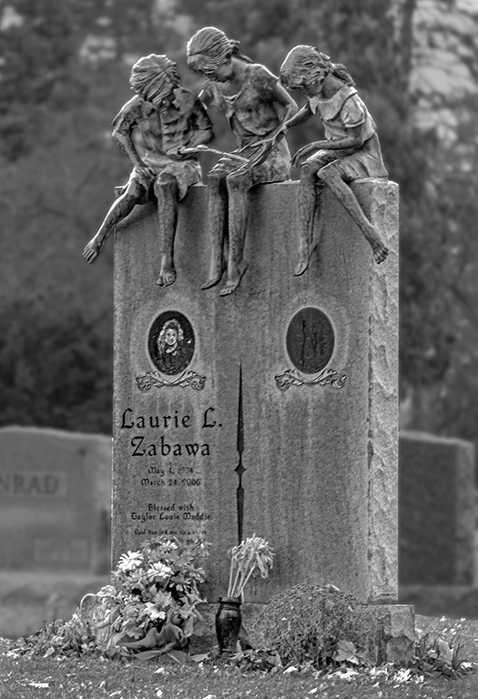
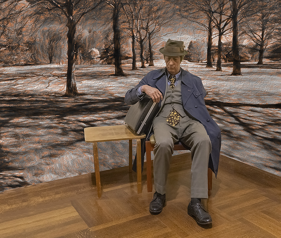
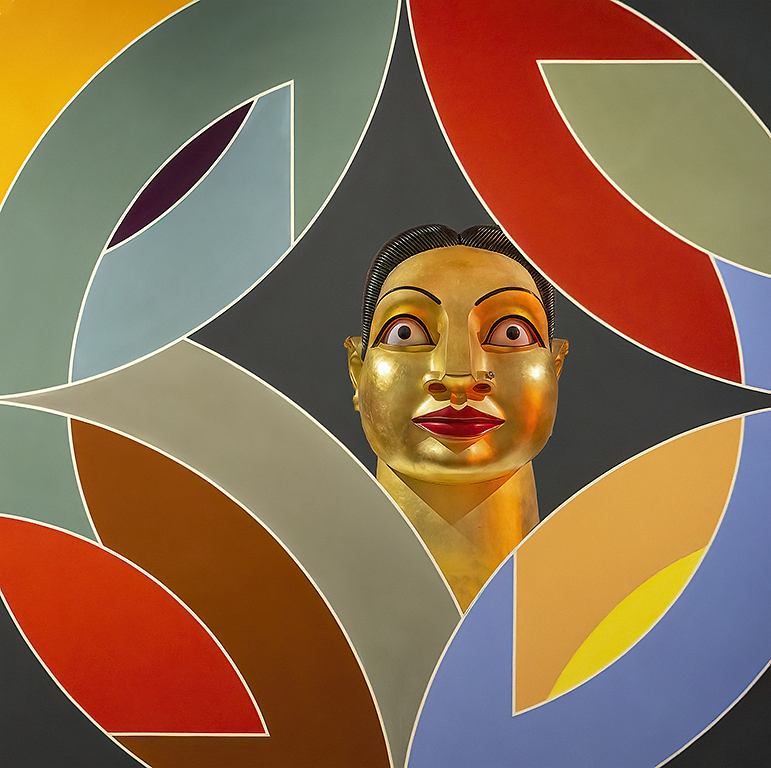
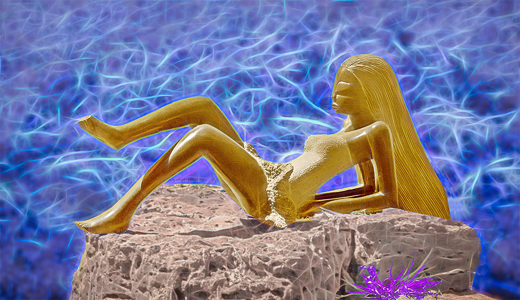
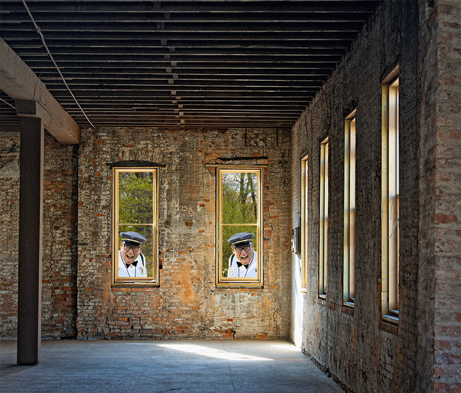
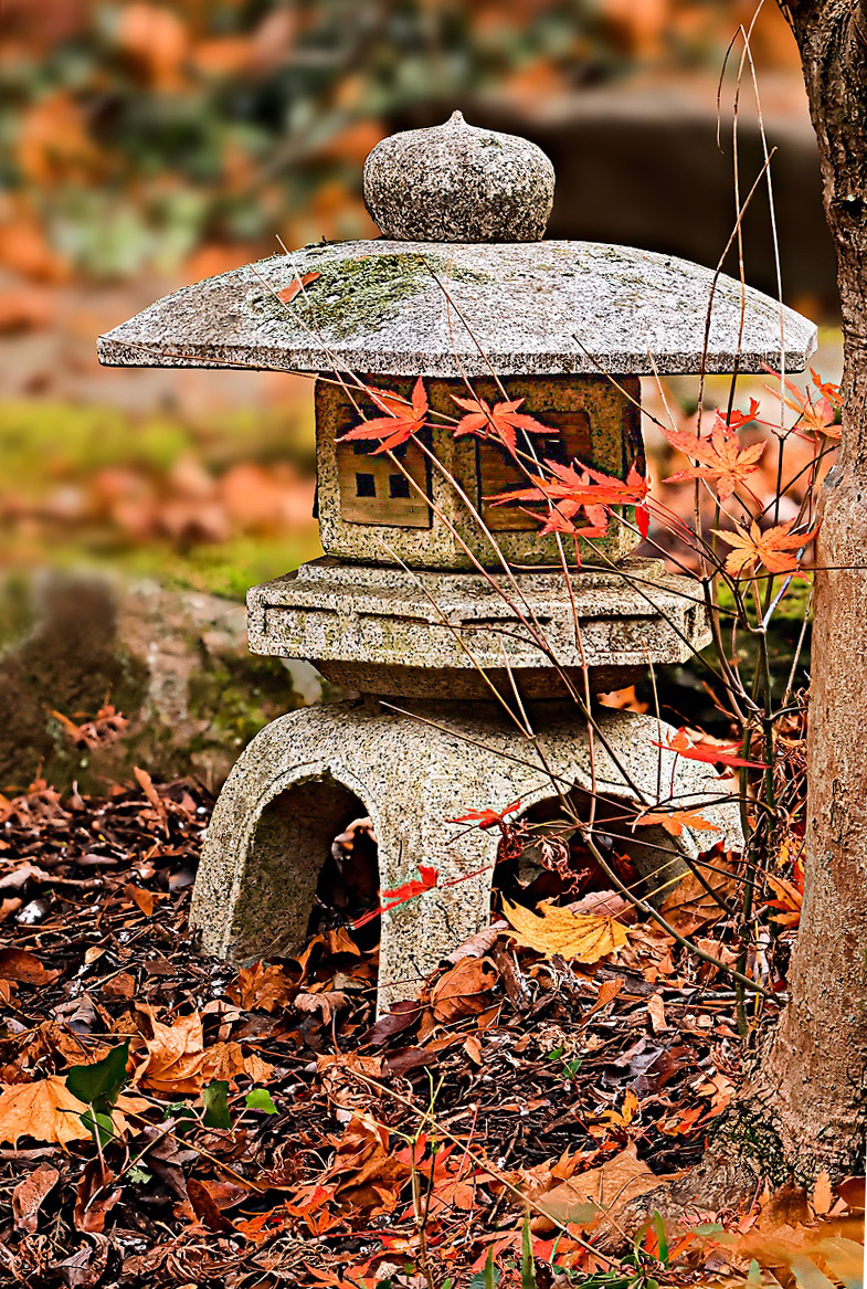
Robert, I really like your image. The composition is great as are the colors and blurred background. A few minor suggestions. It seems to me that the sculpture is tilting a little counter clockwise. And, I would like to see the area under to top part of the sculpture not to be so dark. In my revision I have included both suggestions. |
Feb 4th |
 |
| 78 |
Feb 24 |
Comment |
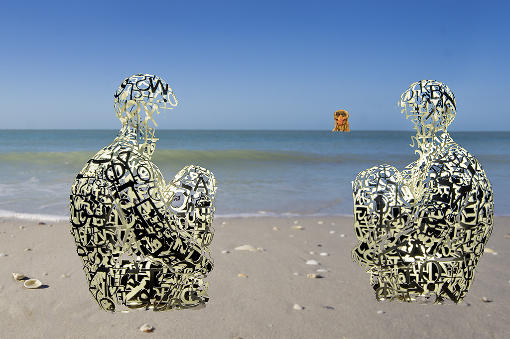
Mu, you image is an incredible creation. Great composition, great color, and great human interest - surely an award winner. I have no suggestions.
Your biography is very interesting - MS, PhD, teacher, oncology nursing and art therapy. My granddaughter graduated with honors with a major in art and is now working on a Master's degree with a dual major in art therapy and counseling.
I look forward to seeing more of your images.
|
Feb 4th |
| 78 |
Feb 24 |
Comment |
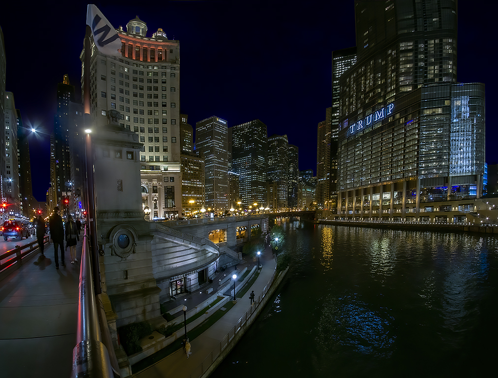
James, your image has 3 sections, vegetation, skyscrapers, and a bridge which, to me, do not fit together well in a cohesive image. I think a more interesting photo would have been if your photo was taken from the bridge and included part of the bridge, the observation deck, and the skyscrapers in the distance. And a plus would be if there were people on the deck. I do like the color of your final image as it is so much brighter than the original. |
Feb 4th |
| 78 |
Feb 24 |
Comment |
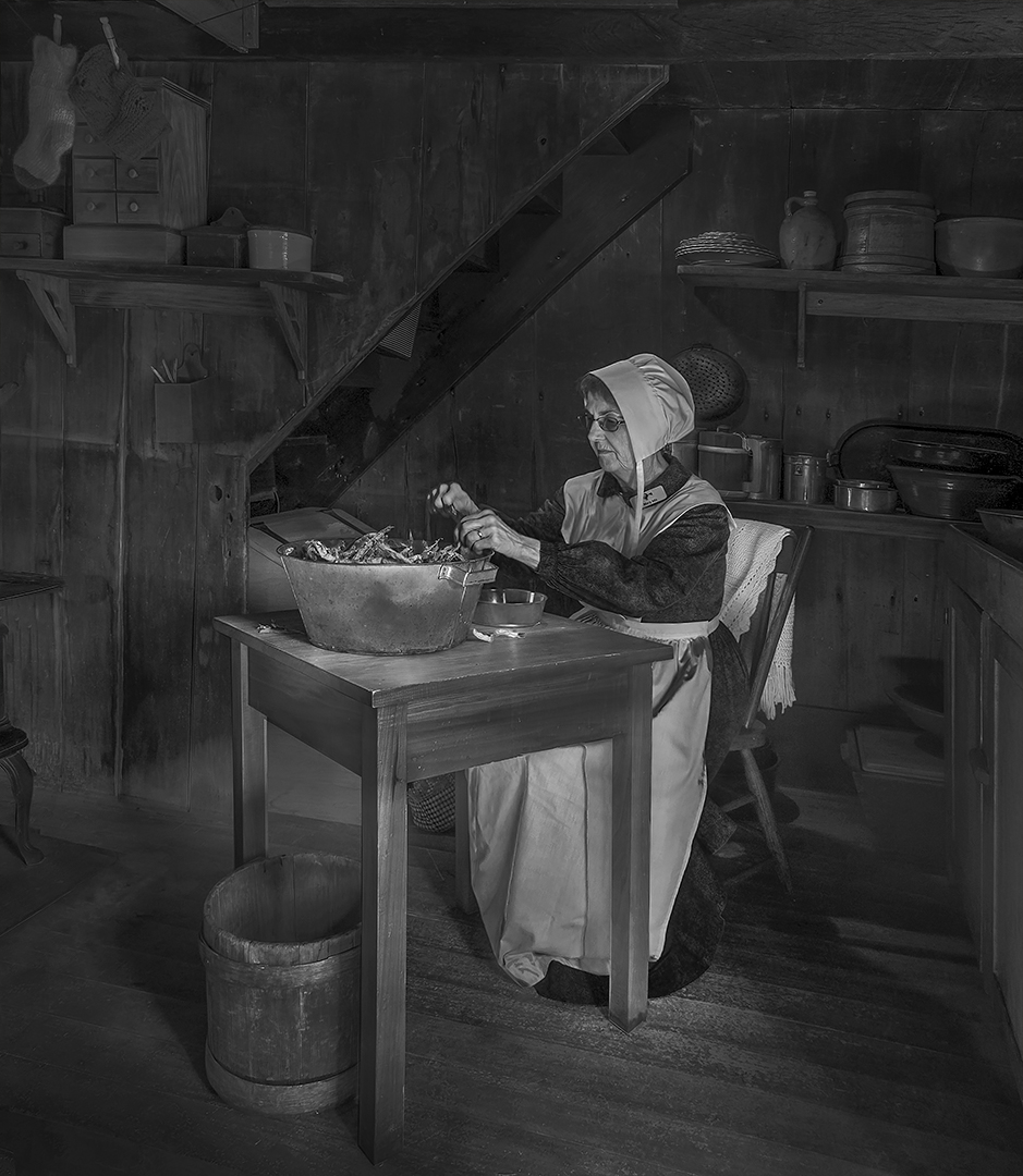
Wonderful image with great human interest. The mono version is so much better than the original especially with the two figures on the right being cloned out. I also like your range to tones from deep black to almost blown out white. I have no suggestions. |
Feb 4th |
| 78 |
Feb 24 |
Comment |
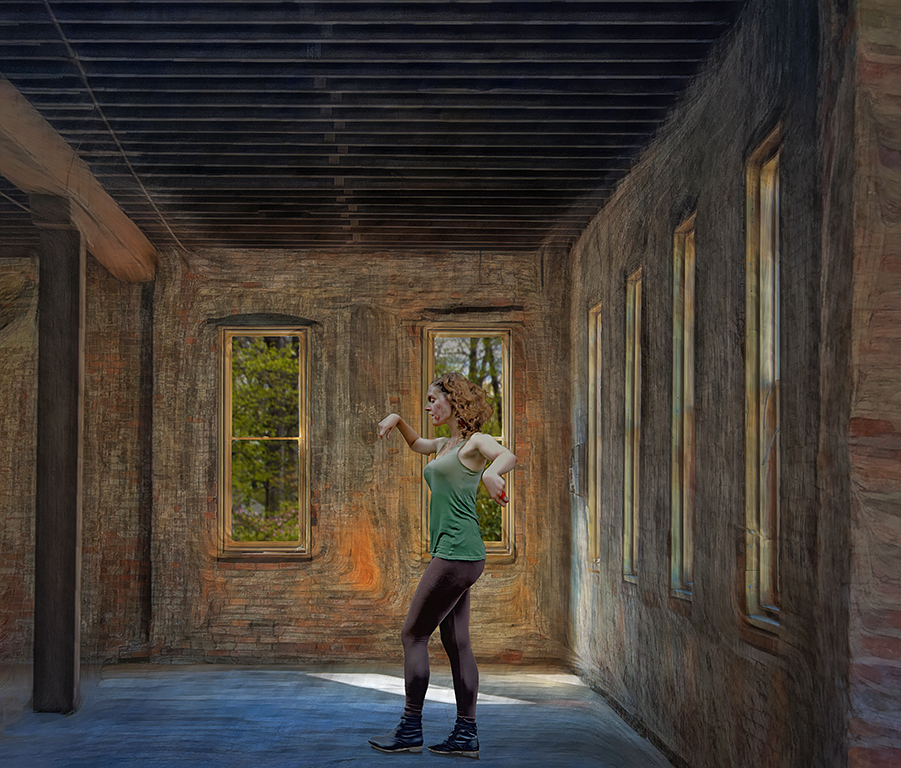
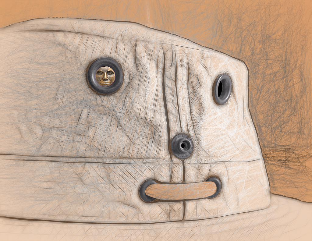
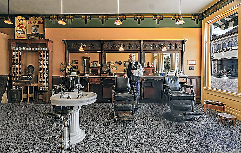
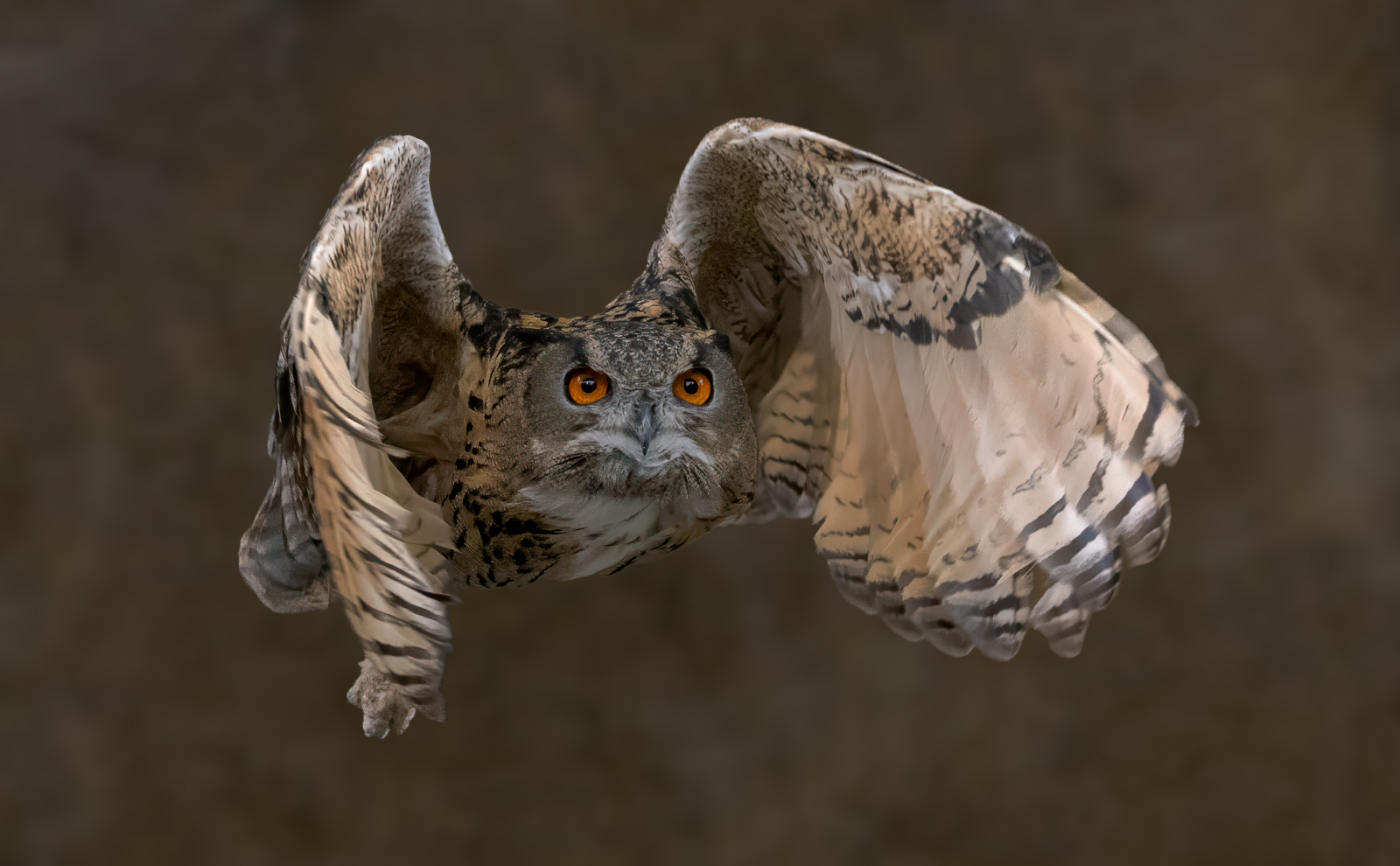
A great shot with an especially sharp and wonderful view of the face. And great composition. My minor suggestion is to slightly darken the owl, clone out the seam in the wall and then darken and blur the background. |
Feb 4th |
 |
| 78 |
Feb 24 |
Reply |
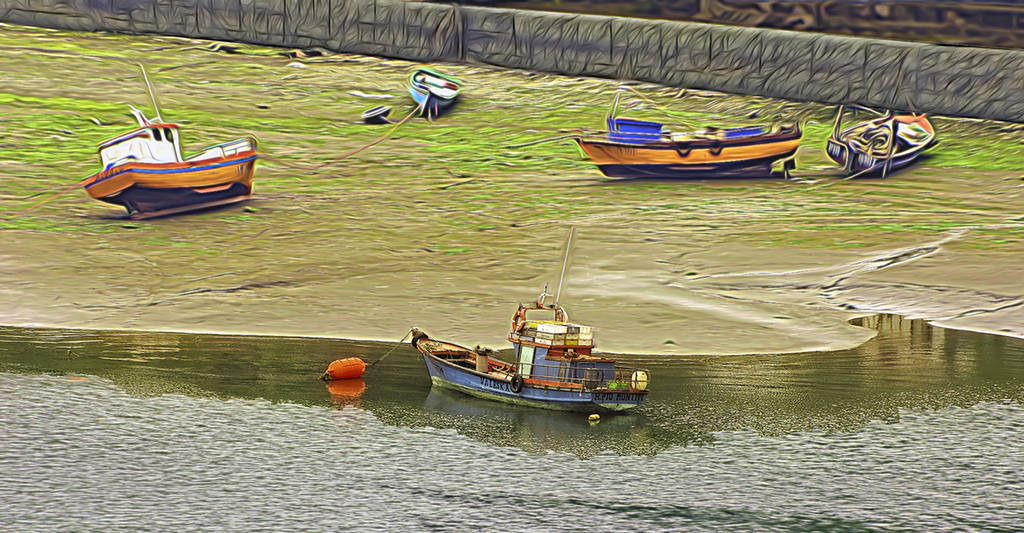
Brenda, thanks for your comments. I try to use just minimal sharpening but the floor does see especially sharp. I have tried stacking in landscape shots but do not like the flatness of the final image. I did not try it on this photo and can't now since I did not keep all 5 copies but I will keep that in mind for the future. I think the white sink is where the barber and client would go if they wanted to have their hair washed. The stencil isn't backward it just looks that way when viewed from the inside looking out. If you are standing in the street "Shave" reads left to right but when reading inside "Shave" is still on the same place on the glass but now reads backward. |
Feb 4th |
7 comments - 4 replies for Group 78
|
18 comments - 7 replies Total
|