|
| Group |
Round |
C/R |
Comment |
Date |
Image |
| 11 |
Jan 24 |
Comment |
Your original image is nicely composed but the mono version is even better. I especially like the way that you've darkened much of the image to feature the wheels. Although many may not like sepia I think it is great in this image. |
Jan 13th |
| 11 |
Jan 24 |
Reply |
Henry, you are right the fence does provide a nice base for the image. |
Jan 6th |
| 11 |
Jan 24 |
Comment |
A wonderful mono image, so much better than the original. A very minor suggestion would be to darken the sky slightly and also to crop a little off the bottom. |
Jan 6th |
 |
| 11 |
Jan 24 |
Comment |
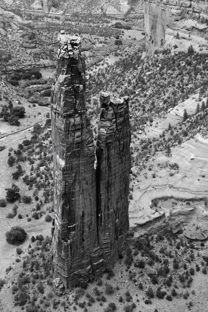
A very nice image with a nice conversion from the original and nice composition. A minor suggestion would be to increase the contrast of the monolith and slightly blur the background. I tried to do so without much success (perhaps because of the very small file size). |
Jan 6th |
 |
| 11 |
Jan 24 |
Comment |
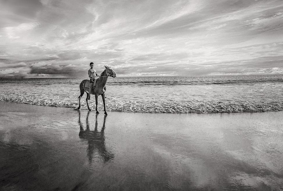
Wow! I really like both the color and mono images. Your numerous procedures have resulted in an great final result. However, let me make a suggestion. I feel the horse and rider should be more prominent. In my revision I cropped some off both the top and bottom so that the horse and rider are now in one of the golden mean power points. |
Jan 6th |
 |
| 11 |
Jan 24 |
Comment |
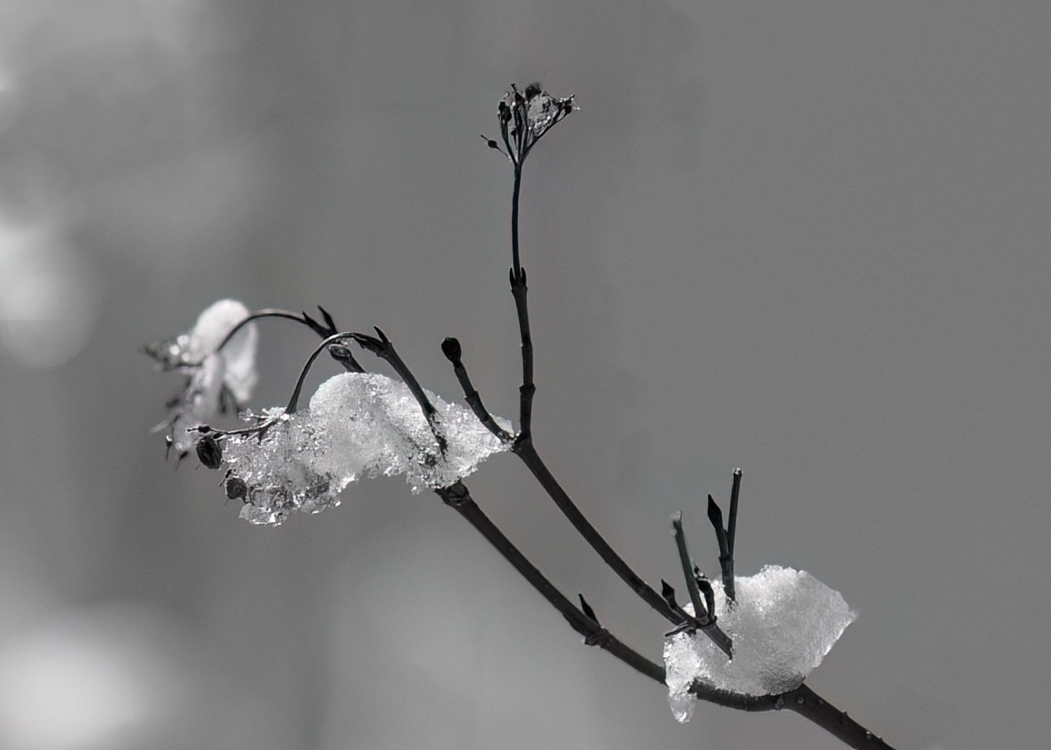
A very nice mono conversion from the original. Let me suggest that the very strong vertical limb in the background is a distraction from the very nice composition. In my revision I eliminated that limb as well as some of the other smaller limbs. I also cropped tighter and increased sharpness. |
Jan 6th |
 |
| 11 |
Jan 24 |
Comment |
The composition of the mono version is a great improvement over the original color image. The expression of the seal is also great. I have no suggestions. |
Jan 6th |
6 comments - 1 reply for Group 11
|
| 18 |
Jan 24 |
Reply |
Joan, I agree with your comment that my final image may look like an actual window. But I took a bland image, eliminated a distracting sticker, added more interest to the very dark windows added color to the walls and improved the composition. Aren't my procedures enough to make my final image creative? Maybe not, but do images have to look like a Picasso to be considered creative? Perhaps. If so, then let's define creative images are where the final creation looks like nothing that exists in reality. |
Jan 31st |
| 18 |
Jan 24 |
Reply |
I agree that the cooler background does make the dulcimer more apparent. |
Jan 13th |
| 18 |
Jan 24 |
Comment |
The original is a nice snapshot. I like the final revision as the small distracting elements are eliminated. I have no suggestions. |
Jan 13th |
| 18 |
Jan 24 |
Comment |
A very interesting and creative image. But, to me there does not seem to be a focal point of interest. I don't know what to suggest. |
Jan 6th |
| 18 |
Jan 24 |
Comment |
What a wonderful creation. Placement of the dulcimer is perfect and darkening the music with another layer is also great. I have no suggestions. |
Jan 6th |
| 18 |
Jan 24 |
Comment |
Wow, what a striking image. I have no suggestions. |
Jan 6th |
| 18 |
Jan 24 |
Comment |
A very nice image and a wonderful conversion from the original. I would not have thought of changing the trash containers from green to red but the red does look so much better. My only suggestion would be to darken the white items in the bottom left area and also the background alley. |
Jan 6th |
5 comments - 2 replies for Group 18
|
11 comments - 3 replies Total
|