|
| Group |
Round |
C/R |
Comment |
Date |
Image |
| 11 |
Nov 23 |
Reply |
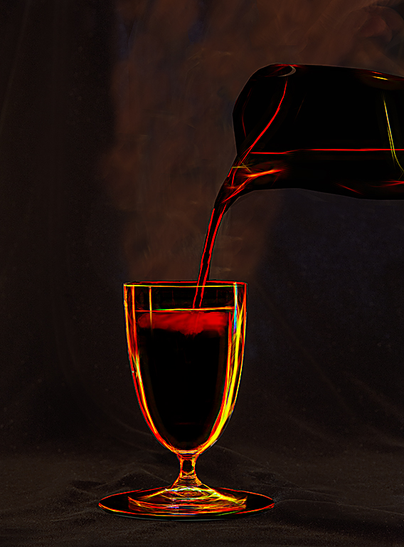
Very nice alternative.
|
Nov 21st |
| 11 |
Nov 23 |
Reply |
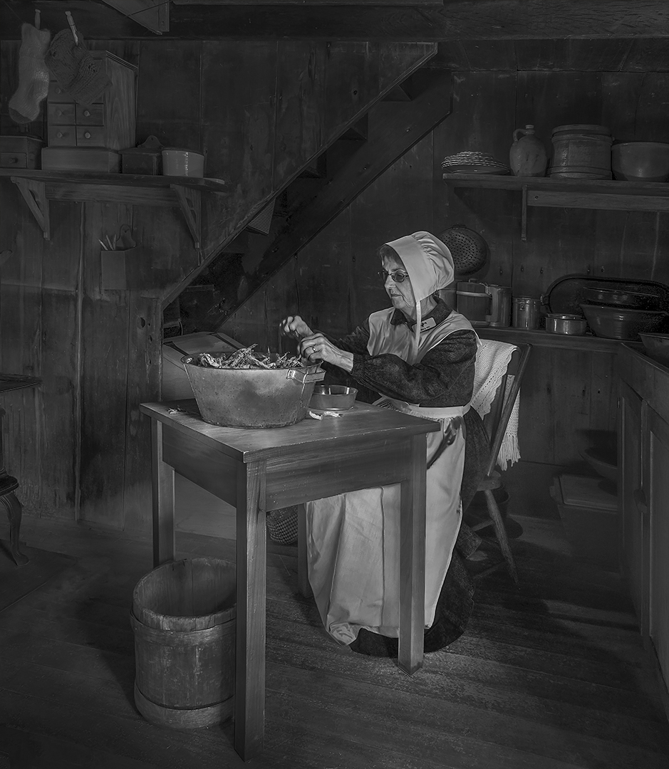
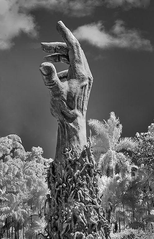
I have found that tinted images do not do as well in competitions as do straight mono versions. I don't know why. So, crop some off the right side and select just the sky and darken it. Then submit it again in competition. I think it is a great image. |
Nov 17th |
| 11 |
Nov 23 |
Reply |
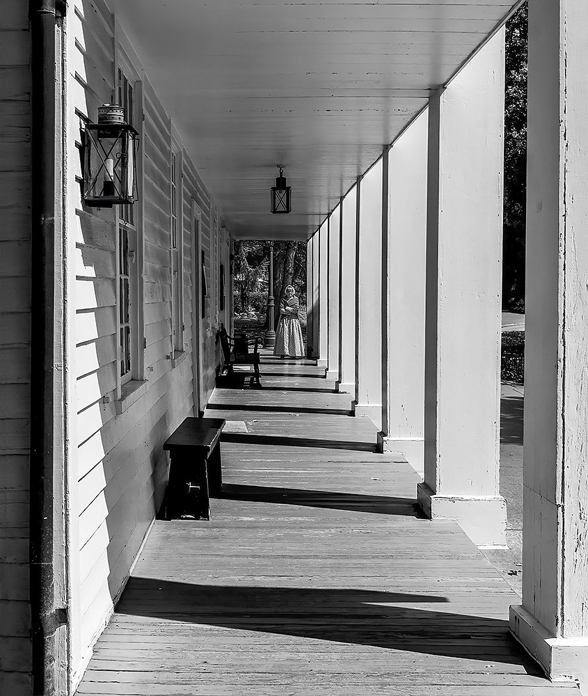
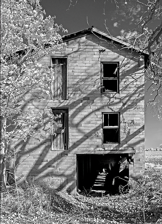
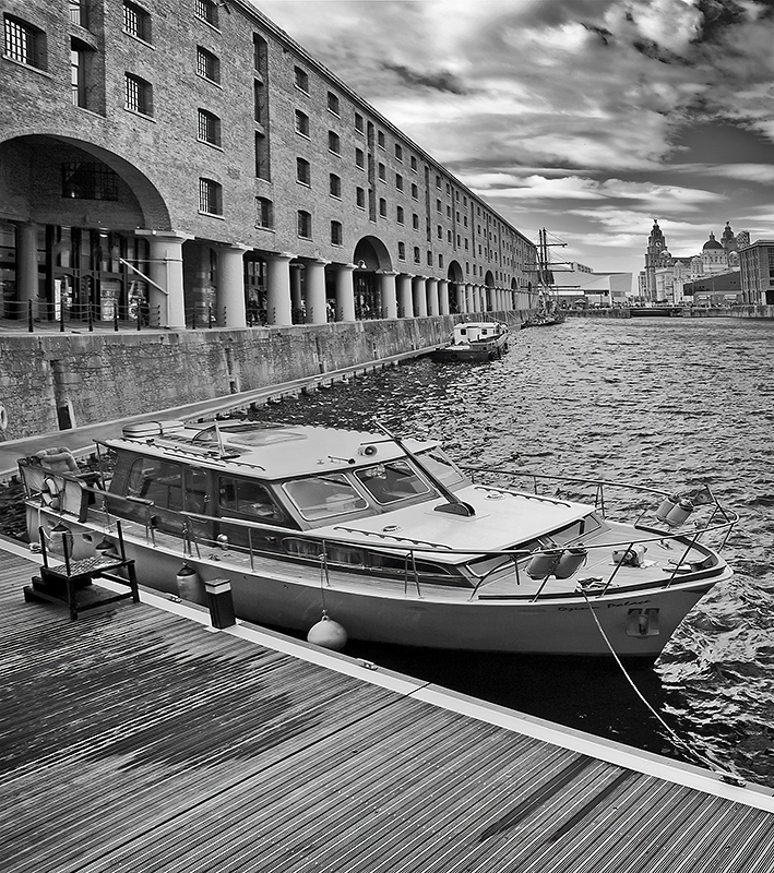
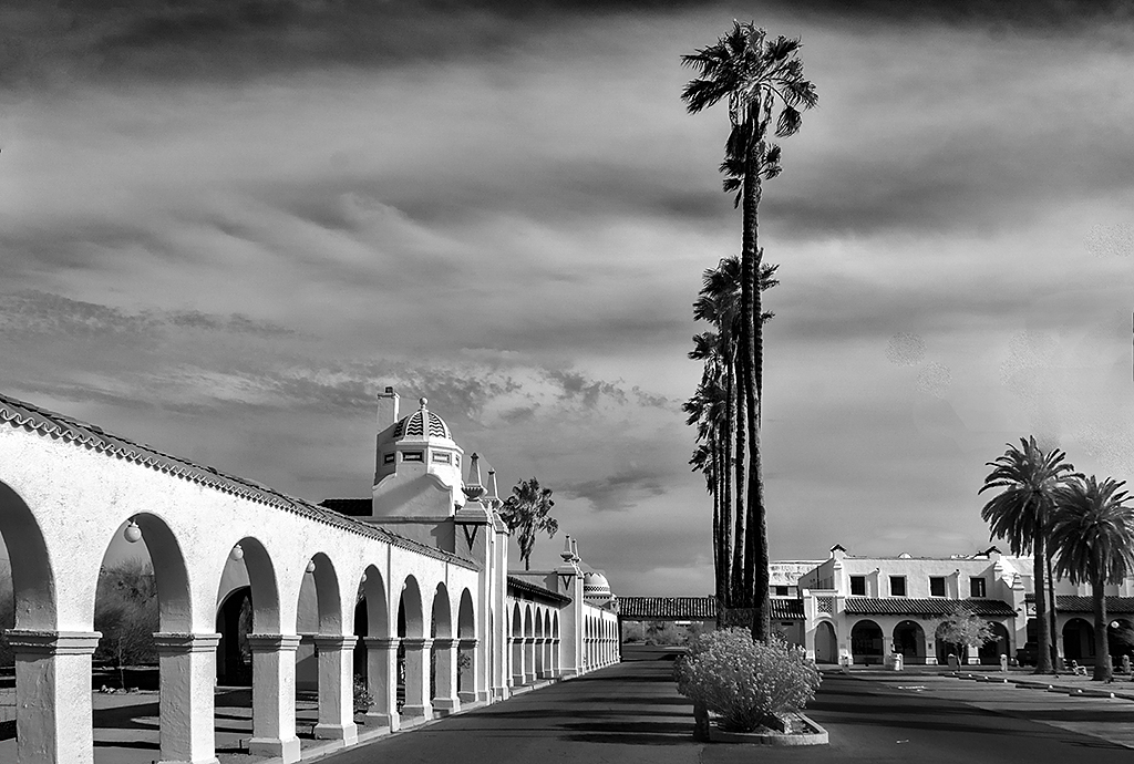
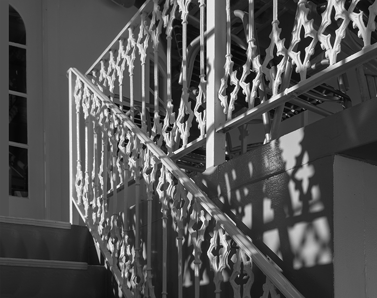
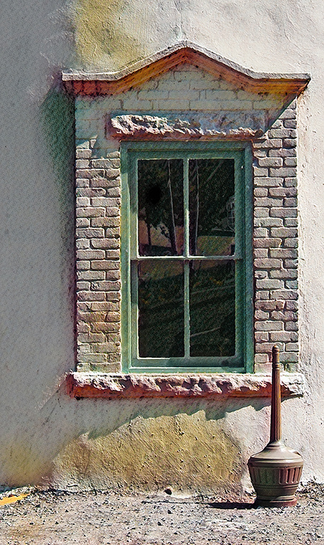
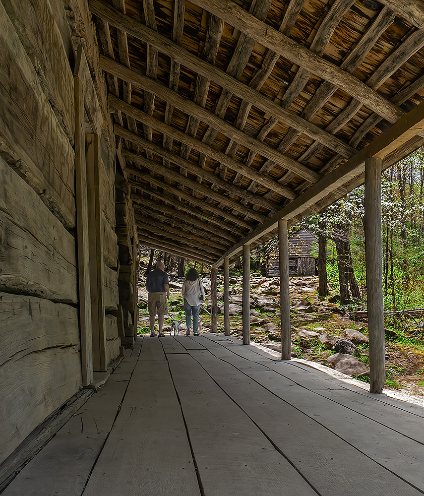
When I look at both your color original and your mono version my eye is drawn to the large tree on the right side of the image. To me the most interesting part of your image is the entrance and it should be the main feature of the image. But, the large mass of foliage on the right side does not complement the entrance. It is a distraction. Notice that how your image becomes much more interesting by cropping out some (but not all) of the foliage. And, I like the portion of the building on the left side as it also compliments the entrance. Your eye now moves around the entire image instead of being drawn to the right side. I would not crop anything else as I think the cropped image is now wonderful. |
Nov 17th |
| 11 |
Nov 23 |
Comment |
I like your image. The mono version is much more interesting that the original. But, I feel, the background is a distraction from the subject so in my revision I reduced the contrast of the background and also blurred it. |
Nov 17th |
 |
| 11 |
Nov 23 |
Comment |
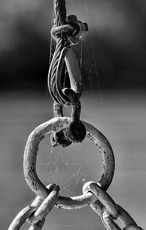
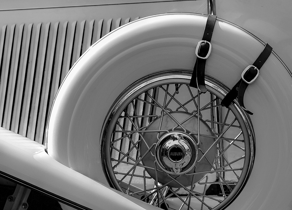
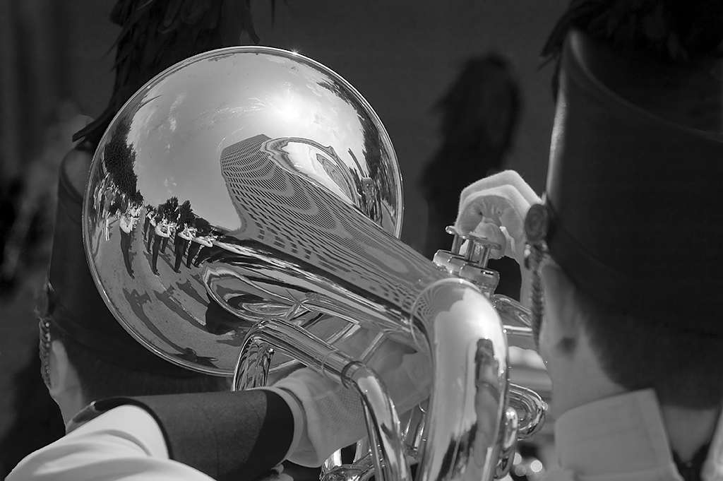
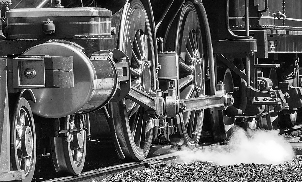
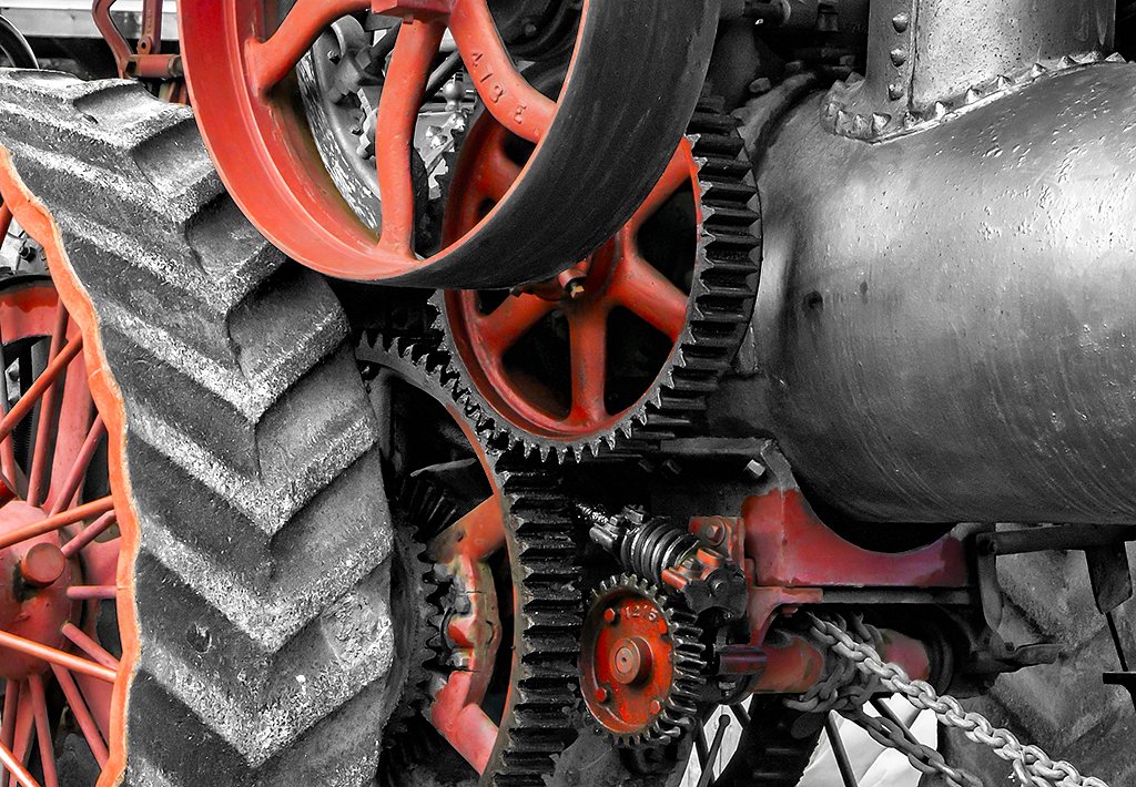
You are right the chain is incongruous with the rest of the gears but I left it in the image as I felt the chain was a very nice leading line. And, I think the chain balanced the composition because without it there would have been a black empty space in that area. |
Nov 17th |
| 11 |
Nov 23 |
Reply |
Henry, you are right the spokes of the back gear should have been in the image. |
Nov 17th |
| 11 |
Nov 23 |
Reply |
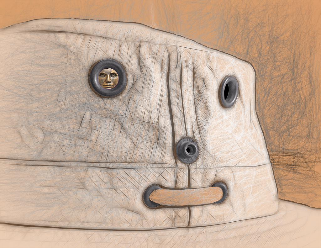
When I look at an image, I try decide what is the subject, that is the main feature. Then, I think, everything in the image should complement the main feature. To me the subject of the grill is the grill itself so my suggested revision focused on just the grill. I removed the grill in the background because it was a distraction from the main feature. |
Nov 17th |
| 11 |
Nov 23 |
Comment |
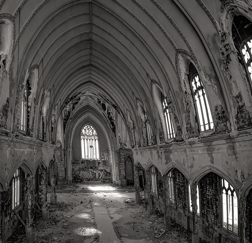
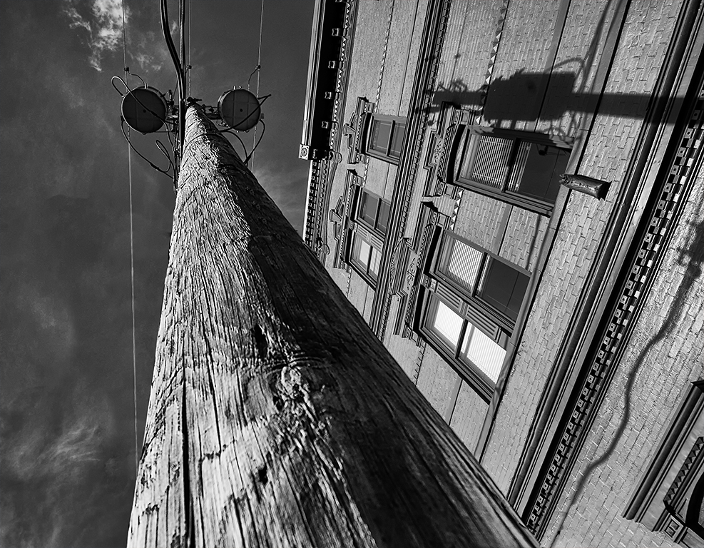
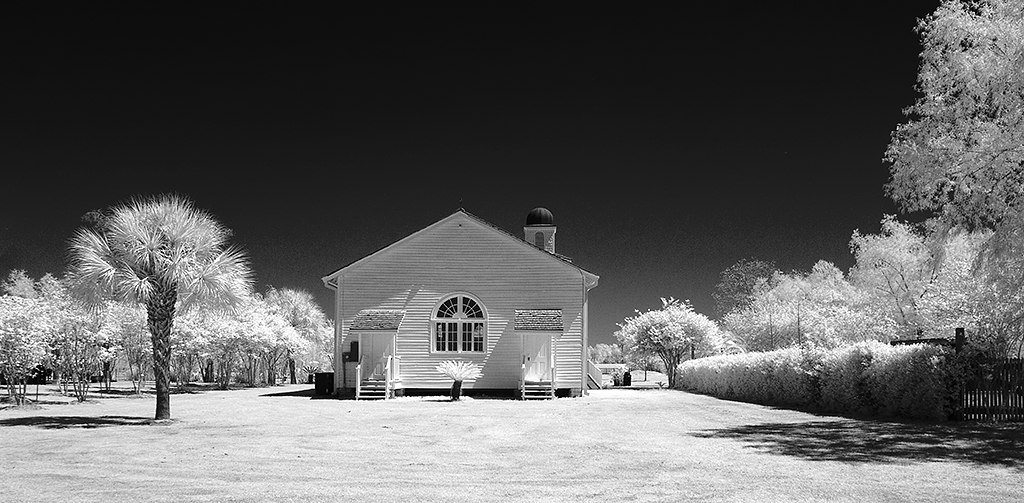
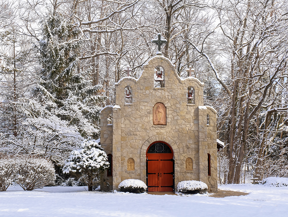
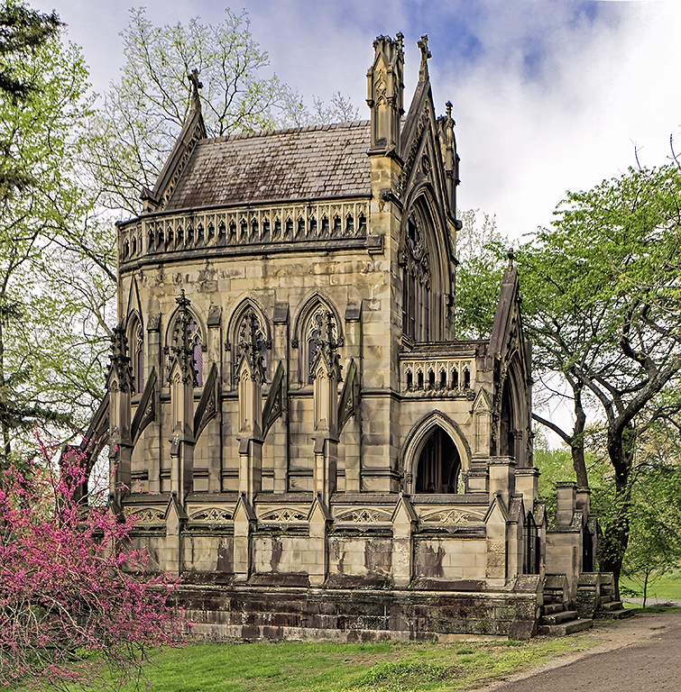
Many thanks for the interesting write up.
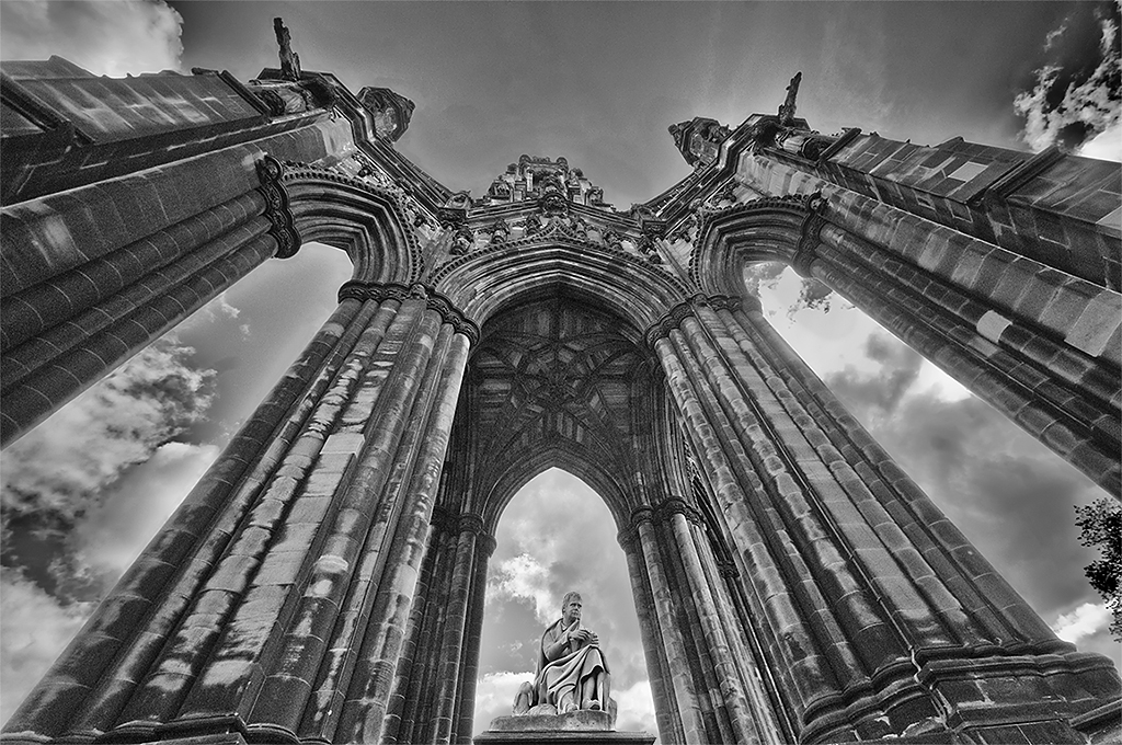
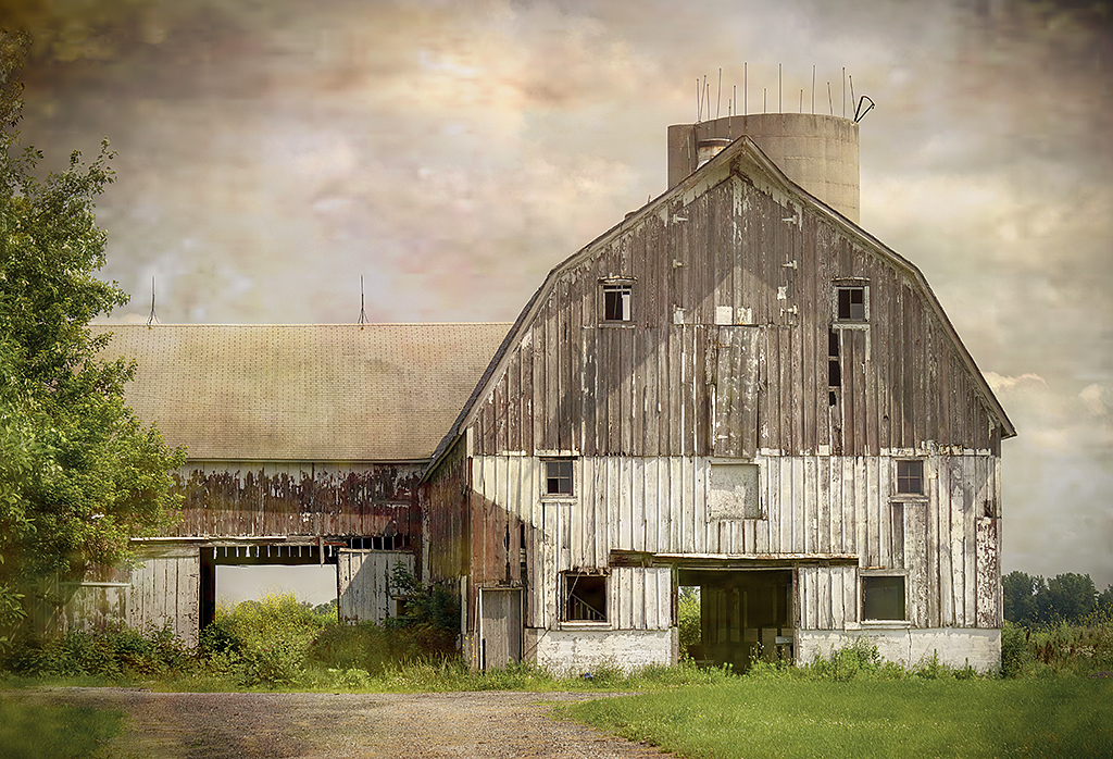
Very nice image and conversion from the original. It seems to me that the walls are sloping inward. I do not know if the walls really do slope but I assumed that the sloping is because the church was photographed with a wide angle lens. So, in my revision I straightened the angles, increased the contrast and darkened the sky slightly.
|
Nov 8th |
 |
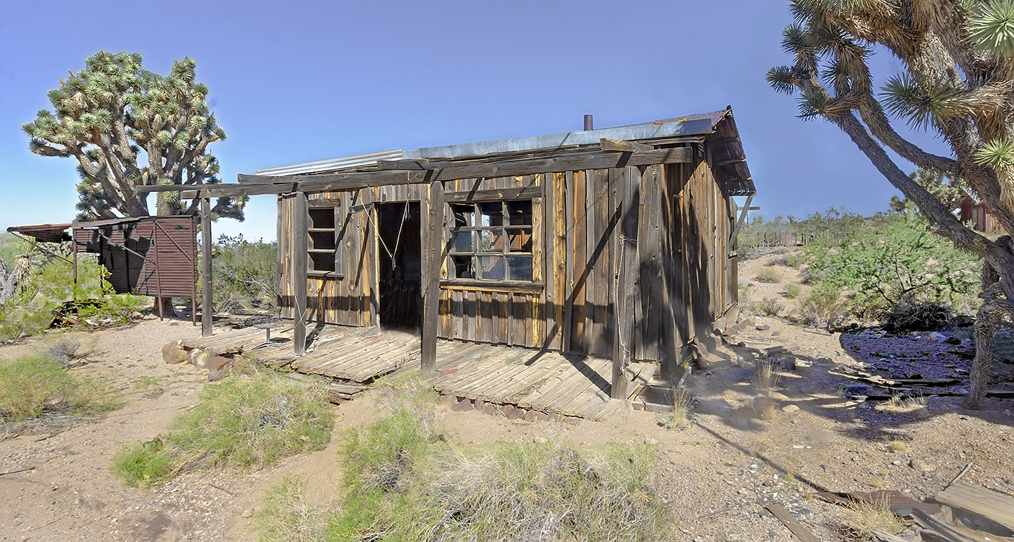
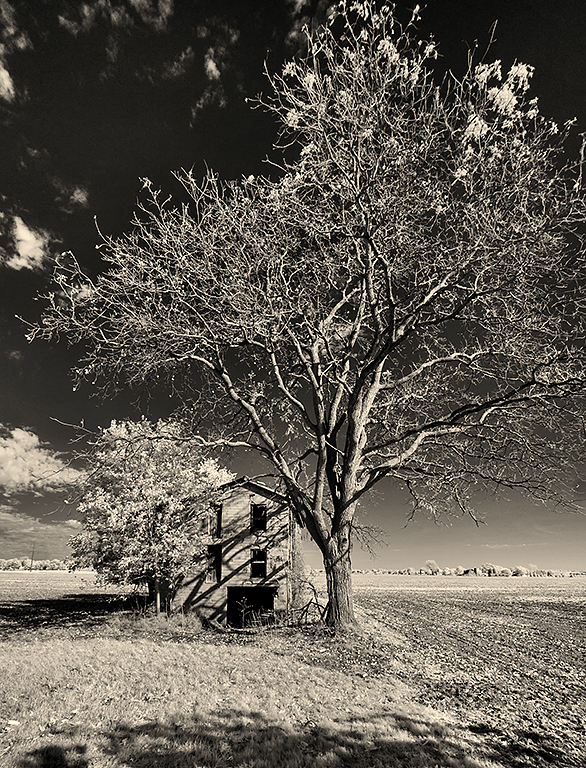
| 11 |
Nov 23 |
Comment |
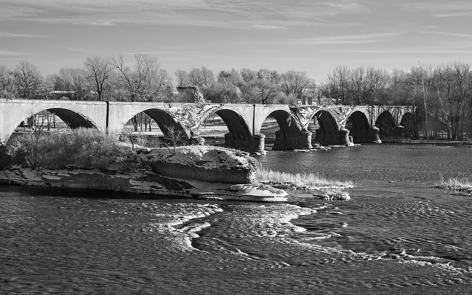
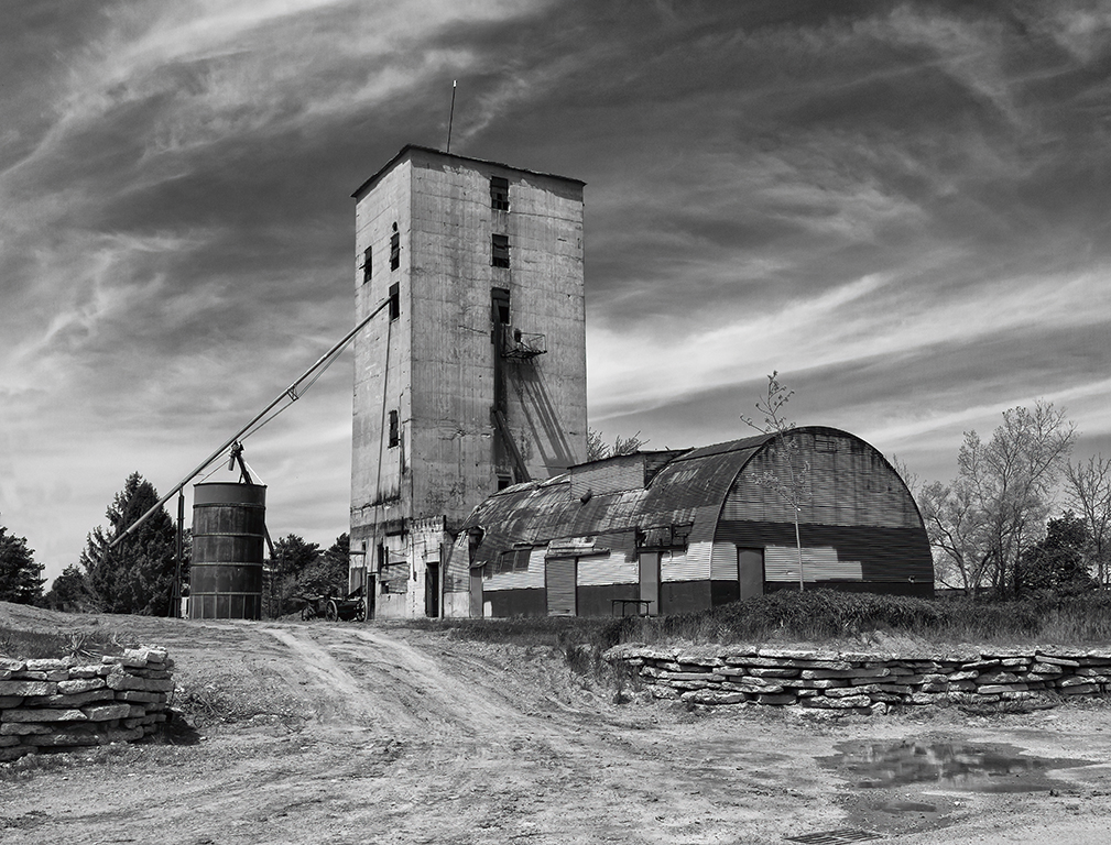
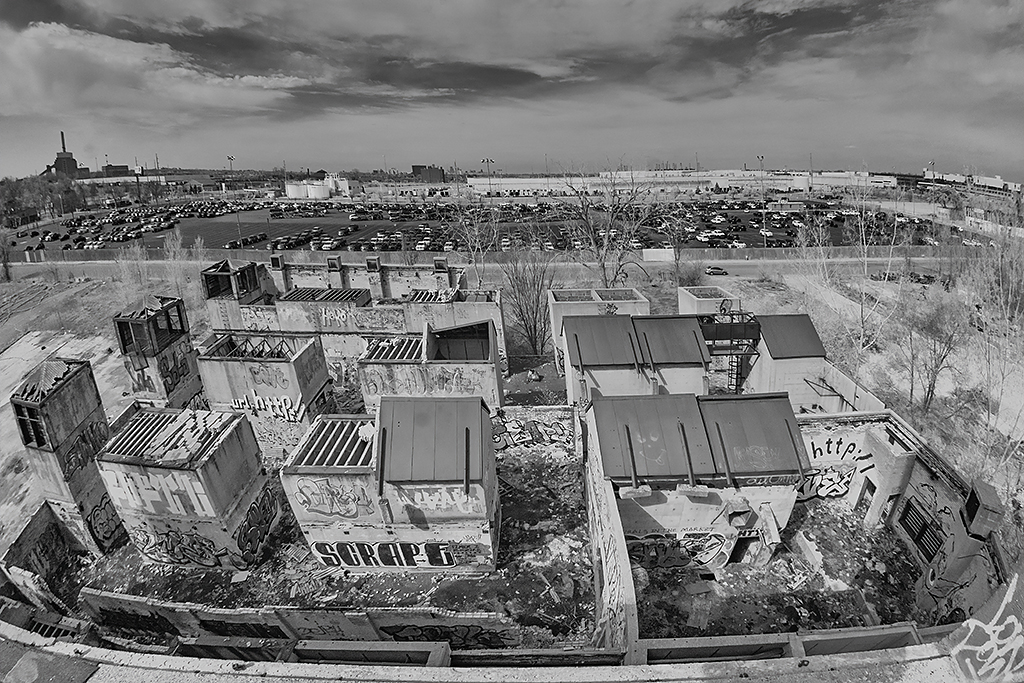
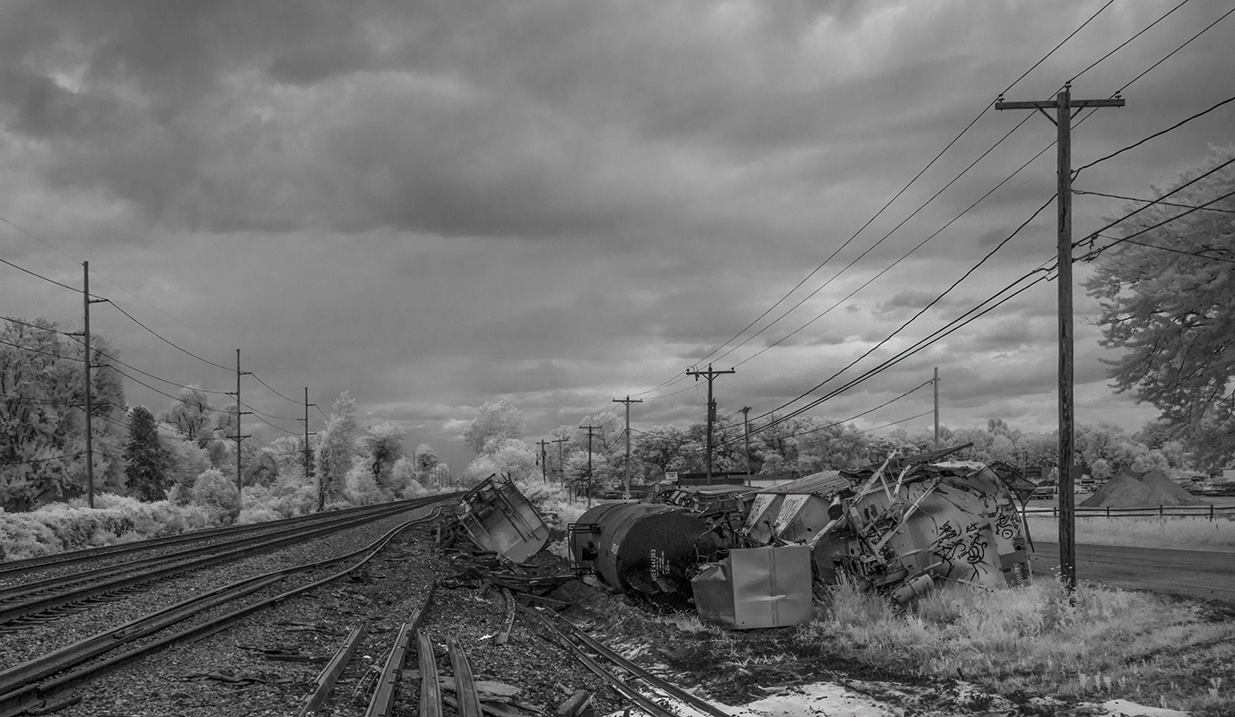
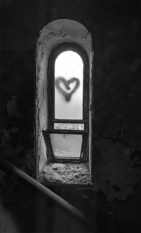
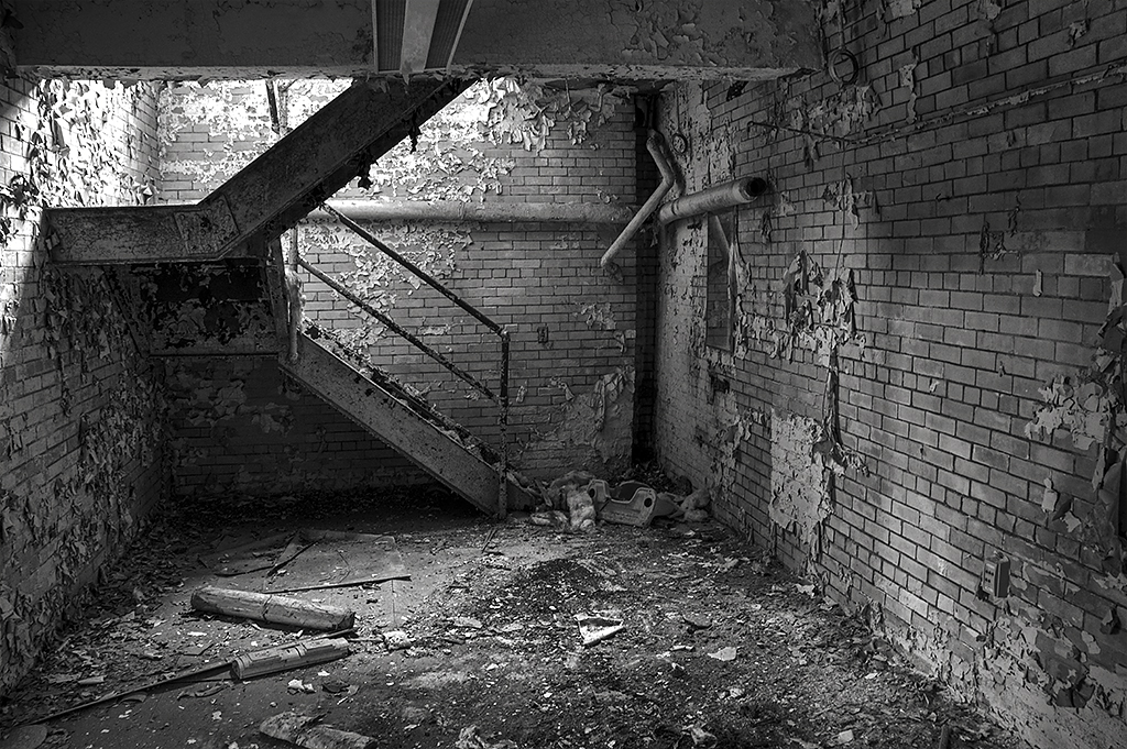
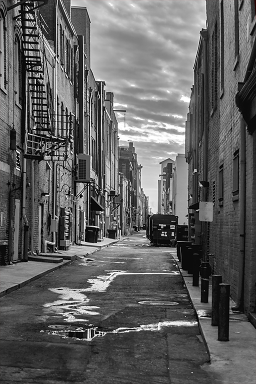
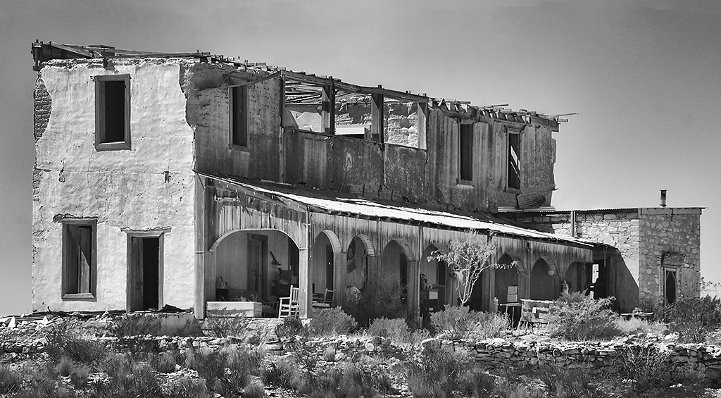
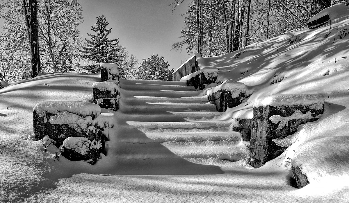
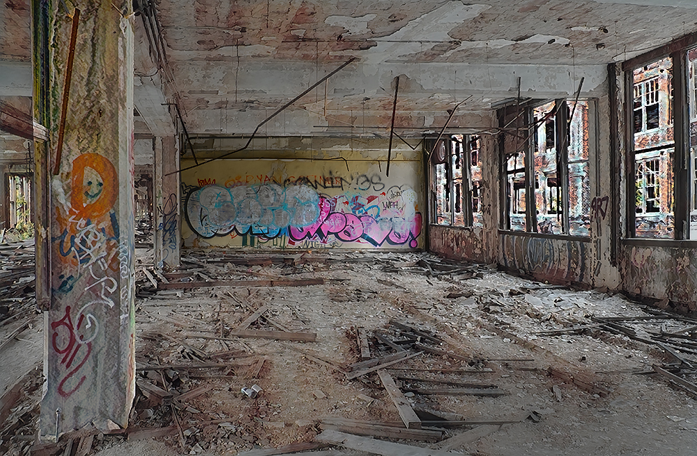
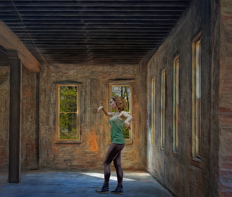
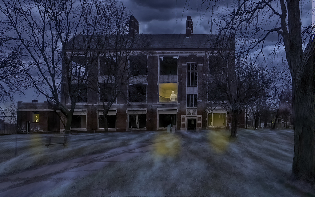
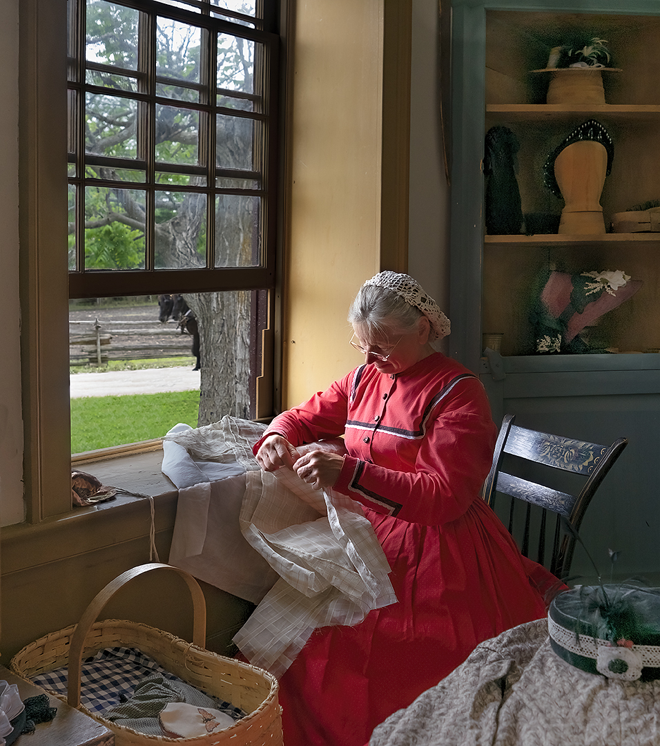
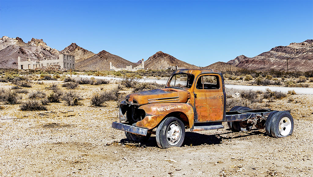
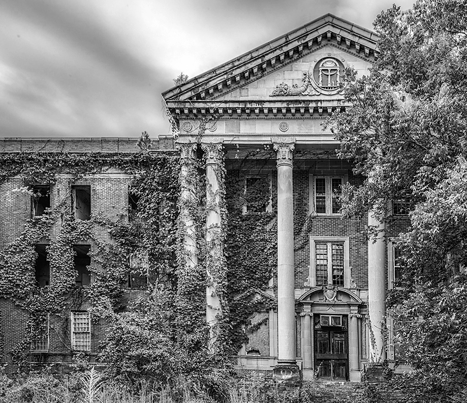
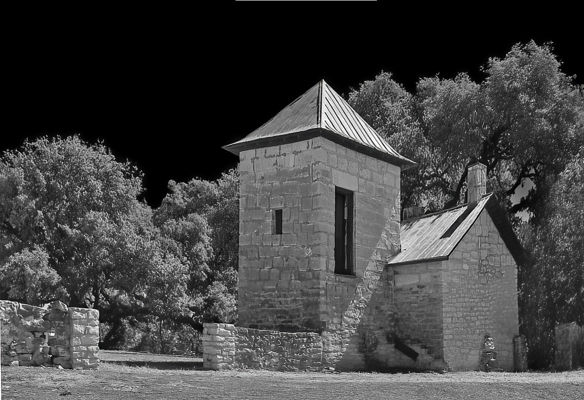
I like this image a lot - both the original color version as well as the mono. You can see immediately that the building has been abandoned. In my revision I cropped some off the right side to improve the composition by focusing more attention to the entrance. I also straightened some of the angles and increased the contrast. Somehow in my revision I converted the image to just black and white but I think the original sepia tone might have been better. |
Nov 8th |
 |
| 11 |
Nov 23 |
Comment |
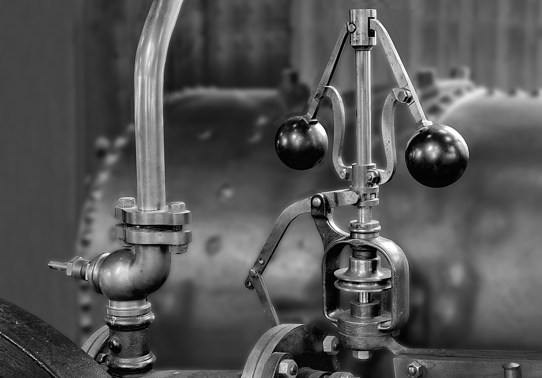
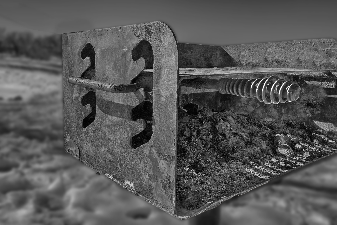
I like the conversion to mono from the original color image. But, in my opinion the problem with the image is that there are many items in the background that detract from the image of the grill. So, in my revision I deleted the grill in the background. And, I darkened the snow and then blurred the entire background. I also brightened the ashes in the grill as well as the coil.
|
Nov 8th |
 |
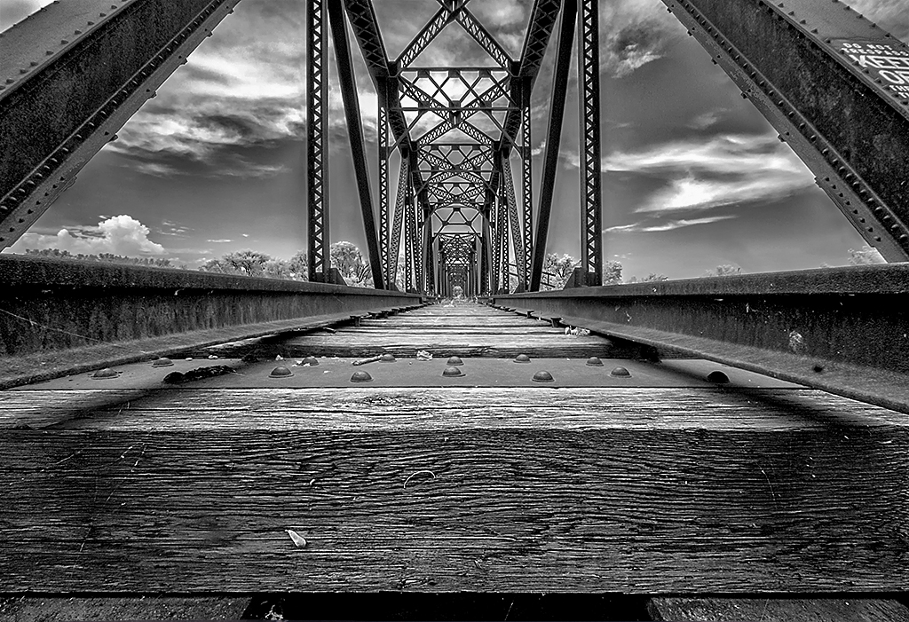
| 11 |
Nov 23 |
Comment |
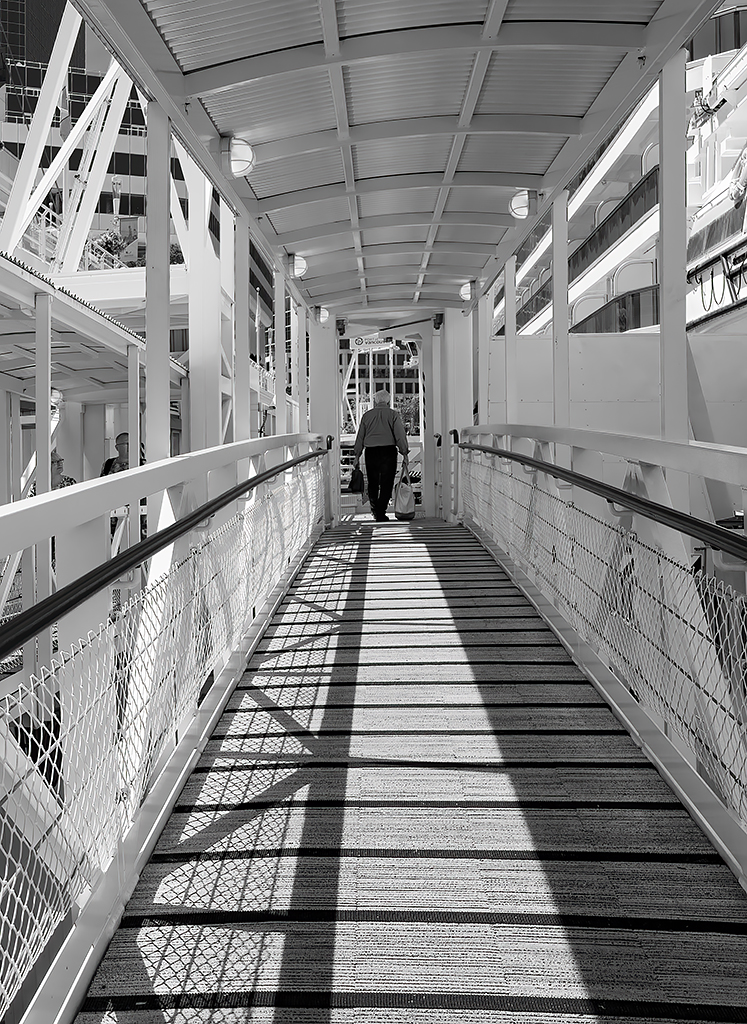
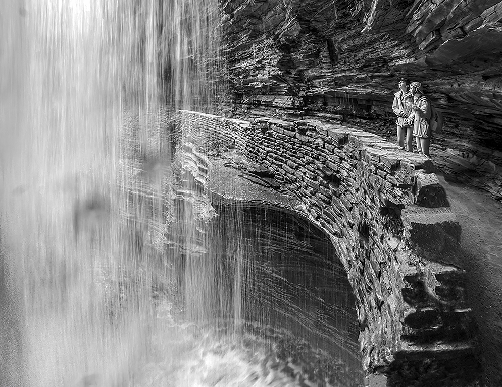
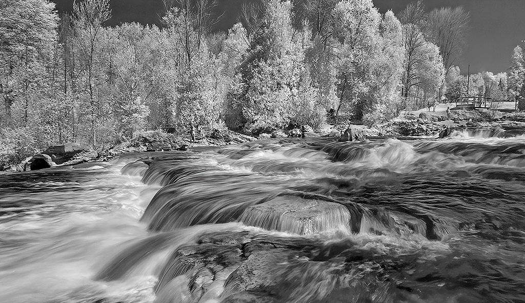
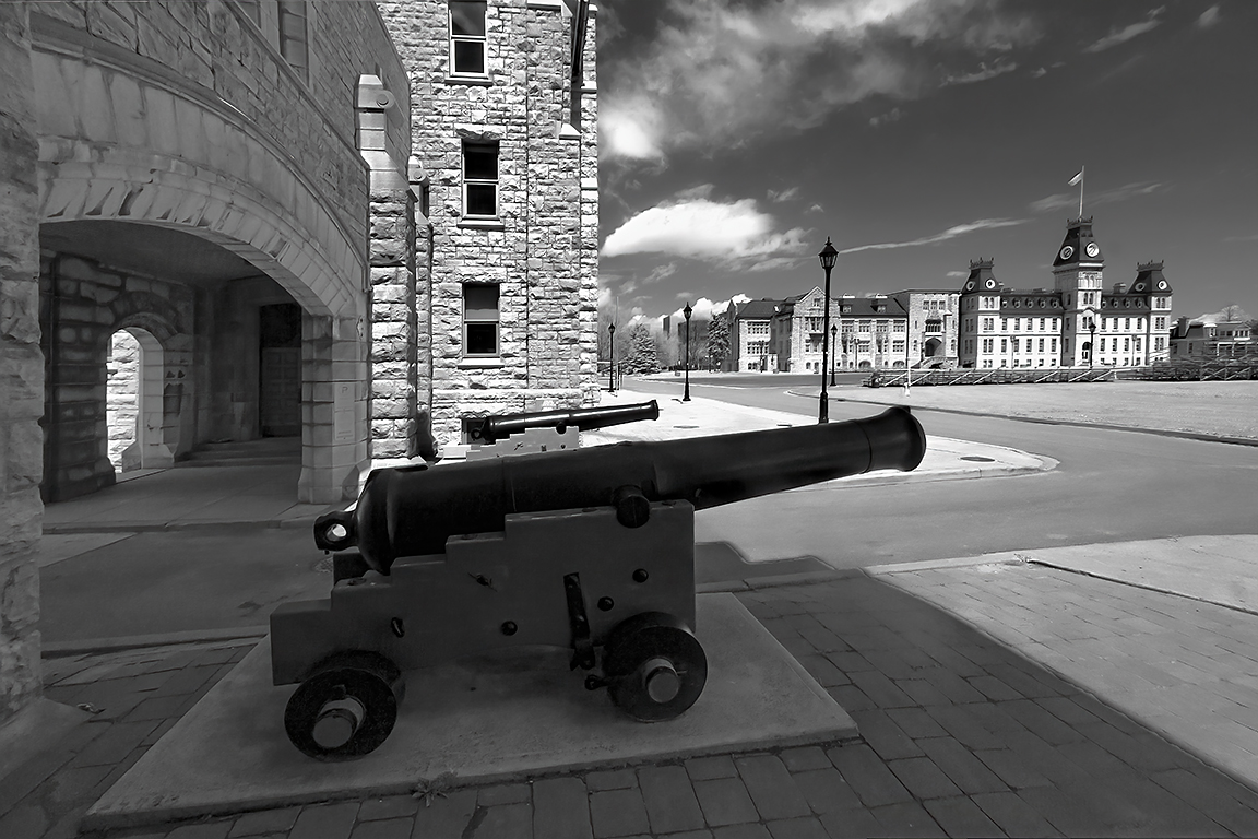
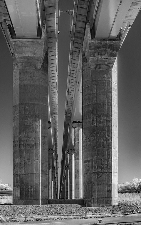
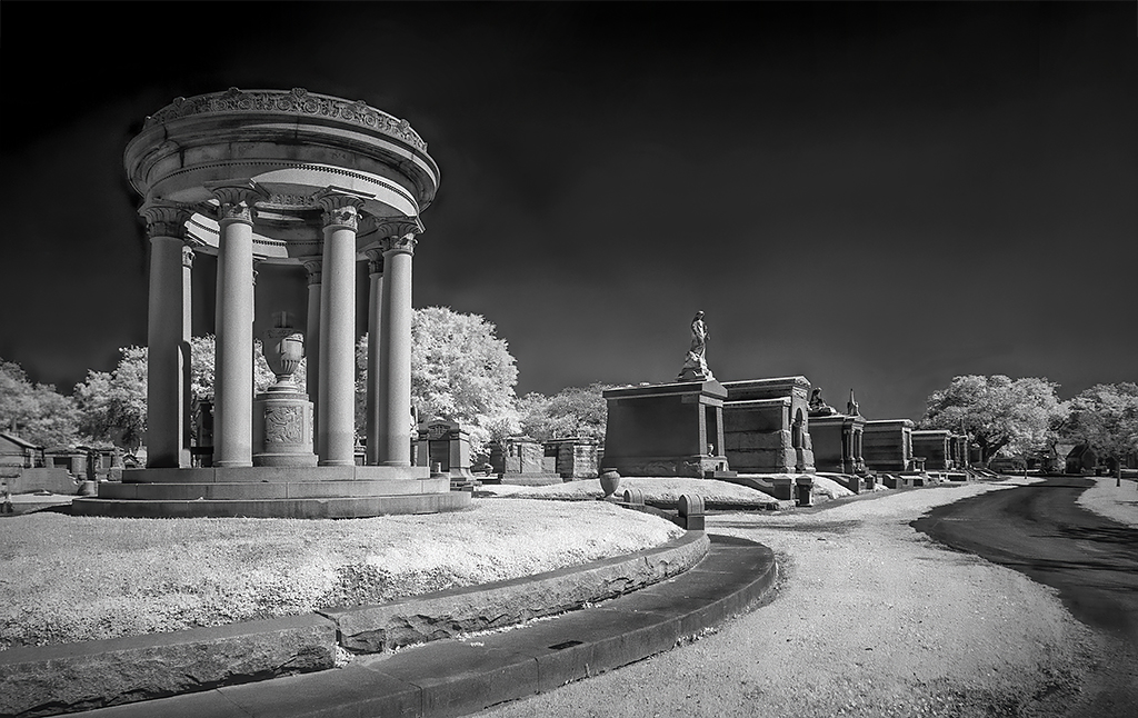
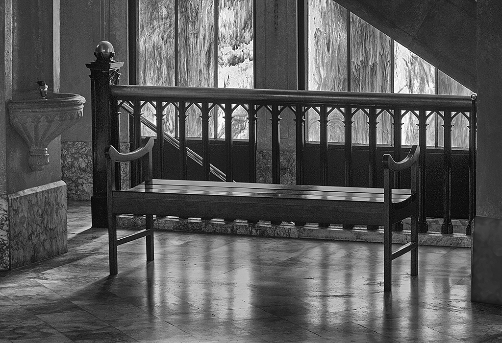
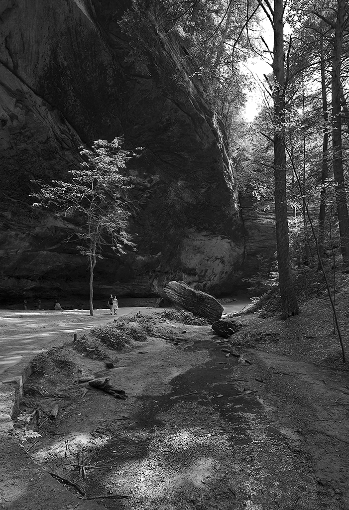
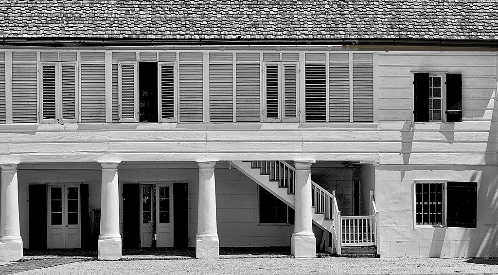
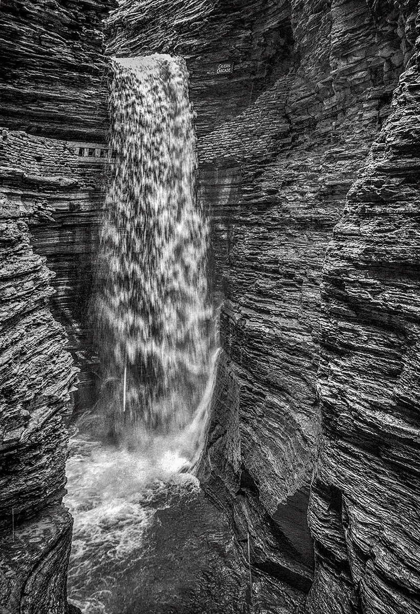
A wonderful image, so much more interesting than the original. I love all the converging lines. Great composition. I have no suggestions. |
Nov 8th |
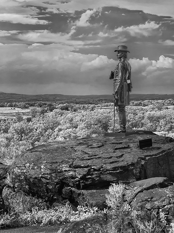
| 11 |
Nov 23 |
Comment |
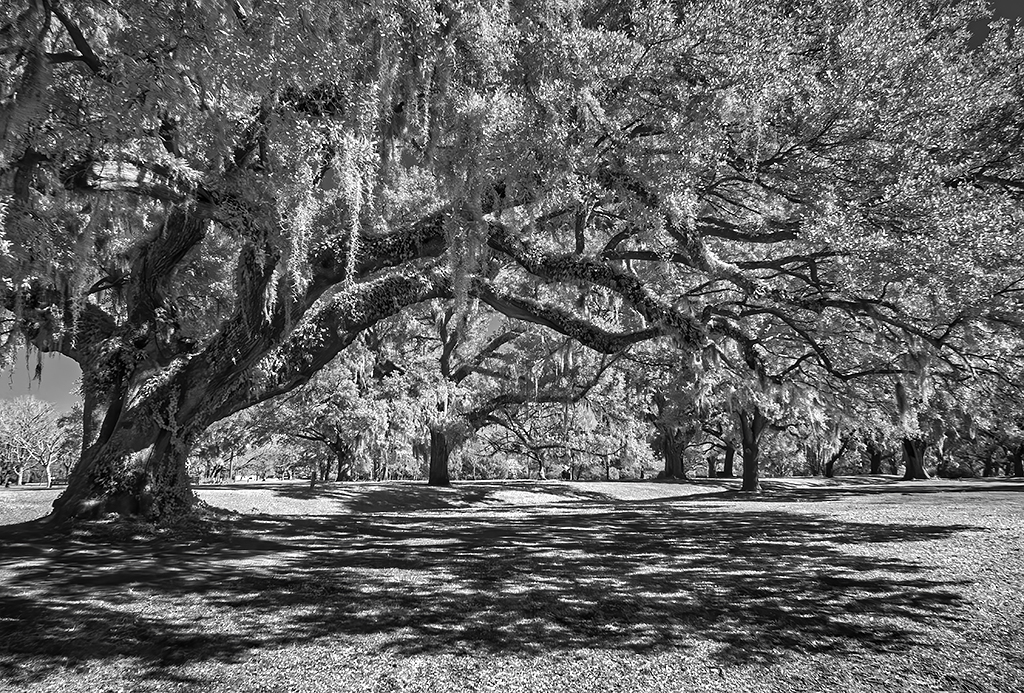
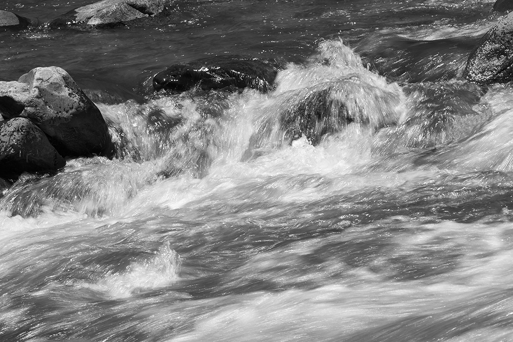
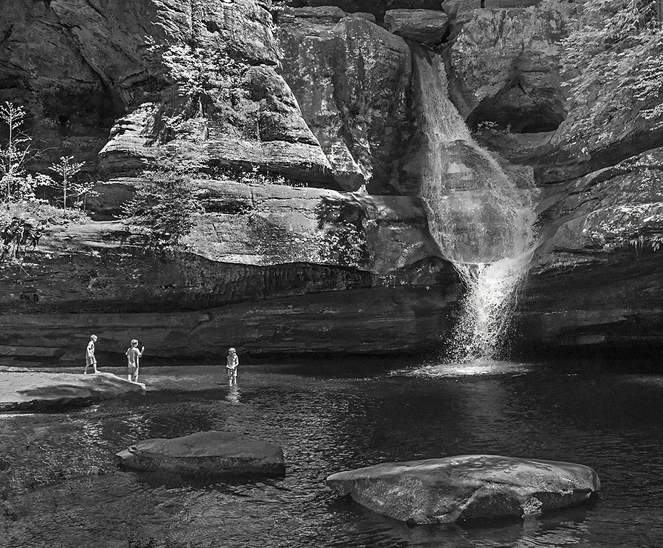
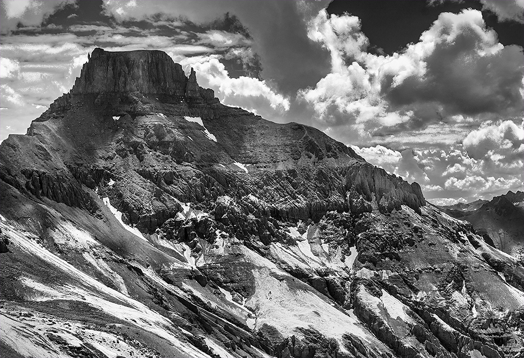
A wonderful image. Great composition with the tree at one of the power points. Great conversion from the original color image. A minor suggestion would be to considers lightly reducing the darkness of the rocks. |
Nov 8th |
 |
7 comments - 5 replies for Group 11
|
| 18 |
Nov 23 |
Reply |
Ian, thank you for your reply. Photography is an art form. And I am glad that in a study group we can agree that we can disagree. |
Nov 18th |
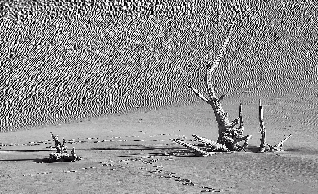
| 18 |
Nov 23 |
Comment |
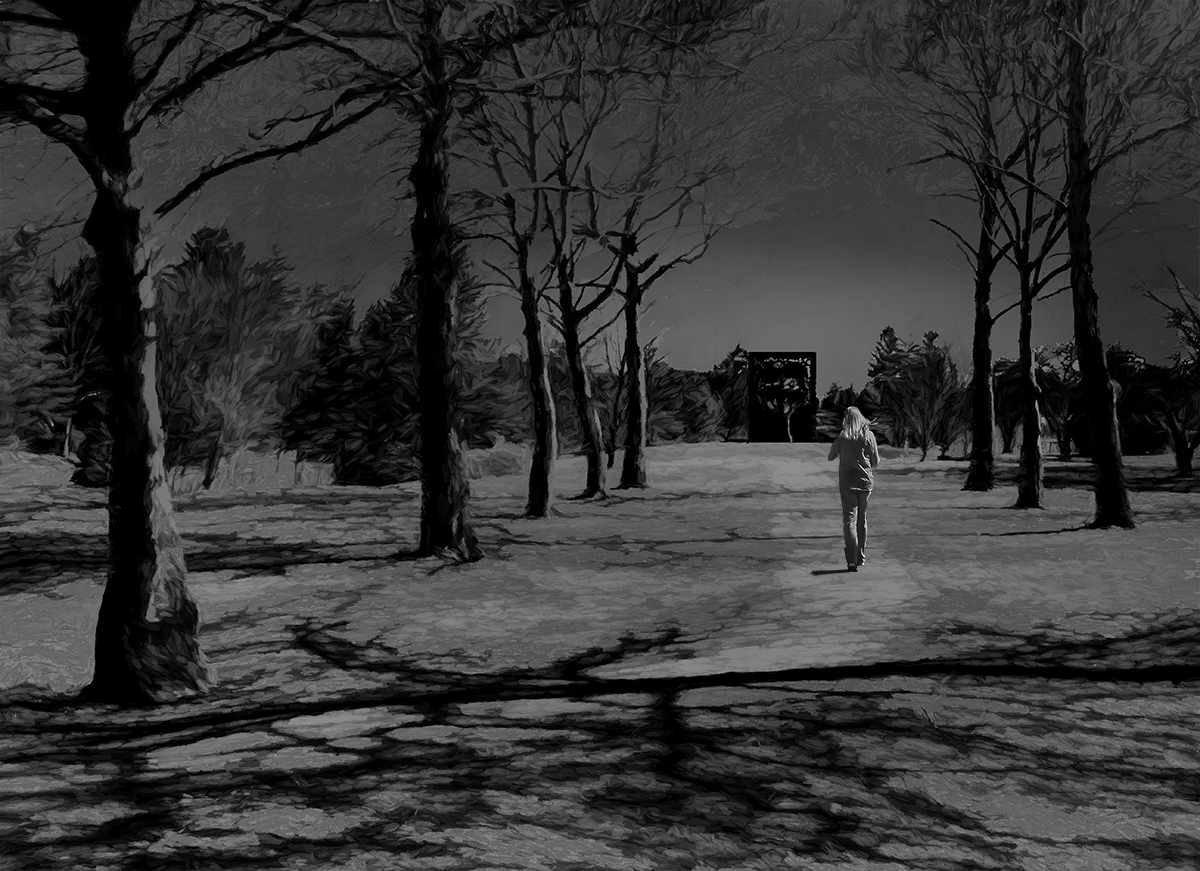
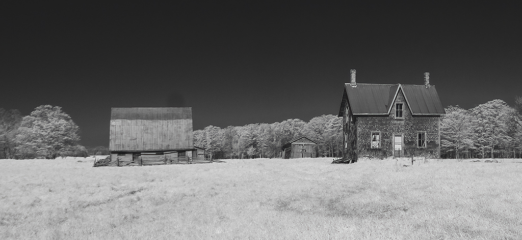
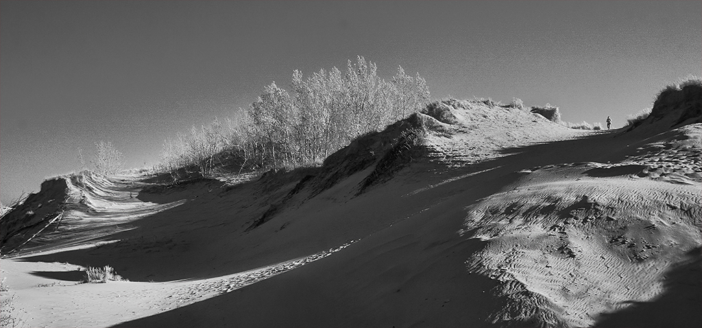
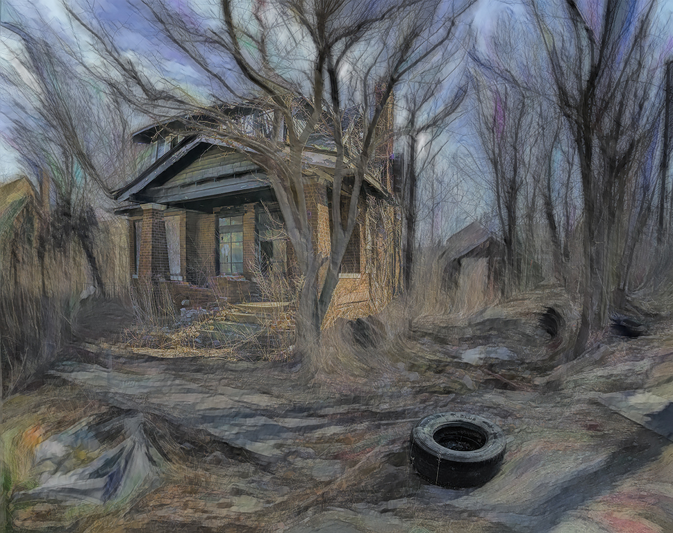
I think your image captures the sense of loneliness quite well. I have no suggestions. |
Nov 17th |
| 18 |
Nov 23 |
Comment |
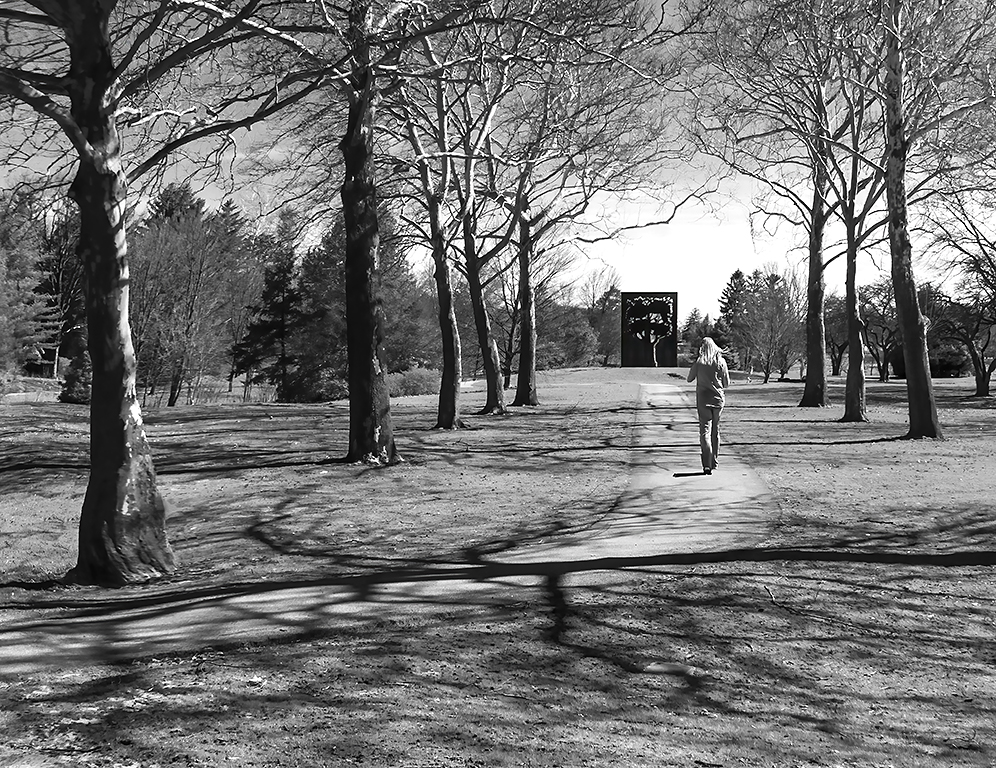
I think your image is wonderful. Adding the outline of the trees was a great idea. I have no suggestions other than, as mentioned, a small border. |
Nov 17th |
| 18 |
Nov 23 |
Comment |
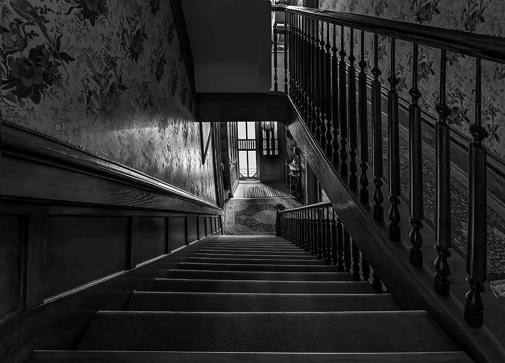
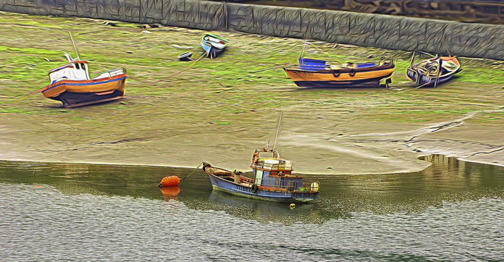
I like the original image. Very interesting perspective and composition. I am not so keen about the revision but do not know what to suggest as an alternative. |
Nov 17th |
| 18 |
Nov 23 |
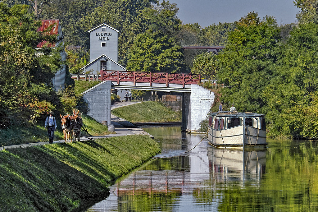
Comment |
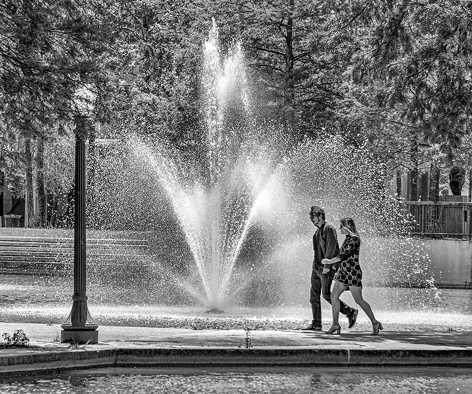
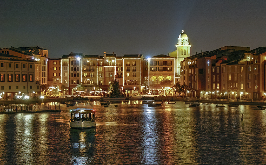
I like the image. Very interesting. But to me I feel the large bright color of the barge is just too strong and draws your eye away from the rest of the image. In my revision I covered the boat with foliage, wall, and some of the building. I also cropped some off the right side. |
Nov 17th |
 |
4 comments - 1 reply for Group 18
|
| 78 |
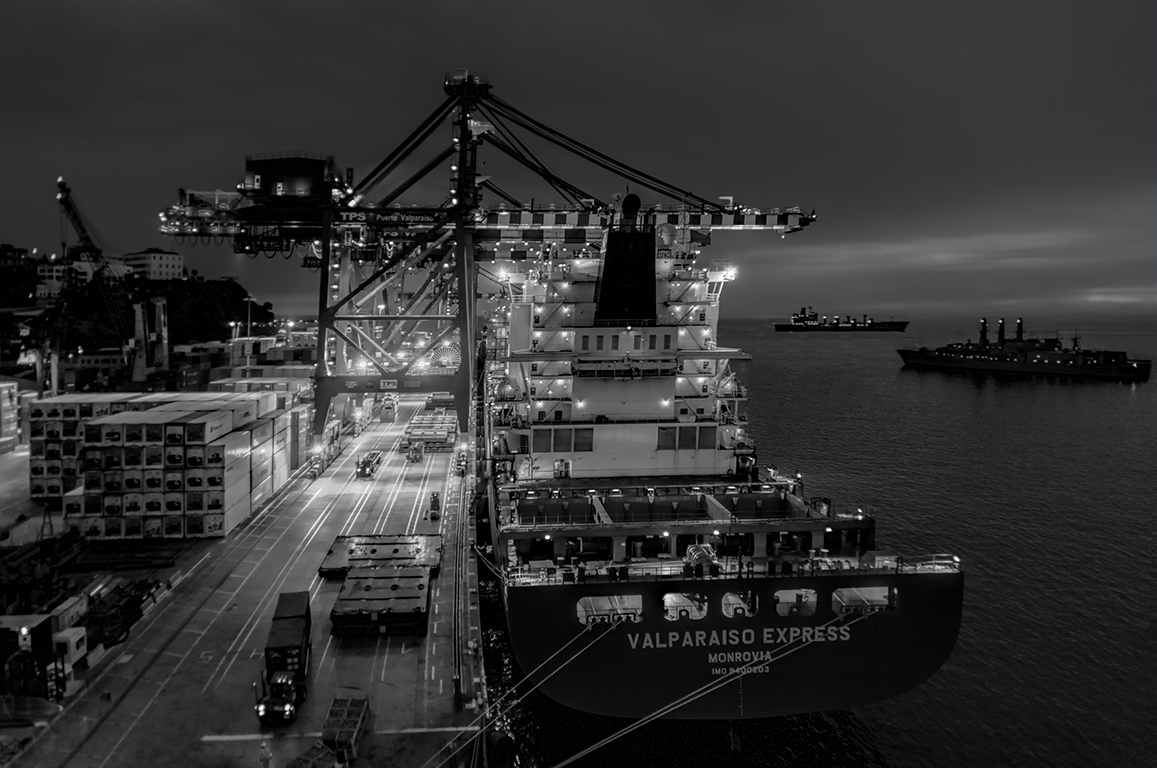
Nov 23 |
Comment |
I like your conversion from the original and I think the composition is great. But, I feel the foreground in the first image is too bright which you've corrected in your revision. I would also darken the foreground even more.
Very nice image. |
Nov 17th |
| 78 |
Nov 23 |
Comment |
Very nice image. Great depth of field, color and composition. I have no suggestions. |
Nov 17th |
| 78 |
Nov 23 |
Reply |
You are right. I brightened the containers on the ship but not the rest of the image. I should have done both. |
Nov 17th |
| 78 |
Nov 23 |
Comment |
More about depth of field. Depth of field is defined as the area of sharp focus and is greatest with short focal length lenses and small aperture settings. And depth of field decreases with wider aperture settings and as the focal length increases. So, with a 20mm lens and a small f stop everything can be in sharp focus from, perhaps, 10 feet to infinity but with a 400mm lens and a wide aperture setting the depth of field might be only 10 feet. And, the area of sharp focus is greater in front of the subject than it is behind the subject. |
Nov 17th |
| 78 |
Nov 23 |
Comment |
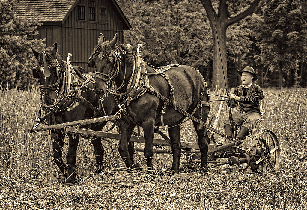
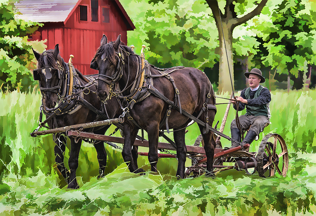
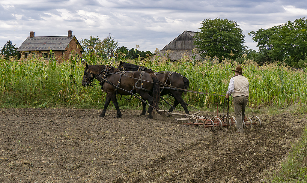
Photography is an art form so there is no "right" or "wrong" image. There have been several comments that a blurred foreground is acceptable, and that is fine. But, to me an image should tell a story. Brenda has captured an image of two beautiful horses but when I look at the image my eye is drawn to the foreground which I feel is a distraction. An artist painting the scene would not have intentionally blurred the foreground. But, a blurred background is almost always acceptable as it focuses your attention on the subject. |
Nov 17th |
| 78 |
Nov 23 |
Reply |
Brenda, I like your version. Nice colors. Sharp and crisp. |
Nov 8th |
| 78 |
Nov 23 |
Reply |
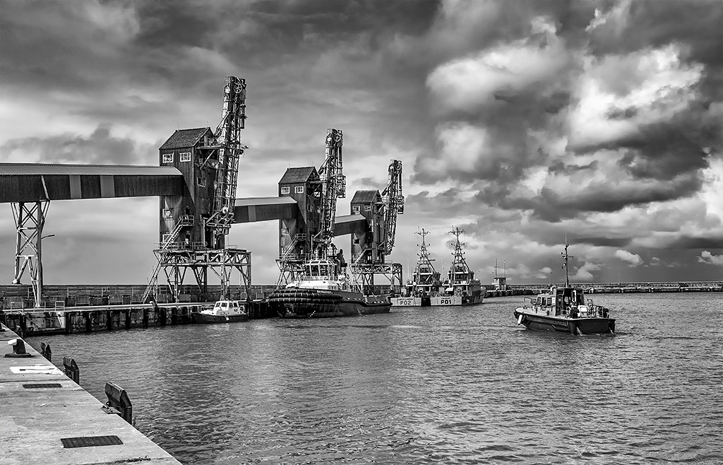
Brenda, I have never heard of a requirement that Travel images must be of an identifiable place. I have achieved Galaxy One in Travel with over 360 acceptances with 123 approved travel titles. Many of these titles do not give any indication of the location such as A Walk By The Sea, Art For Sale, Boys Playing Football, Enjoying Music, Good Friends, High Rise, Oncoming Storm, Sea Home, Where Are We etc. I welcome and look forward to your version of my Unloading Dock. |
Nov 7th |
| 78 |
Nov 23 |
Comment |
A great capture at the right moment. Nice colors, sharp and great composition. I have no suggestions. |
Nov 6th |
| 78 |
Nov 23 |
Comment |
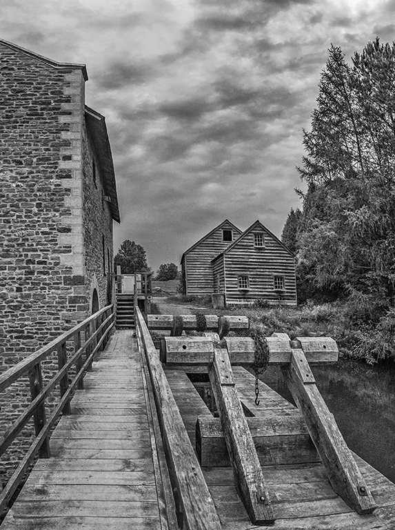
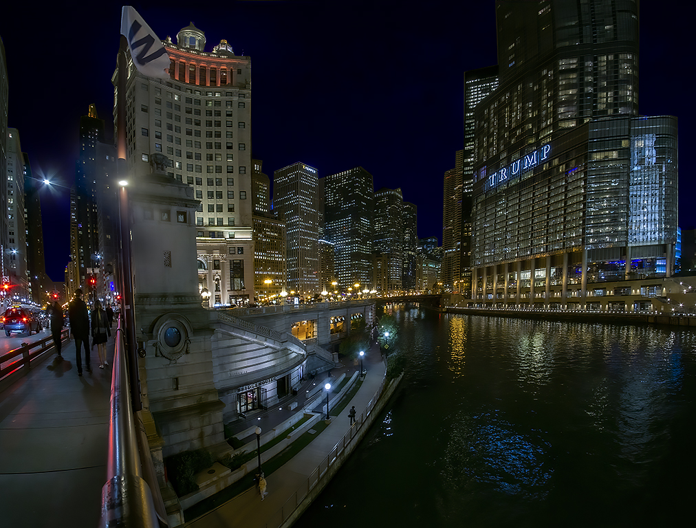
Sunil, I love photographers who are so devoted to their craft that they will drive miles and stay for hours for a single image. Many thanks for your explanation. I like the mono photo of the building (without the eclipse) much more than the color image. I think it is great but I did make a few adjustments in my version. I cropped some off the right side, lightened the shadow areas and darkened the grass area. I know nothing about eclipse photography and can offer no suggestions. |
Nov 6th |
 |
| 78 |
Nov 23 |
Comment |
There are many great things about your image. The composition is great. The color of the two horses is outstanding. But, I feel, the out of focus brush in front of the central horse is just too disturbing. However, there is some brush just behind the horses that is in sharp focus. With a lot of careful work, you could clone some of that area in to the out of focus areas. In my revision I did a quick use of the clone tool to indicate my suggestion. I also cropped tighter and warmed up the image. |
Nov 6th |
 |
| 78 |
Nov 23 |
Reply |
Thanks. I agree, clouds in the sky would be an improvement but I will probably enter the image in a future PSA Travel exhibition and additions to your original image are not allowed in either Travel or Nature categories. |
Nov 6th |
| 78 |
Nov 23 |
Reply |
Thank you. |
Nov 6th |
7 comments - 5 replies for Group 78
|
18 comments - 11 replies Total
|