|
| Group |
Round |
C/R |
Comment |
Date |
Image |
| 11 |
Oct 23 |
Reply |
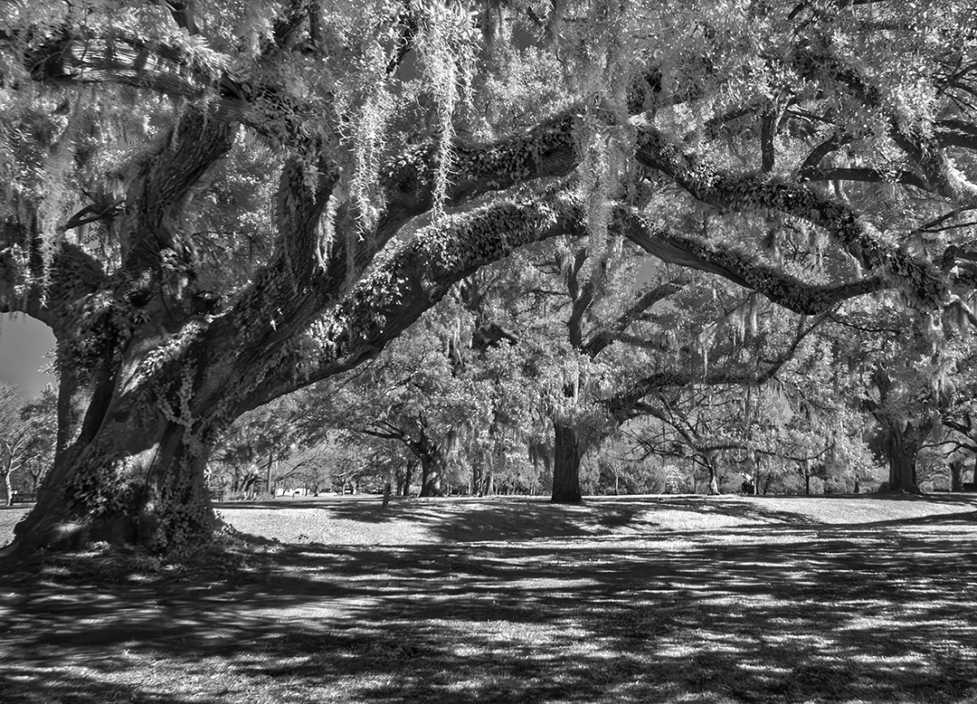
Darlene, I've revised my image by cropping off a lot from the right side and the top. Those areas are too bright and confusing. Then I darkened the remaining background,cropped off some of the bright foreground and also dodged some of the moss. I think the composition of my revised image is much improved. Thanks for your suggestions. |
Oct 25th |
 |
| 11 |
Oct 23 |
Reply |
I think you are right. Everything is so sharp that the detail is distracting. I will work on the image to see if I can soften just the background areas. Thanks for your suggestion. |
Oct 23rd |
| 11 |
Oct 23 |
Reply |
Peter, I am glad that the problems with your lens have been resolved.
|
Oct 23rd |
| 11 |
Oct 23 |
Reply |
Peter, let me make a comment about the depth of field (area of sharp focus) of your image. The depth of field of a 300mm lens is rather narrow especially when shot at with a wide aperture (F4.0). The depth of field decreases the wider the aperture and also the closer you are to the subject. To me there are several leaves in the middle of your image that are in sharp focus and the areas before and after that area are not sharp. I believe this is due to the optics of a 300mm lens. My point is your lens could be perfect but the shallow depth of field is due to optics and not the lens. You can find information about the depth of field of a 300 mm lens on the internet. |
Oct 19th |
| 11 |
Oct 23 |
Comment |
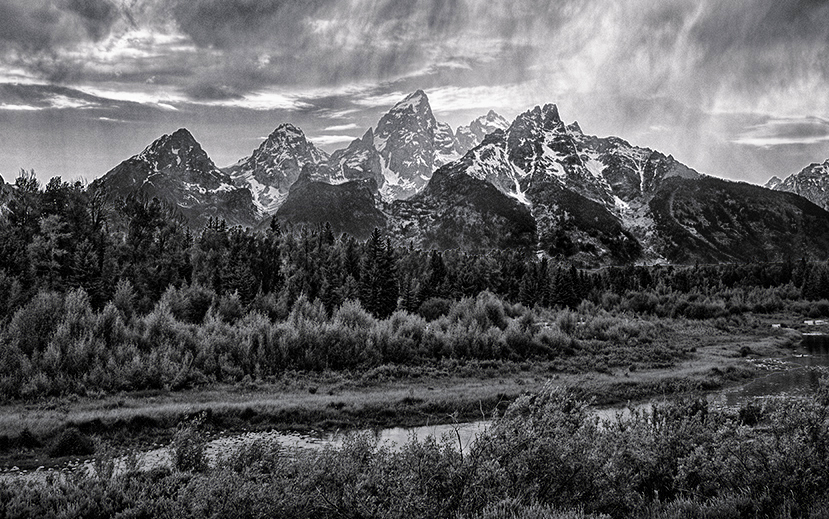
I like your overall composition. But, to me I would like to see a little more detail in the foreground. So in my revision I lightened the foreground (perhaps too much). I also cropped some off the bottom, the left side and the sky which I did to improve the composition by making the mountain peaks more prominent. |
Oct 19th |
 |
| 11 |
Oct 23 |
Comment |
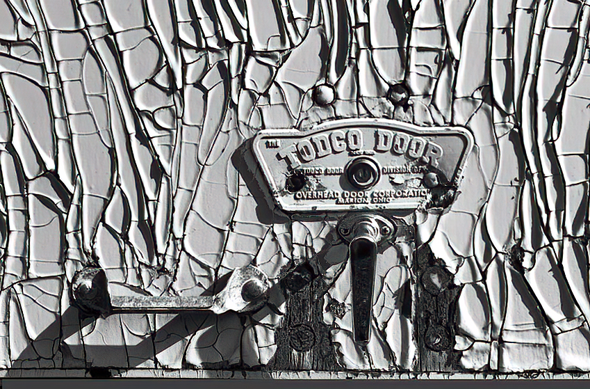
I like all the patterns in the peeling paint. But, to me, it looks a little odd to have the door emblem at the very bottom of the image so in my revision I included both the door pull and the door lock. |
Oct 5th |
 |
| 11 |
Oct 23 |
Comment |
I like the composition. However, the subject was photographed with a long lens and only a F4.0 aperture. The result is a narrow depth of field and an image in which much of the image is not sharp. |
Oct 5th |
3 comments - 4 replies for Group 11
|
| 18 |
Oct 23 |
Comment |
I don't have any suggestions about your final image as, to me, the image is confusing. I prefer original 2 as it suggests vegetation grow in, over and through an abandoned car |
Oct 5th |
| 18 |
Oct 23 |
Comment |
Very nice conversion. No suggestions. |
Oct 5th |
2 comments - 0 replies for Group 18
|
| 78 |
Oct 23 |
Reply |
I am going to enter my shopping image in an upcoming PSA color exhibition. I will let you know if I get any acceptances. |
Oct 25th |
| 78 |
Oct 23 |
Reply |
Much, much better. Very nice. |
Oct 20th |
| 78 |
Oct 23 |
Comment |
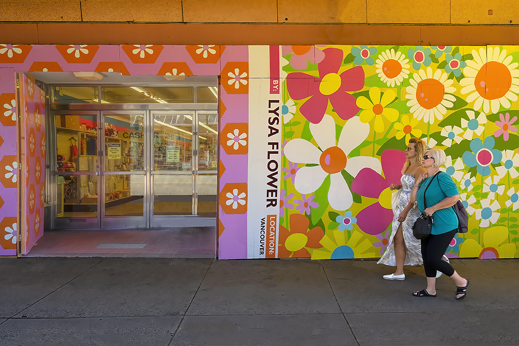
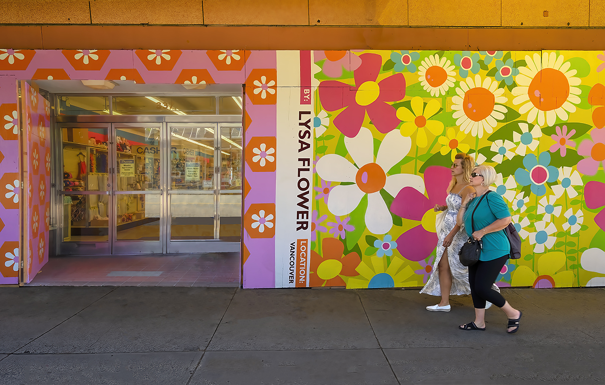
Well, I am in the minority as almost everyone prefers the image with just two women. But I still prefer my image as I feel that the doors are needed to be complete my image of two women about to go shopping. |
Oct 19th |
 |
| 78 |
Oct 23 |
Reply |
The fabric store is in an area of Vancouver that is "troubled." I do not know the details of the vandalism except that the store was closed for several days. Plywood sheets were placed over the broken windows and the store reopened. Then, apparently, they found the colored panels shown in my image which they attached to the plywood. |
Oct 19th |
| 78 |
Oct 23 |
Reply |
I agree that the trash bag is a distraction. In my revised image I eliminated the trash bag and also did a little housekeeping on the sidewalk. And, I decided that the bright sun spots on the sidewalk are a distraction so I also eliminated them |
Oct 6th |
 |
| 78 |
Oct 23 |
Comment |
Very sharp. Nice composition. No suggestions. |
Oct 5th |
| 78 |
Oct 23 |
Comment |
It is amazing that you've created such a wonderful image from such a poor original. Thanks for sharing your procedue. I have no suggestions. |
Oct 5th |
| 78 |
Oct 23 |
Comment |
Nice sharp image. Nice colors. Nice composition. No suggestions. |
Oct 5th |
| 78 |
Oct 23 |
Comment |
A wonderful creation. A wonderful image. No suggestions. |
Oct 5th |
| 78 |
Oct 23 |
Comment |
I like your image but my personal preference is to make the image less blue. So, in my revision I did make the image less blue. I also straightened the horizon and cropped some off the left side which I feel improves the composition. And I lightened the shadow areas of the large rocks. I would have liked my version to have had more of the magenta colors in your image. |
Oct 5th |
 |
6 comments - 4 replies for Group 78
|
11 comments - 8 replies Total
|