|
| Group |
Round |
C/R |
Comment |
Date |
Image |
| 11 |
Jun 23 |
Comment |
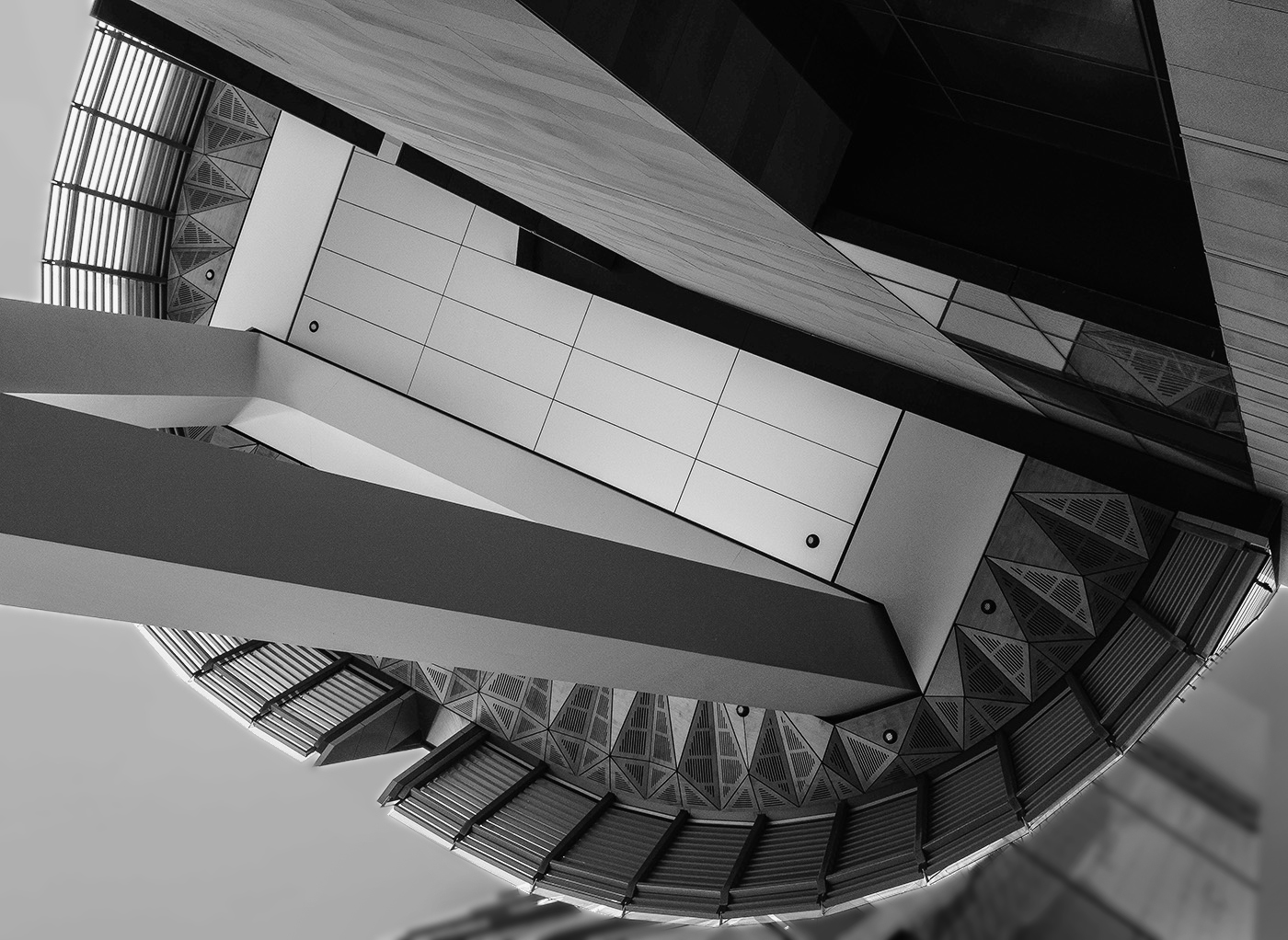
Your conversion is great but Henry's is even better as his image shows the dripping wax much better. |
Jun 5th |
| 11 |
Jun 23 |
Comment |
An absolutely amazing image developed from a very underexposed image. The final image is great with wonderful detail and great composition. I have no suggestions. |
Jun 3rd |
| 11 |
Jun 23 |
Comment |
Very nice image. Great conversion. I have no suggestions. |
Jun 3rd |
| 11 |
Jun 23 |
Reply |
Henry, many thanks for your suggestion. I your crop much better than mine as preserving the candle's shadow adds much to the image. |
Jun 3rd |
| 11 |
Jun 23 |
Comment |
Very nice image and great conversion from color. My only suggestion is to darken the background areas. I feel they are too bright and a distraction. |
Jun 3rd |
 |
4 comments - 1 reply for Group 11
|
| 18 |
Jun 23 |
Comment |
I really like your revised image. No suggestions. |
Jun 23rd |
| 18 |
Jun 23 |
Comment |
I like both of your images. I have no suggestions on your revision but might prefer a little more warmth in the original. |
Jun 23rd |
| 18 |
Jun 23 |
Reply |
Thanks for your comment. I did not notice the halo. |
Jun 23rd |
| 18 |
Jun 23 |
Comment |
A wonderful creative image, so much more interesting than the original. I have no suggestions. |
Jun 3rd |
3 comments - 1 reply for Group 18
|
| 78 |
Jun 23 |
Reply |
Ed, thanks for the mono suggestions. I had not considered that option. |
Jun 23rd |
| 78 |
Jun 23 |
Comment |
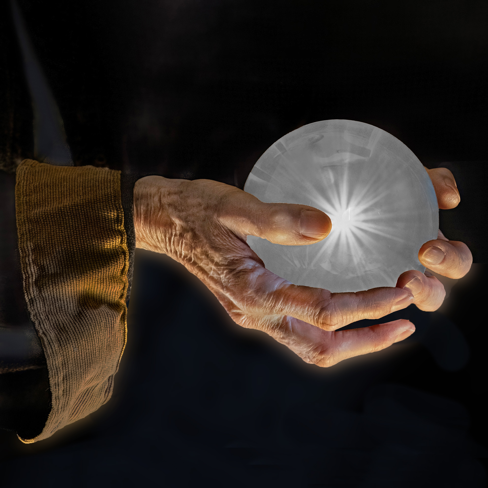
I think you have a wonderfully created image. However, I feel a serious distraction is the blue cloth in the background as it is a major distraction from the subject. In my revision I cloned out that cloth. I also cloned out the partial fingers showing behind the two central fingers. I also darkened the cuff of the shirt (perhaps a little too much). |
Jun 3rd |
 |
| 78 |
Jun 23 |
Comment |
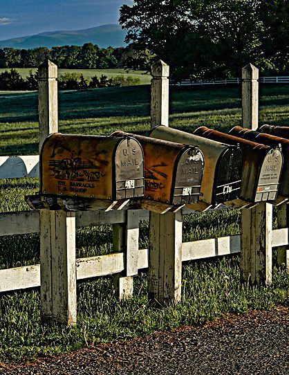
To me your image has two subjects; a beautiful landscape or interesting mailboxes. I don't feel they work together as a single image as each competes for your attention. In my suggested revision I selected the mailboxes. |
Jun 3rd |
 |
| 78 |
Jun 23 |
Comment |
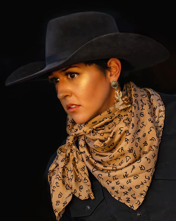
A great conversion from the original. Many thanks for sharing your information. A minor suggestion is to reduce the brightness of the ear ring and buttons. I did so in my revision and I also brightened the shadows slightly. |
Jun 3rd |
 |
| 78 |
Jun 23 |
Reply |
Brenda, thanks. |
Jun 3rd |
| 78 |
Jun 23 |
Comment |
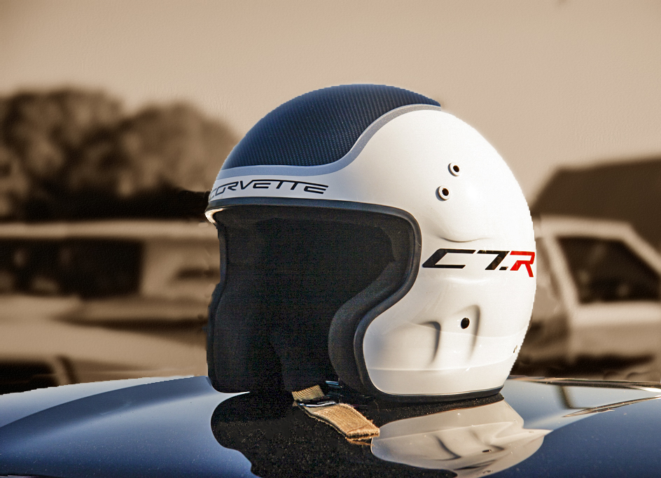
I like the color image of the helmet sitting on top of the car. And, i like your idea of using sepia for the background. And, I like your cloning out the flagpole. In my revision I cloned our more in the background, blurred it more and converted it to sepia. But, I kept the original color version of just the helmet, lightened shadows areas and removed some dust spots. Then I combined my color helmet layer, the sepia background layer and then cropped some off the right side. |
Jun 3rd |
 |
| 78 |
Jun 23 |
Comment |
Very nice image and a great conversion from the original. In my revision I eliminated the second boat, brightened the shadow areas and cropped a little off the bottom. |
Jun 3rd |
 |
| 78 |
Jun 23 |
Comment |
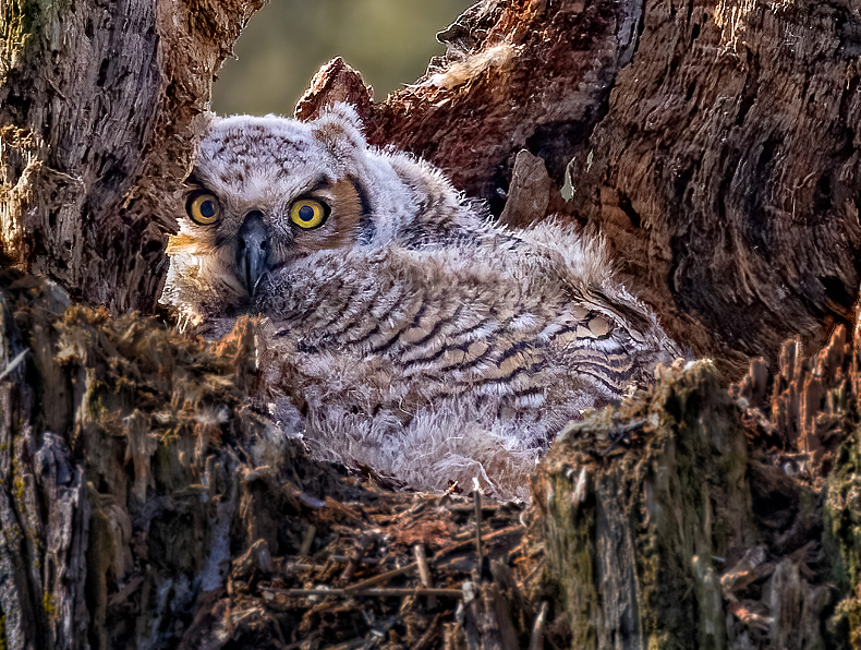
Great shot. Great capture. However, since the subject is the owl I suggest the image should be cropped tighter to feature the owl. In my revision I did crop tighter, darkened the foreground and also sharpened somewhat. |
Jun 3rd |
 |
6 comments - 2 replies for Group 78
|
13 comments - 4 replies Total
|