|
| Group |
Round |
C/R |
Comment |
Date |
Image |
| 11 |
Apr 23 |
Comment |
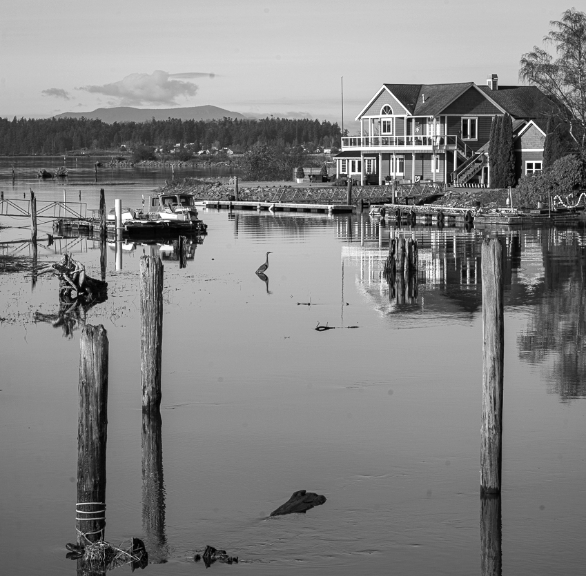
A very nice image but I wonder if you need the reflections of the posts. In my revision I cropped about off about a third of the image. |
Apr 12th |
 |
| 11 |
Apr 23 |
Comment |
A wonderful image and a great conversion from the original. Your original color image is okay but I really like the mono version and especially the way the branch frames the window. I have no suggestions. |
Apr 12th |
| 11 |
Apr 23 |
Comment |
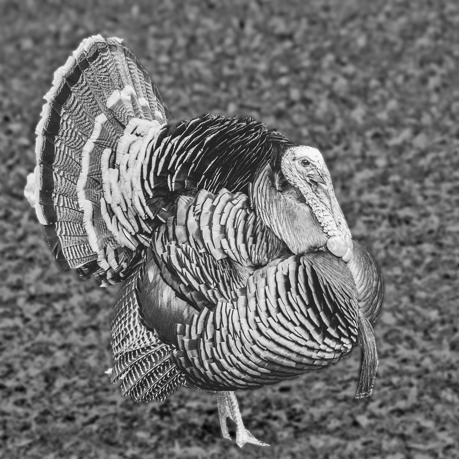
I like both the color and mono versions. But, in both version I feel the background is too bright and detracts from the subject. In my version I darkened and blurred the background. |
Apr 12th |
 |
3 comments - 0 replies for Group 11
|
| 18 |
Apr 23 |
Reply |
After trying for several hours, I have been unable to re-create my image. But, let me describe the procedure I used. First, I placed the orange wall on a layer in Photoshop and the sidewalk area on a separate layer. Then I reduced some of the bright areas on the sidewalk layer and increased the contrast. Then, I applied a Topaz 2 "add look" to the wall layer. I think I used the Vibrant City look but the colors don't seem quite the same as the filter I used. I then added a horizontal motion blur from Topaz 2 filters. I then applied the new top layer at about 70% opacity so that a portion of the original orange wall showed through. I have gone through every filter that I have several times and cannot find a way to recreate the green and red colors in my final image. If I somehow can recreate my image, I will certainly post updated information. |
Apr 15th |
| 18 |
Apr 23 |
Comment |
Wow, what a project. How creative. Let me suggest that perhaps instead of a "bubble" around each cat and dog you just show the face without the bubble. And, perhaps try using a lower opacity such as 80% instead of 100%. |
Apr 12th |
| 18 |
Apr 23 |
Comment |
A very interesting compilation but I wonder about having trees appearing on the front of the car. |
Apr 12th |
| 18 |
Apr 23 |
Comment |
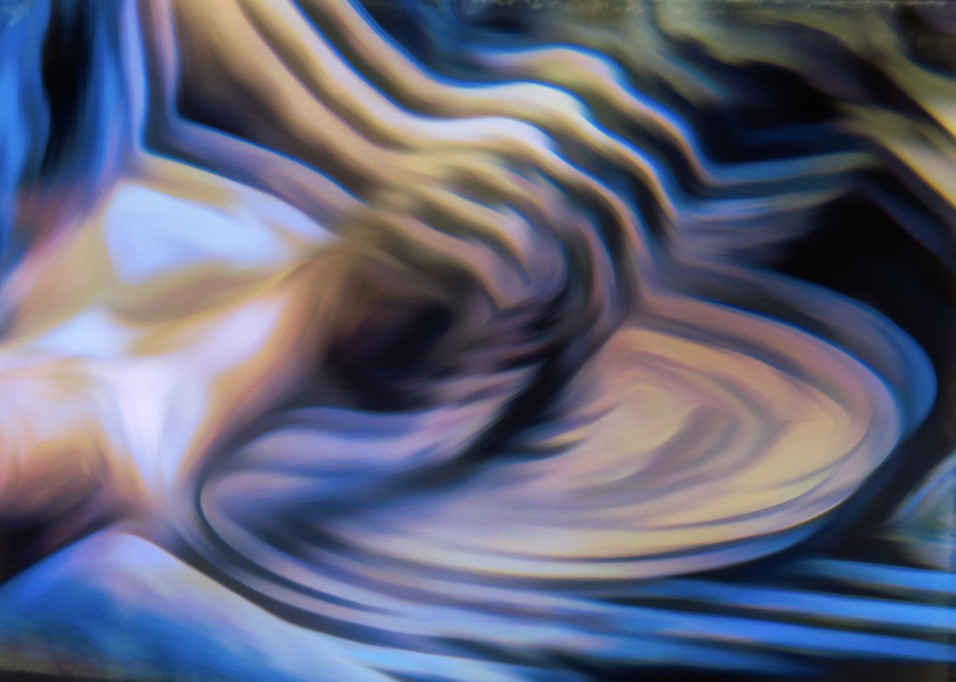
An interesting abstract. In my revision I tilted the image clockwise and then brightened it. Let me suggest a title of The Potters Hands. |
Apr 12th |
 |
| 18 |
Apr 23 |
Comment |
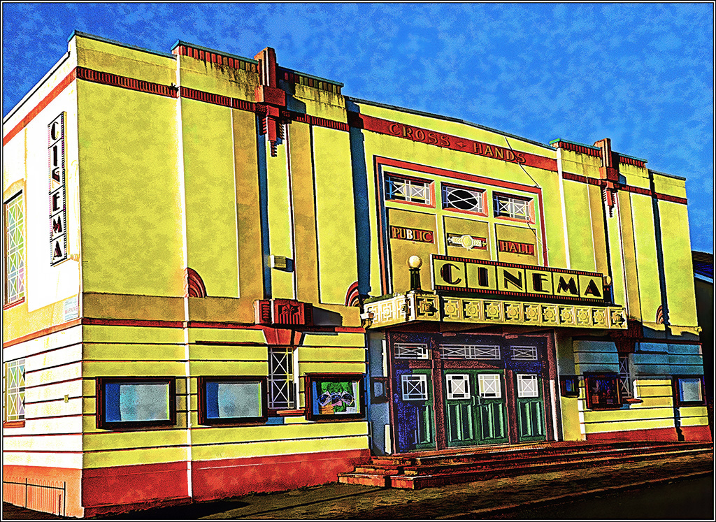
A wonderful image. I especially like the texture of the walls. I agree with Gunter suggestions. I also suggest that the entrance doors be brighter which I've done in my revision and I also slightly reduced the vibrancy. Many thanks for sharing your procedures. |
Apr 12th |
 |
4 comments - 1 reply for Group 18
|
| 78 |
Apr 23 |
Comment |
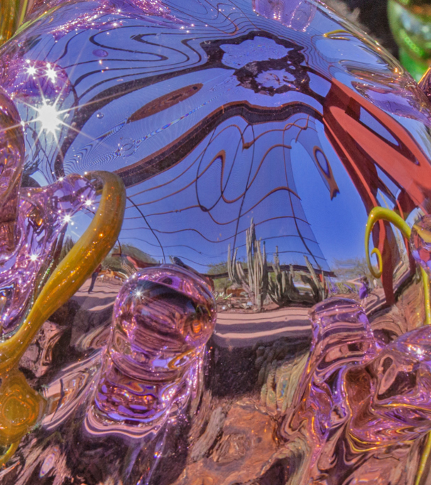
Very unusual. To me the most interesting part of the image are the cactus. In my revision I cropped out the dark lower portion of the image and then twisted some of the image so that the everything points toward the cactus. |
Apr 11th |
 |
| 78 |
Apr 23 |
Comment |
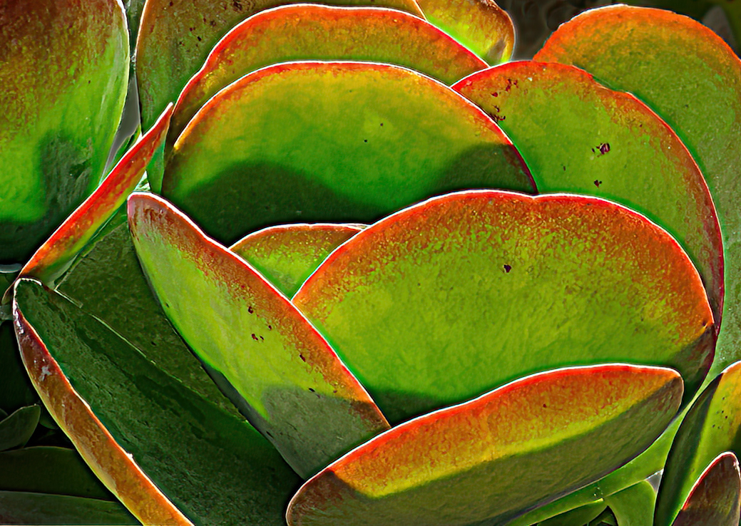
I like the round pedals but am bothered by the distracting background. In my revision I rotated the petals slightly, cropped out the background, enlarged some of the petals so as to make more of a circular pattern and then sharpened. |
Apr 11th |
 |
| 78 |
Apr 23 |
Comment |
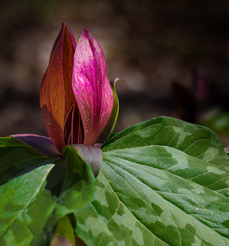
Nice image but I am bothered by the right leaf. It is somewhat soft and there appears to be something green showing from underneath the leaf. In my revision I sharpened the right leaf and darkened it. I then cropped the image so that the veins of the right leaf lead your eye up towards the blossom. My crop also moves the blossom away from the center of the image. |
Apr 11th |
 |
| 78 |
Apr 23 |
Comment |
I like your original image and like the revised image even more. The highlights are okay with me. Great image. |
Apr 11th |
| 78 |
Apr 23 |
Reply |
Thanks for the suggestion. I will either crop the window out or darken it. |
Apr 11th |
| 78 |
Apr 23 |
Comment |
Great shot. Great composition. I have no suggestions. |
Apr 11th |
5 comments - 1 reply for Group 78
|
12 comments - 2 replies Total
|