|
| Group |
Round |
C/R |
Comment |
Date |
Image |
| 11 |
Oct 22 |
Comment |
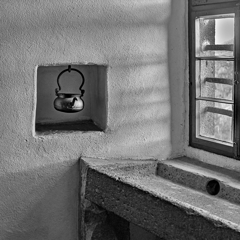
I like the image but wonder if the kettle should be more prominent. In my revision I cropped out the top window, brightened the kettle and its background and also extended the wash basin to the right. |
Oct 14th |
 |
| 11 |
Oct 22 |
Comment |
I like the image, the conversion from color, the composition and the blurred background. I have no suggestions. |
Oct 14th |
| 11 |
Oct 22 |
Reply |
Ian I am not sure where I was when I took the shot but it was near a terminal so you are most likely correct in that it was in Trondhiem. |
Oct 14th |
| 11 |
Oct 22 |
Comment |
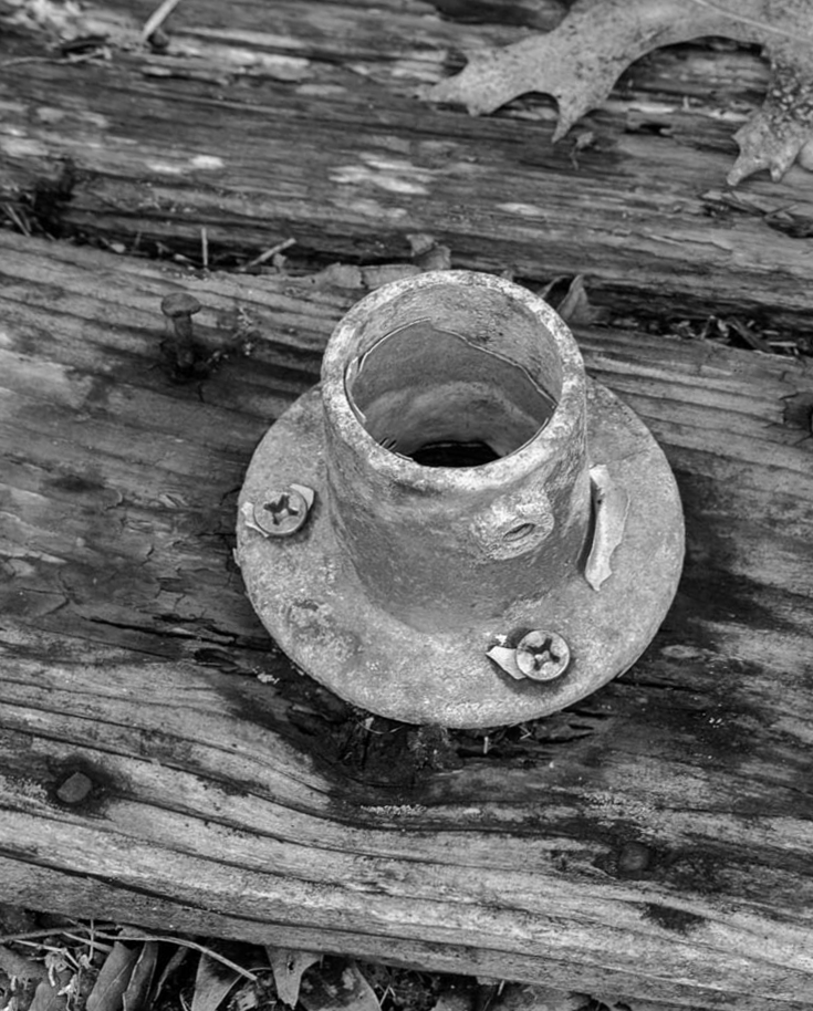
I like your conversion and like Henry I would prefer a tighter crop. In my revision I also added a diagonal dimension. |
Oct 14th |
 |
| 11 |
Oct 22 |
Comment |
Great idea to convert to mono. I like everything about the image except I would like the bird to be a little sharper.
|
Oct 14th |
| 11 |
Oct 22 |
Comment |
It is always hard to lose a treasured pet.
I like your conversion and everything else in the image. I have no suggestions. |
Oct 14th |
5 comments - 1 reply for Group 11
|
| 78 |
Oct 22 |
Comment |
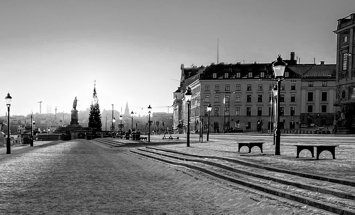
I like your conversion from color and also your cropping out some of the street. Let me suggest that, to me, the main feature is the street. So in my revision I cropped the boat out from the left side. |
Oct 14th |
 |
| 78 |
Oct 22 |
Reply |
Your image without the waves also looks great. |
Oct 14th |
| 78 |
Oct 22 |
Comment |
Many thanks for your kind comments.
|
Oct 14th |
| 78 |
Oct 22 |
Comment |
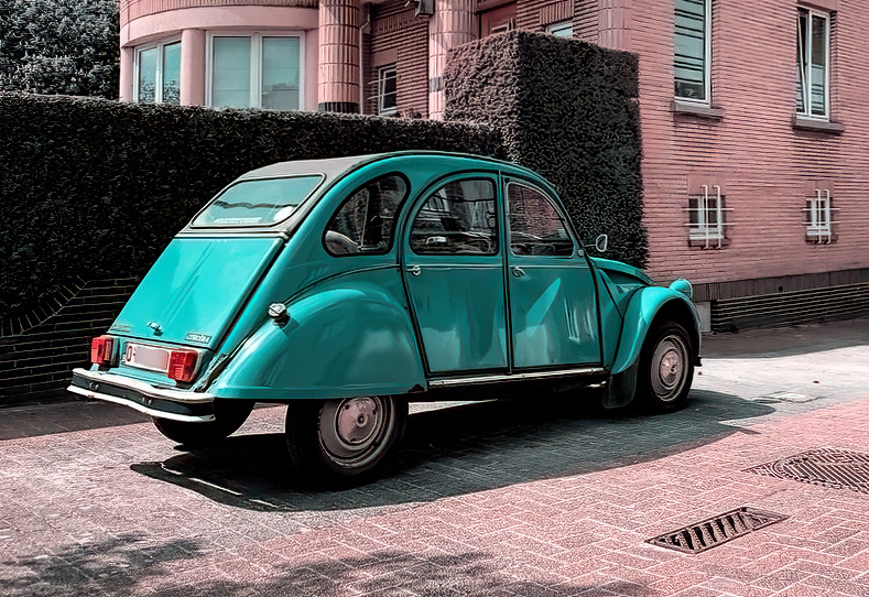
I am not sure what the subject is in the image. Is it the car or is it the building? I chose the car. In my suggested revision I straightened the slanting building, cropped to feature the car and then increased the contrast. |
Oct 13th |
 |
| 78 |
Oct 22 |
Comment |
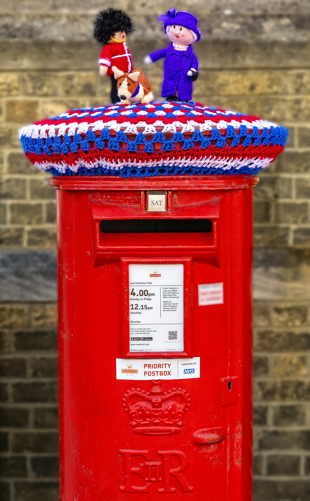
I like your image - very sharp, interesting and nice bright colors. My only suggesting is to blur the background to make the subject stand out even more. |
Oct 13th |
 |
| 78 |
Oct 22 |
Comment |
I like your image. The colors and composition are great. My only minor suggestion is to dodge the dark shadow areas in the central rock formation to show more detail. |
Oct 13th |
| 78 |
Oct 22 |
Comment |
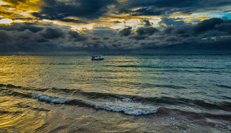
What a great conversion from the original image. The colors are great and I really like the waves in the foreground. But, to me the boat in the background is in the exact center of the image and the overall image is divided almost exactly in half. To improve the composition, I suggest cropping some off the sky so that the water is not at a one third level and also cropping some off the right side so the boat is not so centered. In my revision I also dodged some of the waves to brighten them slightly and I also brightened the overall image. |
Oct 13th |
 |
| 78 |
Oct 22 |
Comment |
I like the image, the color and sharpness. And, as has been suggested, the image needs to be cropped tighter since most of the left side of the image is not relevant to the subject. I think your crop version is just right with nice composition and which includes important environment features. |
Oct 13th |
7 comments - 1 reply for Group 78
|
12 comments - 2 replies Total
|