|
| Group |
Round |
C/R |
Comment |
Date |
Image |
| 11 |
Sep 22 |
Comment |
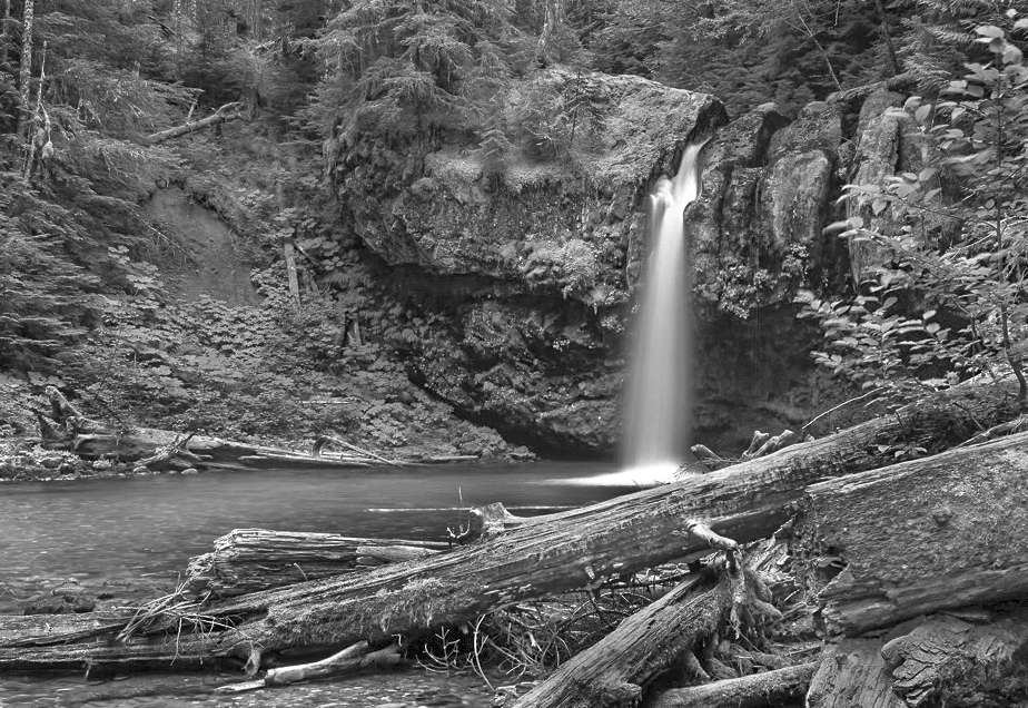
I like your image and your conversion from color. My preference, however, would be for less contrast so in my revision I reduced the contrast, dodged the waterfall and also dodged some of the river. I also cropped tighter so the waterfall is more prominent. |
Sep 10th |
 |
| 11 |
Sep 22 |
Comment |
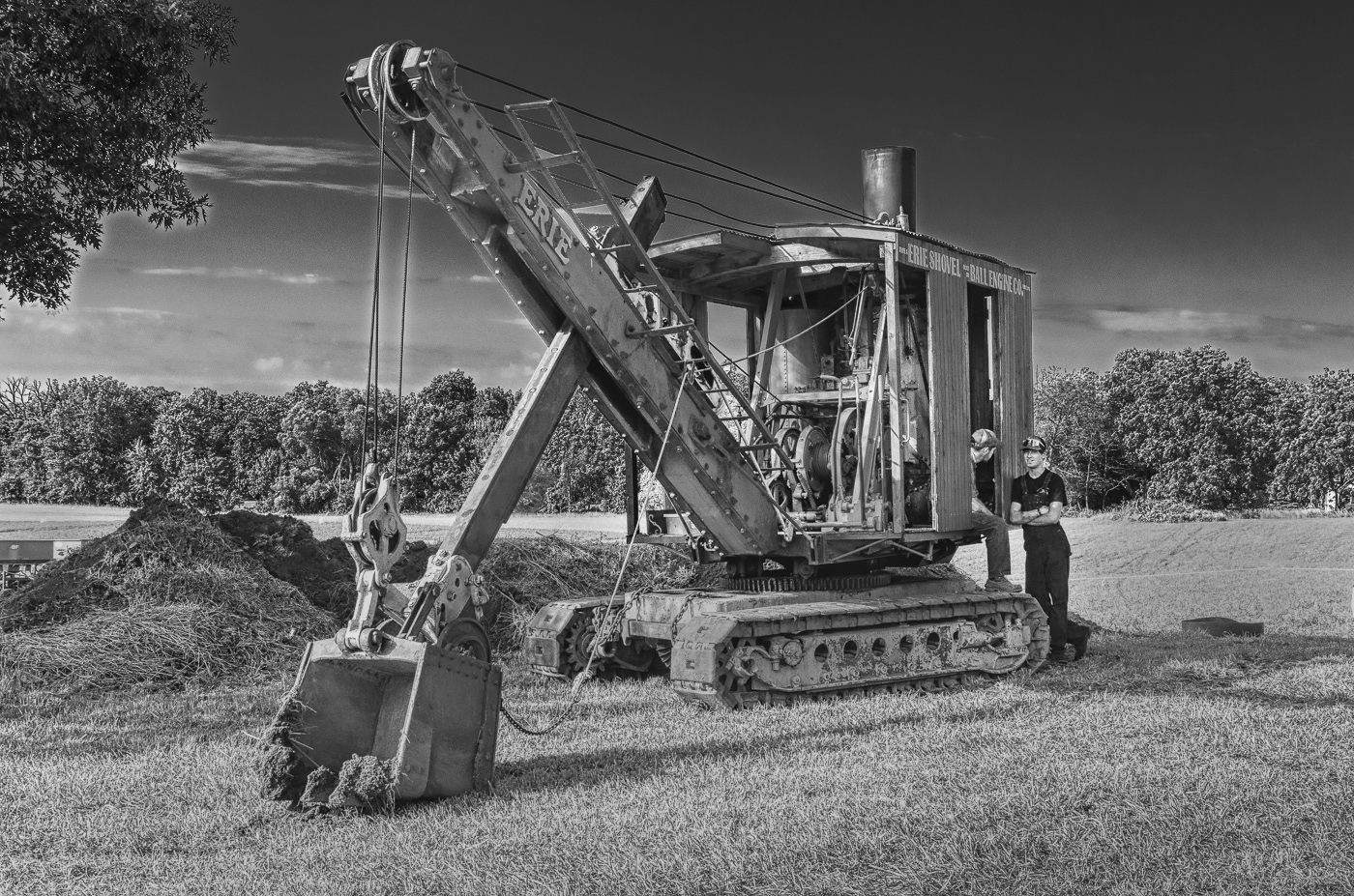
I like your image, the composition and the conversion from color. But, I suggest the background should be darker so that the excavator and the two men are more prominent. In my revision I've darkened the background, dodged a few areas and removed the sign and ropes from the background. |
Sep 10th |
 |
| 11 |
Sep 22 |
Comment |
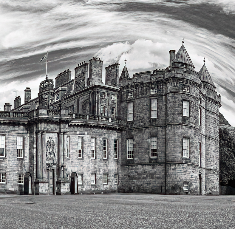
I like your conversion from the original color image but I do not like the horizontal wall. It slopes downward from the left edge of the image. In my suggested revision I straightened that wall and also increased the overall sharpness of the image. |
Sep 10th |
 |
| 11 |
Sep 22 |
Comment |
Very nice image. A minor suggestion is to brighten the face and perhaps a little on the fountain streams. |
Sep 10th |
| 11 |
Sep 22 |
Comment |
I really like your "Studio Test" image. Your lighting was done so well that the shadow and highlighted areas give a great feeling of depth. I would not change anything. |
Sep 10th |
5 comments - 0 replies for Group 11
|
| 18 |
Sep 22 |
Comment |
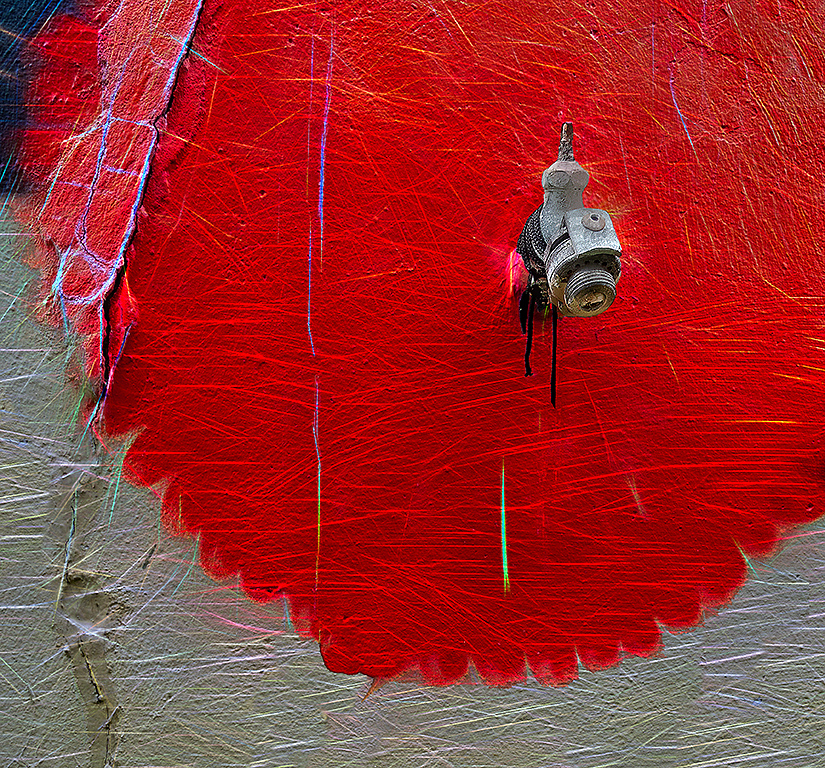
I love this image. I could never have imagined that such a wonderful image could have been created from such an ordinary image. |
Sep 13th |
| 18 |
Sep 22 |
Reply |
Thanks for your reply. Please see my revision. |
Sep 13th |
 |
| 18 |
Sep 22 |
Reply |
Thanks for your reply. Please see my revision. |
Sep 13th |
1 comment - 2 replies for Group 18
|
| 78 |
Sep 22 |
Reply |
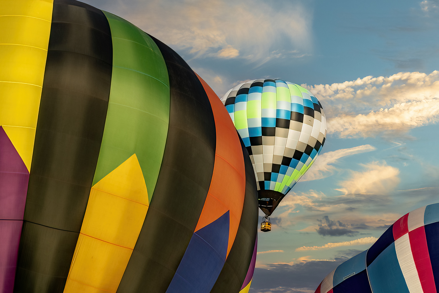
Benda, I suggested using Topaz DeNoise not DeHaze. I like your composition and the small balloon just as it is. |
Sep 10th |
| 78 |
Sep 22 |
Comment |
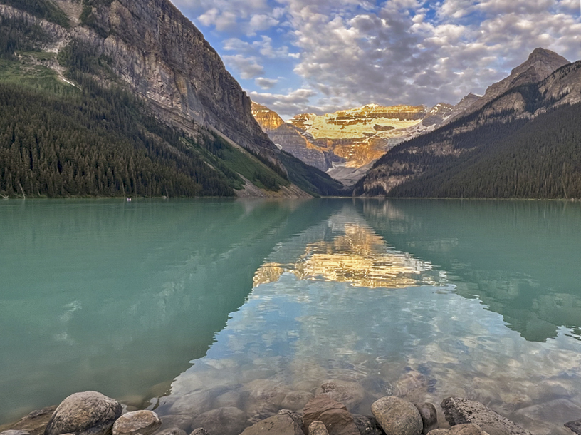
A beautiful image of Lake Louise but it suffers from the over exposed areas of the mountain. Also, I feel the image would be improved if the image was not so centered. In my revision I cropped some off the right side so the sunlit mountain is not so centered. I also cropped off some of the rocks and darkened the remaining ones. I tried the darkening the sunlit area but I think I made it worse. If you have an underexposed image of the same subject you could greatly improve the overexposed areas by using layers in Photoshop. |
Sep 7th |
 |
| 78 |
Sep 22 |
Comment |
I very much like the overall image and composition as is. But, I do like the suggestion of more detail in the shadow area by reducing the high contrast. |
Sep 7th |
| 78 |
Sep 22 |
Comment |
I like the image and composition but suggest a darker sky and not so much contrast in the instrument panel. |
Sep 7th |
| 78 |
Sep 22 |
Comment |
I love your image and would not bother about the foot or kickstand. I really like the look of the rider as it fits so well with the background. I like the image just as it is. |
Sep 7th |
| 78 |
Sep 22 |
Comment |
A wonderful image, so much improved from the original. Great color, great mood, great composition. I have no suggestions. |
Sep 7th |
| 78 |
Sep 22 |
Reply |
Thanks, I will try a little dehazing. |
Sep 7th |
| 78 |
Sep 22 |
Reply |
Thanks for the suggestions. I will remove the women and pipe for entry into PSA color but leave them as is for PSA travel. I struggled with the angles in the because the bridge is sloping and decided that since the verticals are correct to leave everything as is. |
Sep 7th |
| 78 |
Sep 22 |
Comment |
Brenda your balloon image is great and should be submitted into competition. I like your composition and the sky blends in just so well. Although it is not needed I took your revised image and used Topaz denoise filter. I love that filter as it not only removes noise but also sharpens. If you decide to use that filter do so only on the balloons and not the sky. That filter sharpened the balloons and the sky but the sky looks great as is with just a slight blur. Kudos. |
Sep 7th |
 |
6 comments - 3 replies for Group 78
|
12 comments - 5 replies Total
|