|
| Group |
Round |
C/R |
Comment |
Date |
Image |
| 11 |
Aug 22 |
Comment |
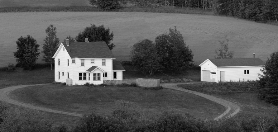
A very nice image with much more interest than the original color version. I like the composition and range of tones. I have no suggestions. |
Aug 13th |
| 11 |
Aug 22 |
Comment |
I like your image and the great mood that you've created. I have no suggestions. |
Aug 13th |
| 11 |
Aug 22 |
Comment |
I like your image and the nice range of mono tones. However, I suggest that not all the area above the house is needed since the house is the main subject. In my revision I cropped out much of that area, cloned out the tree on the left and some of the tree in the field above the house. And, I darkened the remaining field area at the top of the image. And, another suggestion would be to crop out the building on the right and just focus on the main building.
|
Aug 13th |
 |
| 11 |
Aug 22 |
Comment |
I like your image but suggest the dark shadows could be brightened somewhat. I like your revision with more light on the rocks. |
Aug 13th |
| 11 |
Aug 22 |
Comment |
A very interesting image. I like all the different patterns at the ends of the logs. So, in my revision I went back to the original. I selected the log with the cut off protrusion as a power point in my revision. After converting the image in to mono in Photoshop, I used the Topaz sharpen filter to increase the texture of the logs and I also burned in the lower left corner. |
Aug 13th |
 |
5 comments - 0 replies for Group 11
|
| 78 |
Aug 22 |
Comment |
A great shot which, as Terry said, suffers from the vertical branch. Perhaps you could darken and blur it so it would not be so apparent. |
Aug 13th |
| 78 |
Aug 22 |
Comment |
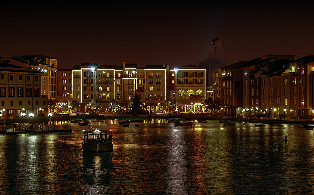
I very interesting moody image but, as has already been said, suffers from many distracting elements. I like Mitch's revision. I would go even further by also removing the power line just above the roof of the building. |
Aug 13th |
| 78 |
Aug 22 |
Comment |
Very, very creative. I have no suggestions. |
Aug 13th |
| 78 |
Aug 22 |
Comment |
I like everything about your photo except for the foliage at the right side which I suggest cropping it out of the image. Other than that I have no suggestions. Great shot. |
Aug 13th |
| 78 |
Aug 22 |
Comment |
Many thanks for your comments. I went back to my original and used a gradient to reduce the noise in the sky and to make it appear as a sunset afterglow. I greatly reduced the brightness of the cathedral and improved its color. I reduced the brightness of the buildings increased their sharpness and, I darkened the water and boat.
Thanks, please see my revision.
|
Aug 9th |
 |
| 78 |
Aug 22 |
Reply |
Thanks, please see my revision. |
Aug 9th |
| 78 |
Aug 22 |
Reply |
Thanks, please see my revision. |
Aug 9th |
| 78 |
Aug 22 |
Reply |
Thanks, please see my revision. |
Aug 9th |
| 78 |
Aug 22 |
Comment |
An amazing photo with great color, detail and composition. I think the sky looks good as it is. I have no recommendations. |
Aug 8th |
6 comments - 3 replies for Group 78
|
11 comments - 3 replies Total
|