|
| Group |
Round |
C/R |
Comment |
Date |
Image |
| 11 |
Jun 22 |
Comment |
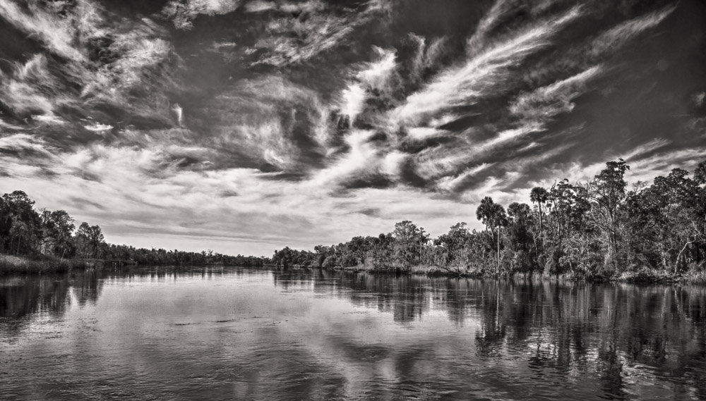
Very interesting image which includes both curves and spirals. No suggestions. |
Jun 22nd |
| 11 |
Jun 22 |
Comment |
Wow! What a great conversion from a rather bland original. My only suggestion is to consider cropping some off the bottom to add even more emphasis to the sky. |
Jun 22nd |
 |
| 11 |
Jun 22 |
Comment |
very nice image and conversion from color. I have no suggestions. |
Jun 22nd |
| 11 |
Jun 22 |
Comment |
I like the image and the conversion from color. I wondered if the image was just a little too bright in the bottom right corner. I did my own conversion and burned in some of what I felt were bright areas. I also flipped the image in my conversion. |
Jun 22nd |
 |
| 11 |
Jun 22 |
Comment |
I like your image, the conversion and your crop. A minor suggestion would be to darken the sky somewhat. |
Jun 9th |
5 comments - 0 replies for Group 11
|
| 18 |
Jun 22 |
Comment |
Nice image and nice conversion but I also agree with the comments that the statue should be more recognizable. |
Jun 22nd |
| 18 |
Jun 22 |
Comment |
I like your image and the overall impression it gives the viewer. I agree with Mike about the lampshade being too bright. Other, no suggestions. Great shot. |
Jun 9th |
| 18 |
Jun 22 |
Comment |
I like your image, the color and composition. I have no suggestions. |
Jun 9th |
| 18 |
Jun 22 |
Comment |
A wonderful image with great detail and sharpness. My personal preference would be for a somewhat darker background. Thanks for the information about adding a 2px stroke to ensure a crisp edge. I am going to try that. |
Jun 9th |
4 comments - 0 replies for Group 18
|
| 78 |
Jun 22 |
Comment |
Nice shot. I like Terry's version with the straightened and muted background although I think a little color in the background is needed - perhaps a blend of mono and color layers. |
Jun 21st |
| 78 |
Jun 22 |
Comment |
Great shot. Sharp. Great composition. No suggestions. |
Jun 21st |
| 78 |
Jun 22 |
Comment |
Very interesting and very creative. I don't have any great suggestions. To me it seems like the dancer should show some sort of motion blur. |
Jun 21st |
| 78 |
Jun 22 |
Comment |
I really like your image. In my revision I darkened the window that is near the subject and also darkened and blurred the other two windows. Great shot. |
Jun 21st |
 |
| 78 |
Jun 22 |
Comment |
A wonderful image. My only suggestion is the same as Terry's - make the subjects just a little brighter. |
Jun 21st |
| 78 |
Jun 22 |
Reply |
I am attaching my original file - raw converted to JPEG. I shot the image using a tripod but must not have the camera properly leveled as the columns on the left appear straight but those on the right are sloping in. |
Jun 21st |
 |
| 78 |
Jun 22 |
Reply |
No there was no mirror. The hallway has almost identical stairways - one leading to the KY House and the other leading to the KY Senate. |
Jun 21st |
| 78 |
Jun 22 |
Comment |
Brenda, very nice shot but like others I am not sure about the color. And, I also would like to see more space both below and to the right of the subject. |
Jun 21st |
6 comments - 2 replies for Group 78
|
15 comments - 2 replies Total
|