|
| Group |
Round |
C/R |
Comment |
Date |
Image |
| 11 |
Nov 21 |
Comment |
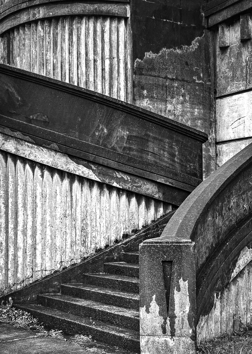
I really like your image. My preference would be to have a little more contrast. I also like the crop suggested by Lance as it does emphasize the lines and curves. |
Nov 14th |
 |
| 11 |
Nov 21 |
Comment |
Great image, great conversion. My preference is for your original 2 image as I prefer less sky and the sky is more dramatic. I think I would clone out the fence in the bottom right corner. |
Nov 14th |
| 11 |
Nov 21 |
Comment |
I really like the way you blurred the background. I suggest burning in the bright white pavement areas. Also, I think you should try to bring out more detail in the black areas - try using the dodge tool. |
Nov 14th |
 |
| 11 |
Nov 21 |
Comment |
I don't know what to suggest. Without your description I would not have know that the model was on a Harley. The mirror and handlebar on the left side of the image are, to me, very distracting - cropping would help. |
Nov 14th |
| 11 |
Nov 21 |
Comment |
I like your image and your composition. My only suggestions would be to try reducing the noise level of the background. |
Nov 14th |
| 11 |
Nov 21 |
Comment |
I love your mono image, so much better than the original color image. The various shades and the luminescence are wonderful. My only suggestion would be, as has been mentioned, to increase the sharpness. |
Nov 14th |
6 comments - 0 replies for Group 11
|
| 18 |
Nov 21 |
Comment |
You have done a great job in combining the images. The composition is great. But, let me suggest that just the background should be blurred. To do this select just the background without any riders and then add a motion blur to the background. Then select each rider and add them (without any blur) on a layer over the blurred background. |
Nov 14th |
| 18 |
Nov 21 |
Comment |
A wonderful creation. As has been suggested I would like the bunnies to be just a little smaller. Great image. |
Nov 14th |
| 18 |
Nov 21 |
Comment |
The image of the girl dancing is great but I feel it needs something else. At first I thought the left hand might have been that of an instructor. If it is, then it should not be so blurred. If it the hand belongs to another dancer then I would like to see more of the second dancer included in the image. |
Nov 14th |
| 18 |
Nov 21 |
Comment |
I love the image, much better than the original. I have no suggestions. |
Nov 14th |
| 18 |
Nov 21 |
Comment |
I love the creativity and the way you've blended in a human face with a sculpture. |
Nov 14th |
5 comments - 0 replies for Group 18
|
| 78 |
Nov 21 |
Comment |
Great capture but I like Terry's version even more with the crop not so tight. |
Nov 16th |
| 78 |
Nov 21 |
Comment |
I haven't seen or thought about a DeSoto for many a year. I enjoyed seeing your image but I like Jason's conversion even more in which I suggest cropping a little off the bottom of the image.
|
Nov 16th |
| 78 |
Nov 21 |
Comment |
Very nice conversion. Minor suggestions are to have the red leaf more at a counter clockwise angle and to blur the background a little. |
Nov 16th |
| 78 |
Nov 21 |
Comment |
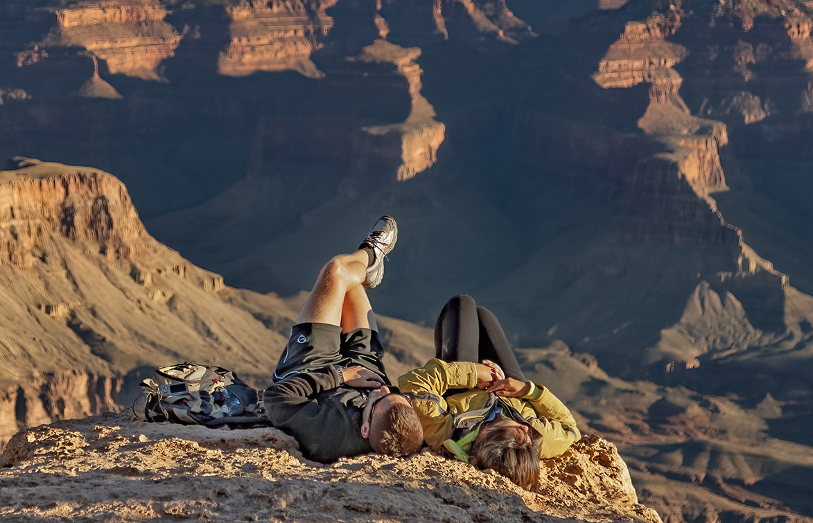
Many thanks for the suggestions. I have revised my image by lightening the dark shadow areas. I have also cropped some off the bottom to bring the images even closer to the edge. |
Nov 14th |
 |
| 78 |
Nov 21 |
Reply |
Mitch, it was not posed. I could not believe that anyone would want to get that close to what is perhaps a 1,000 foot drop off. |
Nov 14th |
| 78 |
Nov 21 |
Comment |
A wonderful image. Just a great capture. My only minor suggestion is the same was Terry's - crop a little off the left side. |
Nov 5th |
| 78 |
Nov 21 |
Comment |
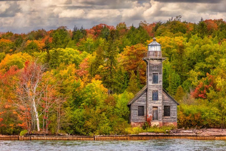
A wonderful image with great composition - so much better with the trees on the left being included. A very minor suggestion is to crop some off the bottom and to crop a little off the left side so the wonderful silver tree is more prominent. In my revision I also dodged some of the colored foliage to bring out more of the fall colors. |
Nov 5th |
 |
6 comments - 1 reply for Group 78
|
17 comments - 1 reply Total
|