|
| Group |
Round |
C/R |
Comment |
Date |
Image |
| 11 |
Oct 21 |
Comment |
A wonderful image with great composition. I especially like the way you have captured the flowing waters. No suggestions. |
Oct 18th |
| 11 |
Oct 21 |
Comment |
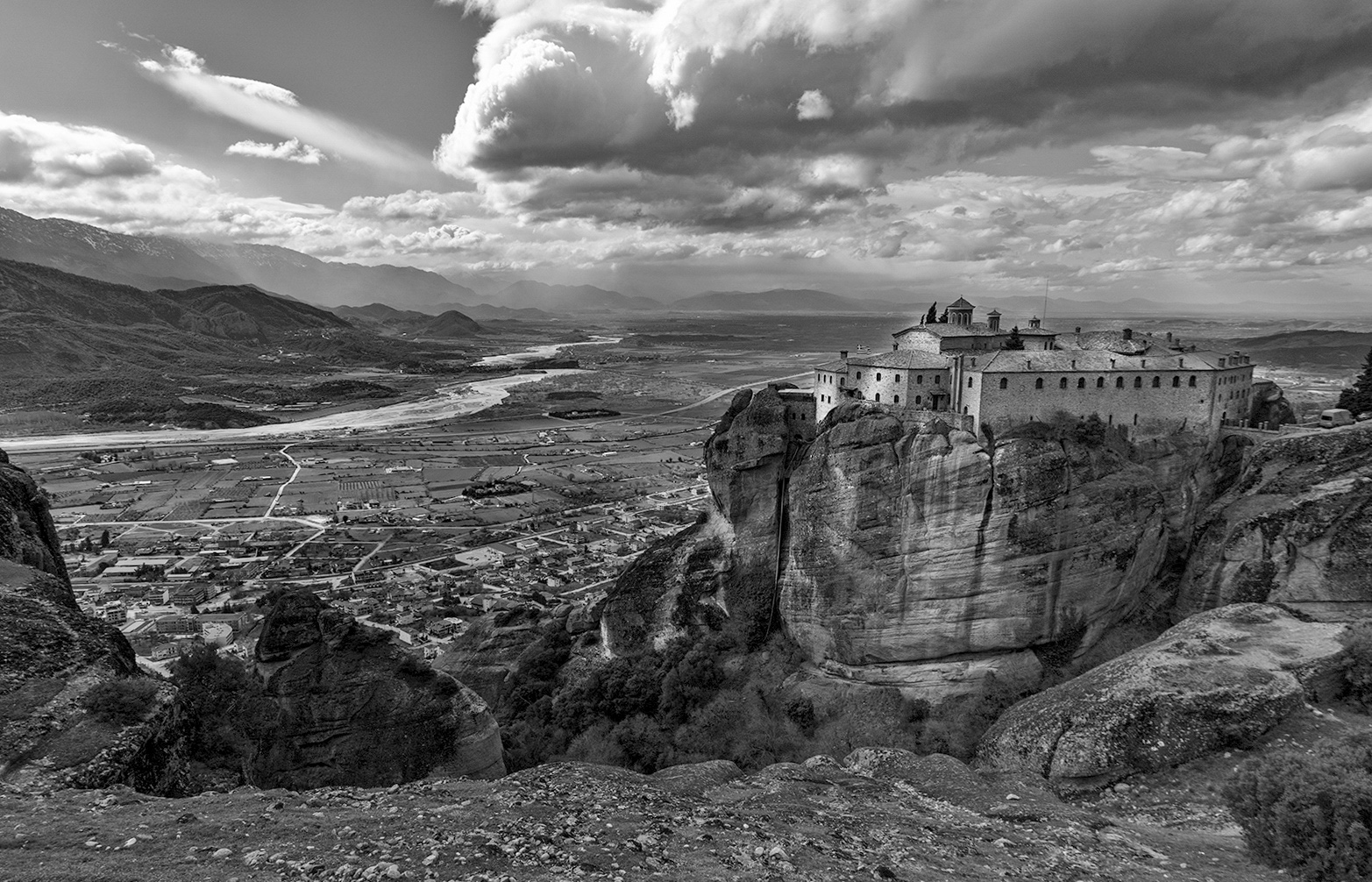
A great photo with great composition. To me it seems like the image is tilting downward toward the left. In my revision I used the roof line of the monastery to level the image and I also lightened some of the very dark shadow areas. |
Oct 18th |
 |
| 11 |
Oct 21 |
Comment |
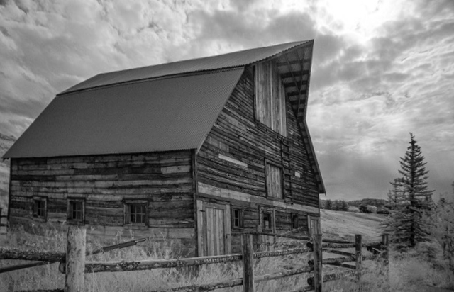
I like the image and your composition. But, it seems to me that the barn is still tilting downward on the right side and also somewhat forward which I've attempted to correct in my revision. Also, I would have liked a little more space behind the barn. |
Oct 5th |
 |
| 11 |
Oct 21 |
Comment |
A very interesting composition with the shadow being the main area of interest. I like Stephen's revision as, in my opinion, it improves the composition by focusing on the very interesting diagonals. |
Oct 5th |
| 11 |
Oct 21 |
Comment |
Wow, what an outstanding image. I have a slight preference for the color 2 version. But, I also like the mono version a lot and have just a minor recommendation which is to lighten the dark areas of those in the raft and especially the hats to make them stand out more from the background. |
Oct 5th |
5 comments - 0 replies for Group 11
|
| 18 |
Oct 21 |
Comment |
I like your wonderful creation. However, to me my eye is drawn to the center of the image. I suggest moving the runner more to the right (closer to the yellow lines) and up slightly to improve the composition. |
Oct 5th |
| 18 |
Oct 21 |
Reply |
Mike, thanks for your suggestion. I do like the additional saturation. |
Oct 5th |
| 18 |
Oct 21 |
Comment |
Great shot! I like your "original" creation which I feel could use a little more contrast. The revision is certainly creative but I am not sure it is an improvement over your original. |
Oct 5th |
| 18 |
Oct 21 |
Comment |
A wonderful creation. The colors go together so well as does your background. I have no suggestions. |
Oct 5th |
| 18 |
Oct 21 |
Comment |
I like both images a lot but do have a preference for your more vibrant revision. I have no suggestions. |
Oct 5th |
| 18 |
Oct 21 |
Comment |
A very interesting and creative image - but, not something I want to hang on my living room wall. I agree with the previous suggestions to put the skull above the bones and in a position not touching the bones. |
Oct 5th |
5 comments - 1 reply for Group 18
|
| 78 |
Oct 21 |
Comment |
A wonderful capture and a wonderful conversion. No suggestons. |
Oct 7th |
| 78 |
Oct 21 |
Comment |
A wonderful image with wonderful composition. But, to me the dark sky seems at odds with the bright grass areas behind the cattle. In my revision I went back to the original, darkened the sky slightly, added more vibrance to the grass areas and cloned out the dark object on the right side of the image. |
Oct 7th |
 |
| 78 |
Oct 21 |
Comment |
Interesting image. Sunil's revision greatly improves the composition. |
Oct 7th |
| 78 |
Oct 21 |
Comment |
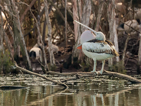
I like your revision as I much prefer the horizontal format instead of the original vertical. In my revision I changed the color cast somewhat and also blurred the background slightly to make the pelican stand out more. |
Oct 7th |
 |
| 78 |
Oct 21 |
Comment |
I like your image except for the remaining white fence as it is a distraction. I like Terry's revision with the remaining fence being removed. One other suggestions would be to add some motion blur to the background. |
Oct 7th |
| 78 |
Oct 21 |
Reply |
Terry, I did not like the windows in my image no matter what I did but thought perhaps they are okay. You comments convinced me to do more work as the windows are not okay. So I revised my windows mainly from other of my images. |
Oct 7th |
 |
5 comments - 1 reply for Group 78
|
15 comments - 2 replies Total
|