|
| Group |
Round |
C/R |
Comment |
Date |
Image |
| 11 |
Sep 21 |
Reply |
Many thanks. Jim |
Sep 19th |
| 11 |
Sep 21 |
Reply |
Thanks for the suggestions. Jim |
Sep 19th |
| 11 |
Sep 21 |
Reply |
It does look over sharpened. Perhaps I somehow sharpened it twice. Thanks.
|
Sep 19th |
| 11 |
Sep 21 |
Comment |
A great image and a great capture. The image is great as is but let me suggest an alternative featuring just the hikers. |
Sep 19th |
 |
| 11 |
Sep 21 |
Comment |
A very nice capture but, to me, very difficult to work with. There are dark areas along the water, little contrast in the mid mountains and very bright areas and little contrast in the mountains. In my revision I have attempted to create more interest by cropping off the bottom reflections and some off the left side so as to feature the mountain peak. In my revision I worked with each area of the image to increase contrast. |
Sep 19th |
 |
| 11 |
Sep 21 |
Comment |
Very nice image and very nice conversion to mono. I would have liked to have seen an object of interest in the composition. |
Sep 19th |
| 11 |
Sep 21 |
Comment |
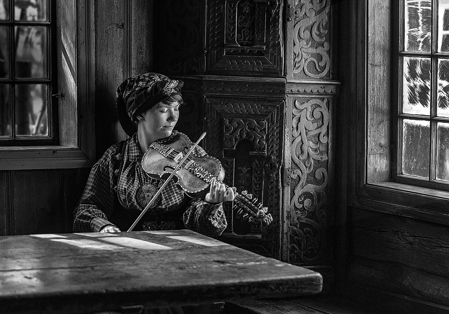
An outstanding image with wonderful lighting and wonderful composition. My only suggestion is to darken the windows as I feel their brightness detracts from the subject. In my revision I burned in the window on the right and darkened and blurred the window on the left. I also cropped a small amount off the left side of the image. |
Sep 9th |
 |
| 11 |
Sep 21 |
Comment |
I like your mono version much more than the color version. And, I think your composition with the curves is great. A very minor suggestion would be to crop out the first pillar on the left as it is the only part of the image that is not sharp, that is it is somewhat blurred. |
Sep 9th |
| 11 |
Sep 21 |
Comment |
I like the composition and think the balance between the flower and the leaf is perfect. My only complaint is that the flower is not in sharp focus. The top left of the leaf is very sharp but since the flower extends so much out beyond the leaf that it is beyond focal plane of the leaf. Since you shot at F16 you cannot extend the depth of field and, I guess, the only solution would be use multiple stacking photography. |
Sep 9th |
6 comments - 3 replies for Group 11
|
| 18 |
Sep 21 |
Comment |
A very interesting creation. No suggestions. |
Sep 23rd |
| 18 |
Sep 21 |
Comment |
You original is a very good photo but your converted image is an outstanding work of art. Just superb. Many thanks for sharing your techniques. |
Sep 23rd |
| 18 |
Sep 21 |
Comment |
A very pleasant image but I suggest adding a creative element of interest - perhaps something coming out of the water.
|
Sep 23rd |
| 18 |
Sep 21 |
Comment |
A very pleasant image but I suggest adding a creative element of interest - perhaps something coming out of the water.
|
Sep 23rd |
| 18 |
Sep 21 |
Comment |
Your original image is okay but your converted version is outstanding with so much feeling of motion. I would keep the conductors in the image. |
Sep 23rd |
5 comments - 0 replies for Group 18
|
| 78 |
Sep 21 |
Reply |
I think your color revision is great but I still prefer the mono. There is one white water spot on her knee - very minor nit but why not get rid of it.
|
Sep 23rd |
| 78 |
Sep 21 |
Comment |
A wonderful capture - great image. To me I prefer to see more contrast in the eagle, more of the trees from the left side and with the subject less centered which I have done in my revision. I also reduced the background noise. |
Sep 23rd |
 |
| 78 |
Sep 21 |
Comment |
Very nice image but I suggest cropping off most of the right half leaving just the main areas of interest. |
Sep 23rd |
| 78 |
Sep 21 |
Comment |
Great image. Time well spent for such a wonderful creation. No suggestions. |
Sep 23rd |
| 78 |
Sep 21 |
Comment |
I really like your color creation. My only suggestion is to consider closing the open gaps in the flowing bars at the right end of your image. |
Sep 23rd |
| 78 |
Sep 21 |
Comment |
Great photo. Gret composition. My only suggestion is to drken the bright areas in the background. |
Sep 23rd |
| 78 |
Sep 21 |
Comment |
I think your converted image is excellent and would not change a thing. The composition, the shades of mono, and the artistic style of the model all work together. I very much prefer the mono. Title? How about The Joy of Dancing. |
Sep 20th |
| 78 |
Sep 21 |
Reply |
Thanks for your suggestion. Cropping those areas does improve the composition. |
Sep 9th |
6 comments - 2 replies for Group 78
|
17 comments - 5 replies Total
|