|
| Group |
Round |
C/R |
Comment |
Date |
Image |
| 11 |
Aug 21 |
Comment |
A wonderful image with great detail and great composition. Many thanks for including the individual image. Amazing that you could take 90 images and photo stack them. I am guessing that the feather was quite small. Again, great shot. No suggestions. |
Aug 13th |
| 11 |
Aug 21 |
Comment |
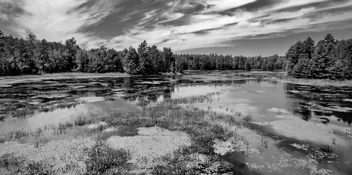
I like your image with the great diagonals coming in from both sides. Photography is of course an art form and my preference is for less contrast. In my revision I increased the height of the image, then cropped some from the left and the bottom. I also reduced the contrast, dodged the lower area of some trees and burned in some bright areas. |
Aug 13th |
 |
| 11 |
Aug 21 |
Comment |
I like your image a lot - sharp with great detail and contrast. But, I would clone out the branches on the right side of the image and also leave more room around the subject and if by so doing unwanted homes or objects are included, then darken and blur them. One other point. When you use wide angle lenses (I love them) try to keep the lens parallel to the subject. I am guessing that your camera (and lens) was pointing upward when shooting, resulting in the top portions of the house appearing to tilt backwards. Try cranking up your tripod as high as possible to minimize tilting. |
Aug 13th |
| 11 |
Aug 21 |
Comment |
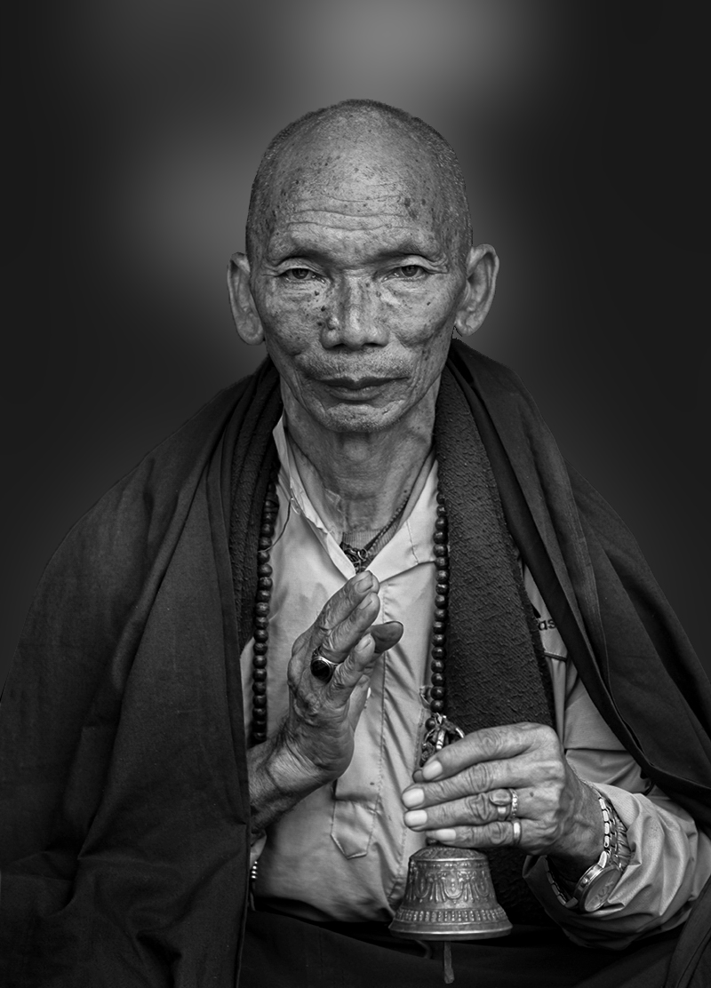
I like your image and especially your composition. But, the face and nose, in my opinion, are too bright. In my revision I opened your color image in Photoshop Raw and reduced the highlights. I then converted the image as you did using Silver Efex but found the background very distracting. So I selected just the background and used a gaussian blur at a high level and liked the effect so I left it that way. And I finally dodged a few areas on the robe to add a little more interest and slightly burned in some of the face area. |
Aug 13th |
 |
| 11 |
Aug 21 |
Comment |
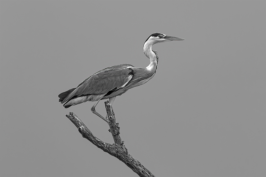
A great photo, composition and sharpness. My only suggestion is to consider making the background somewhat darker as in my revision. |
Aug 13th |
 |
| 11 |
Aug 21 |
Comment |
A wonderful image and composition. The placement of the truck so great as everything in the background compliments the truck. I have no suggestions. |
Aug 13th |
6 comments - 0 replies for Group 11
|
| 18 |
Aug 21 |
Comment |
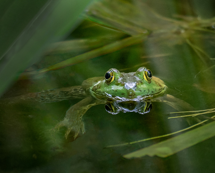
A wonderful image. My only suggestion would be to have the frog to be not in the exact center of the image. In my revision I made the frog more horizontal and cropped some off the bottom and right side. I also darkened the foliage on the top left side. |
Aug 16th |
 |
| 18 |
Aug 21 |
Comment |
I love everything about your image - the colors, the objects, the background and the composition. Everything is just great. I have no suggestions. |
Aug 16th |
| 18 |
Aug 21 |
Comment |
I find your image very interesting. I keep looking at the right side and imagine it is some sort of a ghost attacking the image on the left. The effect might be even more pronounced if the image on the left side was separated more from the right side. Just a thought. |
Aug 16th |
| 18 |
Aug 21 |
Comment |
Very nice image which is so much better than the original. I have no suggestions. |
Aug 16th |
| 18 |
Aug 21 |
Reply |
Mike, I will have to think of a better name than morning coffee.
|
Aug 13th |
4 comments - 1 reply for Group 18
|
| 21 |
Aug 21 |
Comment |
Very interesting and very creative. I have no suggestions. |
Aug 16th |
| 21 |
Aug 21 |
Comment |
Very nice image. Wonderful color, wonderful composition. I have no suggestions. |
Aug 16th |
| 21 |
Aug 21 |
Comment |
I also think there are too many elements in the image. I think that having just the people in the image (with those on the right also highlighted), the wonderful sky, birds and the moon would make a great image. |
Aug 16th |
3 comments - 0 replies for Group 21
|
| 78 |
Aug 21 |
Comment |
Great capture, great image. I agree with the suggestions to flip the image. No other suggestions. |
Aug 22nd |
| 78 |
Aug 21 |
Comment |
Very nice image except for the bright areas at the top. I like your revision where you burned them out. You also might try to blur those areas as well. |
Aug 22nd |
| 78 |
Aug 21 |
Comment |
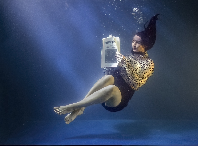
I like the image a lot, very creative. However, I prefer the color version. In my revision I selected just the model, brightened the image, eliminated the bluish tone and darkened the legs. Then I used the dodge tool to increase the light streams. And, I cropped tighter with the model more at a diagonal. |
Aug 22nd |
 |
| 78 |
Aug 21 |
Comment |
A wonderful image and a great conversion. It would have been even greater if the subject had been facing forward. |
Aug 22nd |
| 78 |
Aug 21 |
Comment |
Great image, great conversion - much better than the original. I really like your corrected version. |
Aug 22nd |
| 78 |
Aug 21 |
Reply |
I used my own home made soft boxes (flood lights covered with cheese cloth) with more light on the left side. |
Aug 22nd |
| 78 |
Aug 21 |
Comment |
Interesting image, much better than the original, but the image needs something of interest. The lantern is not quite enough. |
Aug 22nd |
6 comments - 1 reply for Group 78
|
19 comments - 2 replies Total
|