|
| Group |
Round |
C/R |
Comment |
Date |
Image |
| 11 |
Feb 21 |
Comment |
I really like your original 2 image and prefer it slightly over your mono conversion. I have no suggestions for improving either image. |
Feb 19th |
| 11 |
Feb 21 |
Comment |
I like your conversion to mono, the leading lines and the overall composition. Very nice. |
Feb 8th |
| 11 |
Feb 21 |
Comment |
A very interesting travel shot. But my preference would be to have seen more of the inside of the tent and more contrast. |
Feb 8th |
| 11 |
Feb 21 |
Comment |
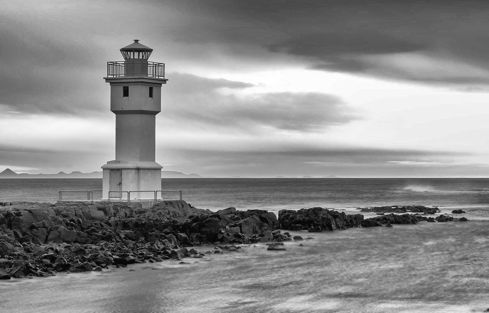
I like the image and your conversion to mono. You might want to consider a tighter crop so as to focus more attention on the lighthouse. |
Feb 8th |
 |
| 11 |
Feb 21 |
Comment |
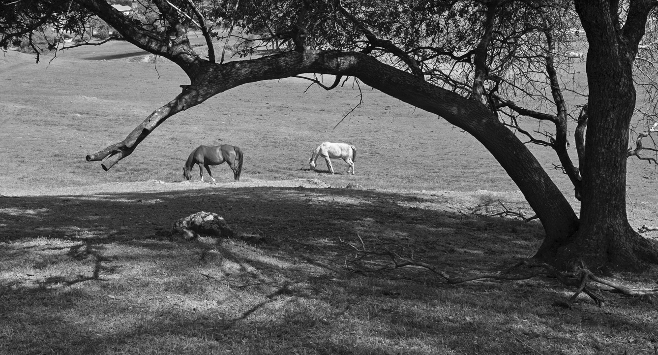
I like the image and the mono conversion. However, I am not sure about the heavy limb framing the horses. Consider my conversion in which I included the end of the limb and more of the foreground which I felt allows the eye to move around more in the image. |
Feb 8th |
 |
5 comments - 0 replies for Group 11
|
| 18 |
Feb 21 |
Reply |
Thanks for your suggestion. Please see my revision. |
Feb 19th |
| 18 |
Feb 21 |
Reply |
Thanks for your suggestion. Please see my revision. |
Feb 19th |
| 18 |
Feb 21 |
Comment |
Many thanks for the helpful suggestions. One comment was about the blurred areas. I found another photo taken at the same time that had the handle bar area in sharp focus so I copied that area and incorporated it into my original photo. I also took the suggestions to brighten my image and increase the saturation. And, finally I also, as suggested, cropped some off the left side of the image. So, here is my revised image. |
Feb 19th |
 |
| 18 |
Feb 21 |
Reply |
Thanks for your suggestion. Please see my revision. |
Feb 19th |
| 18 |
Feb 21 |
Reply |
I agree, see my revision. |
Feb 19th |
| 18 |
Feb 21 |
Reply |
Thanks Mike. I am going to try to do as you suggest. |
Feb 9th |
| 18 |
Feb 21 |
Comment |
Wow! How creative! I have no suggestions.
|
Feb 8th |
| 18 |
Feb 21 |
Comment |
Wow! How creative! I have no suggestions.
|
Feb 8th |
| 18 |
Feb 21 |
Comment |
A great idea and a great composition. My only suggestion is to consider eliminating the "hanging" boy as his image doesn't seem natural and I think the image would look great with just the single boy. |
Feb 8th |
| 18 |
Feb 21 |
Comment |
The image is a great capture but I feel there should be a lot more space around the plane. The crop is too tight. And, I would have liked to have seen less contrast especially in the shadow areas. |
Feb 8th |
| 18 |
Feb 21 |
Comment |
I like the image,the composition and have no suggestion for improvement. |
Feb 8th |
6 comments - 5 replies for Group 18
|
| 78 |
Feb 21 |
Reply |
I very much like your revision and your straightened walls - just right. I like the image without the moon but that is just a personal preference. Great photo! |
Feb 19th |
| 78 |
Feb 21 |
Comment |
I really like the image, sharp with great composition. But, as suggested, I would reduce the noise in the sky. |
Feb 9th |
| 78 |
Feb 21 |
Comment |
An incredible amount of work resulting in an incredible photo. I would not change anything. Great photo! |
Feb 9th |
| 78 |
Feb 21 |
Comment |
Great shot. I especially like the way you blurred the background. |
Feb 9th |
| 78 |
Feb 21 |
Reply |
I am also going to try to add as you (and Brenda)a flame and maybe some smoke. |
Feb 9th |
| 78 |
Feb 21 |
Reply |
Terry, great idea to reduce the halo. Thanks. |
Feb 9th |
| 78 |
Feb 21 |
Comment |
Very nice, great shot although my preference would have been to straighten the slanting wall. |
Feb 9th |
4 comments - 3 replies for Group 78
|
15 comments - 8 replies Total
|