|
| Group |
Round |
C/R |
Comment |
Date |
Image |
| 11 |
Jan 21 |
Reply |
Jim, I wish that photo was in my collection. Kudos! |
Jan 16th |
| 11 |
Jan 21 |
Comment |
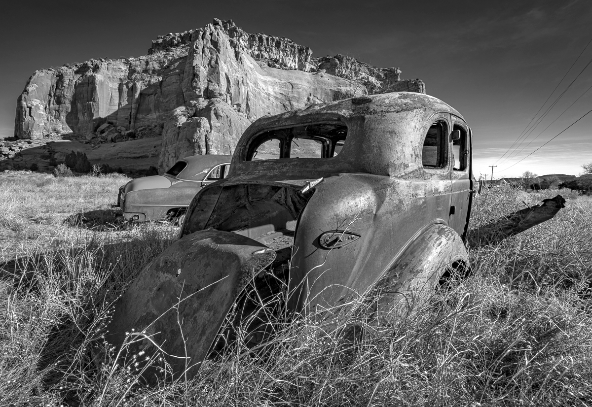
I like the image and the composition. My personal preference is to have a little more contrast as in my revision. (I am going to re calibrate my monitor as my posted revision looks the same as your original.) |
Jan 15th |
 |
| 11 |
Jan 21 |
Comment |
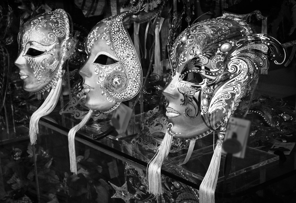
I think this is wonderful image with a great composition and great tonal range. My only minor suggestion would be to darken the cards and the two smaller masks sitting on the glass shelf. In my revision I also slightly blurred the cards. |
Jan 15th |
 |
| 11 |
Jan 21 |
Comment |
I like your image and the composition. I would have liked to have seen more contrast but given the very dark original such an adjustment does not seem possible. |
Jan 15th |
| 11 |
Jan 21 |
Comment |
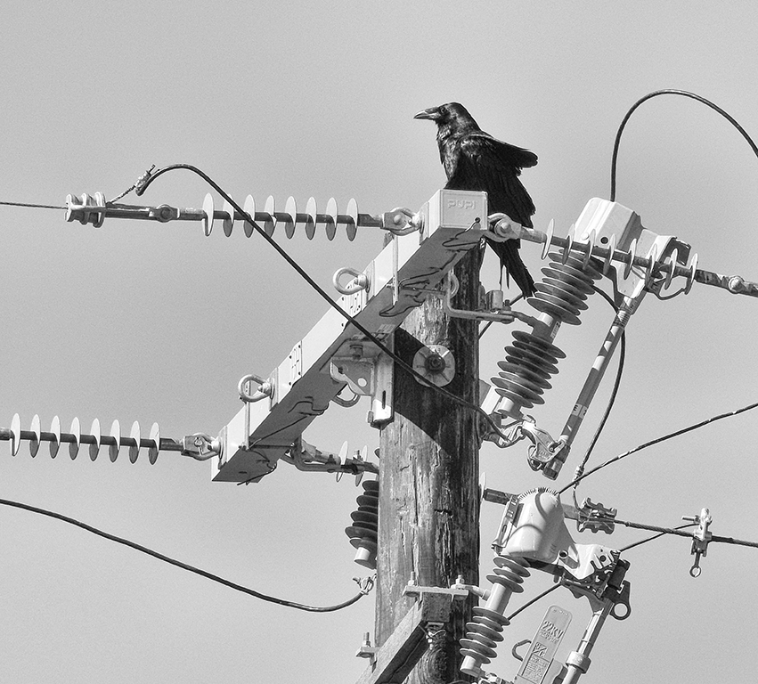
Allen, I really like your conversion as the color image has little interest. My only suggestion is to crop some off the right side so that the pole and bird are no so centered. |
Jan 15th |
 |
4 comments - 1 reply for Group 11
|
| 18 |
Jan 21 |
Comment |
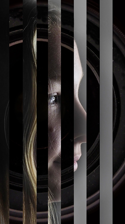
I like the overall concept but I also find the lettering to be distracting. In my revision I eliminated the lettering and also cropped much tighter. |
Jan 15th |
 |
| 18 |
Jan 21 |
Comment |
Mike, I really like your revised image. Your original is very good but your revision is outstanding. Eliminating the blue panels and slanting the image adds a great feeling of motion. |
Jan 15th |
| 18 |
Jan 21 |
Comment |
I like you image and the composition. I have no suggestion for improvement other than considering another title such as, "A Tree of Health." |
Jan 15th |
| 18 |
Jan 21 |
Comment |
I like the image and your eliminating the distracting background. My preference is also to eliminate the barriers around the subject as I feel they distract from the overall whimsical feeling of the image. I also think some sort of a bow would be a great addition. |
Jan 15th |
| 18 |
Jan 21 |
Comment |
A wonderful image. A wonderful conversion. I have no suggestions. |
Jan 15th |
5 comments - 0 replies for Group 18
|
| 78 |
Jan 21 |
Reply |
Terry, many thanks for the suggestion. |
Jan 15th |
| 78 |
Jan 21 |
Comment |
Abdo, you have created a superb image. I have no suggestions for improvement. |
Jan 15th |
| 78 |
Jan 21 |
Comment |
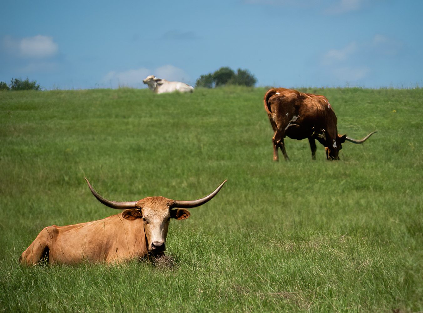
I like the image but like others I felt the horizon should be straightened (even though the original may be more accurate). I also added a little saturation to the image and I blurred the grasses behind the front cow. I also cropped some off the grass in the foreground and some from the right side and top and I also reduced some of the noise in the sky. |
Jan 15th |
 |
| 78 |
Jan 21 |
Comment |
I like the image and the way you eliminated so many distracting elements from the background. I have no suggestions. |
Jan 15th |
| 78 |
Jan 21 |
Comment |
A wonderful card and a great start to a much better New Year. Best wishes to you as well. |
Jan 15th |
| 78 |
Jan 21 |
Comment |
I like this image a lot as there is so much interest in all areas of the image. I have no suggestions. |
Jan 15th |
5 comments - 1 reply for Group 78
|
14 comments - 2 replies Total
|