|
| Group |
Round |
C/R |
Comment |
Date |
Image |
| 11 |
Oct 20 |
Comment |
A great photo. To me it was amazing that flipping the image so greatly improved the image. I have no suggestions - just wonderful. |
Oct 11th |
| 11 |
Oct 20 |
Comment |
A very nice image and a very nice conversion. My only minor suggestions are to have a little more space above the statue, to crop a little off the right side and to darken the two white flowers. |
Oct 11th |
| 11 |
Oct 20 |
Comment |
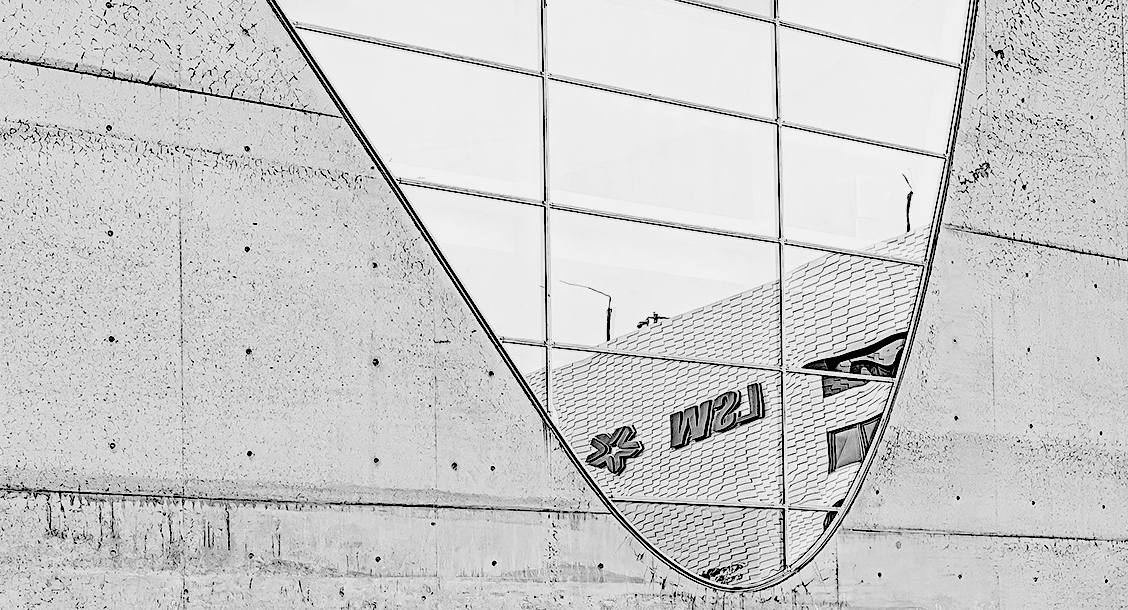
I am not sure what is the subject of the photo. I think the most interesting parts of the photo is the reflection so in my revision I eliminated the sky and most of the concrete wall. And, I also increased the contrast of the reflection. |
Oct 11th |
 |
| 11 |
Oct 20 |
Comment |
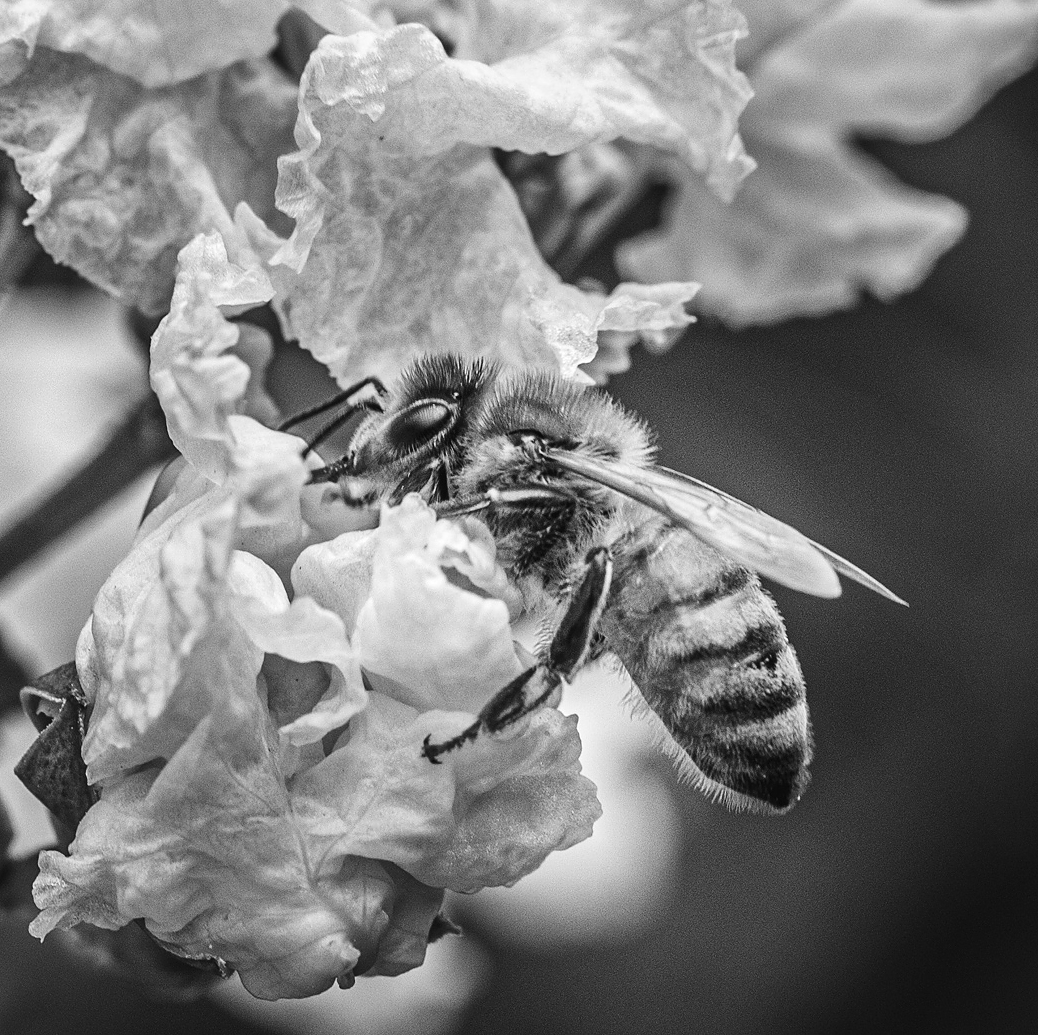
What a great shot and what outstanding sharpness! I like the mono image (but original 2 is also great). Since the subject of the photo is the bee I suggest a tighter crop and also a little more contrast. |
Oct 11th |
 |
4 comments - 0 replies for Group 11
|
| 18 |
Oct 20 |
Comment |
Very interesting image. To me there are so many things going on that I am not sure what is the subject of the photo. My eye is drawn to the staircase and the joker so one suggestion would be to feature just the staircase and to its left have the joker looking sideways at it. |
Oct 11th |
| 18 |
Oct 20 |
Comment |
Very interesting combination of images. |
Oct 11th |
| 18 |
Oct 20 |
Comment |
Mark, very clever and very interesting. |
Oct 11th |
| 18 |
Oct 20 |
Comment |
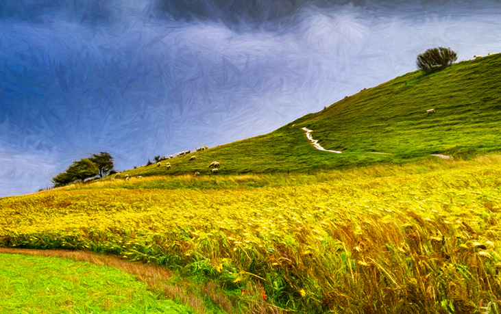
Ian, I like your dramatic conversion. However, to me, the main areas of interest are the sheep, the clump of trees on the left and the path on the hill. In my revision I have tried to emphasize those features. |
Oct 11th |
 |
| 18 |
Oct 20 |
Reply |
The mono image is my original image after I converted it from my infrared image (which I have not shown). The images shown as Original 1 and Original 2 are my mono image after I adjusted using Topaz Studio 2 filters. |
Oct 2nd |
4 comments - 1 reply for Group 18
|
| 78 |
Oct 20 |
Comment |
A wonderful image. I have no suggestions for improvement. |
Oct 26th |
| 78 |
Oct 20 |
Comment |
I really like this image but also feel a little more contrast is needed. |
Oct 26th |
| 78 |
Oct 20 |
Comment |
I think the photo is outstanding except for the very blurred foliage on the right and left of the image. I like Terry's image which reduces the blurred foliage and emphasizes the great expression of the woman. |
Oct 26th |
| 78 |
Oct 20 |
Comment |
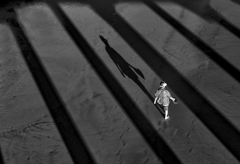
Sunhil, I like your mono converted image much more than the original color. My preference would be for a tighter crop to emphasize the figure and also so he is not so centered. In my revision I also added a slight increase in contrast. |
Oct 13th |
 |
| 78 |
Oct 20 |
Reply |
Thanks for your comments. I have submitted my original photo and if you are still interested I would like to see your revision. |
Oct 13th |
| 78 |
Oct 20 |
Reply |
My original and revised photos have now been submitted. |
Oct 13th |
| 78 |
Oct 20 |
Reply |
Sunil, please see my revised photo and let me know if the sky looks better. |
Oct 13th |
| 78 |
Oct 20 |
Reply |
Please see my recently submitted comments and let me know if you have any other questions. |
Oct 13th |
| 78 |
Oct 20 |
Reply |
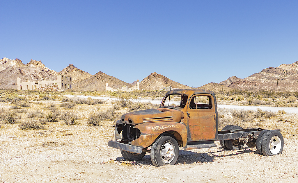
Following is my revised image. |
Oct 13th |
 |
| 78 |
Oct 20 |
Comment |
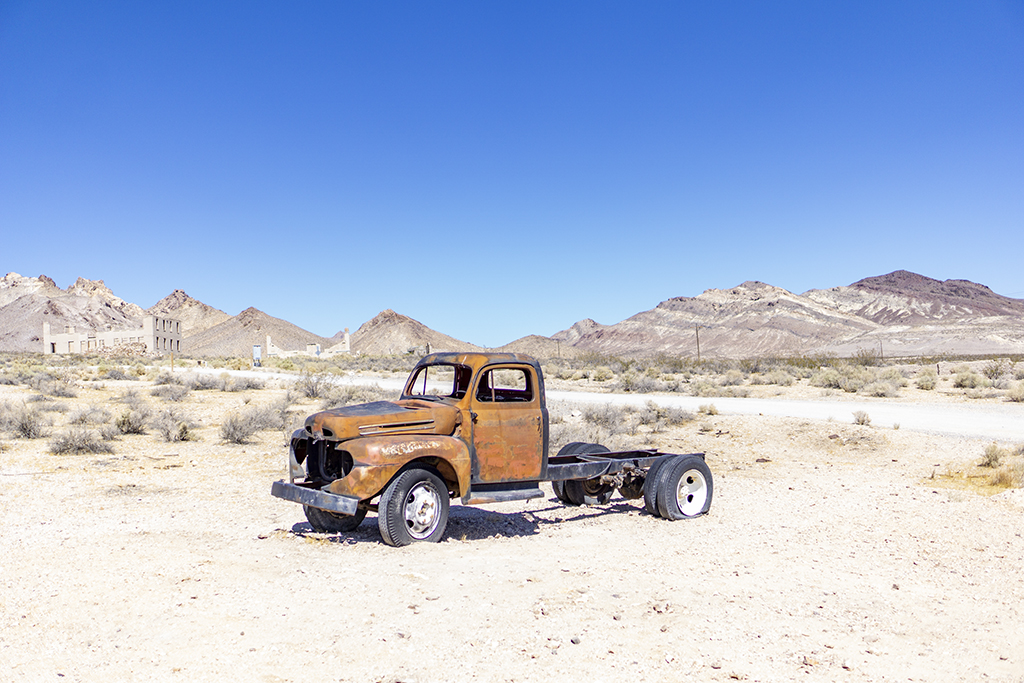
Attached is my original Road to Tonopah photo. In my originally submitted photo, I cropped much off the right side, bottom and sky areas as I wanted to get the truck out of the center of the image and also to emphasize the buildings in the background. I also eliminated a sign and a utility box from the image. I then selected the truck and increased the color and contrast of everything else in the photo and then slightly increased the contrast of the truck. In my revised image I did almost everything the same except that I left the sky and truck about the same as in the original and then slightly increased the contrast of everything else.
|
Oct 13th |
 |
5 comments - 5 replies for Group 78
|
13 comments - 6 replies Total
|