|
| Group |
Round |
C/R |
Comment |
Date |
Image |
| 11 |
Aug 20 |
Comment |
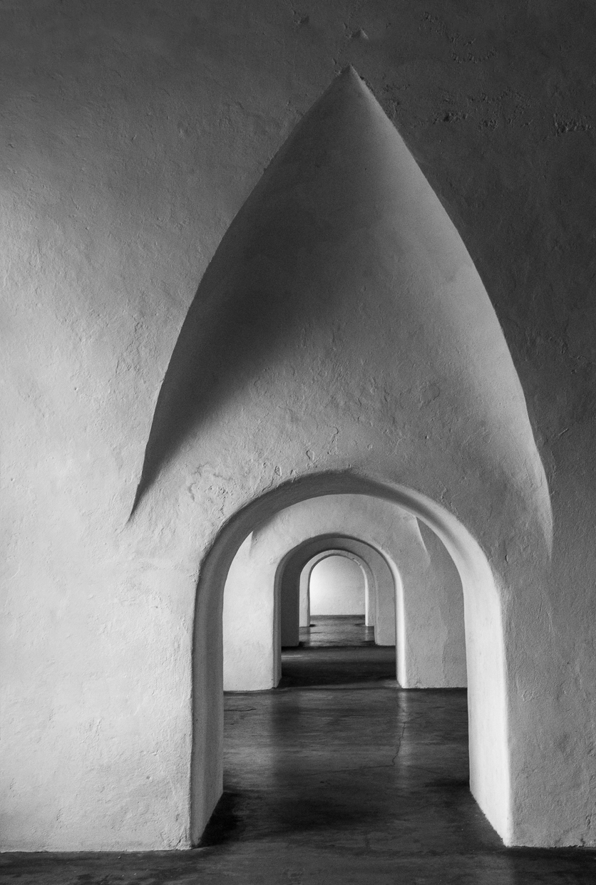
I like the photo, the shadows and the composition. A minor suggestion is to consider adding a little height to the image and cropping some off the right side so that the image is not quite so centered. |
Aug 20th |
 |
| 11 |
Aug 20 |
Comment |
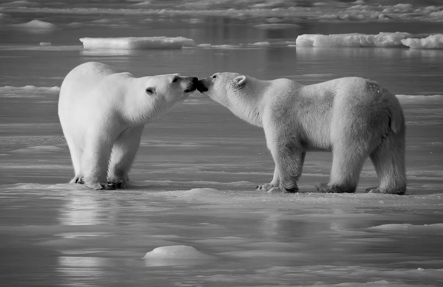
A very great photo with a capture at an incredible moment. A very minor suggestions is to crop the image somewhat and to add more contrast as in my suggested revision. |
Aug 20th |
 |
| 11 |
Aug 20 |
Comment |
What a wonderful photo - sharp, good contrast and great composition. I have no suggestions for improvement.
|
Aug 20th |
| 11 |
Aug 20 |
Comment |
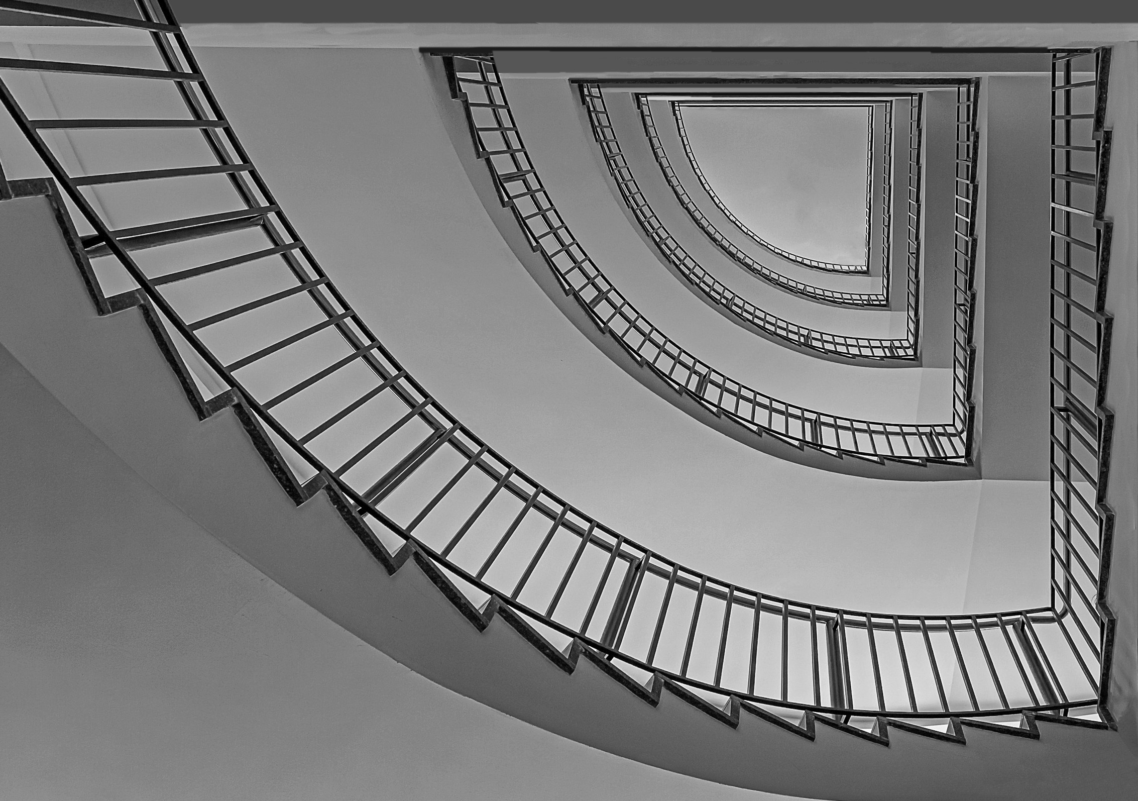
I like the image. The composition is great but I am bothered by the triangle and what appears to be reflections in the skylight. So in my revision I eliminated the triangle and the reflections. I also cropped some and took Sharron's suggestion and flipped the image. |
Aug 20th |
 |
| 11 |
Aug 20 |
Comment |
I like both the color and the mono versions. Both have a very nice composition with the upward look filled out with the surrounding leaves. I have no suggestions for improvement. |
Aug 20th |
5 comments - 0 replies for Group 11
|
| 18 |
Aug 20 |
Reply |
Okay, I guess it is distracting. See my revision below without flower. Jim |
Aug 25th |
| 18 |
Aug 20 |
Reply |
Okay, I guess it is distracting. See my revision below without flower. Jim |
Aug 25th |
| 18 |
Aug 20 |
Reply |
Okay, I guess it is distracting. See my revision below without flower. Jim |
Aug 25th |
| 18 |
Aug 20 |
Comment |
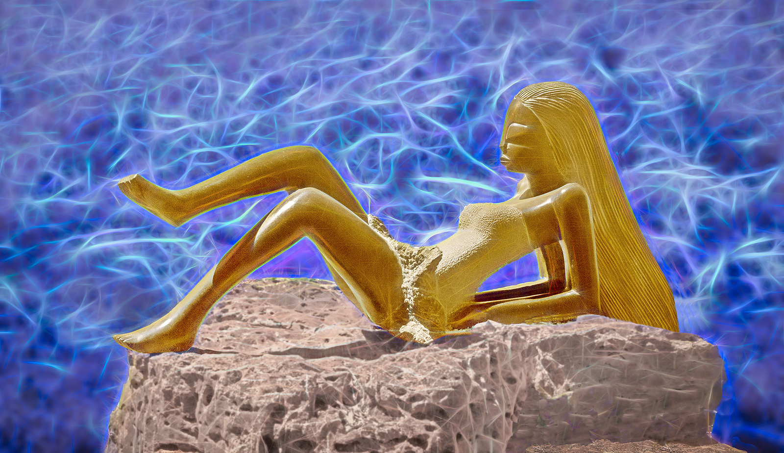
Okay, I've eliminated my lovely flower. |
Aug 25th |
 |
| 18 |
Aug 20 |
Comment |
I like the image and the very creative composition and I agree with the other suggestions of a slight crop on the left. |
Aug 19th |
| 18 |
Aug 20 |
Comment |
I like the image a lot and especially the background. My only suggestion is to consider eliminating the bird in the bottom left. The other three birds are all looking in the same direction while the bottom bird is not and with just 3 birds there would be a very nice circular eye movement. |
Aug 19th |
| 18 |
Aug 20 |
Comment |
I like the image but like others I feel that the image of Mary should be more pronounced. Also, I wonder in the candle is needed in the composition - perhaps just a larger cross. |
Aug 19th |
| 18 |
Aug 20 |
Comment |
I like the image and the composition but I do agree with the suggestion that the background should be somewhat muted.
|
Aug 19th |
| 18 |
Aug 20 |
Comment |
I like the image and am amazed at your creativity. I have no suggestions for improvement. |
Aug 19th |
6 comments - 3 replies for Group 18
|
| 78 |
Aug 20 |
Reply |
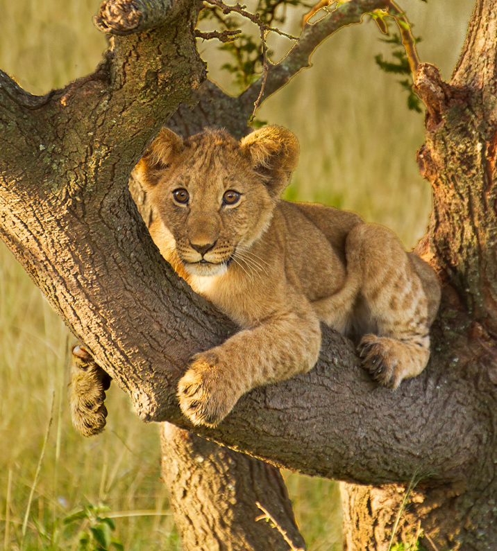
Brenda, I really like your latest crop as it eliminates most of the distracting background but I would still like to see the grass in the background darker. Did you try selecting just the background and then in Photoshop go to Image, Adjustment and Levels? Then use the middle slider to darken the selection. In my revision I did only that but then reversed the selection and used the sliders to brighten just the cub and tree but not the background. |
Aug 25th |
 |
| 78 |
Aug 20 |
Comment |
An incredible photo with incredible detail. Great! |
Aug 22nd |
| 78 |
Aug 20 |
Comment |
Very creative - like it. |
Aug 22nd |
| 78 |
Aug 20 |
Comment |
I also like the mono version and I also refer just the 3 images.
|
Aug 22nd |
| 78 |
Aug 20 |
Comment |
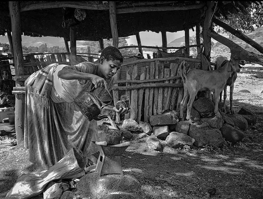
A wonderful photo but as already been said it lacks contrast. I increased the contrast then dodged some areas and burned some areas and finally cropped some off the left side. |
Aug 20th |
 |
| 78 |
Aug 20 |
Comment |
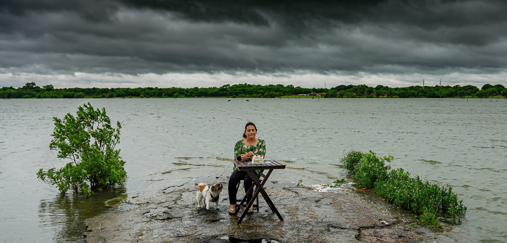
I like this very interesting photo a lot. A minor suggestion is to crop some off the sky so that the tree line does not divide the image in half and by so doing it results in more attention to your wife. |
Aug 20th |
 |
| 78 |
Aug 20 |
Comment |
I like this very interesting photo a lot. A minor suggestion is to crop some off the sky so that the tree line does not divide the image in half and by so doing it results in more attention to your wife. |
Aug 20th |
 |
| 78 |
Aug 20 |
Comment |
A wonderful image but, in my opinion, the background is too bright. In my suggested revision I darkened the background, replaced the dark tree area in the top left with grass and then cropped the image somewhat. |
Aug 20th |
 |
| 78 |
Aug 20 |
Reply |
Stephen, many thanks for your creation. |
Aug 20th |
| 78 |
Aug 20 |
Reply |
Jason you are probably right about the hallway slanting. I used a 10mm lens (15 equivalent in 35) which had a lot of distortion. I straightened everything as best I could but then made sure that one pillar was absolutely straight. |
Aug 20th |
| 78 |
Aug 20 |
Reply |
Helen, my recollection is that I took the shot actually somewhat about the railing so that if I went back any further my image would have included the railing as well as the top of the arch. The lens was a 10mm wide angle zoom - 15mm in 35. |
Aug 20th |
| 78 |
Aug 20 |
Reply |
Terry thanks for your suggestions. I took the kphoto on a Sunday which is why the corridor was empty. |
Aug 20th |
| 78 |
Aug 20 |
Reply |
Thank you Sunil. |
Aug 20th |
| 78 |
Aug 20 |
Reply |
Brenda, there was nothing left at the top of the photo. |
Aug 20th |
7 comments - 7 replies for Group 78
|
18 comments - 10 replies Total
|