|
| Group |
Round |
C/R |
Comment |
Date |
Image |
| 11 |
Jul 20 |
Comment |
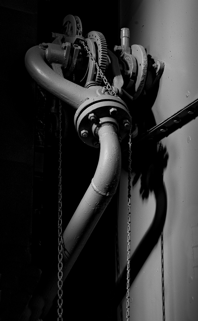
I very much like your image but am bothered a little by the object in the bottom left corner. In my revision I cropped tighter and eliminated the object. |
Jul 18th |
 |
| 11 |
Jul 20 |
Comment |
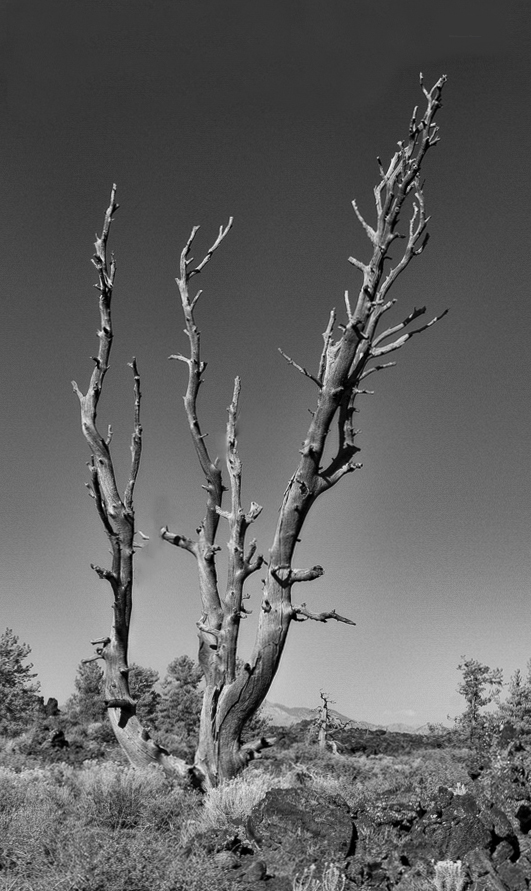
I very much like your final revision and especially the smaller juniper framed by the mountains. I made an image of the entire tree but its doesn't "work" as the limbs on the right are too confusing. |
Jul 18th |
 |
| 11 |
Jul 20 |
Comment |
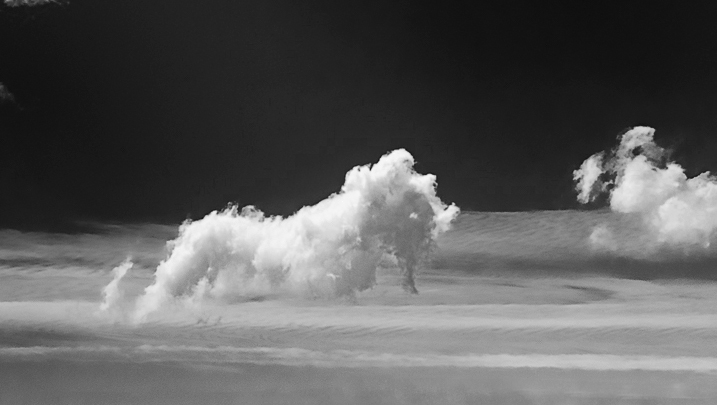
Great capture. I like the mono version and in my revision I cropped out most of everything except the sea horse. And, I changed the name to Puff The Magic Dragon. |
Jul 11th |
 |
| 11 |
Jul 20 |
Comment |
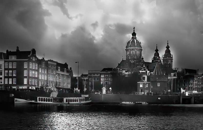
Victor, I like the photo - very striking. I have just a few minor suggestions. In my revision I cropped some of the buildings off of the left side of the image as well as some of the sky. I also removed the white outline around the large dome which I also brightened and sharkpened. |
Jul 11th |
 |
| 11 |
Jul 20 |
Comment |
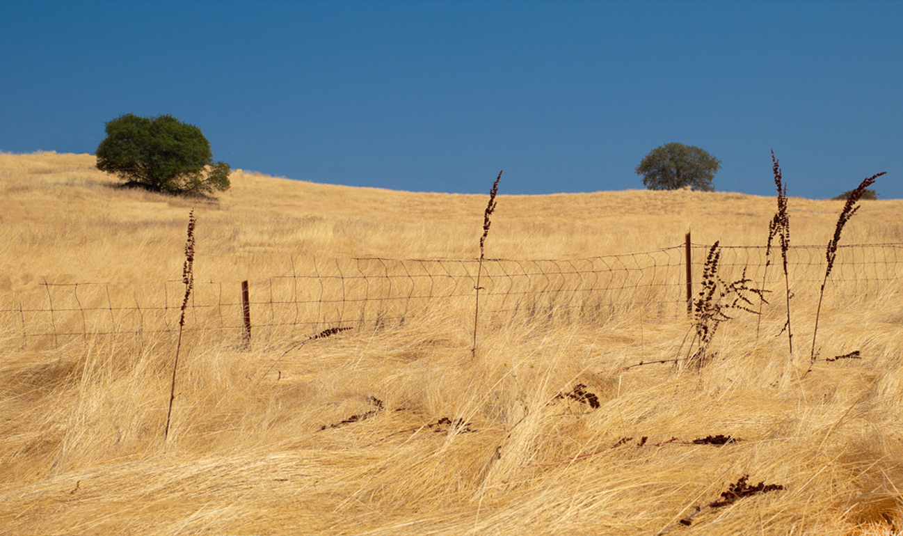
Allen, thanks for explanation about the "Golden State" as I thought the name did come from the gold rush. I like your image but I am bothered by the wire fence especially the portion going up into the sky. In my revision I left the photo in color, removed much of the upper portions of the wire fence and cropped much off the bottom. |
Jul 11th |
 |
| 11 |
Jul 20 |
Reply |
Larry, many thanks for your gracious comments. |
Jul 11th |
| 11 |
Jul 20 |
Reply |
Thanks for your comment. I agree the foliage should be eliminated from the image. |
Jul 11th |
| 11 |
Jul 20 |
Reply |
Thanks for your comment. You are right about the foilage. It adds nothing to the image. |
Jul 11th |
| 11 |
Jul 20 |
Reply |
Allen, thanks for your comments. I also would like to have seen cleaner columns. |
Jul 11th |
5 comments - 4 replies for Group 11
|
| 18 |
Jul 20 |
Reply |
Ian, thanks for your comments. I agree with you in that we can all learn from each other even though we don't always have to agree with each other. Photography is an art form and there are no "correct" answers. |
Jul 14th |
| 18 |
Jul 20 |
Comment |
A very interesting image and concept but, to me, it doesn't seem to convey an image of a chapel window. Perhaps different frames and different filters could be used to convey more of a feeling of stained glass. |
Jul 10th |
| 18 |
Jul 20 |
Comment |
To me the two images don't quite match. The one on the left is like somewhat coming out of a fog but the central image has no fog and is quite sharp. I also very much like the original color image. |
Jul 10th |
| 18 |
Jul 20 |
Comment |
I really like the image - very creative with a lot of interest. I wonder if color could be added to the blades of the windmill. |
Jul 10th |
| 18 |
Jul 20 |
Comment |
I am not sure what I am looking at (without reading your narrative) or what it represents so I am at a loss to make any suggestions. |
Jul 10th |
| 18 |
Jul 20 |
Comment |
I very much like the overall image, the colors and the composition. My only suggestion is to remove the red circle. |
Jul 10th |
| 18 |
Jul 20 |
Comment |
Your creation certainly has a lot more interest than the original. Very interesting - no suggestions for improvement. |
Jul 10th |
| 18 |
Jul 20 |
Reply |
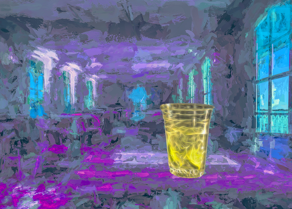
Thanks for your suggestion. I've tried to blend the cup a little better. Please see my revision. |
Jul 10th |
| 18 |
Jul 20 |
Reply |
Thanks for you suggestion. I've painted the drink a little different. Please see my revision. |
Jul 10th |
| 18 |
Jul 20 |
Reply |
Thanks for you suggestions. Please see me revision. |
Jul 10th |
| 18 |
Jul 20 |
Comment |
I revised the cup in my image by using another filter and softened the edges so that it blends in better. |
Jul 10th |
 |
7 comments - 4 replies for Group 18
|
| 78 |
Jul 20 |
Comment |
I like the image a lot, the composition and the mono version. MY suggestion is to blur the background which I think adds to the feeling of disarray. |
Jul 18th |
 |
| 78 |
Jul 20 |
Comment |
Helen, I like your image and have no suggestions for improvement. I like the cool tone of your image and the feeling it gives of the oncoming storm. |
Jul 18th |
| 78 |
Jul 20 |
Comment |
Many thanks for the suggestions and I agree my image needs to be toned down. I heard on the news that a tourist fell to her death last week in the Grand Canyon by stepping back too far for a photo op. The National Parks repeated their warning that no one should go beyond the posted signs and railings. |
Jul 18th |
| 78 |
Jul 20 |
Comment |
Wonderful photo with great colors. Of the wonderful comments and revisions already submitted I like Helen's as I feel the black rail is not needed in the image. |
Jul 18th |
4 comments - 0 replies for Group 78
|
16 comments - 8 replies Total
|