|
| Group |
Round |
C/R |
Comment |
Date |
Image |
| 11 |
Jun 20 |
Comment |
Very nice photo with great shadows and composition. No suggestions.
|
Jun 18th |
| 11 |
Jun 20 |
Comment |
Wonderful image. Great composition. No suggestions. |
Jun 18th |
| 11 |
Jun 20 |
Comment |
I like the image a lot. Wonderful composition. My only suggestion would be to lighten the very dark deep black area on the left side of the image to show some detail. |
Jun 18th |
| 11 |
Jun 20 |
Comment |
I don't know what to suggest. To me it appears that there are two competing conflicting images. The one in front is upright and the one behind it is spreading outward. I like the original color image 1.
|
Jun 18th |
4 comments - 0 replies for Group 11
|
| 18 |
Jun 20 |
Comment |
Very nice, very creative - no suggestions. |
Jun 20th |
| 18 |
Jun 20 |
Comment |
Very creative. You might consider spacing the two arches further apart.
|
Jun 20th |
| 18 |
Jun 20 |
Comment |
Very nice image - no suggestions. |
Jun 20th |
| 18 |
Jun 20 |
Comment |
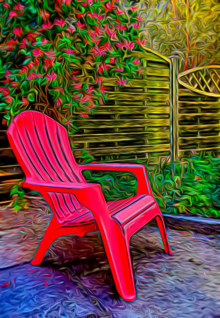
Wonderful photo. Andrew I like the photo with your original chair but also felt the chair was just too bright. In my revision I reduced only the brightness or the chair. |
Jun 17th |
 |
| 18 |
Jun 20 |
Comment |
I like the composition, the colors and have no suggestions for possible improvement. |
Jun 17th |
| 18 |
Jun 20 |
Comment |
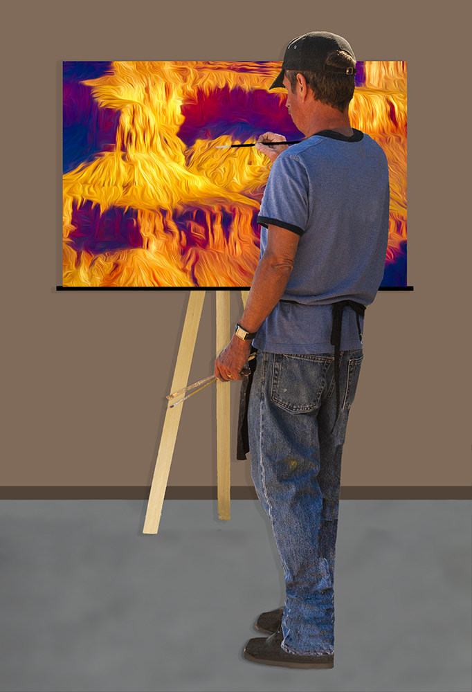
Ian, thanks for your suggestion. I decided to reduce the size of the painting and now the size of the brushes look more reasonable. |
Jun 17th |
 |
| 18 |
Jun 20 |
Reply |
Mark, thanks for your suggestion. I've reduced the size of the painting and the size of the brushes now look more reasonable. |
Jun 17th |
 |
| 18 |
Jun 20 |
Reply |
John thanks for your suggestions. I reduced the size of the "painting" to a more realistic size and I have tried to make the image of the artist more realistic by adding shadows and softening edges and I've reduced the brightness of the left arm. |
Jun 17th |
 |
| 18 |
Jun 20 |
Reply |
Mike thanks for your suggestions. I reduced the size of the "painting" to a more realistic size and I have tried to make the image of the artist more realistic by adding shadows and softening edges. |
Jun 17th |
 |
6 comments - 3 replies for Group 18
|
| 78 |
Jun 20 |
Comment |
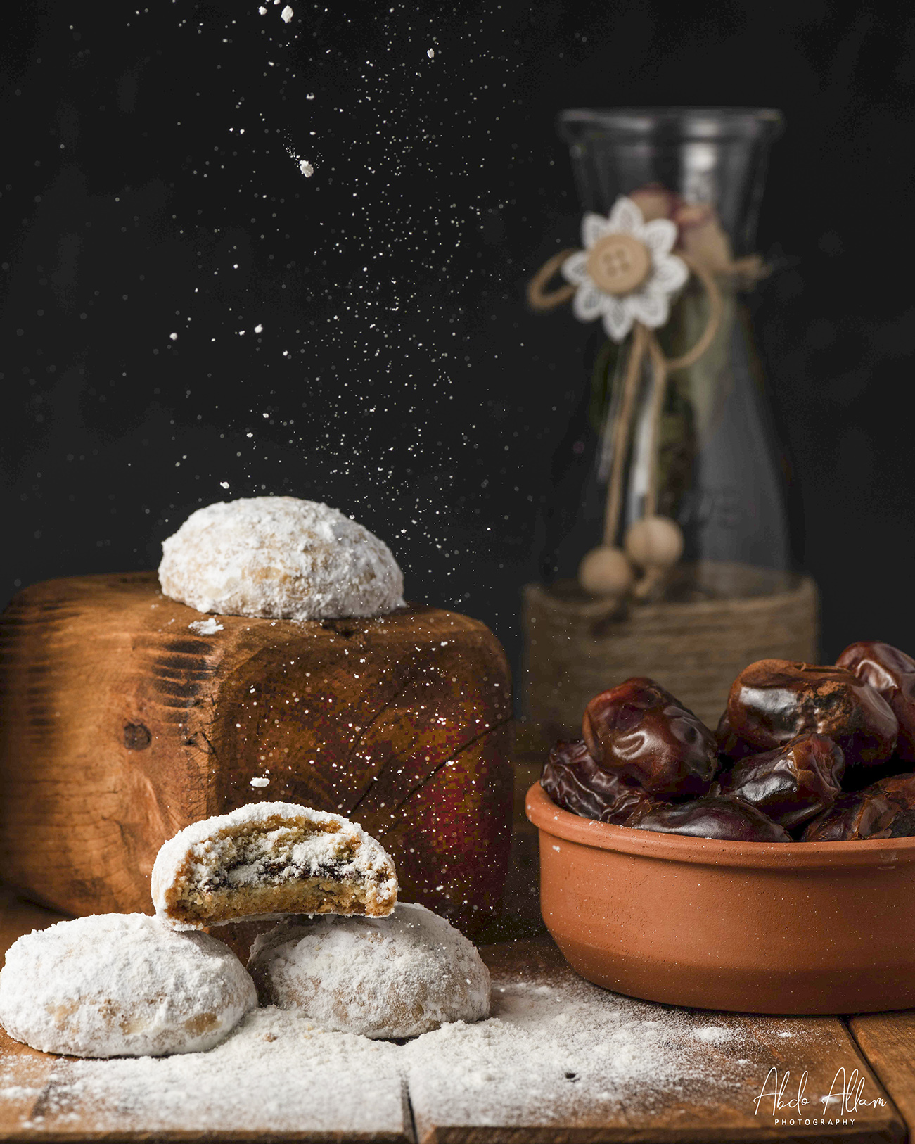
I like the photo a lot. The colors and composition are great. My only minor suggestion is to brighten the dark shadow areas. |
Jun 18th |
 |
| 78 |
Jun 20 |
Comment |
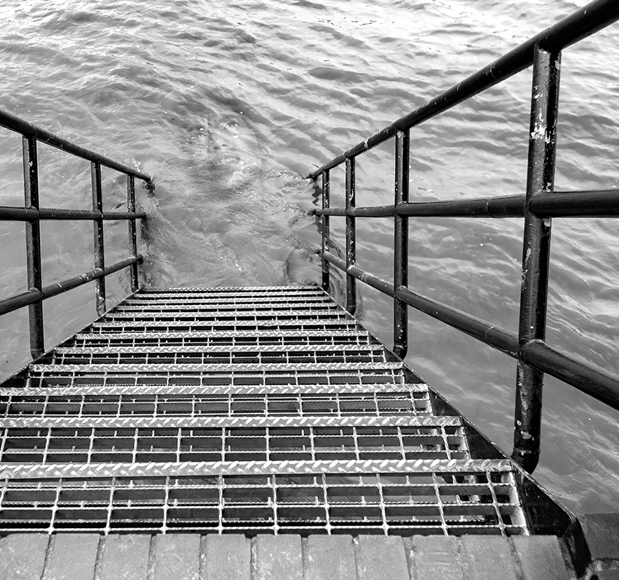
I like the photo and the way you combined the two photos. You might consider cropping some off the left side to emphasize the image in the water. |
Jun 18th |
 |
| 78 |
Jun 20 |
Comment |
An overall very nice moody photo but I don't know what to suggest to improve it. The photo is, I guess, a couple enjoying an evening. But, the couple is such a very small portion of the photo (and it is difficult to tell that there are two people there) that you wonder if the photo is really about the sea and the clouds.
|
Jun 17th |
| 78 |
Jun 20 |
Comment |
I like your photo. The composition is great as are the colors and I really enjoy the very low perspective. The only suggestion is the same as others, more space at the top of the photo. |
Jun 17th |
| 78 |
Jun 20 |
Reply |
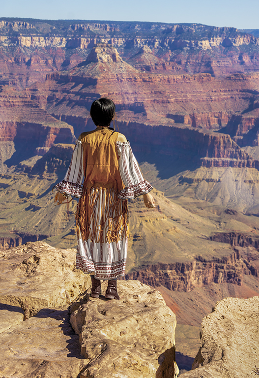
Jason, thanks for your reply. In my revision I reduced the vibrancy of the woman, changed the color of the boots to brown, eliminated the small book from the left hand and cropped some off the sky. I like your mono version. |
Jun 13th |
 |
| 78 |
Jun 20 |
Reply |
Terry thanks for your reply. In my revision I changed the color of the boots to brown, reduced the vibrancy of the woman and cropped some off the sky. |
Jun 13th |
 |
| 78 |
Jun 20 |
Reply |
Brenda, thanks for your reply. I changed the color of the boots to brown and reduced the brightness of the woman. |
Jun 13th |
 |
4 comments - 3 replies for Group 78
|
14 comments - 6 replies Total
|