|
| Group |
Round |
C/R |
Comment |
Date |
Image |
| 11 |
Apr 20 |
Comment |
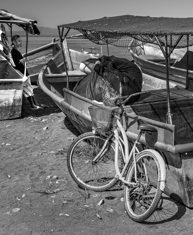
I am not sure what the subject is of the photo. I decided on an image of the boy who just arrived on a bike and is now waiting. So my revision reflects my interpretation but I would have liked to have included more of the boy in may image. I cropped the image to a vertical with the bike being prominent and then brightened the image of the boy. |
Apr 9th |
 |
| 11 |
Apr 20 |
Comment |
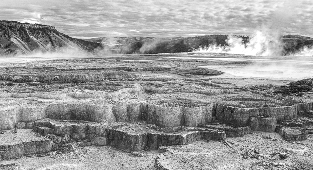
I like the image but feel that overall it is too dark especially the mountains. I also feel that the foreground should be cropped as it is not as interesting as the rest of the image. So, in my revision I started with your image 1 and converted it to mono. Then I cropped the foreground, increased the canvas size and enlarged the mountains. Then I dodged the shadow areas and also the steam areas. |
Apr 9th |
 |
| 11 |
Apr 20 |
Reply |
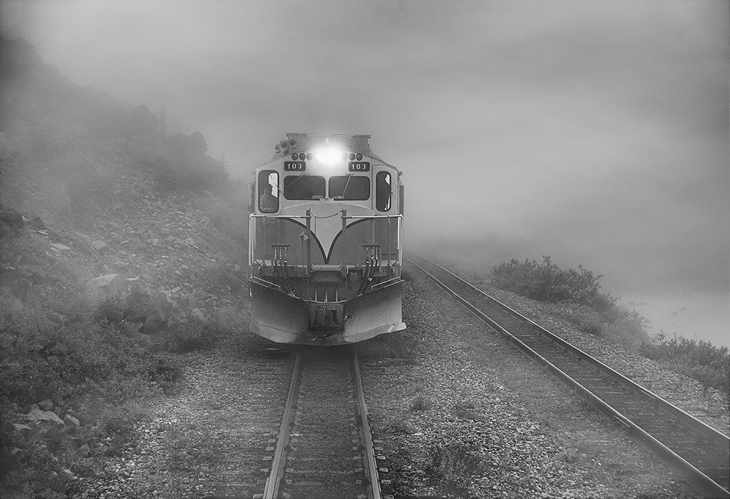
Sharon, many thanks for pointing out the moiré pattern in my image as I did not see it. I went back to my original color photo and found no trace of any pattern. And, I cannot discern where or how that pattern became part of my mono image as I keep no record of my processing steps. So, I found, on the internet, a video on how to add fog (and clouds) to an image and used it to revise my original image. Attached is my revised Train in Fog. |
Apr 9th |
 |
| 11 |
Apr 20 |
Comment |
Wow, the pigeon looks like a Star War's creation. I prefer the mono version as the color version is just too unbelievable. And I prefer the flipped version. |
Apr 8th |
| 11 |
Apr 20 |
Comment |
I love the soft beautiful colors of the original and prefer that image over the mono but I would also like to see the horse without the horizontal bars across its face. |
Apr 8th |
| 11 |
Apr 20 |
Comment |
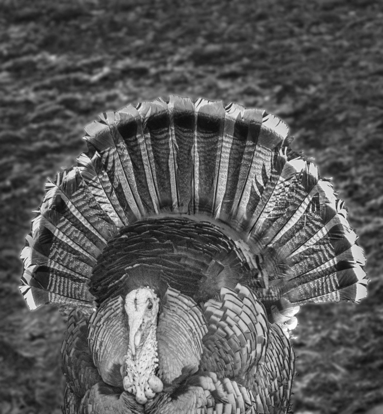
I prefer the straight mono version as I feel the sepia version emphasizes the features too much. In my revision I darkened the feathers and blurred the background. |
Apr 8th |
 |
5 comments - 1 reply for Group 11
|
| 18 |
Apr 20 |
Comment |
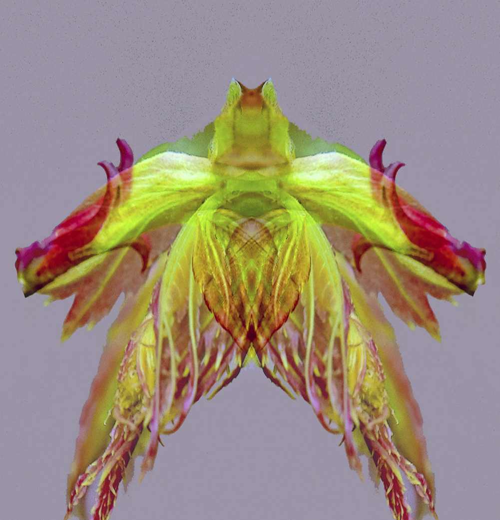
Very creative. You might consider a taller image i.e. no so squat. |
Apr 8th |
 |
| 18 |
Apr 20 |
Comment |
Nice photo. Nice creation. You might consider a beige background instead of white. |
Apr 8th |
| 18 |
Apr 20 |
Comment |
I like the image, the composition and the oars in the background. I have no suggestions. Great photo. |
Apr 8th |
| 18 |
Apr 20 |
Comment |
Nice image, nice composition and very interesting but I do agree with Mark that the reds do seem too vivid. |
Apr 8th |
| 18 |
Apr 20 |
Comment |
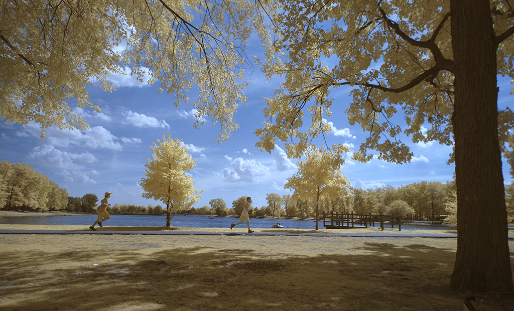
Andrew, attached is what I think is a revised original image. I cannot find any other original photo. The reason I think it is not the original is that all the tree foliage and grass is yellow so I probably changed all the green colors to yellows in the original. The photo was shot 8 years ago and has been sitting in my "to do" file for some years. |
Apr 2nd |
 |
5 comments - 0 replies for Group 18
|
| 78 |
Apr 20 |
Reply |
Good idea. I like the tighter crop. |
Apr 13th |
| 78 |
Apr 20 |
Comment |
The photo is nice but I would like to see the left side of the face not so dark. And, since this is a portrait I feel that the photo of this beautiful lady would not need so much jewelry. |
Apr 8th |
| 78 |
Apr 20 |
Comment |
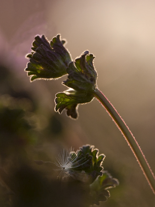
I feel the main feature of the image is the backlit plant on the left side of the photo. So, in my revision I eliminated the purple flower and cropped the image to feature just the single stem. |
Apr 8th |
 |
| 78 |
Apr 20 |
Comment |
I like the photo, the interest and the feeling of loneliness. A very minor suggestion would be to brighten the face of the dog slightly. |
Apr 8th |
| 78 |
Apr 20 |
Reply |
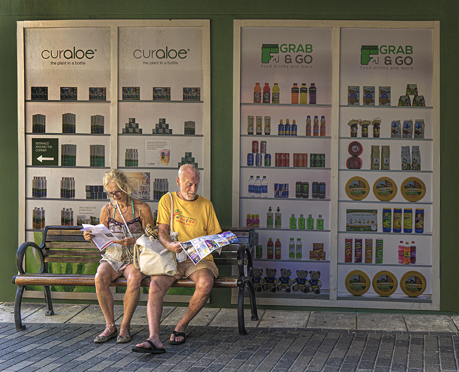
Richard many thanks for your comments. In my 4 23 20 revision I brightened the couple, darkened the background, and cropped a little off the bottom and right side. I like the effect as it now appears that the sun is shining on the couple but not the background. |
Apr 3rd |
 |
| 78 |
Apr 20 |
Comment |
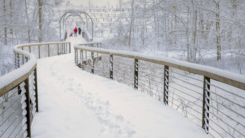
I like the photo, the composition is great. But, my preference is for a much warmer image as in my suggested revision. |
Apr 2nd |
 |
| 78 |
Apr 20 |
Comment |
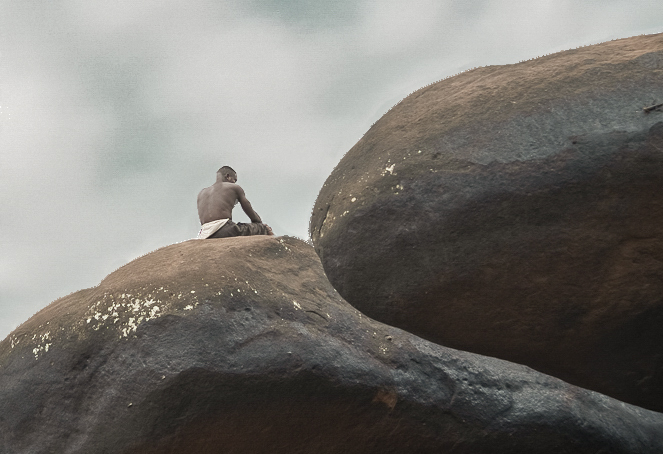
I like the photo and the leading lines but I feel the figure should be more prominent. In my revision I cropped much of the photo so that the figure is in a more interesting place in the photo. I also darkened the sky. |
Apr 2nd |
 |
| 78 |
Apr 20 |
Comment |
I love the photo and composition but I feel the great curving lines could be improved with the additional of an object - perhaps a panther or person. |
Apr 2nd |
| 78 |
Apr 20 |
Reply |
Terry thanks for your comments. See my comments to Brenda about sharpening. I will have to consider softening the background but since I intend to submit this photo in PSA Travel competitions I cannot change the background image. |
Apr 2nd |
| 78 |
Apr 20 |
Reply |
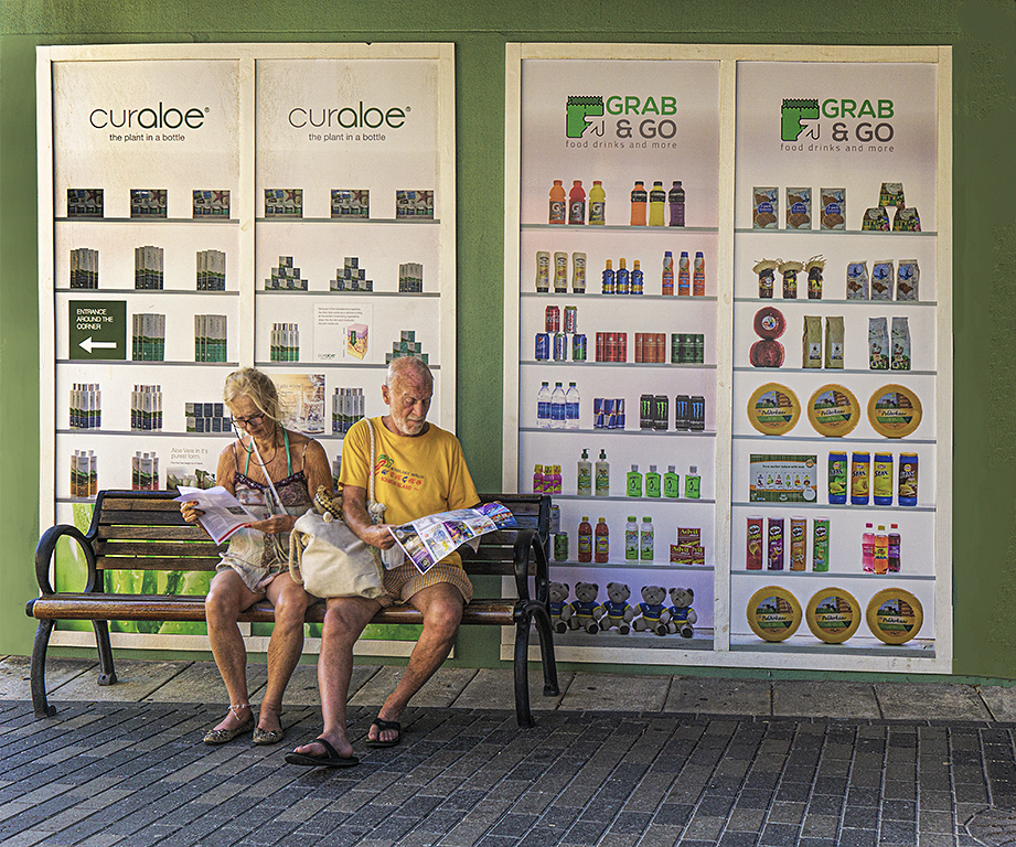
Brenda, thanks for your comments. The original photo shows that the couple are elderly and both with skin problems. I sharpened the submitted photo at only .4 pixels but which perhaps did accentuate their skin problems. So I went back and selected the couple and sharpened at .2 pixels, which did soften their skin, and then sharpened everything else at .4. My revised photo follows. |
Apr 2nd |
 |
6 comments - 4 replies for Group 78
|
16 comments - 5 replies Total
|