|
| Group |
Round |
C/R |
Comment |
Date |
Image |
| 11 |
Mar 20 |
Comment |
I like Henry's version where the flower is detailed and the background dark but yet with just enough detail. |
Mar 16th |
| 11 |
Mar 20 |
Comment |
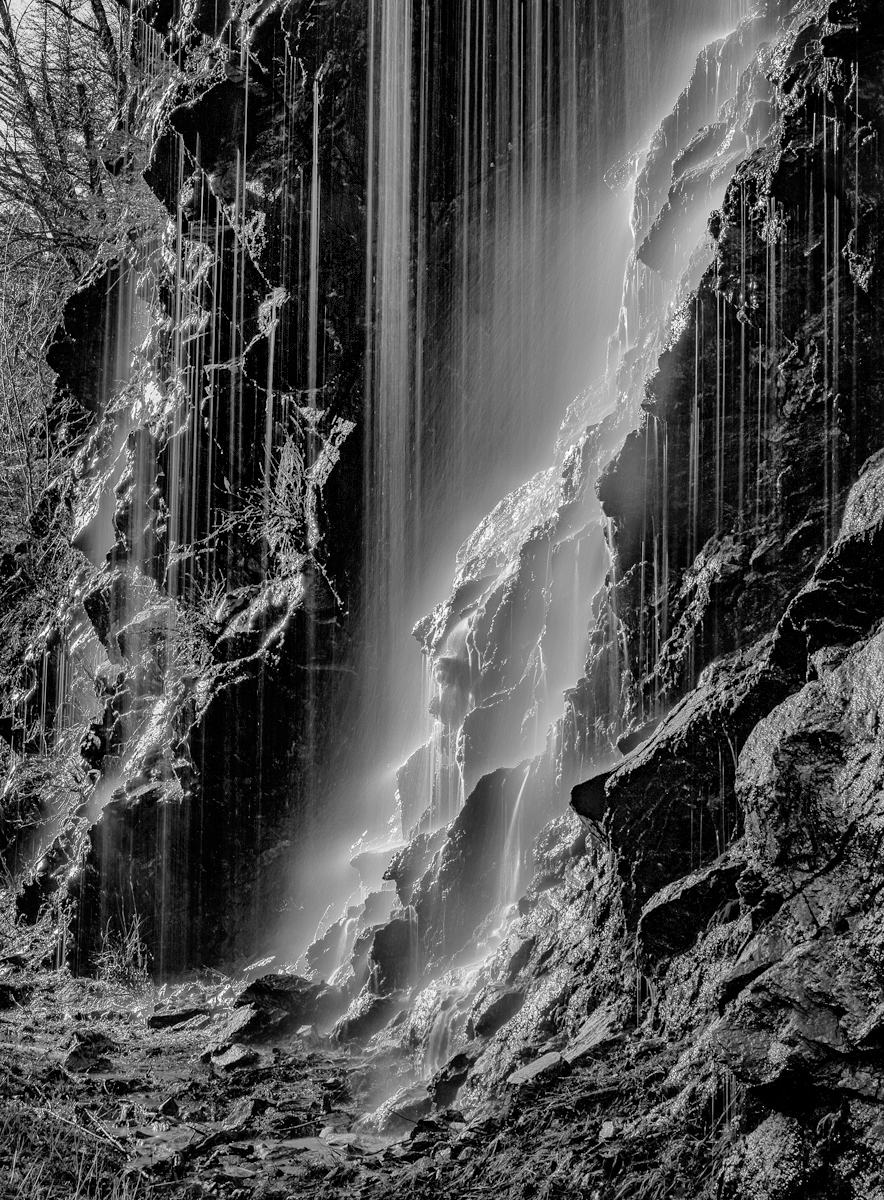
A great shot. My only suggestion would be to consider lightening up some of the dark shadow areas as in my revision. |
Mar 16th |
 |
| 11 |
Mar 20 |
Comment |
I like the photo a lot and especially the composition and leading lines. I would have liked to have seen more sharpness of the stamens. |
Mar 16th |
3 comments - 0 replies for Group 11
|
| 18 |
Mar 20 |
Comment |
Very creative. I have no suggestions. |
Mar 16th |
| 18 |
Mar 20 |
Comment |
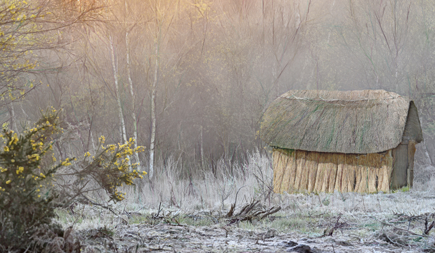
I think the two images work well together but I wonder if the image would have more interest if cropped tighter as in my revision. |
Mar 16th |
 |
| 18 |
Mar 20 |
Comment |
No suggestions. |
Mar 16th |
| 18 |
Mar 20 |
Comment |
I like the image a lot and have little to recommend except perhaps darkening the wall areas. |
Mar 16th |
| 18 |
Mar 20 |
Comment |
I really like the image - color and composition are great. I have no suggestions. |
Mar 16th |
| 18 |
Mar 20 |
Comment |
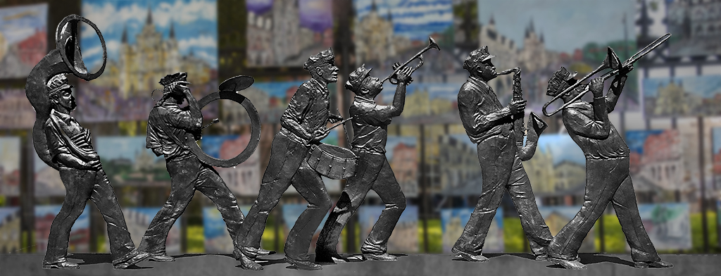
Many thanks for all your suggestions. I have reversed the direction of the players so that they now are marching left to right and for some reason prefer that directions. I have also changed the color of the walking surface from brown to sidewalk gray. And, I have added more blur. |
Mar 16th |
 |
6 comments - 0 replies for Group 18
|
| 78 |
Mar 20 |
Comment |
An interesting image but suffers from the out of focus area at the bottom of the image. It was a great first try but next time use an F stop of perhaps 11 or greater. You used f3.5 which has a very limited depth of field. |
Mar 19th |
| 78 |
Mar 20 |
Comment |
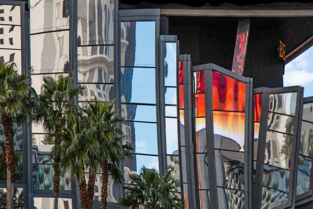
An interesting image but I feel the image is about the building reflections and that the lips don't quite fit. In my revision I brightened the image and especially the trees. Then I selected most of the buildings and made them taller and thus eliminated the lips. |
Mar 19th |
 |
| 78 |
Mar 20 |
Comment |
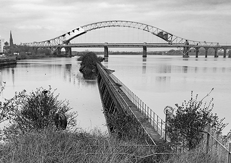
To me it seems like there are two subjects - the stairs and the bridge. In my revision I eliminated the stairs and most of the brush. I also cropped some off the left and from the sky and also darkened the sky. |
Mar 19th |
 |
| 78 |
Mar 20 |
Comment |
I like the image a lot, the intensity and composition. My thought would be to slightly increase the contrast of the team and darken the background a little. |
Mar 19th |
| 78 |
Mar 20 |
Comment |
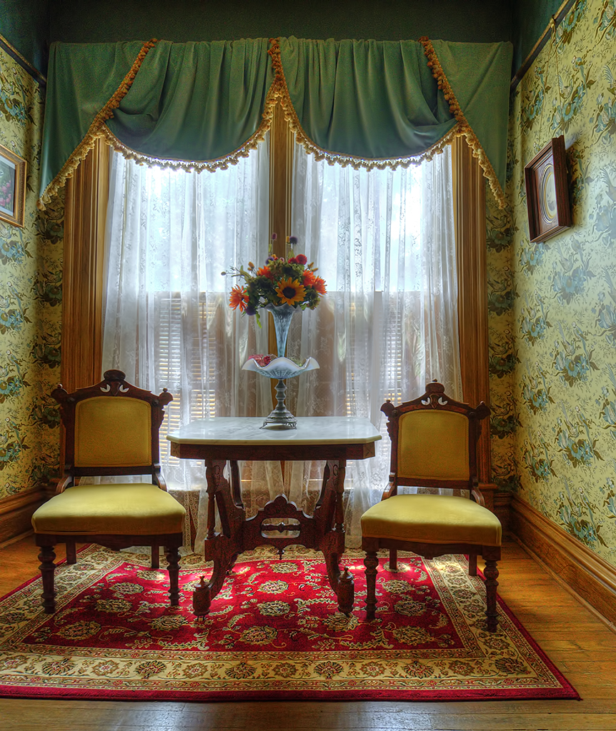
I like the image just as it is and have no suggestions. Green windows? Sure, why not? |
Mar 19th |
| 78 |
Mar 20 |
Comment |
Thanks for your comments and suggestions. I selected the white/blue curtains and the table top and reduce their bluish cast. Richard suggested a spot needed fixing which I think was that the now white curtain did not cover all of a brown shutter which I corrected in my revision.
The image was shot with a Sony 6000 mirrorless camera with a 10mm zoom. All processing was done in Photo Shop but I don't remember which filters I used. |
Mar 16th |
 |
| 78 |
Mar 20 |
Comment |
I like the image just as it is. Nice composition. I have no suggestions.
|
Mar 16th |
7 comments - 0 replies for Group 78
|
16 comments - 0 replies Total
|