|
| Group |
Round |
C/R |
Comment |
Date |
Image |
| 11 |
Feb 20 |
Comment |
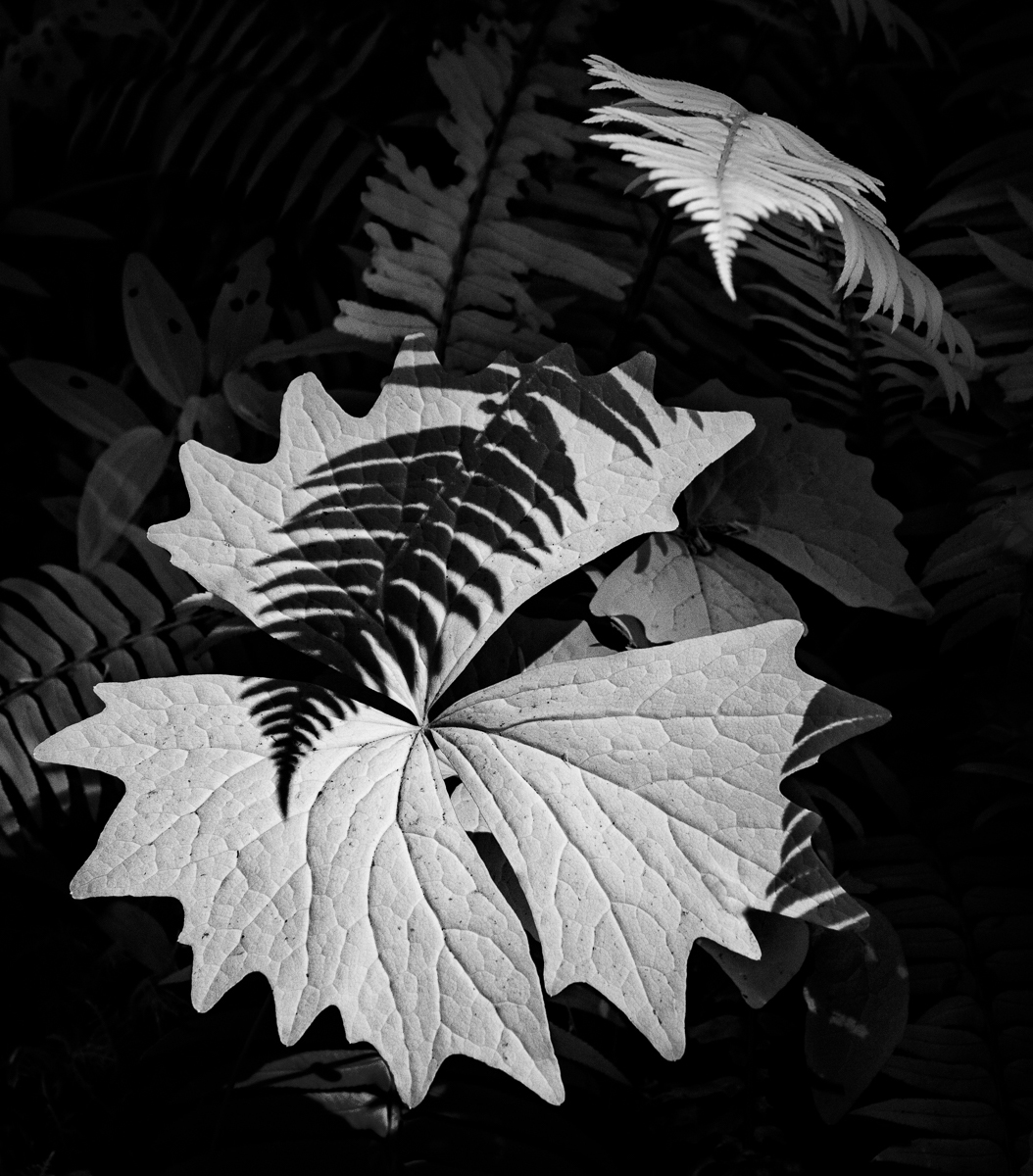
I like the image but wonder if the composition would be improved by slightly cropping the left side of the image as the left side is not the main area of interest. |
Feb 11th |
 |
| 11 |
Feb 20 |
Comment |
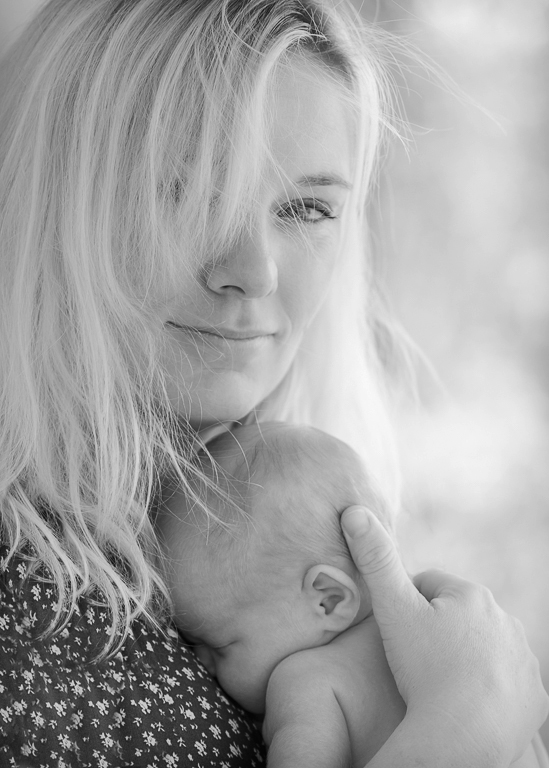
Absolutely outstanding. Just wonderful. In my revision I darkened the mother's face just slightly but I would be very happy with the high key image as shot. |
Feb 8th |
 |
| 11 |
Feb 20 |
Comment |
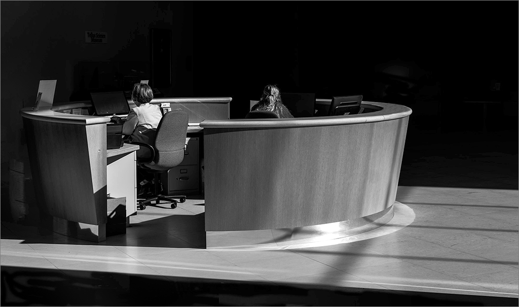
I also like this photo a lot. In my revision I cropped a little off the right side and much more off the top as I felt not so much empty black space was needed. I also lighten the mid tones and added a very small gray border. |
Feb 8th |
 |
| 11 |
Feb 20 |
Comment |
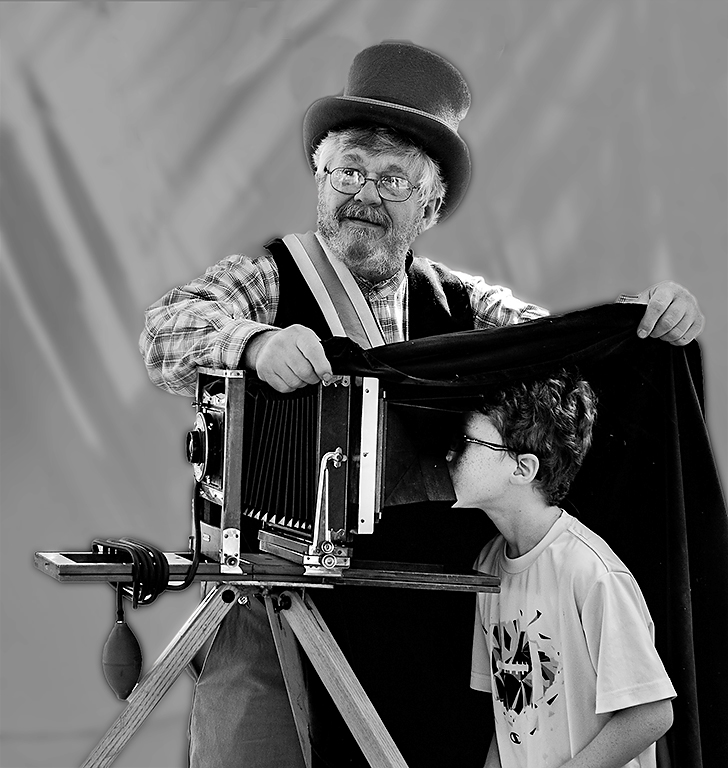
I love the photo, the human interest and the composition. But, since photography is an art form my preference is to have a darker background which I have done in my revision. I also added a little space above the photographer's hat. |
Feb 8th |
 |
4 comments - 0 replies for Group 11
|
| 18 |
Feb 20 |
Comment |
I like the image but am not sure about the pink land areas.
|
Feb 11th |
| 18 |
Feb 20 |
Comment |
I like the concept but agree with Mark that the image would be improved if somehow the dancers' leg were blended in the clouds rather than floating above them. |
Feb 11th |
| 18 |
Feb 20 |
Comment |
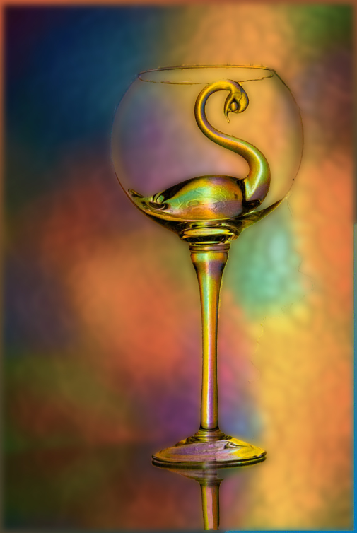
I like the image but suggest that since the subject is the swan then perhaps the background should be less prominent. In my revision I reduced the vibrancy and brightness of the background and also blurred it. I should have done a better job of preserving the outline of the glass. |
Feb 11th |
 |
| 18 |
Feb 20 |
Comment |
I like the image a lot and have no suggestions for improvement. |
Feb 11th |
4 comments - 0 replies for Group 18
|
| 78 |
Feb 20 |
Reply |
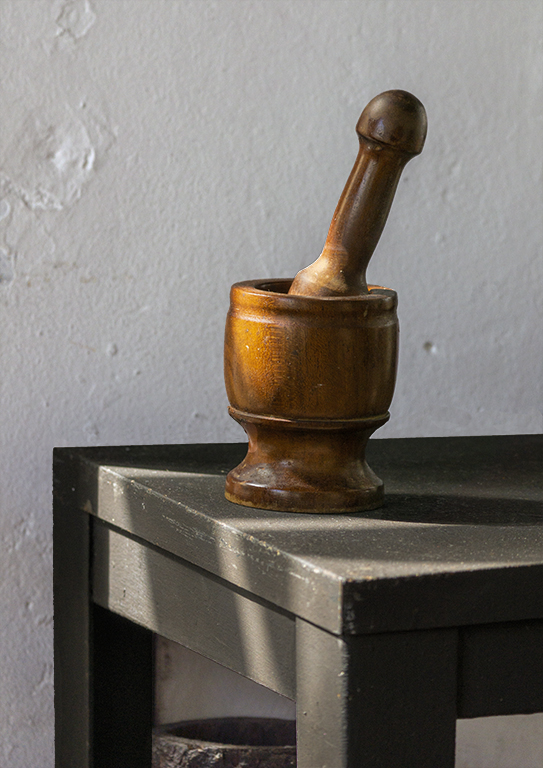
Terry, I've reworked my image with the background close to the original photo. After comparing the original and revised images I prefer the revised image with the lighter background with its interesting detail. Thanks, Jim Hagan |
Feb 10th |
 |
| 78 |
Feb 20 |
Reply |
Jason, thanks for your comment. Jim |
Feb 8th |
| 78 |
Feb 20 |
Comment |
I like the image, the composition and contrast. I have no suggestions. |
Feb 7th |
| 78 |
Feb 20 |
Comment |
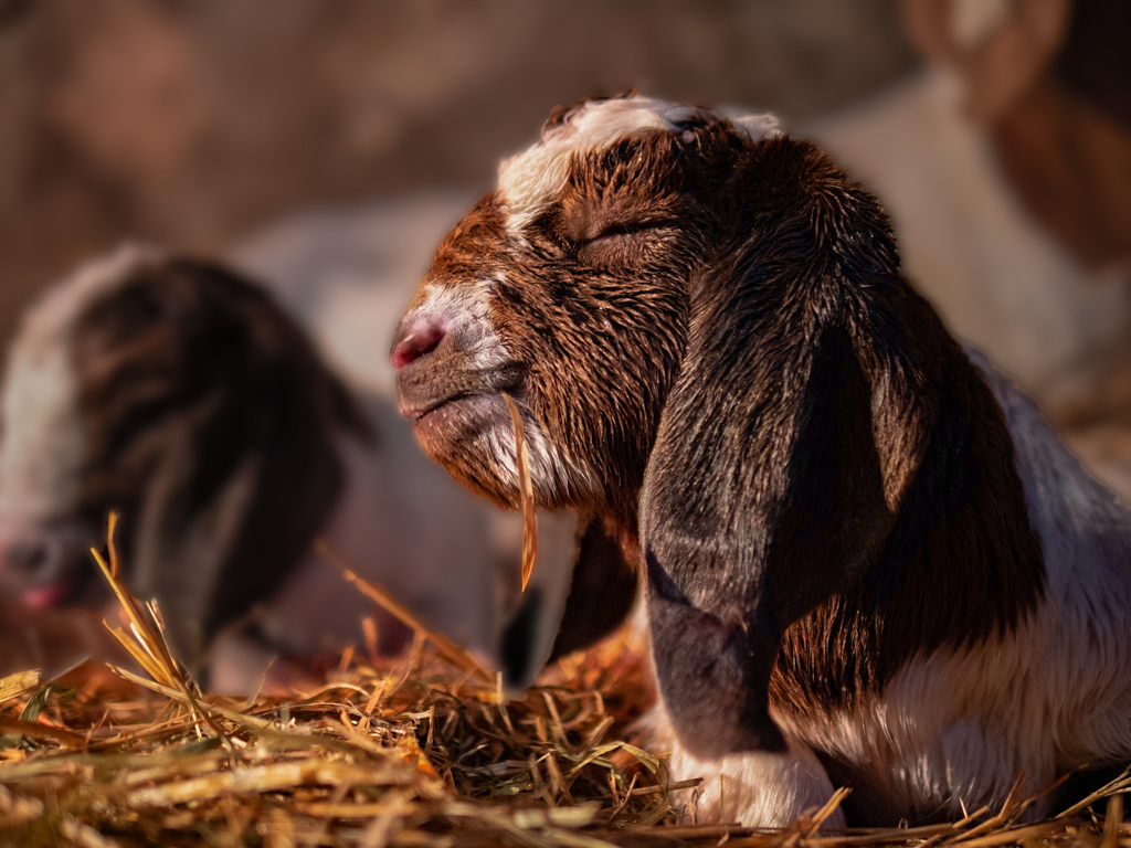
I like the image but am bothered by the out of focus area coming down from the goat's ear. In my revision I blurred the background and also reduced its brightness. |
Feb 7th |
 |
| 78 |
Feb 20 |
Comment |
I like the image and composition and your conversion from the original without burning out the white areas. I wonder how the image would have looked without the fence in the foreground. |
Feb 7th |
| 78 |
Feb 20 |
Comment |
I like the image and the composition and agree with Jason that additional contrast is needed as in his revision.
|
Feb 7th |
| 78 |
Feb 20 |
Comment |
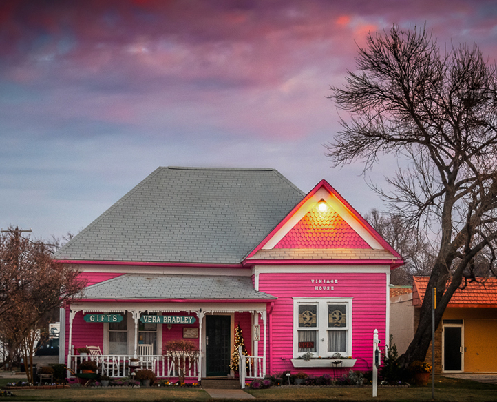
I like the image and the vibrant colors. However, I felt the subject of the photo is the store so in my revision I cropped out most of the building to the right, most of the road and straightened what I felt was a slight slant to the building. |
Feb 7th |
 |
| 78 |
Feb 20 |
Comment |
I like the image but would like less contrast in the rock areas. And, the image would be improved if the birds eyes could have been seen (not easy to do).
|
Feb 7th |
| 78 |
Feb 20 |
Reply |
Sunil, thanks. Jim |
Feb 7th |
| 78 |
Feb 20 |
Reply |
Richard, many thanks for your suggestion. I did not see the problem in the highlighted area and will make a correction. I will also soften the edge line. Attached is a copy of my original image with the white wall. |
Feb 7th |
 |
6 comments - 4 replies for Group 78
|
14 comments - 4 replies Total
|