|
| Group |
Round |
C/R |
Comment |
Date |
Image |
| 11 |
Sep 17 |
Reply |
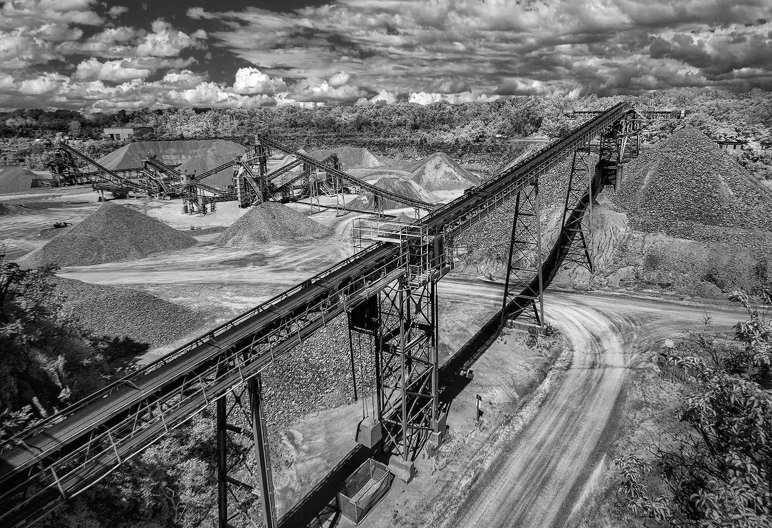
Tom. I like your revision. The clouds are nice but the photo is not about the clouds. The photo is about the main conveyor and your reducing the contrast of the other items in the background is a big improvement. |
Sep 24th |
| 11 |
Sep 17 |
Reply |
Jim Bodkin. I appreciate your comment about sharpening. When I got ready to post the photo it look quite sharp so I sharpened the photo just slightly but then it look too sharp. I am thinking that perhaps I should not use "clarity" in Photoshop Raw as it also gives a sharpening effect. I think I am double sharpening. |
Sep 24th |
| 11 |
Sep 17 |
Reply |
Maria. My original photo was infrared. I did not focus but instead set the lens to manual at infinity because I knew that at F8 everything would be in focus.
|
Sep 24th |
| 11 |
Sep 17 |
Comment |
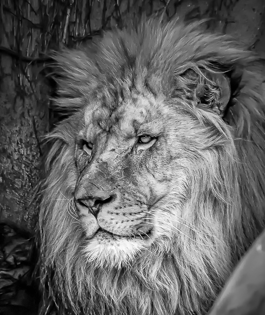
I like the composition and the lion's gaze and I like the mono version more than the color photo. But I don't like whatever it is in the bottom right corner of the photos and along the bottom edge. And, to me, I think you pushed the contrast too high - so much so that the face is overexposed and the shadows underexposed. In my revision I cropped out much of that object in the bottom corner and reduced the contrast. My photo could be further improved by blurring some of the background. |
Sep 14th |
 |
| 11 |
Sep 17 |
Comment |
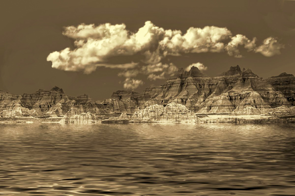
I like the composition. The addition of the sky and water seems very natural with the rocks and clouds both highlighted with sun from the same direction. To me adding the moon does not seem to go with the design and flow of the rest of the photo. I like the sepia tone but felt a little more contrast was needed. In my revision I increased the contrast and eliminated the white spot in the top right corner of the photo and the moon. |
Sep 14th |
 |
| 11 |
Sep 17 |
Comment |
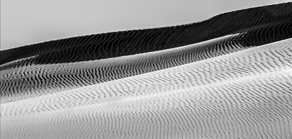
I have trouble commenting on this photo because I am not sure what the subject is. At the bottom of the photo are grasses but the shadows are so dark and the contrast so high there is no detail in the shadows. Then at the top of the photo the sky is so overexposed that there is no detail in the sky. I like the details of the sand in the upper third of the photo and suggest a very cropped revision. |
Sep 14th |
 |
| 11 |
Sep 17 |
Comment |
I love this photo and everything in it - the detail, the composition and the reflections. The photo has a wonderful 3D effect.
Jim Hagan |
Sep 11th |
| 11 |
Sep 17 |
Comment |
In my revised photo I eliminated some of the conveyors and expanded the clouds so they did not look so compressed. |
Sep 11th |
 |
| 11 |
Sep 17 |
Comment |
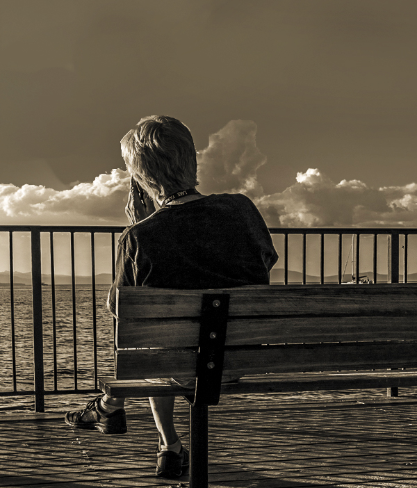
I like the warm tone of the photo, the subject and the shadows. Photography is an art form so everyone is entitled to their own opinion. And, my opinion is the mushroom shaped cloud looks like it is coming out of the guy's head. Also, I feel the subject should not be so centered.
In my revision I removed the mushroom cloud, increased the contrast and placed the subject so he is not in the center of the photo. |
Sep 11th |
 |
6 comments - 3 replies for Group 11
|
6 comments - 3 replies Total
|