|
| Group |
Round |
C/R |
Comment |
Date |
Image |
| 5 |
Nov 23 |
Reply |
Fixed. |
Nov 28th |
| 5 |
Nov 23 |
Comment |
David, excellent capture! Your timing was perfect, and you caught the woman with a fascinating expression that clearly shows her intensity. Well done!
I am impressed that you managed to achieve some definition in the white water. In the original, it appears to be blown out. As Jim noticed, I think the color of the water looks a bit better in the original, but that's a nit.
|
Nov 28th |
| 5 |
Nov 23 |
Comment |
Sophia, it's an extraordinary photograph, and your processing is excellent. I reviewed all of the suggested modifications by our group members and settled on Mark's as the one that most appeals to me. (Note: Even though Mark used Generative Fill, you have enough in your original image that you could have simply done a different crop.)
Beautiful photograph!
|
Nov 23rd |
| 5 |
Nov 23 |
Comment |
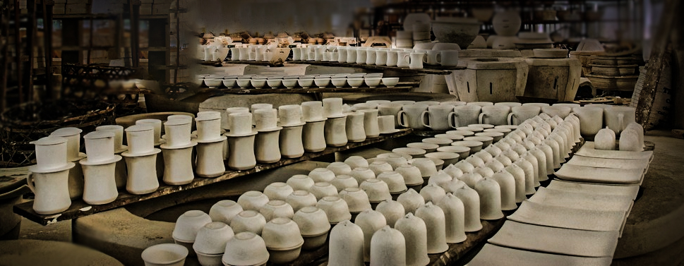
Richard, like Jim and David, I thought the striking part of your image was the pots and their repeating pattern. So, with that in mind, I cropped the image and played with it in Camera Raw to see how I might highlight them. Your thoughts? |
Nov 14th |
 |
| 5 |
Nov 23 |
Comment |
Jim, your second cropping is definitely much better. I played with your image a bit in Camera Raw to see how it might look with more contrast and color in the trees. When I finished, I decided that I liked yours better. Nonetheless, I've attached what I came up with.
|
Nov 5th |
 |
| 5 |
Nov 23 |
Reply |
Richard, thank you! The image with the silver/gray canoe was pretty dreary since the canoe was the focal point. My wife thought I should make it red (her favorite color), but for it to yell "Fall", I thought it should be the color of the leaves.
|
Nov 4th |
| 5 |
Nov 23 |
Reply |
Thank you, Mark. Fall is my favorite time of year. I hope you have a fantastic trip to Japan. Bring back some of your wonderful photographs.
|
Nov 4th |
| 5 |
Nov 23 |
Comment |
The word that comes to my mind is "charming"! I love images that greet me with emotional impact, and this one fits that criteria perfectly. Well seen!
|
Nov 3rd |
| 5 |
Nov 23 |
Reply |
Well, Mark, the only thing that you might want to try is to slightly darken the bright areas of the rocks on the diagonal leading to the top right corner. They definitely need to be a component of the image; however, the one outcropping is so bright that it competes with the wonderful Milky Way portion of the image. But, that is a tiny nit! |
Nov 1st |
| 5 |
Nov 23 |
Comment |
Mark, this is amazing. I love everything about it... the Milky Way, the lighthouse, and the stairs. I'm sure it must have been challenging to deal with the lighting in order to highlight Jacob's ladder, the lighthouse, and still get such vivid/sharp stars. Your 15 second exposure was perfect -- as much light as possible without causing the stars to streak. I have no suggestions. It's a gorgeous image!
|
Nov 1st |
6 comments - 4 replies for Group 5
|
| 62 |
Nov 23 |
Reply |
Bunny, since I don't take hundreds of similar images (e.g., school pictures, wedding photography), my workflow varies by the specific photograph. In general, however, it progresses like this:
�� Download images
�� Browse using Adobe Bridge
�� Open "promising images" into Camera Raw and go directly into Photoshop
�� Use Topaz DeNoise AI, then return to Camera Raw
�� Make obvious global adjustments (usually not many changes)
�� Use Camera Raw's masking tools to make localized adjustments (this is often extensive)
�� Go into Photoshop from Camera Raw with a Smart Object
�� Use the Remove tool, clone tool, etc.
�� Usually, return to Camera Raw for additional modifications
�� Back to Photoshop for final sharpening using Topaz Sharpen AI
�� Save the image in the appropriate folder (I use a hierarchy of folders instead of Lightroom cataloging)
�� Resize as necessary for printing, displaying, etc.
That's the essence of my workflow.
|
Nov 7th |
| 62 |
Nov 23 |
Comment |
Bob, I was about to say the same thing as Emil, but probably not as well. Nonetheless, I decided to play with your image in PS and Camera Raw. The "streaks" at the top kept bothering me, so I tried to reduce their prominence. Thus, I lowered their brightness compared to the delightful lily pads, and I also turned the photograph into a panoramic. Your thoughts? |
Nov 7th |
 |
| 62 |
Nov 23 |
Comment |
Bunny, it's a lovely image of a fascinating location. Your iPhone did a great job (with you directing it!). Nicely done.
I wanted to see how your photograph would look with a bit more contrast. Your thoughts?
|
Nov 6th |
 |
| 62 |
Nov 23 |
Reply |
Thank you, Mark. I also find trees intriguing. This one seemed special somehow. Perhaps that's because it stood out from the rest of the trees. |
Nov 3rd |
| 62 |
Nov 23 |
Reply |
Great. I'm glad you like it.
Mark, I've been using (and teaching) Photoshop for many years. One thing I've learned is that virtually no one really "learns Photoshop"... there's simply TOO MUCH for one brain to hold! So the best approach is to learn just the very basics to start with, then add knowledge about other tools and techniques as you need them. It's overwhelming (for me, at least) to take on too much at the beginning.
|
Nov 1st |
| 62 |
Nov 23 |
Comment |
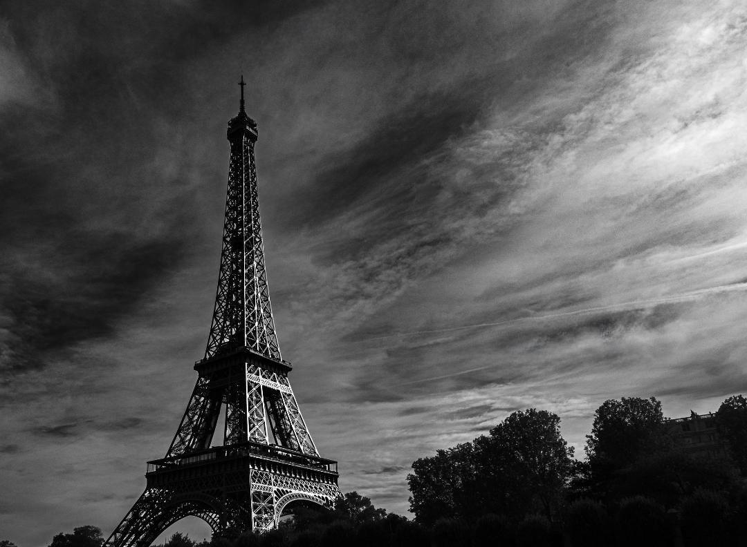
Mark, your perspective and composition make the Eiffel Tower incredibly powerful. I also love how you handled the sky to make it seem to point to the Tower - beautifully done!
I'm not sure exactly what you are looking for with the additional sheen on the tower. Nonetheless, I took a shot at it by selecting the tower and putting it on a separate layer. Then, I used a levels adjustment layer with a black mask, just on the tower layer, and increased the brightness. Using a soft white brush, I painted on the mask over the right side of the Tower to let the lightened areas show through. (I also used the remove tool to remove a couple of the contrails in the sky.) Your thoughts?
|
Nov 1st |
 |
| 62 |
Nov 23 |
Reply |
Both tips make a great deal of sense. I especially like the idea of using the Detail Extractor with a mask to determine where it will be applied. Thanks again!
|
Nov 1st |
| 62 |
Nov 23 |
Comment |
Mandy, the birds make this an exciting image! And the castle gives an excellent point of focus for the viewer. You did an outstanding job with the conversion to B&W, retaining the tones and not blowing out the highlights.
Like you, I found that the vast number of birds was a bit overwhelming. With that in mind, I used the PS remove tool to "prune the flock" a bit... mostly concentrating on the gulls that were overlapped with others. Your thoughts?
|
Nov 1st |
 |
| 62 |
Nov 23 |
Comment |
Emil, it's fantastic! However, what I REALLY appreciate is your description. Although I have the latest Nik Collection, I wasn't familiar with the Detail Extractor. So, seeing the fabulous end result of your workflow, I decided that I needed to learn about this Color Efex filter... and it's very impressive. I will begin using it. THANK YOU!
|
Nov 1st |
5 comments - 4 replies for Group 62
|
| 74 |
Nov 23 |
Comment |
Ed, it's an extraordinary image! The clouds, mountain ranges, and glacier are wonderful. I think I see the halo that Ed Taje mentioned, but when I first saw it, I thought it was snow blowing over the ridge. Beautiful photograph.
Since I love playing with appealing images, I took it into Photoshop (mostly Camera Raw) to experiment a bit. I found the road at the bottom a bit distracting; however, the photograph needs it to anchor the rest of the scene. So, with that in mind, I tried darkening it. Also, I slightly modified the lighting and contrast of the clouds, sky, and mountain. I don't know that this works... your thoughts?
- Pete
|
Nov 6th |
 |
1 comment - 0 replies for Group 74
|
12 comments - 8 replies Total
|


