|
| Group |
Round |
C/R |
Comment |
Date |
Image |
| 5 |
Apr 23 |
Reply |
Thank you, Jim. I hadn't noticed the "smiling lights," but now that you've mentioned it, I can't NOT see them. lol
I'll have to let the flipped image grow on me for a while to see how I really feel about it. At first glance, it doesn't "look right," but that's probably because I'm accustomed to seeing it unflipped.
|
Apr 23rd |
| 5 |
Apr 23 |
Comment |
David, really well done! The hands are intriguing and seem even stronger with Jim's edit.
After reading Lance's comment, I decided to take the original into Photoshop and Camera Raw to see what I could do with the entire image. Here's what I came up with. Thoughts?
|
Apr 22nd |
 |
| 5 |
Apr 23 |
Comment |
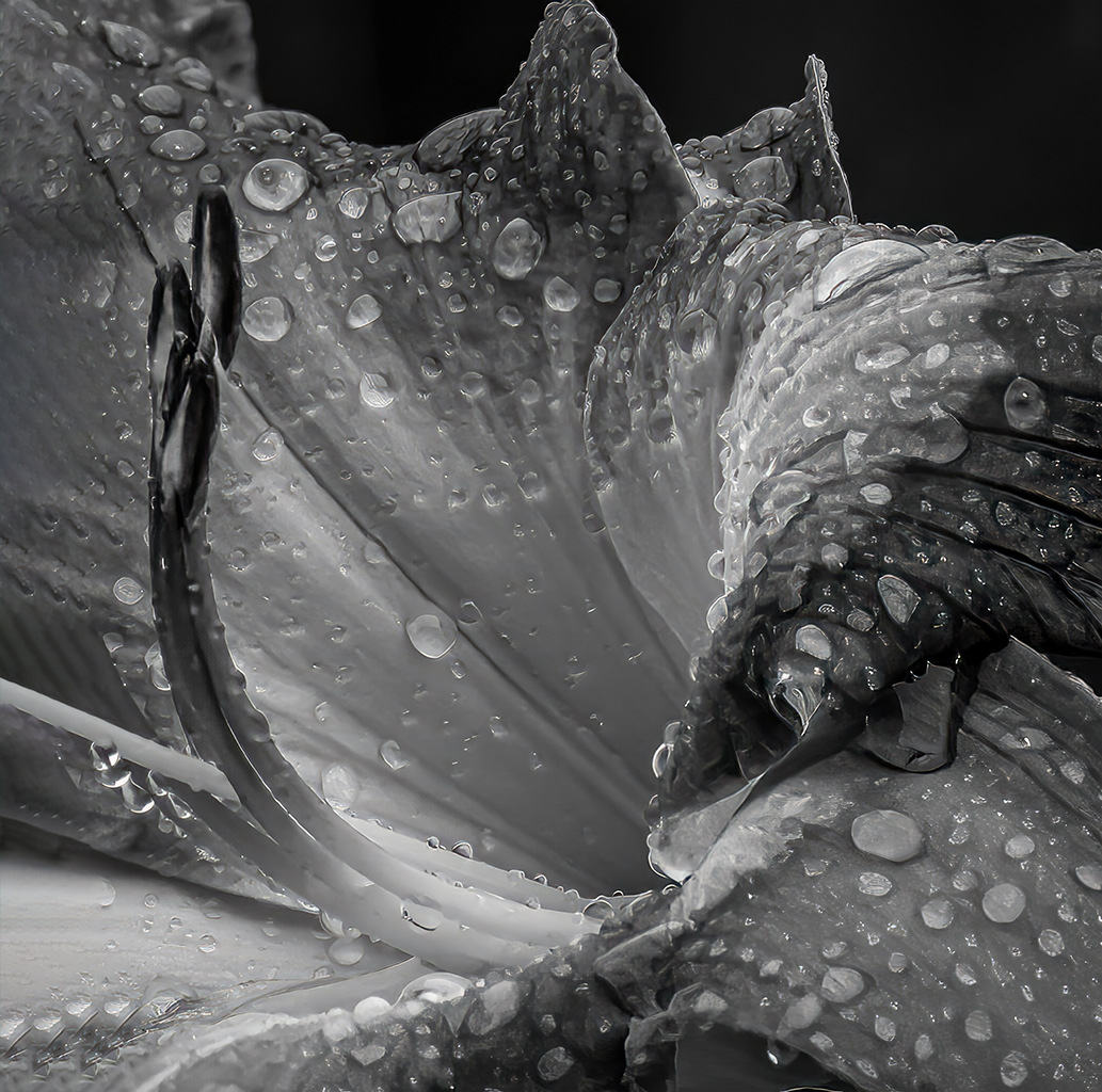
What a terrific model and excellent photograph. I'm curious about her pose. Did she pose herself, or did she get directions? Either way, it really conveys a feeling.
There's nothing I can suggest to improve this image; however, my favorite variation of those shown is the last one by David. Having a bit more space in front of her seems more natural to me.
Well done!
|
Apr 13th |
| 5 |
Apr 23 |
Comment |
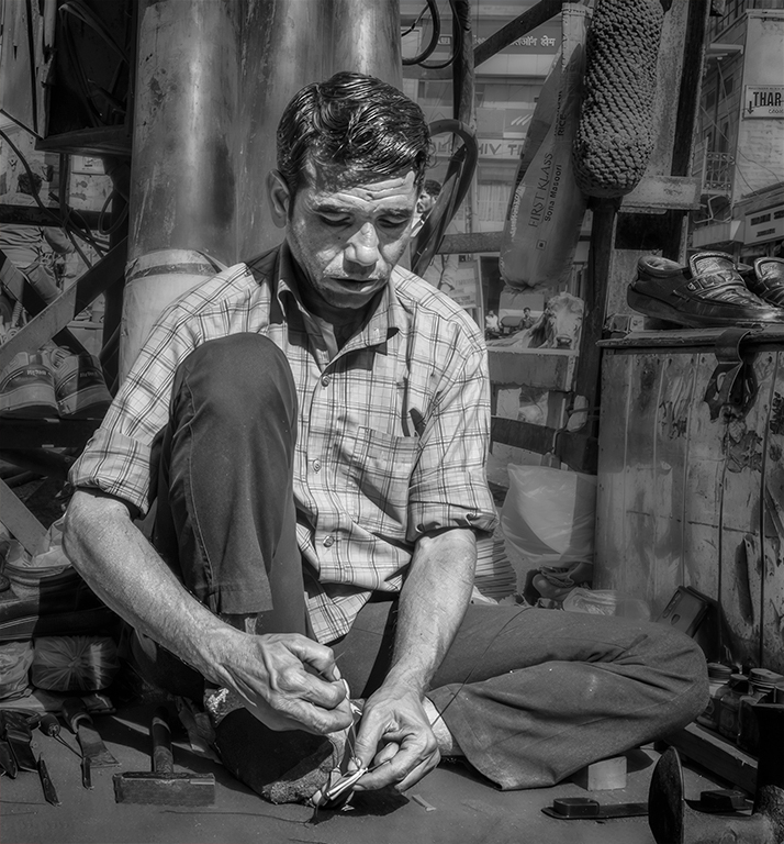
It's always challenging to comment after most others in our group have provided their input. So, since I'm a bit late this month, I tried something different. Instead of highlighting the bulkhead, I attempted to use it as a frame. I'm not sure that it's successful. Your thoughts?
|
Apr 10th |
 |
| 5 |
Apr 23 |
Reply |
Thank you, Sophia! It was a memorable event and I was honored to be included.
I will definitely play with the changes that you suggested before I print the photograph. Thanks again.
|
Apr 3rd |
| 5 |
Apr 23 |
Comment |
Barbara, I can certainly see why she is a model. And I completely agree about the come hither look! I'm amazed that you captured such a perfectly exposed and cropped image. The border is a nice touch, and frankly, it doesn't need anything else. Well done!
|
Apr 2nd |
| 5 |
Apr 23 |
Comment |
This is an amazing scene, and your framing and post-processing create a wonderful image! The rolling hills give me a sense of motion that has quite an impact. And I completely agree with your color choice. Somehow the gold feels more intriguing than the green in the original.
Mark, I played with your photograph a bit to see what other images could be created from it. Primarily, I used Camera Raw to modify the lighting and extend the gold color even farther into the background. Your thoughts?
|
Apr 2nd |
 |
| 5 |
Apr 23 |
Reply |
Thank you, Mohan. I'm really glad to know the name of the dance! Take care! |
Apr 1st |
| 5 |
Apr 23 |
Comment |
Sophia, I also love this image! Gorgeous! It's VERY difficult for me to suggest any changes that might improve this photograph. It's absolutely lovely as is. Your post-processing was brilliant!
|
Apr 1st |
| 5 |
Apr 23 |
Reply |
Thank you, Barbara. It was definitely an astounding event!
I left the splashes of light in an attempt to balance the photograph. Perhaps I should darken them or remove them altogether. Let's see what our other members have to say.
|
Apr 1st |
6 comments - 4 replies for Group 5
|
| 62 |
Apr 23 |
Reply |
Thank you, Israel. I agree with you... Emil's approach works well.
Take care! |
Apr 24th |
| 62 |
Apr 23 |
Reply |
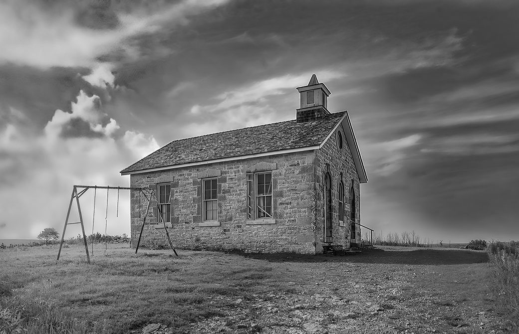
Emil, I love this idea. Instead of cropping out the tree and/or the shed, simply make them less significant in the photograph. Brilliant idea. THANK YOU!
|
Apr 24th |
| 62 |
Apr 23 |
Reply |
Bunny, I occasionally drive past this old house when I'm casually out with my camera to take photographs. (I call it "photo-grazing".) When I next go past, I'll take a current image... if it is still standing.
I appreciate your comments and compliments! |
Apr 24th |
| 62 |
Apr 23 |
Reply |
Thank you, Stephen. It's certainly a wonderful old house and, to me, it tells an interesting story. I'll continue playing with the cropping to see what I can do. |
Apr 24th |
| 62 |
Apr 23 |
Comment |
Bob, I found your image fascinating but something about it bothered me. Bunny's version helped, but there was still something that "didn't sit quite right" for me. So, I took Bunny's image into Photoshop and played with it. Finally, I realized that it was the position of the style (a term I had to look up) that bothered me. It felt too close to the left edge. After playing with the cropping, content aware fill, and camera raw, I came up with this. Your thoughts?
|
Apr 14th |
 |
| 62 |
Apr 23 |
Comment |
Bob once told me that it's best to comment early in the month; otherwise, most things have already been said. This month proves, once again, that Bob is a wise man!
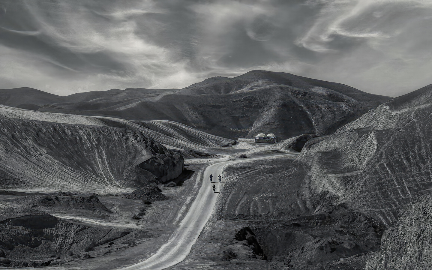
So, as I read each person's comments, I found that I agreed with them. And I really enjoyed examining each of the suggested images with their modifications. Now, I'm trying to add to this stimulating conversation.
To be a bit different, I decided to take the lighting in a new direction. Since the riders appear to be the center of interest, I wanted to make them even more apparent. It wouldn't have looked natural to brighten the people and their motorcycles, so instead I brightened the road and left the riders dark. Another component of the wonderful photograph is the domes. To draw a bit of attention to them, I attempted to slightly brighten the building that's just in front of them.
I don't know how successful my changes are. Your thoughts?
|
Apr 12th |
 |
| 62 |
Apr 23 |
Reply |
Thank you, Emil. It was fun to play with your image. The only tricky part (for me) was the geometry. After making the edges of the schoolhouse vertical, the support for the swing set looked a bit wanky. Transform with Distort came to the rescue.
|
Apr 12th |
| 62 |
Apr 23 |
Comment |
Beautifully done, Emil! You've really captured a feeling with this image. I never attended a one-room school like this one appears to be, but my father did. Your posted image is outstanding. The balance with the tree, swing, and building feels just right. I also like the image that you posted in response to Bunny's comment and decided to play with it a bit. I kinda like what I ended up with, but really like your posted version better. Your thoughts?
|
Apr 11th |
 |
| 62 |
Apr 23 |
Comment |
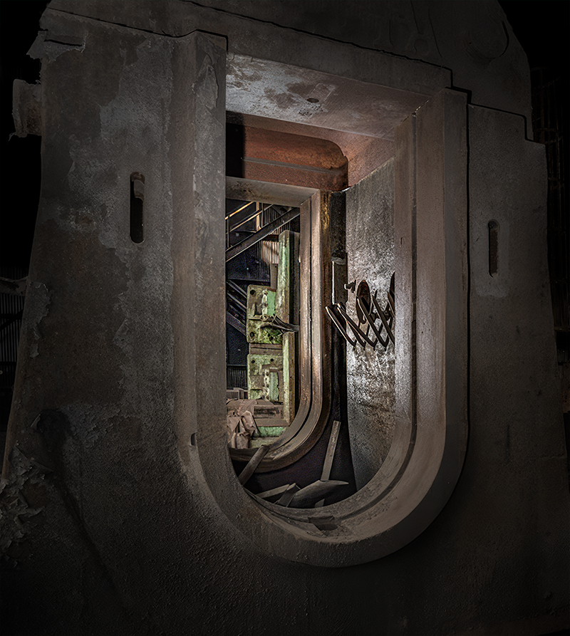
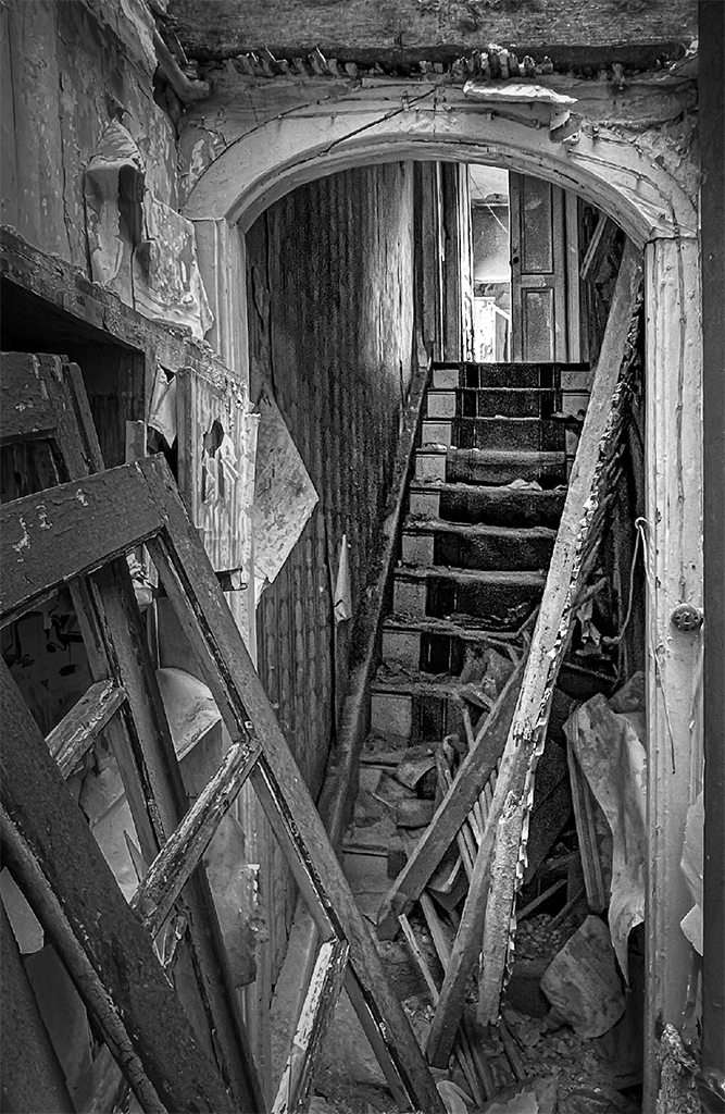
What a fascinating image. I love the view up the stairs and through the door. Intriguing!
Mark, like you I really like the monochrome version better than the original color one. To me, it's the shapes and tones that make this such an appealing photograph. The bright colors are distracting.
I played with your image a bit to see what it might look like with an even more intense darkening combined with some additional light leading up the stairs. Your thoughts? |
Apr 3rd |
 |
| 62 |
Apr 23 |
Reply |
Bob, I like your suggestions and decided to see what they would yield when followed. What do you think?
|
Apr 2nd |
 |
| 62 |
Apr 23 |
Comment |
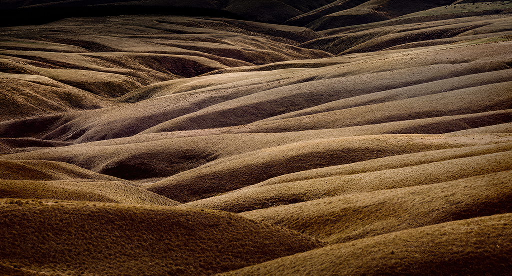
Each time you submit one of your Antarctica images, your description gives me another insight into how exciting the experience was. It's fascinating and absolutely wonderful!
I'm not at all surprised that your choice of shutter speeds was influenced by the fact that you were on a Zodiac. The motion must have been tremendous. Nonetheless, you captured an outstanding image. I love the shapes made by the hills. Gorgeous!
Your modifications to bring out the sky were well done. I played with your image to see how it might look with even more detail in the sky. Your thoughts?
|
Apr 2nd |
 |
| 62 |
Apr 23 |
Comment |
LuAnn, I love images that have impact, and yours does that to an amazing degree! It is hard to look at this photograph without being taken back (mentally) to an earlier era. The time travel provided by the turntable is perfectly emphasized by the use of monochrome and grain. (Do you remember B&W tv?) I may play with this image later, but right now I can't think of anything that has the possibility of improving it. Beautifully done!
|
Apr 1st |
6 comments - 6 replies for Group 62
|
12 comments - 10 replies Total
|


