|
| Group |
Round |
C/R |
Comment |
Date |
Image |
| 62 |
Dec 22 |
Reply |
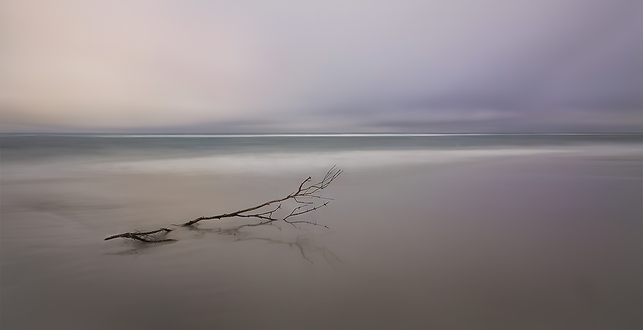
Bob, I tried adding a shadow, but I couldn't get it to look right. There were two problems... First, it was very difficult to tell the direction of the sun. And, second, it was hard to determine the bird's position over the sand. Oh well, it was worth a try!
|
Dec 17th |
| 62 |
Dec 22 |
Reply |
Bob, good point! I probably should add a shadow... but certainly not with a well-defined edge since the bird is fairly high. I'll see how it goes. Thanks!
|
Dec 17th |
| 62 |
Dec 22 |
Reply |
Thank you, Bunny! I like your tonal changes. They add even more mood to the image. And it's especially beneficial to have darkened the bottom and lower-right side. Those changes provide a base for the photograph. Well done!
|
Dec 12th |
| 62 |
Dec 22 |
Reply |
Thank you, Emil. I debated with myself about the pelican. It certainly makes it clear that it's a composite image instead of a long exposure. Ultimately, I left the bird in since it felt a bit unbalanced to me without it. I noticed that you cropped a bit tighter on the right and darkened the bottom-right side to overcome the balance issue. Nice. |
Dec 12th |
| 62 |
Dec 22 |
Reply |
Thank you, Michael. I debated about whether it would be beneficial to include the pelican. As you see, I included it in my image for this study group. However, in November, I used it in Group 5 as a color image without the bird. Here's how it looked.
|
Dec 7th |
 |
| 62 |
Dec 22 |
Comment |
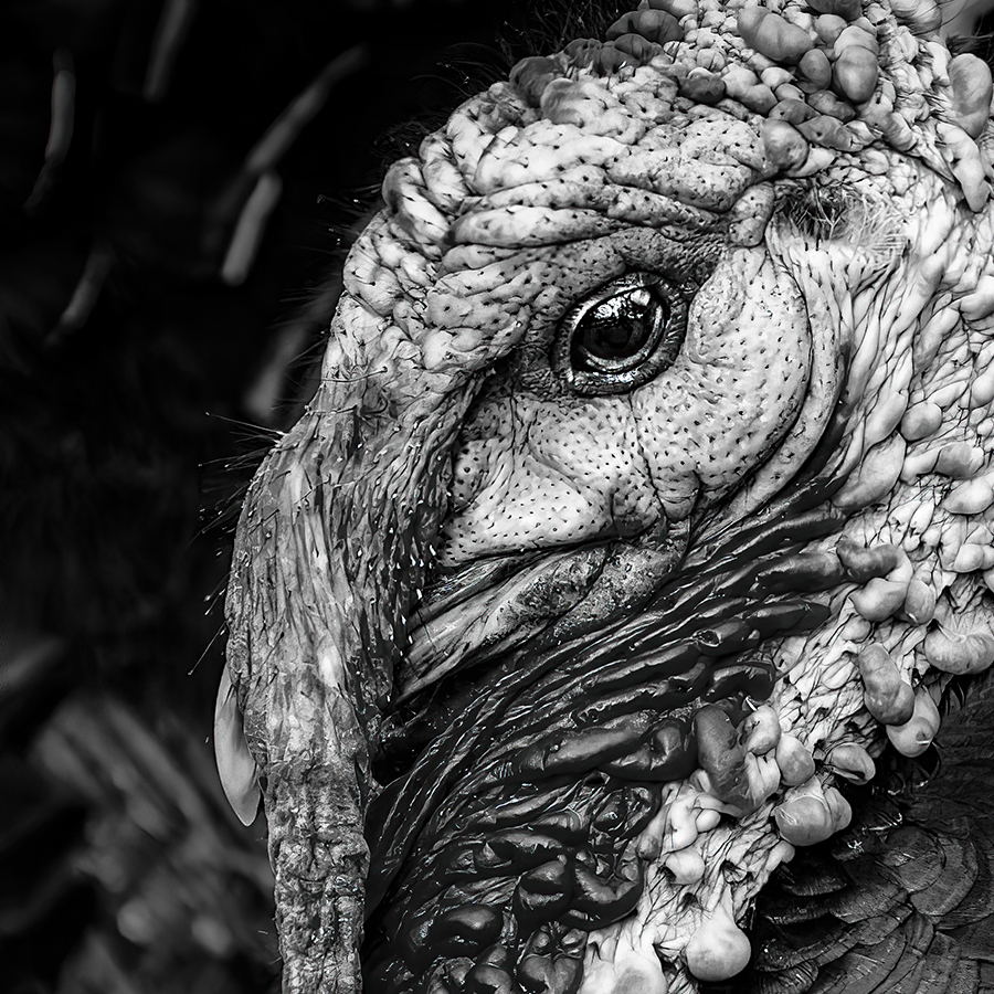
Fascinating! I've always thought turkeys were interesting, and your image shows why. All of the bumps and folds are certainly unique to this bird. I like your conversion to B&W and decided to play with some other approaches. My favorite is below. What do you think? |
Dec 7th |
 |
| 62 |
Dec 22 |
Comment |
Nice work, Mark! I like your "Original 2" image, but not as much as your high-key one. Although the water tanks are wonderful, to me the repeating windows are the main attraction.
I like the fact that you didn't "dramatize" the sky. That would have detracted from the building and water towers. |
Dec 7th |
| 62 |
Dec 22 |
Comment |
Bunny, your image this month is wonderful. You've managed to obtain tones that really work well together. Plus, the strong diagonal lines of the launchers are incredibly dynamic. The thin clouds make it appear that the launchers have just fired, leaving a whisp of smoke. I can't think of any way to enhance your photograph. Nicely done! |
Dec 6th |
| 62 |
Dec 22 |
Comment |
LuAnn, this is beautiful. I like both the original and the monochrome. You did a great job retaining the "flavor" of the Star Gazer in your conversion. If I suggested anything, it would be to try adding just a bit of contrast to the image. Nicely done! |
Dec 5th |
| 62 |
Dec 22 |
Reply |
Thank you, Israel. I enjoy giving input to our fantastic group members.
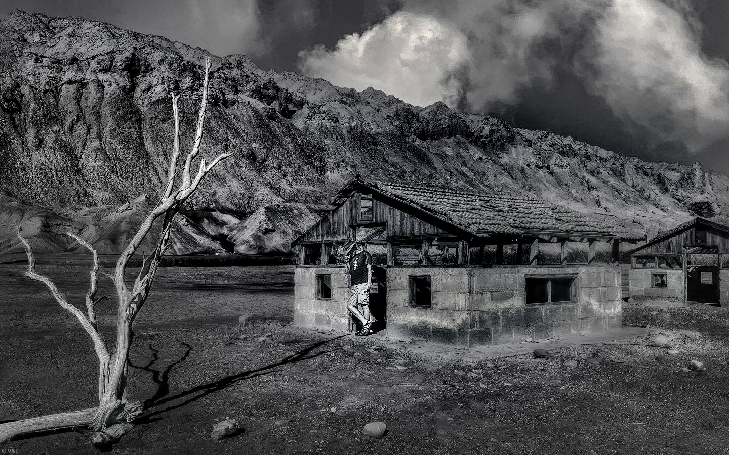
When I looked back at my modification to your delightful image, I felt that I added too much contrast to the mountains and parts of the buildings. But, the additional contrast around the cowboy seems to help him stand out.
Take care! |
Dec 3rd |
| 62 |
Dec 22 |
Comment |
Israel, it's a fascinating scene (and description). Well done! However, I found that the cowboy was a bit lost in the image. Perhaps a bit more isolated contrast would highlight him. Here's what I came up with. Your thoughts?
|
Dec 2nd |
 |
| 62 |
Dec 22 |
Comment |
Emil, like Bunny I've also been to the Chihuly Museum. The glass there is absolutely amazing! And, my friend, your photograph did it justice. The texture and brightness of the glass are perfect! I like your removal of the projectiles at the top right. You might consider doing the same to the two "prongs" on the bottom right.
I recently watched one of the Superman movies, and your wonderful image certainly reminds me of the crystals. Smiles.
Nicely done!
|
Dec 2nd |
6 comments - 6 replies for Group 62
|
6 comments - 6 replies Total
|