|
| Group |
Round |
C/R |
Comment |
Date |
Image |
| 5 |
Nov 22 |
Reply |
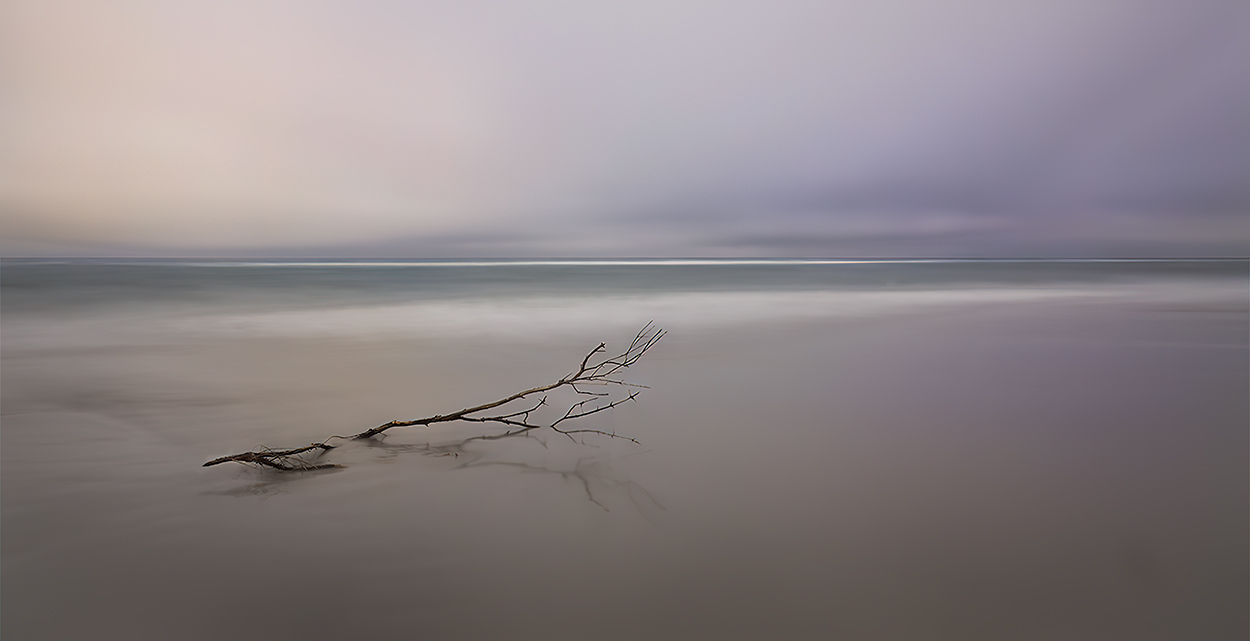
Thank you, Richard. I've done a bit of cropping (as you suggested) and subtly enhanced the colors. Here's the final result.
|
Nov 11th |
 |
| 5 |
Nov 22 |
Reply |
Thx. (Minimalist reply... with a smile)
|
Nov 11th |
| 5 |
Nov 22 |
Comment |
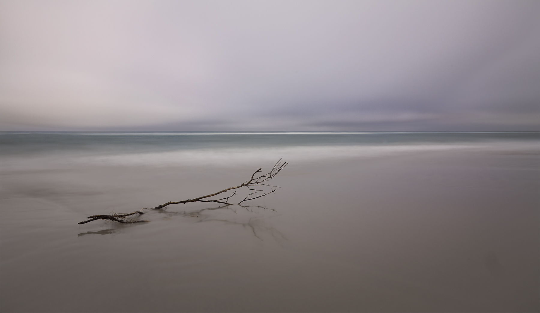
I think most of us know that Artificial Intelligence (AI) plays a larger and larger role in photography. Some of the newer capabilities of Photoshop and Lightroom use AI extensively. For fun, I decided to try DALL-E to see what it would generate if I gave it the text description of "long exposure of small branch lying on the beach with the ocean in the background". I then took the AI-generated image into Photoshop to make minor adjustments, mostly cropping and slight desaturation.
I realize that our study group is focused on helping each other with our photographs, so AI-generated images don't "fit". Nonetheless, I felt that others might want to see the current capabilities of this rapidly-evolving technology.
|
Nov 6th |
 |
| 5 |
Nov 22 |
Reply |
Barbara, not a problem at all. Here's the image.
|
Nov 5th |
 |
| 5 |
Nov 22 |
Reply |
Thank you, Barbara. I thought about the horizon splitting the image and wondered if I should modify it. But, decided that "rules are made to be broken"... and, besides, I liked it the way I had it.
|
Nov 5th |
| 5 |
Nov 22 |
Comment |
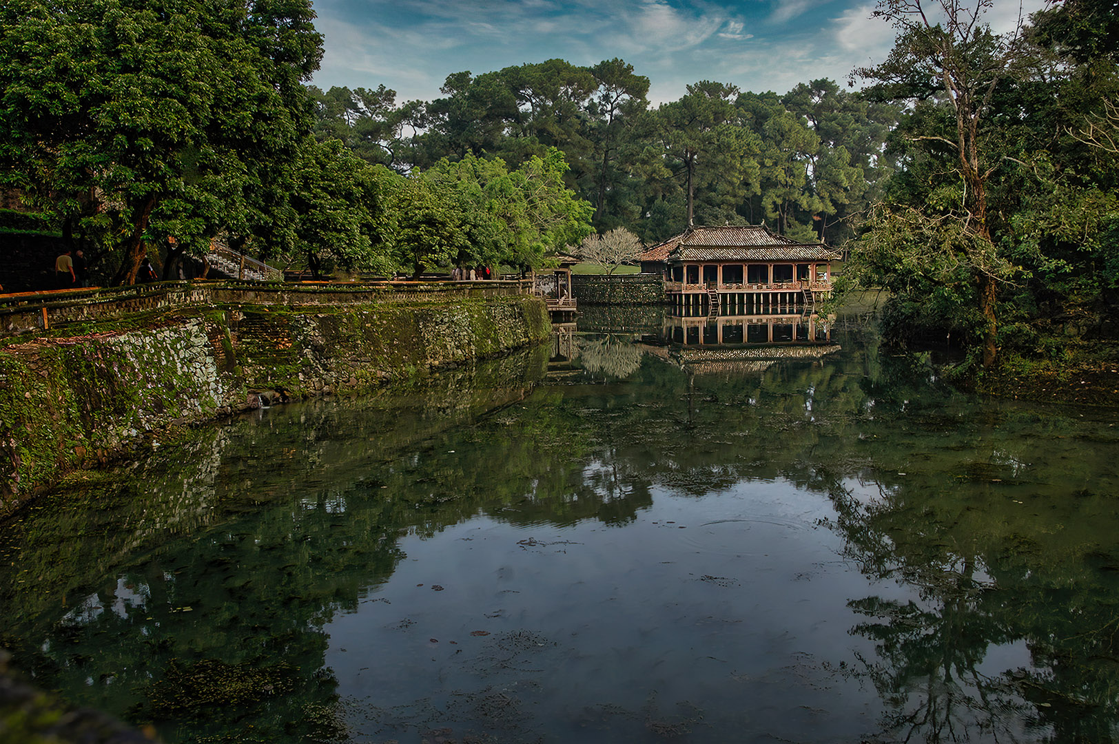
Richard, it's a beautiful photograph of a remarkable scene. I love the composition. The leading line of the wall leads my eyes directly to the temple, and the trees on the right keep my focus on the temple.
I played with the image a bit using Photoshop's Camera Raw filter. My goal was to see if I could adjust the lighting to further the focus on the temple even more. Your thoughts?
|
Nov 4th |
| 5 |
Nov 22 |
Comment |
Sophia, the blue color of the night sky is wonderful. It sets off the Milky Way beautifully. And, I've never seen the Milky Way in a vertical orientation. Fascinating. Excellent photograph. |
Nov 4th |
| 5 |
Nov 22 |
Comment |
Mark, your post-processing on this image is wonderful! I love how you brought out the boat and the amazing colors of the rocks. Also, the rocks on the left and right of the foreground make a great frame for the pier and boat. My only thought is that you might be able to make the boat and the area around it even a tiny bit brighter. However, that's a nit. Great image!
|
Nov 3rd |
| 5 |
Nov 22 |
Comment |
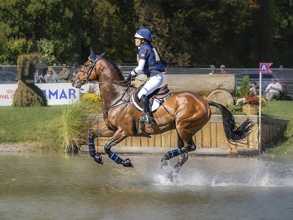
Jim, your timing was perfect! And, the splashing water behind the horse is wonderful.
I agree with Mark that the background is a bit distracting, so I played with your image in Photoshop and Camera Raw. I added some blur but also removed a few objects. Your thoughts?
|
Nov 3rd |
 |
| 5 |
Nov 22 |
Comment |
David, I see lots of improvements you made to the original image. I especially like the fact that you replaced the windows in the background, slightly blurred the background, as well as darkening it. Well done! My only suggestion, and it's a nit, is to eliminate the small bright spot that's just above her crown.
It's a beautiful image!
|
Nov 2nd |
| 5 |
Nov 22 |
Reply |
Thank you, Mark. Jim clearly gets much of the credit for the improvements. His suggestions were wonderfully helpful!
|
Nov 2nd |
| 5 |
Nov 22 |
Comment |
Barbara, I love the colors and shapes in your image. The colorful heads of the pins were a wonderful idea. And, I think your vignette gives the photograph a nice aged feeling. Well done!
|
Nov 2nd |
| 5 |
Nov 22 |
Reply |
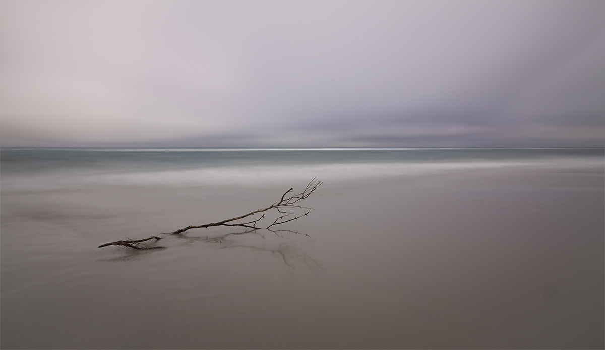
Jim, I feel like the minimalist goal is still adequately met, especially since the color makes me want to look at the image longer than I did with the older version. I simplified the base of the branch as you suggested. Here's the "current final" image. Smiles...
Thank you for your help!
|
Nov 1st |
 |
| 5 |
Nov 22 |
Reply |
Jim, I like it! And, you did an excellent job with the modifications. Thank you!
After living with the image for awhile, I decided to try adding just a bit of color and lighting modifications. It's the original image (with the "offending branch"). What do you think?
|
Nov 1st |
 |
7 comments - 7 replies for Group 5
|
| 27 |
Nov 22 |
Comment |
I think it's a wonderful image. The sailboat and the setting sun nicely give horizontal balance to the photograph, and the brilliant sky and the water give vertical balance. It's a photograph that I wouldn't tire of seeing! Well done!
|
Nov 6th |
1 comment - 0 replies for Group 27
|
| 62 |
Nov 22 |
Reply |
Thank you, Bob. It was an indoor shot with fairly low light, none of it natural. With all the various light colors that were present, monochrome was definitely the way to go!
|
Nov 14th |
| 62 |
Nov 22 |
Reply |
Thank you, Bunny! I was also captivated by his hand position and motion. When I look at the image it feels like he's talking to me (adamantly!).
|
Nov 11th |
| 62 |
Nov 22 |
Comment |
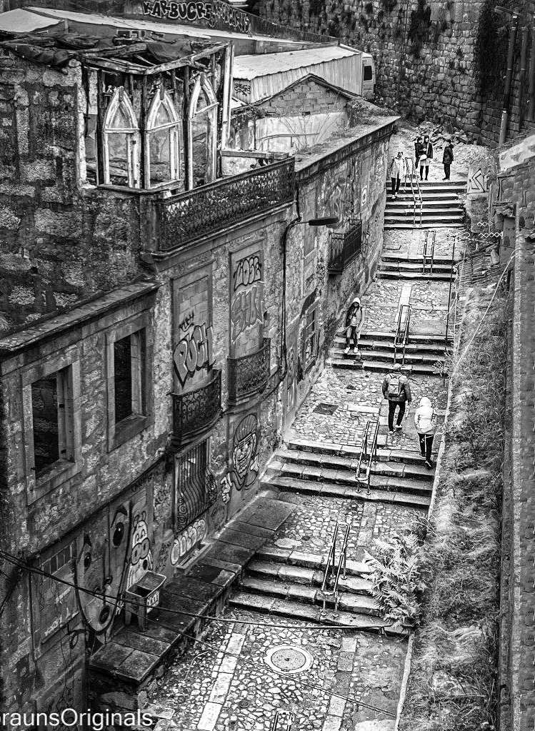
What a wonderful photograph! And, you demonstrated your artistic skills when you created it from the original. Outstanding!
As Bunny and Emil demonstrated, it's hard NOT to play with this image. I wanted to emphasize the walk, so I added a bit of exposure. I also cropped slightly on the left side, again to emphasize the walk. Finally, since my crop made the photograph feel a bit lopsided, I added a small amount to the right side. Thoughts?
|
Nov 5th |
 |
| 62 |
Nov 22 |
Reply |
I find that matte paper works especially well when an image has deep, rich colors and blacks that need to be truly black. While it isn't great for fine-detailed photographs, it does quite well showing texture.
|
Nov 4th |
| 62 |
Nov 22 |
Comment |
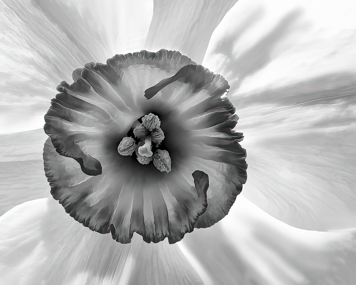
Bunny, I like what you did to the original image! You have turned a nice (but common) flower photograph into a fascinating work of art. It's clear that you want the viewer's eyes to go to the center of the daffodil. So, in keeping with our tradition (lol), I played with your image a bit in photoshop. My goal was to make the center even more prominent. Your thoughts?
|
Nov 3rd |
 |
| 62 |
Nov 22 |
Comment |
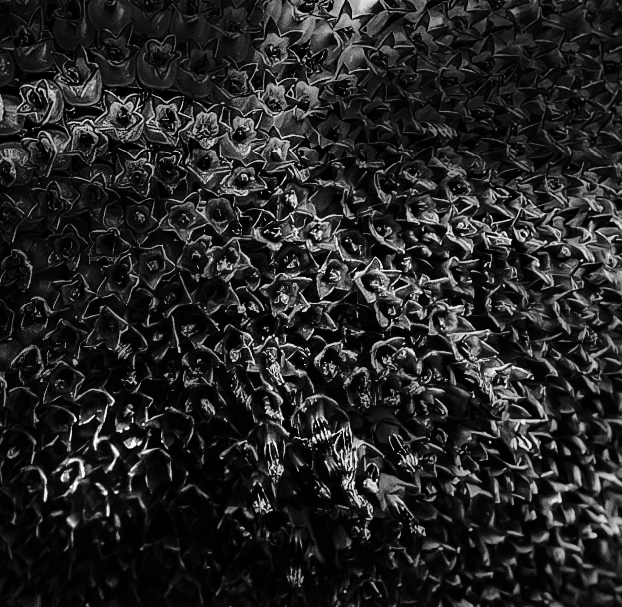
Fascinating image and treatment. I like how Bunny has manipulated the brightness/shadows... and, like her, I decided to play with it a bit. Since the seeds are so unusual in the way they are packed together, I thought that an abstract with only the seeds might work. When I did that, I found that it was boring. So, I attempted to add some interest by using some light "paths". Not sure it's at all successful. Thoughts?
|
Nov 3rd |
 |
| 62 |
Nov 22 |
Comment |
LuAnn, it's a captivating image. I love both high-key and minimalist photographs, and yours is both. Beautiful!
When you print this image, I suggest that you try it on a good paper that has a luster finish. I think the subtle tones might be lost on matte paper and I generally avoid glossy papers. |
Nov 3rd |
| 62 |
Nov 22 |
Reply |
Thank you, Emil. I appreciate your compliment! My favorite area of photography is portraits. Faces tell such fascinating stories of people's life.
|
Nov 2nd |
| 62 |
Nov 22 |
Comment |
Emil, this sounds like a wonderful project! Hopefully, your car gets good gas mileage, and you don't encounter a possessive farmer with a shotgun. lol
I like the composition of your silo image. The clouds seem to almost point to the silos. Fantastic.
I wanted to see how slightly different lighting and contrast would work. So, I started with your original image and converted it to B&W using Nik's Silver Efex. Then I further modified it with Adobe Camera Raw. Your thoughts?
|
Nov 1st |
 |
| 62 |
Nov 22 |
Comment |
Israel, to me this is one of the best images you've shared with us! It's absolutely beautiful in both the original (color) version and the monochrome version. I love how you treated the road and the church brightness. They both have exactly the right luminance to let them stand out while still feeling natural. The light on the left side of the church "fits" the image nicely.
The only thing that you might want to change is the light spot at the base of the tree on the right of the church. In the original, it's clear that this is a yellow light of some kind. However, in the monochrome version, it feels more like a minor distraction. (I almost hate to mention such a tiny nit in such a gorgeous image!)
Wonderfully done!
|
Nov 1st |
6 comments - 4 replies for Group 62
|
14 comments - 11 replies Total
|