|
| Group |
Round |
C/R |
Comment |
Date |
Image |
| 3 |
May 22 |
Comment |
Ruth, I really like how you framed the boat. You really direct the viewer's eyes to the catamaran. Nice! I decided to see how your photograph would look in a square format. And, while I was at it I played with the lighting and color balance of the boat. What are your thoughts?
|
May 9th |
 |
1 comment - 0 replies for Group 3
|
| 5 |
May 22 |
Comment |
Richard, to me your title makes this image. Without it, I would find that it simply leaves me questioning what's going on. But, the title turns it into a story. Nice.
|
May 9th |
| 5 |
May 22 |
Reply |
Thank you, Barbara. I've been playing with some PS manipulation of the waterdrop images. All that I've seen elsewhere are in color, so I decided to see how they look in B&W. Your thoughts?
|
May 8th |
 |
| 5 |
May 22 |
Comment |
Sophia, like you, I've seen this kind of sky. I think it's lovely and doesn't feel unnatural. I especially like how you've reduced the brightness of the sunrise sky toward the right of the image. The brighter sunrise color immediately attracts my eyes which then follow the color back into the line of boats. Nicely done.
Since I have memories of early morning on the water, I played with your image to try to recreate those remembrances. I also used sky replacement but took an entirely different approach. Your thoughts?
|
May 5th |
 |
| 5 |
May 22 |
Reply |
Davie, thank you. Your appreciation is truly appreciated.
I debated about putting a border around the image. However, after giving some thought to how it would look against a black background, I decided that I'd like to see it "floating" on the screen. |
May 4th |
| 5 |
May 22 |
Reply |
Thank you, Candia. I haven't yet played with ink trails in water, but your comment has put it on my agenda. To me, the secret of water-drop photography is PATIENCE! It's also something that I have in short supply.
|
May 4th |
| 5 |
May 22 |
Comment |
Candia, I'll miss your astute comments and suggestions. Nonetheless, I have a lot of respect for the RPS. One of my friends, David Cooke, used to be a member of our Group 5 study group. Now, I believe, he's the Vice-Chair of the Royal Photographic Society Creative Eye Group. David's a great person and wonderful photographer, as was his father and now his daughter! (I bought one of her amazing images to give as a Christmas gift.)
I wish you well!
BTW, even though it's not at all traditional, I really like this month's submission. Not only are the primary colours (note the additional "U" in honour of your British background) wonderfully sprinkled around the image, but the contrast between the highly textured bamboo and the stark building is wonderful. Well done!
|
May 4th |
| 5 |
May 22 |
Comment |
Wonderful image and post-processing. Like Richard, I think the whiskers coming over the matt is brilliant. It really makes it a unique photograph that shows your talent and creativity. I'm also fond of David's version. The green matt is a nice addition. |
May 4th |
| 5 |
May 22 |
Comment |
Outstanding! The subtle color and texture of the leaves inside the arc of the foreground trees are wonderful! I wanted to play a bit with the lighting (below). But, I wasn't attempting to improve your photograph. Instead, I was trying to create a different feeling and, hence, a different image. Yours is beautiful. Well done!
|
May 4th |
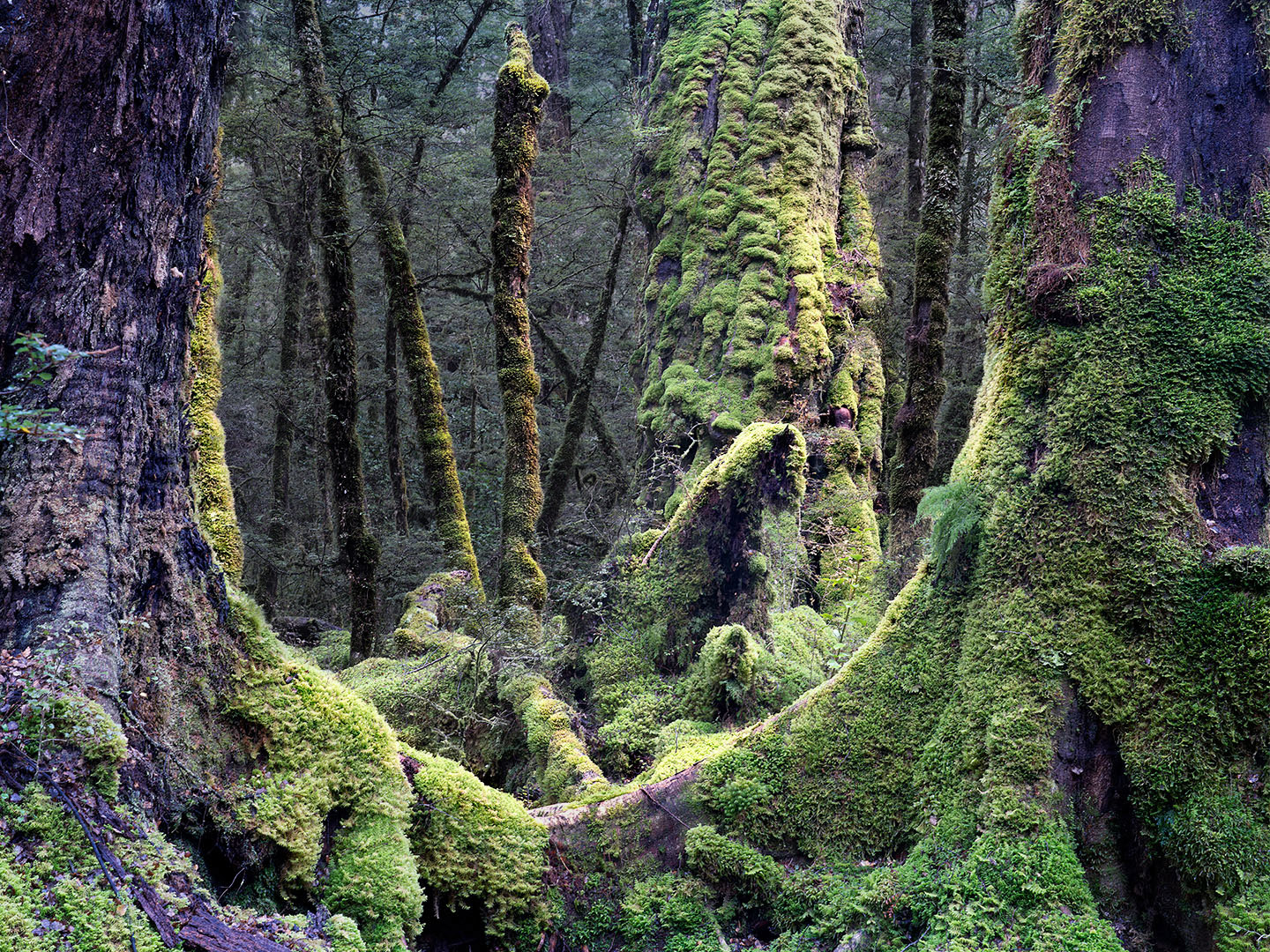 |
| 5 |
May 22 |
Comment |
Wonderful image, David. Like Candia, I think your crop is perfect. To me, the image is "made" by the curve of the train tracks, the smoke, and the red strip on the engine. Well done!
|
May 4th |
| 5 |
May 22 |
Reply |
Thank you, Richard. That means a lot to me.
When you're ready to get back into water drop work, let me know and I'll be glad to share some of my trials and tribulations... and how I finally got around them. |
May 2nd |
6 comments - 4 replies for Group 5
|
| 27 |
May 22 |
Reply |
Renee, I agree about the relatively bright flower in the bottom left corner. (I got lazy.)
It was a very easy modification. In the new mask tool, I selected Subject and then inverted the selection. If I remember correctly, I had to add a bit more to the selection using the brush tool. Then it was simple to darken everything selected... that is, the background. If that doesn't make sense, please let me know. It would only take 30 minutes or so to show you.
|
May 15th |
| 27 |
May 22 |
Comment |
What a lovely image, Renee! It is really difficult to create a photograph of flowers that is unique; however, you've done a beautiful job! The colors are wonderful and the sharpness is amazing... especially considering that you didn't use focus stacking and the three primary flowers aren't in the same plane. Really nicely done!
I took the liberty of playing with your image in Photoshop and Camera Raw to see if I could make the three center azaleas stand out even more. Your thoughts?
|
May 14th |
 |
1 comment - 1 reply for Group 27
|
| 62 |
May 22 |
Comment |
Bob, I keep coming back to your image. It fascinates me for some reason. Part of it, I think, is that it is both beautiful (in an abstract way) and yet looks like it could be an example of polluted water. The human mind is STRANGE. (Or, maybe it's just mine.) |
May 16th |
| 62 |
May 22 |
Reply |
Thank you, Emil. I like the slightly brighter gravel and table. However, the arching leg and back piece of the chair on the right seems to be a bit too bright. I'll definitely play with your suggestion.
|
May 14th |
| 62 |
May 22 |
Reply |
LuAnn, your alternative to the wine bottle would certainly be safer since no alcohol is permitted in the garden. Perhaps a man's fedora and a pair of lady's gloves would work! |
May 14th |
| 62 |
May 22 |
Reply |
Thank you, Bunny. I love the idea of a bottle of wine and a couple of wine glasses. I might be able to get away with the wine approach since it's not a busy part of the garden. (Although no alcohol is permitted.) With a camera bag, I should be able to "smuggle it in". |
May 14th |
| 62 |
May 22 |
Comment |
Bob, this is wonderful! You've made an intriguing and well-composed abstract out of a well-done but fairly boring photograph. I really like it and think you should enter it in a competition.
My only (small) suggestion is that you add just a bit more to the top and complete the large bubble that is cut off.
Nicely done!
|
May 7th |
| 62 |
May 22 |
Reply |
Thank you, Bob! I have removed the offending limb from the version of the image that I'm going to print. (I'm glad no one has suggested removing the table or a chair... lol)
|
May 7th |
| 62 |
May 22 |
Comment |
Bunny, you get better and better. This image is absolutely amazing. I love the monochrome version. Your lighting is outstanding. It makes the petals stand out... almost as though they are fans who are applauding the center of the flower. Truly well done. I'm humbled.
|
May 4th |
| 62 |
May 22 |
Comment |
Very cool! I can almost hear the sound of the motorcycle as it races past. I love the angle of the man and the spray of dirt behind him. Well captured!
The only thing I noticed was a thin area at the bottom of the frame that is slightly brighter than the dirt beyond it. It might be useful to darken this a bit so that it's the same colour as the darker dirt.
|
May 3rd |
| 62 |
May 22 |
Reply |
Excellent modifications, Israel! I especially like adding the grasses on the left.
See? We/I learn from you too! Thank you!
|
May 3rd |
| 62 |
May 22 |
Comment |
Israel, it's a magical image, both in color and B&W! Naturally, I prefer the B&W version (smile). The beam of light is amazing! I assume it's from some sort of spotlight, right? In any event, the entire event is extraordinary, as is your image!
I couldn't resist playing with the light a bit in Photoshop. Not sure it's an improvement. Your thoughts? |
May 2nd |
 |
| 62 |
May 22 |
Comment |
What a fascinating image! Flipping it was an excellent idea. It feels much more "comfortable" now. I guess that's because we read left to right and top to bottom, so having the grasses lean to the right and down feels natural.
The thin reeds that extend above the grasses are great against the black background. Well done!
It might be beneficial to remove the blurred grass head that's about 2/3rds of the way up on the right of the image. Since it's in a prominent position, I can't help noticing it. However, it would be hard to remove and it's not a major distraction.
|
May 2nd |
| 62 |
May 22 |
Reply |
I don't know if you've found yourself, but your art has definitely found YOU! To me, minimalistic photography combines beautifully with either high key or low key and that opens a wealth of possibilities. It's hard to imagine getting tired of something gorgeous.
|
May 1st |
| 62 |
May 22 |
Comment |
LuAnn, you make it very difficult to offer constructive comments! There is nothing that I can suggest for modifications. I love the image. It's definitely another award winner. I especially like the smooth tones and how they subtly define the plant. This photograph is a wonderful example of something that works incredibly well as a monochrome. Well done! |
May 1st |
7 comments - 6 replies for Group 62
|
15 comments - 11 replies Total
|


