|
| Group |
Round |
C/R |
Comment |
Date |
Image |
| 5 |
Mar 22 |
Comment |
Richard, I love it! You've captured the boy's emotions brilliantly. I agree with Mark that a bit of sharpening on the Pidgeon would be nice... but that's a nit. Well done! |
Mar 9th |
| 5 |
Mar 22 |
Comment |
Although it's an architectural image, it would also fit into the abstract category. Like Mark, my first thoughts were that it was an amazing yacht. Then, I realized that a seven-story yacht probably doesn't exist... even among the super-rich.
In any event, your processing and the wonderful lines and patterns have made a fascinating photograph. Well done!
|
Mar 7th |
| 5 |
Mar 22 |
Reply |
Thank you, David. With the background darkened as Richard did, I agree that including the Buddha adds useful context to the image.
I submitted an early April image yesterday and it appears that its description overlayed the one for March. I've let Barbara know. |
Mar 7th |
| 5 |
Mar 22 |
Comment |
This is one of the "wow" images. Wonderfully done! It must have been terribly exciting to see this interaction between the birds.
I really like Mark's modifications. However, I might darken the background even a bit more.
Outstanding!
|
Mar 6th |
| 5 |
Mar 22 |
Comment |
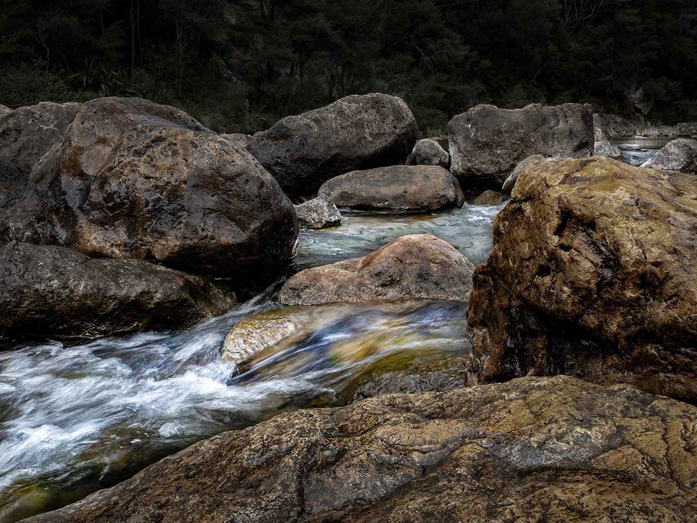
Mark, I read Sophia's and Richard's comments and thought they made a lot of sense. I like the rushing water... and the large rocks add a feeling of power. Very nice. Although the color of the rocks is fascinating, to me it made them dominate the photograph. Since I wanted to see how your image would look with the water playing a more prominent role, I played with the original in Photoshop. When I finished, I found that it was a different photograph altogether. Your thoughts?
|
Mar 6th |
 |
| 5 |
Mar 22 |
Comment |
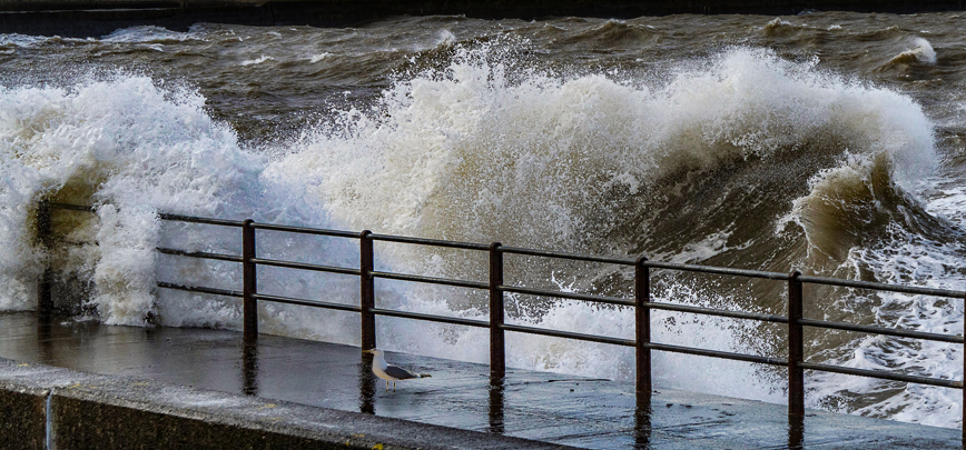
Impressive photograph. I love the feeling of strength, excitement, and action. Excellent capture!
When I read Sophia's comment, I decided to play a bit in Photoshop. I cropped in on the fence and wave to virtually eliminate the sky. This version was exciting but didn't tell the story that yours did. So, just for fun, I added a gull.
|
Mar 6th |
 |
| 5 |
Mar 22 |
Comment |
Barbara, you never cease to amaze me. Your image is wonderfully imaginative. I especially like the little touches, like the shadow of the horse and rider who are coming out of the film strip. Although you might be able to crop a bit off the bottom, it doesn't bother me the way it is. Part of the reason is that the shadow extends below the horse/rider.
I really don't have any suggestions for changes. Well done!!
|
Mar 5th |
| 5 |
Mar 22 |
Reply |
Thank you, Sophia. I agree with you completely about Mark's comments and changes. |
Mar 5th |
| 5 |
Mar 22 |
Reply |
Mark, I really like your changes! Your cropping changes the entire "flavor" of the image in a way that gives a sense of intimacy. Wonderful! And, I completely agree with your fix to the feel and artifacts in the rug. Thank you! You've really improved the original that I submitted.
|
Mar 5th |
6 comments - 3 replies for Group 5
|
| 62 |
Mar 22 |
Reply |
Thank you, Nick. I used the content-aware fill to replace the messy background in the original image. It did an amazing job, but as you noticed there are a few details that I still need to iron out. I really appreciate your input on this. It is very helpful!
|
Mar 22nd |
| 62 |
Mar 22 |
Reply |
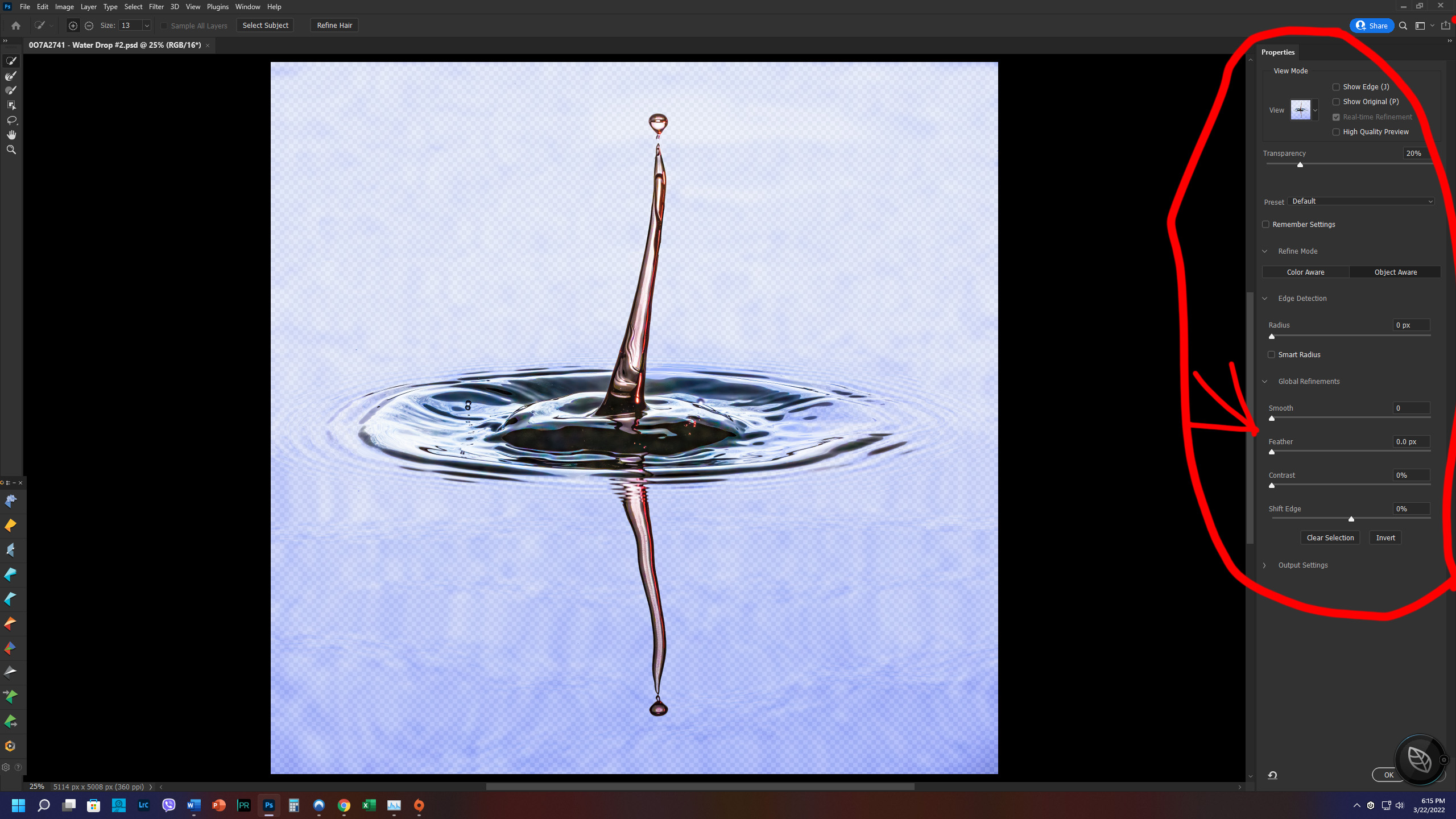
Bob, Photoshop has quite a few ways to manipulate a selection. Whenever you select a tool (like the lasso) that can do a selection, there's a tab at the top that says "Select and Mask...". When you click on that, you get lots of selection options, including Feather. Take a look at the screen shot. I circled the various options and put a red arrow pointing to the feather option.
|
Mar 22nd |
 |
| 62 |
Mar 22 |
Reply |
Thank you, Bunny. A couple of days ago some young ladies (probably around your age) visited my grandson and saw the color image. Their immediate question was, "Is that a picture of the Covid virus?"
I guess each of us sees through a different lens. |
Mar 18th |
| 62 |
Mar 22 |
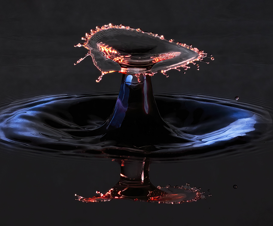
Reply |
Emil,
I definitely like the darker background. It makes the water drop much more prominent.
It's interesting that your workflow for this image is very close to mine, except you use the LR develop module. One thing I have noticed is that the Photoshop Select Subject does not yield the same result as the Camera Raw/LR Mask's Select Subject. Usually, but not always, I find that the Photoshop selection is closer to what I want.
Thank you for the version with the darkened background. Very nice!
|
Mar 10th |
| 62 |
Mar 22 |
Reply |
Nick, it would be wonderful to visit the Old Port of Marseille with you. It sounds like a great place for photography.
Like you, I am not fond of sky replacement. On the rare occasions that I do a replacement, it's always with one of my own sky photographs. My sky changes on your image entailed a simple selection and then adding a tiny bit of Dehaze.
|
Mar 9th |
| 62 |
Mar 22 |
Comment |
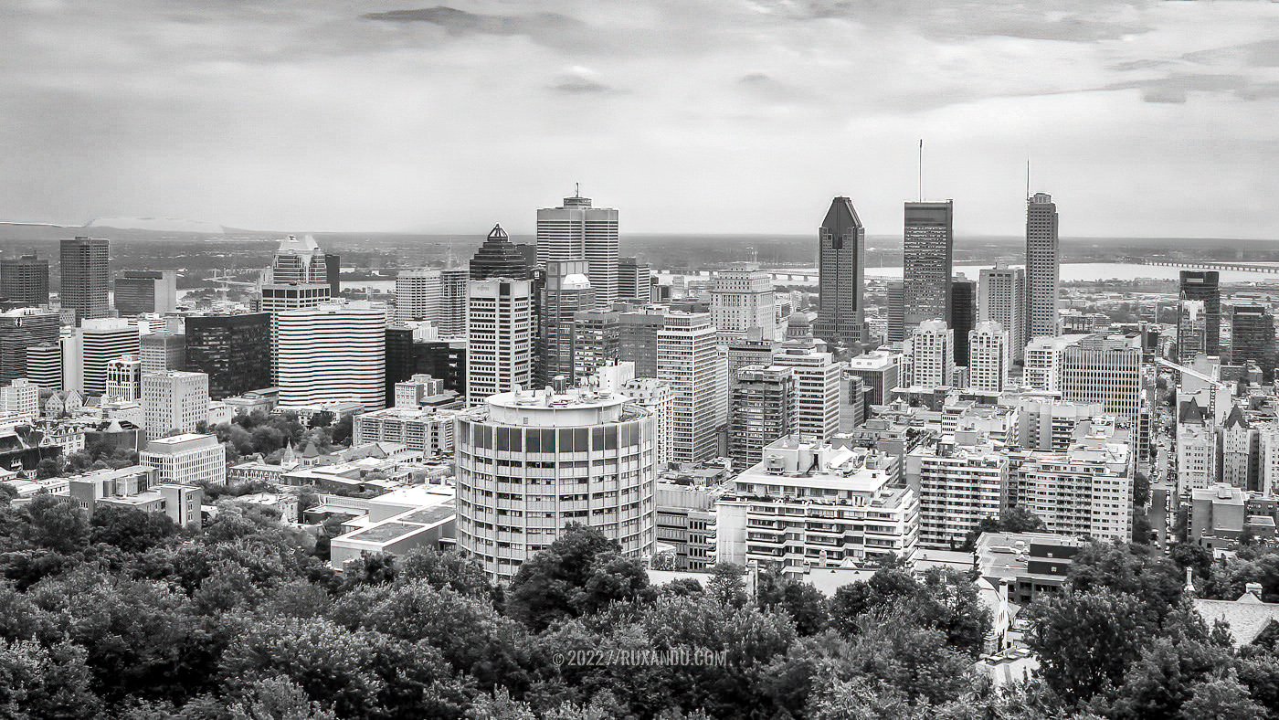
Nick, it has been many years since I was in Montreal, but my memories of it are delightful. Your image has captured a fascinating skyline. I love the three layers... trees, city, and sky. Very well done!
When I looked at the photograph a second time, I thought that it might benefit from a bit more contrast and a slightly more interesting sky. With that in mind, I made a copy and played with it in Photoshop and Camera Raw. Your thoughts?
|
Mar 7th |
 |
| 62 |
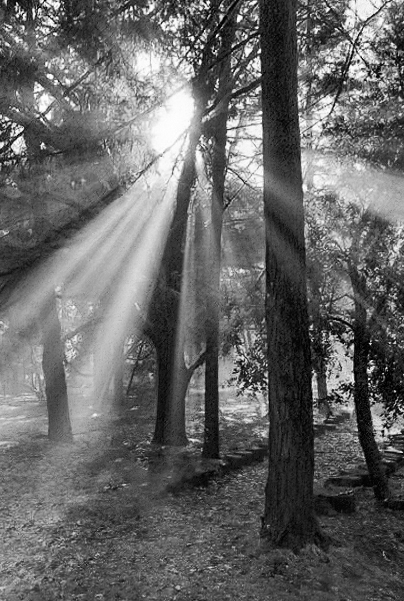
Mar 22 |
Comment |
Bunny, this is a striking image. Like you, I find sun rays fascinating and beautiful. Your post-processing really brought out the rays brilliantly. I especially like the image that you included in your reply to Bob. Nonetheless, I wanted to play with it a bit in Photoshop and Camera Raw. Starting with your original photograph, I cropped it so that the ground would be included as an "anchor". Then, I played with the light a bit, but don't think the result was nearly as successful as yours. Well done!
|
Mar 5th |
 |
| 62 |
Mar 22 |
Reply |
Thank you, LuAnn. I'm now the proud owner of Smart Photo Editor. It appears to be a powerful product. Can't wait to explore its capabilities.
|
Mar 5th |
| 62 |
Mar 22 |
Reply |
Thank you, LuAnn. I like the background and frame that you've added. The subtle diagonal lines in the background are especially interesting. How do you create your frames?
One of the things that I've discovered is that more complex waterdrops do best in color. (I've attached a sample.) But, simpler ones work best as monochrome so that the patterns and tones show through.
All-in-all, it's a fun kind of photography. But, the process truly challenges one's patience!
|
Mar 5th |
 |
| 62 |
Mar 22 |
Comment |
LuAnn, this is an interesting subject and approach. I like how you direct the eyes of the viewer by pointing to "Yours Truly" with the tip of the fountain pen and the fold of the paper. Then, you further emphasized the Valediction with the fairly intense vignette. Clever and well done.
I like this image, but it's not one that holds my attention long. It is difficult to have writing in a photograph since people have a strong urge to read the words. I find that I soon start searching for meaning in the letter and that it's a bit frustrating that I can't read it. |
Mar 4th |
| 62 |
Mar 22 |
Comment |
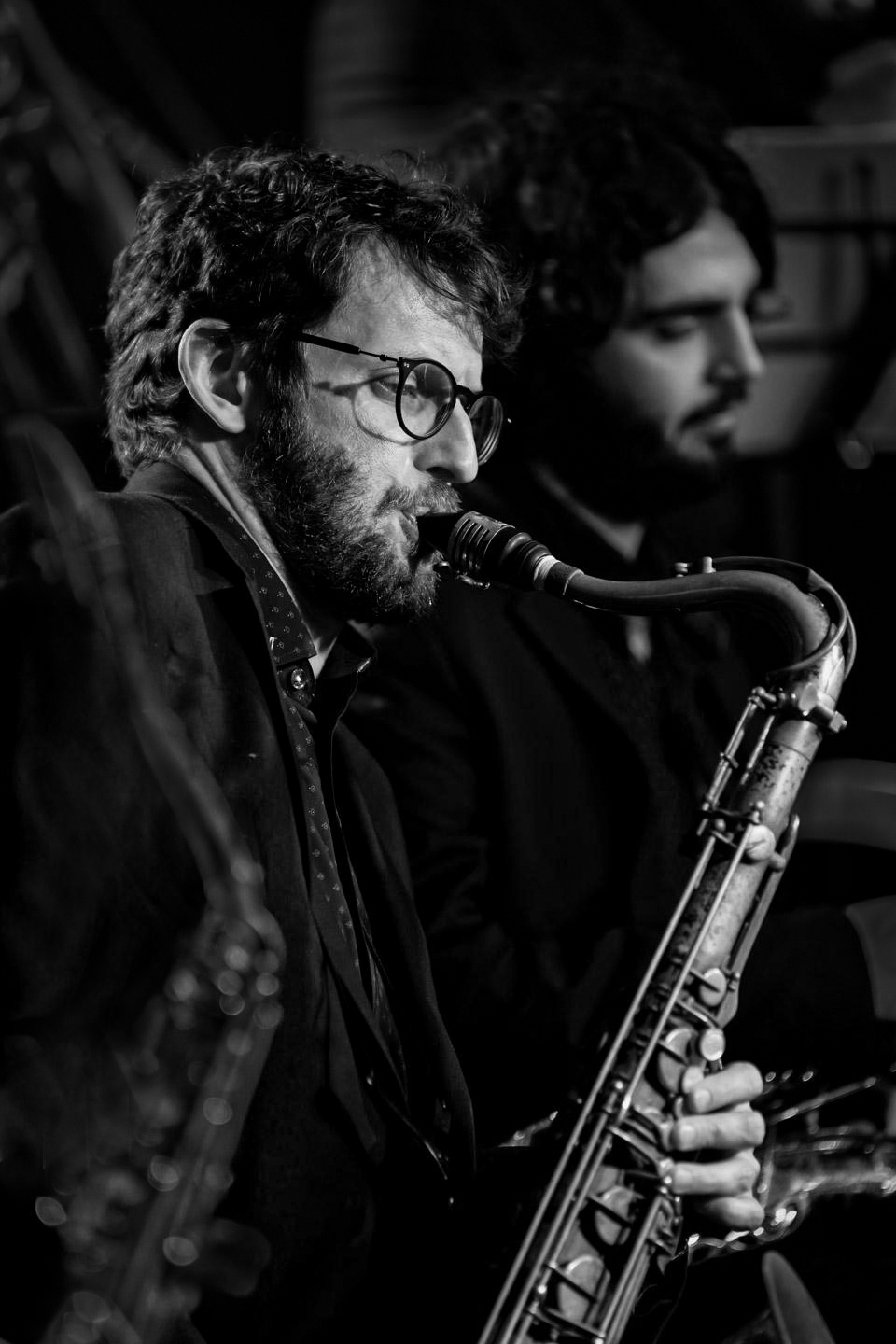
Israel, I love the mood that this image evokes. It makes me feel the sensual softness of a wonderful saxophone being played in a jazz club... late at night. I envy your ability to enjoy this music and photography opportunity on a monthly basis.
I couldn't resist playing with your image. I attempted to diminish the importance of the saxophone on the far left and slightly darken the primary musician's face. I also lowered some of the surrounding bright areas.
Your thoughts? |
Mar 3rd |
 |
| 62 |
Mar 22 |
Comment |
Bob, for me this is a truly nostalgic image since it reminds me of my first car. I really like your post-processing. The darkness of the hood and the elimination of any detail in the top-right of the photograph makes the chrome bumper and radiator pop. Well done!
You might consider including just a bit more of the hood since it would be good to see it curving down toward a more horizontal position. But this is merely a nit on an excellent image.
|
Mar 3rd |
| 62 |
Mar 22 |
Comment |
Emil, I love the mood that you've created with this image. It is especially effective as a monochrome. The starburst from the train's light is outstanding and you've done a magnificent job retaining the details in the darker portions of the photograph.
I noticed what looks like a crane that is barely visible above the heads of the two models. It isn't bad but you might want to consider cloning it out.
|
Mar 3rd |
| 62 |
Mar 22 |
Reply |
Bob, I have looked at dozens of different youtube videos. However, I had never seen this one. It really gave me some good ideas of things to try. Thank you so much!
|
Mar 3rd |
| 62 |
Mar 22 |
Reply |
Thank you, Bob. As you noted, much of the effort that went into this image was post-processing. I'm not sure what kind of background would be beneficial. Since I wanted the waterdrop to stand out, I thought a subtle texture might "fit" the image. What kind of background do you think would work?
|
Mar 2nd |
6 comments - 9 replies for Group 62
|
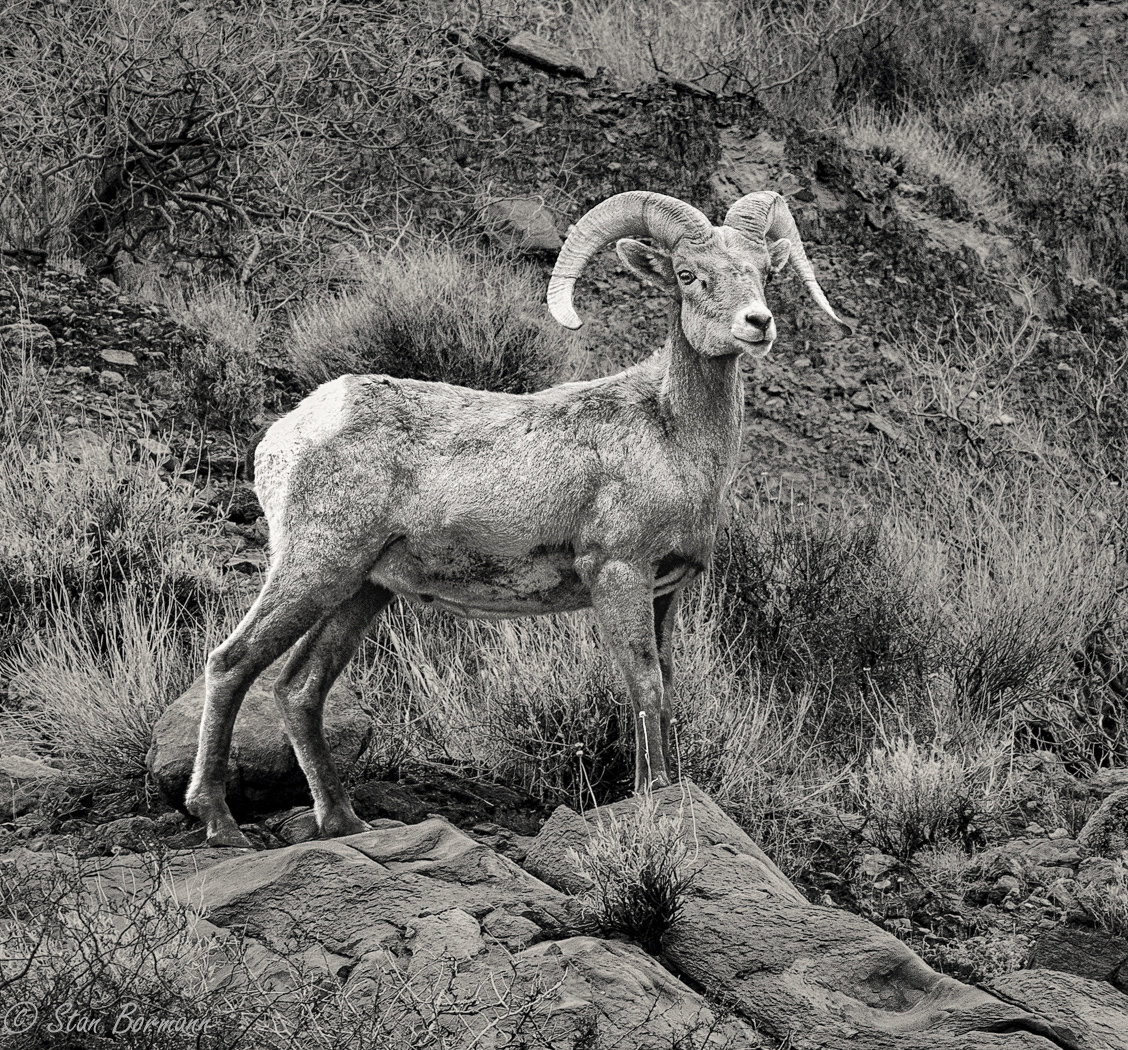
| 64 |
Mar 22 |
Comment |
Stan, it's an amazing capture! Even with your tight cropping I'm surprised that you were able to get so close. Beautifully done!
Following Don's suggestion, I tried slightly darkening the background and adding just a bit of a vignette. Your thoughts? |
Mar 10th |
 |
1 comment - 0 replies for Group 64
|
13 comments - 12 replies Total
|


