|
| Group |
Round |
C/R |
Comment |
Date |
Image |
| 3 |
Feb 22 |
Comment |
Mary Ann, I think this is a wonderful image. I love how you've captured the juxtaposition of the colorful (and old-style) houses and the modern city behind them. To me, it's perfect that the cityscape has dull colors compared to the foreground houses. Nicely seen and nicely captured! |
Feb 10th |
1 comment - 0 replies for Group 3
|
| 5 |
Feb 22 |
Reply |
Sure, glad to help any way I can. My email is Oliver.Morton@yahoo.com.
|
Feb 21st |
| 5 |
Feb 22 |
Reply |
Yep, there are definitely halos.
I find this purple image quite interesting. I like the color of the water and the background. And, it's quite sharp on the critical parts. However, I don't think I'd say that it's attractive since it's a bit confusing to look at.
What lens and camera settings are you using? |
Feb 20th |
| 5 |
Feb 22 |
Reply |
Thank you, Bunny. I enhanced the blue of the sky to draw attention to the top of the dome. To me, that bit of blue and the flag made it a much more interesting photograph.
|
Feb 19th |
| 5 |
Feb 22 |
Reply |
Thank you, LuAnn. I agree that this image is much more appealing than the one in group 62. I think the low angle has a lot to do with it. I don't know if you noticed, but there was a black chain on the steps in the original photograph. Removing that and a couple of distance guards helped too, I think
|
Feb 19th |
| 5 |
Feb 22 |
Comment |
Richard, I came back to your delightful water drops and thought I'd play with your image a bit in Photoshop. Mostly, I used the Topaz Sharpen AI filter plus a bit of Camera Raw to add a little yellow to some of the areas. Your thoughts?
|
Feb 19th |
 |
| 5 |
Feb 22 |
Comment |
This is an amazing photograph. Your timing was outstanding. I especially like David's version, though your submission is wonderful. There's nothing I can add except to echo Mark's comment about Topaz DeNoise AI. It's an amazing plugin. Although DeNoise has a sharpening slider, I use the Topaz Sharpen AI instead. Sharpen AI will handle quite a variety of sharpening requirements... more than the DeNoise AI sharpening slider. |
Feb 19th |
| 5 |
Feb 22 |
Reply |
Barbara, thank you so much. I tried converting it to black and white but it lost the impact of the colourful (note the "u" was added in your honour... smiles) flag. I submitted a black and white version of another photograph from that same trip downtown to the monochrome study group 62. However, the angle isn't nearly as appealing to me as this one is.
|
Feb 6th |
| 5 |
Feb 22 |
Reply |
Thank you, Mark. I certainly agree with the optimistic (and strong) tone. It was the strength that I was attempting to portray. I didn't intentionally make an ominous sky, but now that you mention it... and, the metaphor could be extended by observing the slight patch of blue that exists. When I fix the bright fringe, I'll also take a look at making the sky less dramatic. |
Feb 6th |
| 5 |
Feb 22 |
Comment |
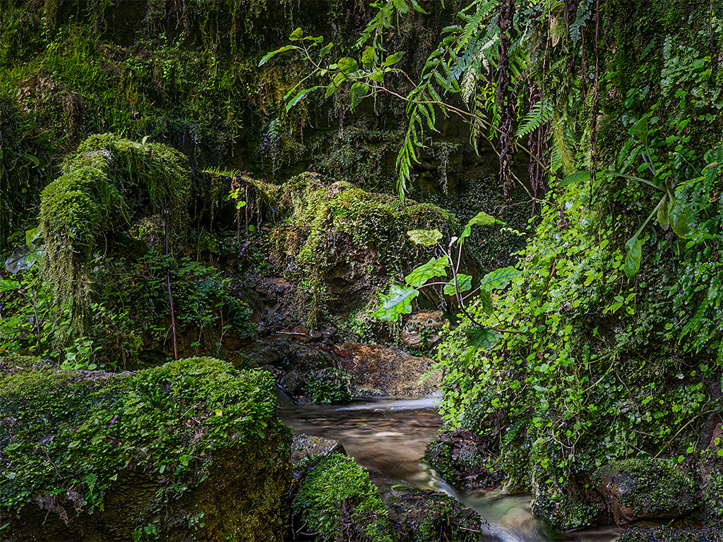
Like Candia, I really like intimate landscapes and you've clearly found a wonderful one! Since I find your image so appealing, I wanted to play with it a bit in Photoshop to see if I could modify the lighting to make it even more intimate. Using the radial gradient and the brush masks, I darkened the outer portions of the photograph and did a bit of editing on the lighting of the stream and intriguing background.
I realize that this isn't the scene that you saw, smiles. Nonetheless, your thoughts?
|
Feb 5th |
 |
| 5 |
Feb 22 |
Comment |
Fascinating scene and image. Misty (or snowy) environments can produce such wonderful photographs! Nicely seen and captured.
To me, the curve in the river in the middle of the image is especially interesting. To make that just a bit "closer" I tried a bit of additional cropping off the bottom. Then, I added just a bit of dehaze at the bottom, using the linear gradient mask. That seemed to "pull me in" to the photograph.
Your thoughts?
|
Feb 5th |
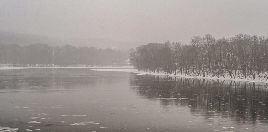 |
| 5 |
Feb 22 |
Comment |
Richard, you are truly a patient man! I have also done water drop photography using the Pluto valve and I know how many tries are required to get a good image. I especially like the small "blob" at the top, above the colliding drops.
One of the techniques that I found more successful than most was to use at least two light sources and to have different colored filters on them. Then, in Photoshop I could enhance and manipulate the colors to give fascinating results.
I really hope you'll continue with this and share your results!
|
Feb 5th |
| 5 |
Feb 22 |
Comment |
Your image is delightful! It is completely intriguing in that it's impossible for me to look at it without feeling the disgust of the awful taste... and to wonder what all is going on. A great story.
I have very little constructive input since your processing is excellent. The only thing that might be interesting would be to slightly darken the right side of his face to give a bit more depth.
Well done!
|
Feb 5th |
| 5 |
Feb 22 |
Comment |
I looked at all the previous comments on your image and found that the words that come to my mind have already been used... "excellent," "extraordinary," "masterpiece," "WOW!," "fabulous," "impressive," and "eye-catching." I have nothing to add except DITTO to all the above! Beautifully done!
|
Feb 5th |
| 5 |
Feb 22 |
Reply |
Candia, I am also very fond of architectural photography. Unfortunately, in spite of my optimal location, I'm not very good at it. Usually, I prefer my architecture images to be B&W, but this one seemed best in color. Since I plan to print this photograph, I'll check the clarity/texture before I do. Thank you for the observation! |
Feb 5th |
| 5 |
Feb 22 |
Reply |
Thank you, Sophia. I see the bright spot you mentioned. (Isn't it strange how distractions are best spotted by someone other than the photographer?) I'll definitely take care of it before printing my image. |
Feb 5th |
| 5 |
Feb 22 |
Reply |
Stephen, I agree. As I replied to Emil (above), I feel that the steps work well to draw the viewer into the photograph. And, the depth-of-field using 30mm and f/10 is amazing!
Thank you! |
Feb 3rd |
| 5 |
Feb 22 |
Reply |
Thank you Emil! I prefer this angle as well. The steps seem to lead my eyes into the image and give a good feeling of depth. I appreciate your comments!
|
Feb 3rd |
7 comments - 10 replies for Group 5
|
| 62 |
Feb 22 |
Reply |
Thank you!
|
Feb 23rd |
| 62 |
Feb 22 |
Reply |
Bunny, I've gone through Earth Oliver's FS2 Part 1 but I can't seem to find parts 2 and 3. Can you help?
Thank you! |
Feb 23rd |
| 62 |
Feb 22 |
Comment |
Bunny, I love your vision and creativity. Your piano-keys image is wonderful. The diagonal lines pull my eyes into and through the photograph. The fact that you took it on an iPhone has been inspirational. I've begun to explore the capabilities of my phone (which I previously ignored). The reflection of the keys is especially well-handled. At first glance, it appears that the keys are simply very long. (lol) However, upon reflection (poor pun) it contributes to the image's interest.
I do like your modified image (after LuAnn's comments) just a bit better; though the original is excellent. There's nothing I can add that would improve your photograph. |
Feb 16th |
| 62 |
Feb 22 |
Reply |
David, a very interesting observation. After looking closely, I completely agree that the sky is too prominent. I wanted it to be interesting, but not to compete with the Capitol Dome. Thank you for this... it will help me refine the image. |
Feb 13th |
| 62 |
Feb 22 |
Reply |
Thank you, Bob. I agree that Emil's version really works well. As you can see in the original photograph, the light was behind the building. Thus, it was a bit challenging to brighten it the right amount. |
Feb 13th |
| 62 |
Feb 22 |
Comment |
Israel, it's truly an amazing photograph! I love the fact that your shutter speed was able to freeze the zebras as they were suddenly dashing off. Clearly, you had set your camera up to be ready for such an event. Well done!
I like the image modifications that Bunny has done. With those minor enhancements, this photograph is ready to be entered into a competition!
|
Feb 13th |
| 62 |
Feb 22 |
Comment |
Bunny, I'm impressed with your post-processing. You've done an excellent job brightening the keys without blowing them out. And, you've left just the right amount of "line" between the keys. Well done. I thought it would be interesting to crop just a bit so that I couldn't see either end of the keys. My idea was that it would appear to stretch on forever. When I tried it, it really didn't work. Your cropping is "right on".
|
Feb 9th |
| 62 |
Feb 22 |
Comment |
LuAnn, Bob suggested that I comment earlier in the month so that I'm not mimicking what others have already said. It looks like I've "missed the boat" this month. Words/phrases like "loving your work," "just wow," "beautiful image," and "very powerful" have already been taken. However, I've found a different word... DITTO.
Well done! I'm really enjoying your rock/feather work. |
Feb 6th |
| 62 |
Feb 22 |
Comment |
A fascinating image. Your decision to flip the photograph made it feel more natural for some reason. I think that the removal of the window's reflection was very well handled. When I looked only at the B&W version of the image, I was confused by the diagonal item on the top left. However, the original photograph clarified the confusion. It is certainly a one-of-a-kind car!
|
Feb 4th |
| 62 |
Feb 22 |
Comment |
Bob, I really like this image... both in color and B & W. The mountains and clouds following the outline of the trees are wonderful. My eyes are drawn into the entire image.
Like you, I find the Raw version a bit dull. However, the trees in the final B & W version seem somewhat bright. So, I played with the image in Photoshop. My goal was to make it appear that the light was peaking through a "crack" in the clouds and falling on one area of the trees.
Your thoughts?
|
Feb 3rd |
 |
| 62 |
Feb 22 |
Comment |
Emil, I like your changes. Lightening the reflected columns makes a subtle change that is really nice. As you can tell from my original vs. final image, I added a good bit of brightness to the dome, but not as much as you did. Frankly, I didn't want it to appear "manipulated"... lol. But, yours works! And, I attribute much of that to the brighter column reflections.
Thank you!
|
Feb 3rd |
7 comments - 4 replies for Group 62
|
15 comments - 14 replies Total
|


