|
| Group |
Round |
C/R |
Comment |
Date |
Image |
| 5 |
Oct 21 |
Comment |
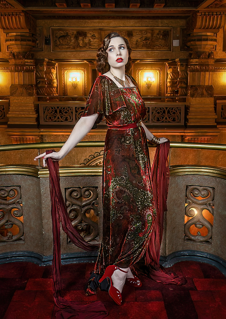
The model is beautifully positioned. Her gaze, her arms, and her crossed feet are wonderful. Like David, I find the lights distracting, especially the ones on the far left and right. So, with that in mind, I tried a vertical format. To me, this resolves the bright lights pulling my eyes away from the model. Your thoughts?
|
Oct 12th |
 |
| 5 |
Oct 21 |
Reply |
David, you are 100% right. Smiles
Like you, this isn't the first time that I thought/hoped that Photoshop would allow me to take a "marginal" photograph and turn it into one that reinstated the feeling I had when I pushed the shutter button. And, it probably won't be the last. I absolutely agree that one of the many valuable traits of study groups is that they can often return a photographer to reality.
Thank you for expressing the situation so well.
|
Oct 11th |
| 5 |
Oct 21 |
Reply |
Thank you, Barbara. Please see my reply to Candia. |
Oct 10th |
| 5 |
Oct 21 |
Reply |
Sometimes I find that a scene captures my imagination. In the case of this image, it was easy for me to envision the "discovery" of the white flower deep in a jungle. After taking the photograph, I found that it didn't provide the same feelings that I had when I took the picture. So, trusting to my Photoshop abilities, I tried to recapture the original feelings.
Now, looking a the image in the bright lights of others' thoughts, I can see that it is far too complex/cluttered to match what I had hoped for. Nonetheless, it's been an excellent learning opportunity. Thank you, Candia and others for your input. It's really valuable!
|
Oct 10th |
| 5 |
Oct 21 |
Comment |
Richard, if you posed the model, you did a fantastic job! I love the position of her arms... with the lower part of her closest arm being parallel with her extended leg. Also, her far arm helps bring my attention to her beautiful face. Additionally, I can't conceive of better cropping. You included enough space around her so that there is excellent context and so that she seems very comfortable and uncramped. Well done!
I couldn't resist playing with your photograph a bit. I wanted to darken the areas around the woman (using the ACR radial filter) and add a bit of additional contrast to enhance the 3D appearance. Then, on a whim, I added a small catchlight to her eyes. Your thoughts?
|
Oct 8th |
 |
| 5 |
Oct 21 |
Comment |
Candia, this is a very impressive image. I love the juxtaposition of the shiny and flowing abstract with the traditional, static building. Also, having the building tilted works beautifully, making your photograph far more than it would have been with a purely vertical building. The tilt somehow works very well with the abstract. Well done indeed!
I wanted to see how your image would be with a bit more contrast and a bit less light. Your thoughts?
|
Oct 8th |
 |
| 5 |
Oct 21 |
Reply |
Thank you, Nick. I opted for sort of a jungle scene with the highlight being the hidden white flower. I increased the saturation of many of the leaves and little flowers. Also, of course, I significantly reduced the light on the leaves, etc. When I attempted to do a global saturation increase, I found that the greens seemed over-processed. |
Oct 8th |
| 5 |
Oct 21 |
Comment |
Nick, this is a wonderful capture! Your timing was outstanding and the focus is tack-sharp. I love the two diagonals -- one made by the bird's legs-through-its-head and the other made by the wings. Very well done!
My only suggestion would be to consider giving a bit more space around the Woodstork. To me, action images like this one can benefit from having more room between the subject and the frame.
BTW, I'd love to know what camera settings you used for this photograph.
|
Oct 5th |
| 5 |
Oct 21 |
Reply |
David, I definitely see what you mean. Your version gives a context that mine lacks. Also, your image is about a critical moment in a rugby game while mine is dealing more with the struggles of the two athletes. The two versions are telling different stories. I think the strength of the image(s) is the timing. You did an amazing job capturing the exact moment of interest. |
Oct 5th |
| 5 |
Oct 21 |
Comment |
David, this is wonderful! You captured the perfect moment in a VERY challenging situation. It's amazing that you were able to include the faces and bodies of both of the key people. Well done!!
Naturally, I couldn't resist playing with your photograph (smiles). I mostly wanted to see how it would look with only the two primary people, as well as just a bit of lighting modifications. Your thoughts?
|
Oct 4th |
 |
| 5 |
Oct 21 |
Comment |
Very nice! To me, the leaves and the jagged edges of the pumpkin's "hat" make the image unique and delightful. I also like how you managed to separate the pumpkin from its similarly colored background. Well done! To me, the sharpening is perfect, but you may want to reduce the noise just a bit. |
Oct 4th |
6 comments - 5 replies for Group 5
|
| 62 |
Oct 21 |
Comment |
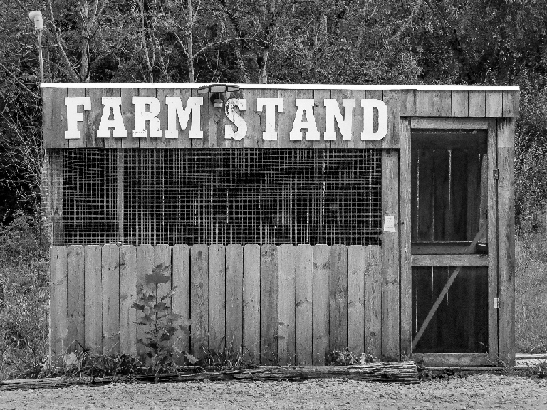
Leah, I played with your original image and couldn't come up with a B&W conversion that was nearly as good as yours.You really did an outstanding job bringing out the wood texture and the screen on the farm stand. Extremely well done!
So, after giving up on using the original and enhancing your post-processing, I tried starting with your B&W image. My goal was to slightly reduce the brightness of the trees surrounding the stand. I selected the non-stand areas and simply reduced the whites and the highlights. Those changes only made a subtle difference. Your thoughts?
|
Oct 11th |
 |
| 62 |
Oct 21 |
Comment |
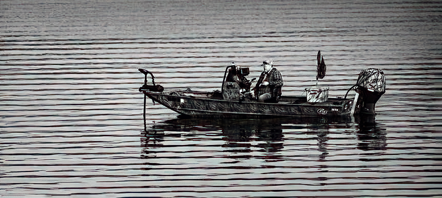
Bunny, this excellent image reminds me of my days fishing with my father... wonderful (mostly) memories.
Like Emil, I felt the waves at the top of the photograph were a bit too intense. Also, your comment about spotlighting the man, made me want to play a bit. I used Camera Raw's radial filter as well as the gradient tool. Also, I did a bit of cropping from the original image. Your thoughts? |
Oct 11th |
 |
| 62 |
Oct 21 |
Comment |
I love the clouds, but I have to agree with Bob... the image would be enhanced by the addition of a "non-cloud" subject. I thought about a boat, but decided that it might take my attention away from the wonderful clouds. So, I pulled an image of a small flock of flying birds and added it to your image. To me, they seem to provide a subject, but not distract from the clouds.
While I was at it, I continued your approach to make the sky dramatic. Also, gave a bit of texture to the trees. Your thoughts?
|
Oct 9th |
 |
| 62 |
Oct 21 |
Comment |
Bob, well done! I agree with Emil about your decision to flip the image and your choice of a sky. Perfect! Also, removing the light was wise. It didn't seem to fit the concept of an old barn.
To me, the sky just above the roof of the barn seems a bit lighter than I would have expected. I don't know if that's natural because of the clouds behind the barn. In any event, it's a very minor thing.
|
Oct 9th |
| 62 |
Oct 21 |
Reply |
Well, thank you BOB and LUANN. However, the simple fact is that we have an outstanding group of photographers who not only take amazing photographs but are also willing to share their thoughts and suggestions. THANK YOU ALL! |
Oct 7th |
| 62 |
Oct 21 |
Comment |
An excellently captured image of the monster. Photographs of Iceland always seem to show pristine land, clean/clear water, and lovely landscapes. Israel, my only suggestion for your image is for you to send it to the Iceland government, along with text that conveys the feelings expressed by Emil.
The government organization that should receive your image and text is the Ministry for the Environment and Natural Resources. The email address is mrn@mrn.is. I would be happy to provide some draft text if that would be helpful.
|
Oct 7th |
| 62 |
Oct 21 |
Comment |
First, I want to thank you for "covering our group" while I was on vacation. Honestly, it was nice to be able to totally focus on the vacation... eating at nice seafood restaurants, photographing the area, reading, and of course, drinking a bit of red wine (Smiles). I really appreciate it!
I played with your image a bit, but couldn't come up with anything as nice as the ones that you and Bob did. My only suggestion would be to go further along the lines that Bob suggested -- darken the bush even a bit more.
One of the things that I've recently discovered about sky replacement is that I can include a folder in the suggested skies. Then I can move my skies into that folder. I've found that to be much easier than having an "external" folder. For some reason, the sky replacement module refers to folders as groups.
|
Oct 5th |
| 62 |
Oct 21 |
Comment |
Thank you, Bob. As you can see in my reply to Emil (above), I think your idea of additional cropping on the right would be a nice improvement. I appreciate your ideas!
|
Oct 5th |
| 62 |
Oct 21 |
Reply |
Thank you, Emil. I agree that further darkening of the "non-frog" is a nice improvement. And, as Bob (below) mentioned, I might also try cropping a bit tighter on the right side. The one thing I'm not sure about is the additional brightening of the frog. At some point, I think it would feel over-processed.
|
Oct 5th |
7 comments - 2 replies for Group 62
|
13 comments - 7 replies Total
|


