|
| Group |
Round |
C/R |
Comment |
Date |
Image |
| 5 |
May 21 |
Comment |
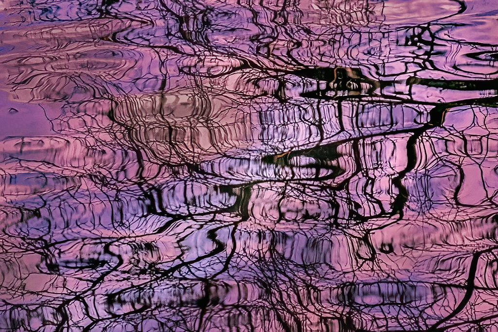
Freddie, I find that I must look at abstracts many times before my feelings about them emerge. Your image is intriguing. But, after multiple viewings, I decided that the lovely purple was a bit overwhelming to me. Thus, I tried playing with the photograph in Photoshop and Camera Raw. This resulted in modifying the colors somewhat and also making the reflection more "solid". Your thoughts?
|
May 13th |
 |
| 5 |
May 21 |
Reply |
Thank you, Nick. It was a powerful experience... very eye-opening. I agree, the reflections really add a feeling of depth to the image.
|
May 13th |
| 5 |
May 21 |
Reply |
Richard, I definitely agree with both of your observations. The monochrome conversion really adds impact. And, now I wish that I had "worked the image" far more than I did. A few different angles would have been very interesting. |
May 13th |
| 5 |
May 21 |
Reply |
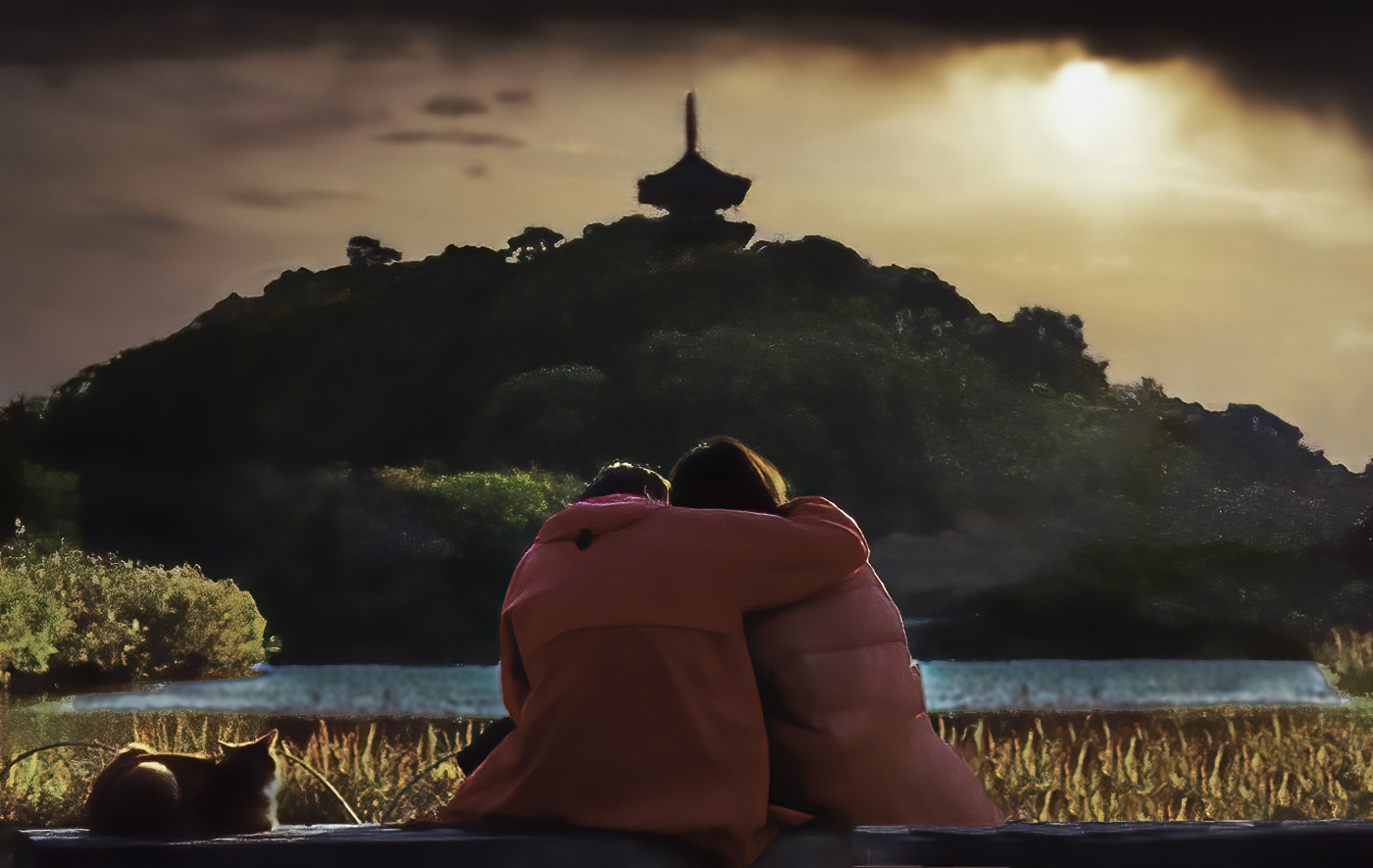
Thank you, Barbara. I agree that it's very easy to miss wonderful images by passing by them without noticing. The fact that we are photographers and work with others who have the same interests makes us much more aware of potential photographs. I find that I often look at a scene wondering what makes it unique or impactful. That approach is one that I think we all have developed over the years. |
May 13th |
| 5 |
May 21 |
Comment |
I definitely like David's modification. It's very well done! When I looked at the image, two things bothered me a bit. One was the brightness of the water, and the other was the noise in the photograph. I played with it a bit in Photoshop and Camera Raw to see what I could do. Thoughts?
|
May 13th |
 |
| 5 |
May 21 |
Comment |
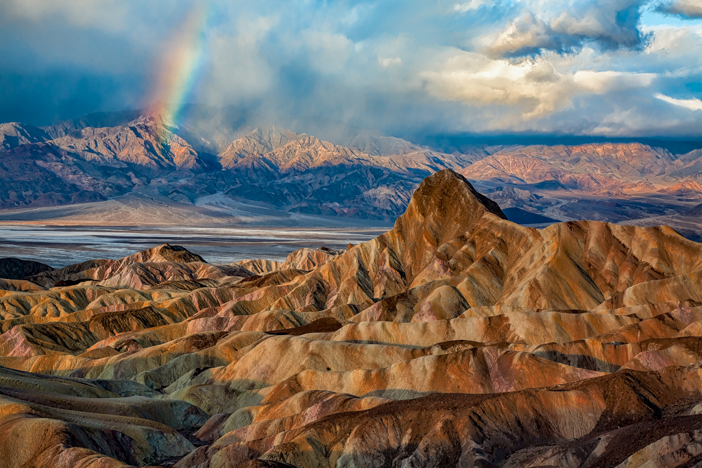
Mark, this is wonderful! It must have been a spectacular sight. Your image is one that should be printed and displayed.
As I do with many of my favorite images, I played with it a bit using luminosity masking to modify the contrast even more than you already have. Your thoughts?
|
May 13th |
 |
| 5 |
May 21 |
Reply |
Mark, I administer a B&W study group but never thought to convert this image. Thank you! Your logic for removing the color makes perfect sense and the result is wonderful.
|
May 6th |
| 5 |
May 21 |
Reply |
Thank you, Freddie. I also felt it was thought-provoking. Since I'm of the "Vietnam War Era," it had special meaning for me. I debated about talking to the man but chose not to interrupt his vigil. |
May 6th |
| 5 |
May 21 |
Comment |
Fascinating and nicely done. I especially like the idea of the red stripes AND changing the blue on the spoon to red. That will tie it all together nicely.
Thanks to "Mr. Google," I found the following for the reason for the bread to be called soldiers: "A British term that refers to a piece of toast cut into thin strips reminiscent of the formation of soldiers on parade."
I learn something new every day.
|
May 1st |
| 5 |
May 21 |
Comment |
David, this is a marvelous macro. I love the heart made by the two abdomens. It goes wonderfully with the action of the damselflies. I like your cropping and the fact that you flipped the photograph. It feels much more natural the way you have it. The handling of the background is well done. I can't tell if you blurred or desaturated the background, but it works well. I would be interested in how the image would look if the background were a bit darker. Nonetheless, it's an outstanding job!
|
May 1st |
| 5 |
May 21 |
Comment |
Wow! Nick, you outdid yourself this month. You've created an amazing composite and managed to utilize much of the USA to do it. There's nothing I can suggest to enhance this wonderful image. The Photoshop work is outstanding, the use of monochrome is excellent, and the frame works wonderfully. Well done!
|
May 1st |
6 comments - 5 replies for Group 5
|
| 62 |
May 21 |
Comment |
Israel, the news here is filled with the situation that you're enduring. I never hear of the problems without thinking of you and hoping that you, your family, and all those around you are safe. Hopefully, the current cease-fire will translate into a lasting peace. Please take care!
|
May 25th |
| 62 |
May 21 |
Comment |
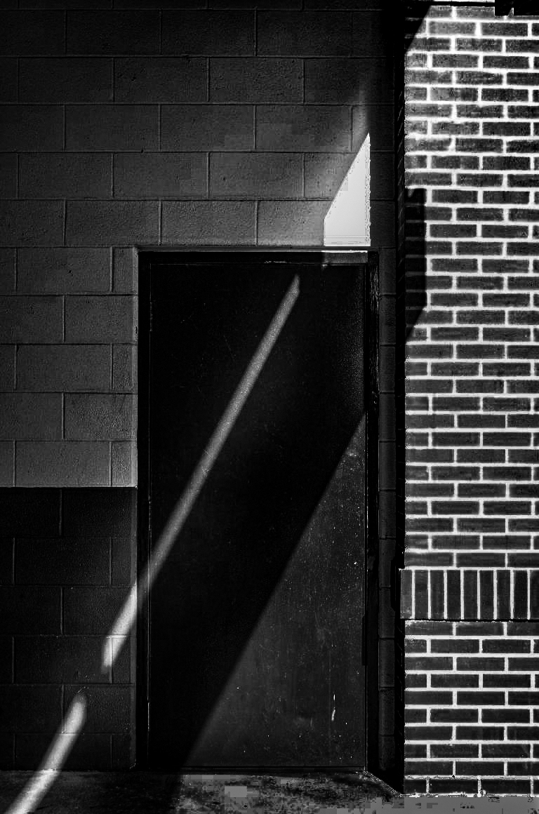
Leah, it appears that everyone loves your image and can't resist the urge to play with it themselves. I'm no exception! The shapes, the diagonal line, the contrasts, and the tonal range are all wonderful! Very well seen and very well processed.
Here's my "play" with it. Thank you for making it available to us!
|
May 14th |
 |
| 62 |
May 21 |
Comment |
Emil, since you have shown an interest in luminosity masking (a powerful technique!), I suggest watching the Quick Start video of an amazing product named Lumenzia. To see it, go to the site
https://gregbenzphotography.com/lumenzia-support/?utm_source=lumenziaCC&utm_medium=btn_loadTutorials&utm_campaign=lumenzia_9.2.1
and scroll down to the Quick Start video. Also, anyone else who might be interested, this is an amazing $40 product.
|
May 13th |
| 62 |
May 21 |
Comment |
Bob, every time I look at your image, I see jewelry. It's like a broach that my mother wore many decades ago. Thus, it is difficult for me to simply see it as a photograph. Smiles...
Nonetheless, it's a fantastic image.
Like you, there are times when I have a "final" photograph but no idea of the steps I made to create it. Old age is definitely creeping in.
|
May 13th |
| 62 |
May 21 |
Comment |
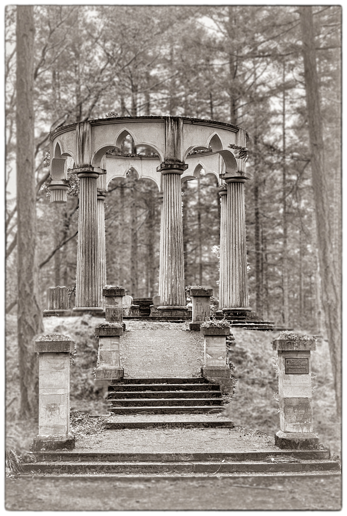
Bunny, you've done a fantastic job adding a bit of space below the steps at the bottom. Personally, I think you've created a photograph that is a family treasure. It's absolutely wonderful to hold on to family history and you've done it in a memorable way. I suggest that this image should go on your wall or, at a minimum, in a family album. Well done indeed.
Nonetheless, I kept playing with it. I wanted to see if I could make the mausoleum a bit more prominent without corrupting the softness of the background. Your thoughts?
|
May 10th |
 |
| 62 |
May 21 |
Reply |
Emil,
It's hard to understand why there are so many homeless people today. My heart goes out to them and I wish I could do more to help. Every street corner in my area seems to have someone asking for money. Since I've read that street-corner begging can be relatively lucrative, I rarely give money to them. However, when I see someone on the street like this woman, I do what I can to help. Even better, if there's a fast food restaurant close by, I'll provide a sandwich and soft drink.
|
May 8th |
| 62 |
May 21 |
Reply |
Thank you, Leah. I was also puzzled by the clothing, shoes, and purse. They don't seem to fit her apparent situation. I'm sure there is a story there.
|
May 8th |
| 62 |
May 21 |
Comment |
Israel, this is an outstanding photograph! Your image not only tells a story, it tells an intriguing story! I can't look at it without wondering what the situation is. Why is the camel out on the road without a rider or person leading it? Of course, I know nothing about camels, but it seems strange.
Monochrome works beautifully for this image and the Antique Plate preset is perfect. I especially like your use of a light vignette since it fits the antique style so nicely. Sometimes it's virtually impossible to suggest improvements for an image. This is one of those times. Well done!
|
May 7th |
| 62 |
May 21 |
Comment |
Emil, I love this image. The monochrome version is truly outstanding. You've done an amazing job with the tones and the wonderful textures of the dunes. Your decision to leave a featureless sky really fits the photograph.
One of the difficulties of commenting on a perfect image is that I'm left without any ideas for suggestions. Smiles...
Well done!
|
May 3rd |
| 62 |
May 21 |
Reply |
Now that I see my image, I notice that my tint doesn't quite match yours. So, it's not what I intended, but perhaps it's close enough to give the idea.
|
May 2nd |
| 62 |
May 21 |
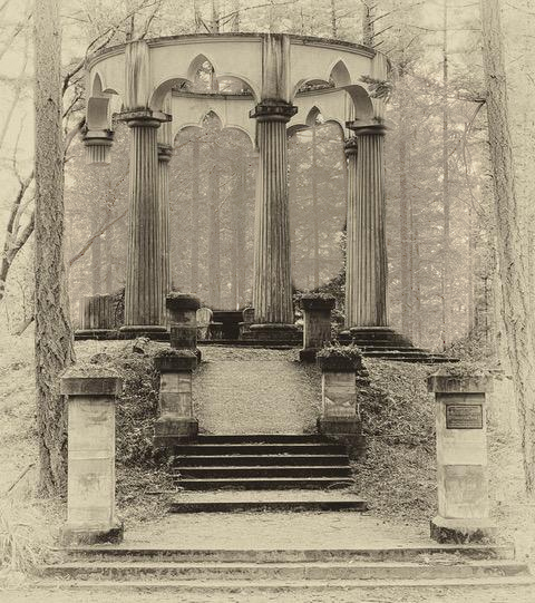
Comment |
Bunny, I love your description/story. It really adds to my understanding of your image and the feelings behind it. Your idea of making it into an antique-like photograph is perfect. (And, Silver Efex Pro 2 is an excellent tool for doing that.)
Since I like the image so much, I decided to play with it a bit. One of the things I tried was to continue the faded tint into the trees behind the columns. I didn't do a great job with the editing, however. What do you think?
|
May 2nd |
 |
8 comments - 3 replies for Group 62
|
14 comments - 8 replies Total
|


