|
| Group |
Round |
C/R |
Comment |
Date |
Image |
| 5 |
Apr 21 |
Comment |
David, I really like how you've simplified the original photograph. Removing the "extraneous" people, including the ripples from the swimmer, has turned this into a very appealing image. Although the resolution/size for submissions to the study groups are fairly constraining, I imagine the high resolution of your 5DS would yield a remarkable print.
I must admit that I find the sky slightly more colorful than I generally prefer, but it seems to work for this image. Well done.
|
Apr 17th |
| 5 |
Apr 21 |
Reply |
Thank you, Mark. I liked the pole too. It would have been easy to eliminate, but seemed to emphasize the angle of the performer. |
Apr 15th |
| 5 |
Apr 21 |
Comment |
As others have said, David's modifications make this an even more wonderful image. If you decide to continue editing this photograph, you might see if it would be beneficial to remove the blade of grass that is at the left edge of the image. Since it is so close to the edge, I feel it is a bit distracting.
|
Apr 13th |
| 5 |
Apr 21 |
Comment |
Nick, I'm afraid that I can't add much to the other comments. However, I played with your image a bit to see what I could do. Unfortunately, the original photograph wasn't available but I did what I could with the image you submitted. Sadly, I don't think I really enhanced it.
|
Apr 12th |
 |
| 5 |
Apr 21 |
Comment |
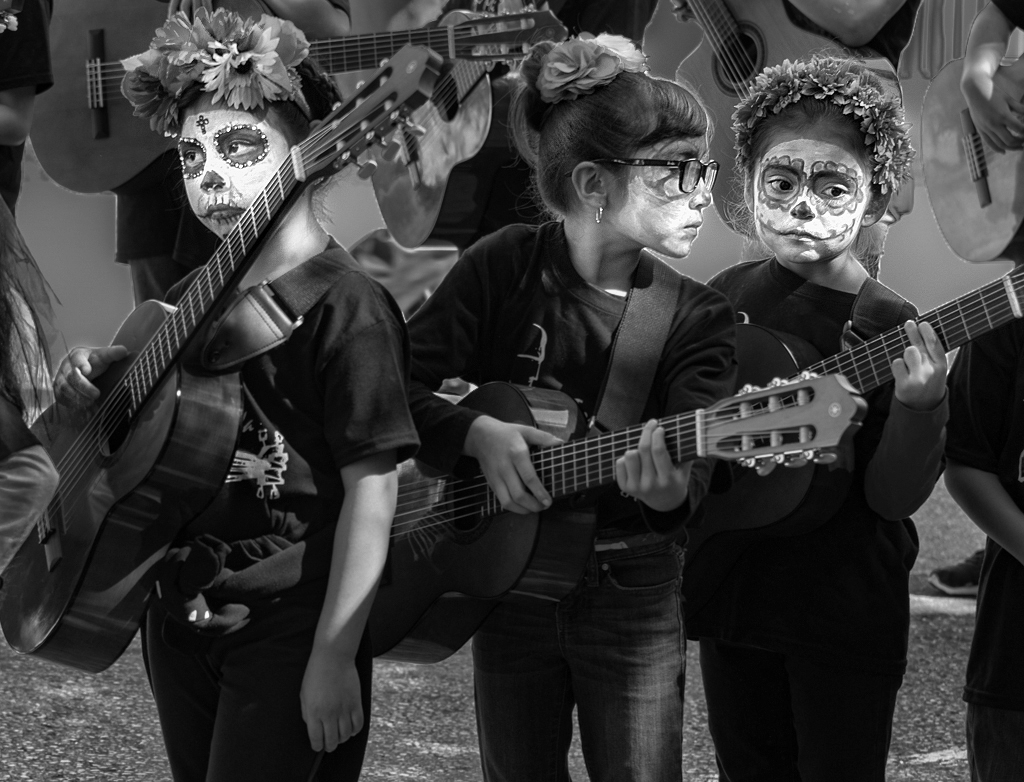
Like Richard, I wanted to try to emphasize the wonderful faces of the three girls. I also darkened the background but additionally played with the other lighting.
It is a fantastic image that holds a delightful story... all told by the girls' expressions. Well done!
|
Apr 12th |
 |
| 5 |
Apr 21 |
Comment |
Freddie, I really like this. The image makes me think of three kites rising into the sky. But, the feeling isn't one of "a child's joy of flying a kite", but rather something much more special.
When I read your technique, I was impressed. Changing the lighting while the photograph is being taken must have been frustrating. However, it certainly worked out well! Nicely done.
|
Apr 12th |
| 5 |
Apr 21 |
Reply |
Thank you, Barbara. I've found that post processing can work wonders for almost any image. And, being lucky enough to get a fairly good photograph to start with, makes it MUCH easier.
|
Apr 7th |
| 5 |
Apr 21 |
Comment |
Barbara, I actually would prefer a combination of the original and the modified version. The sharpness and "sparkle" of the original are great. However, the reds in the original seem a little bit strong. Nonetheless, it's a wonderful image and a creative idea. Well done! |
Apr 4th |
| 5 |
Apr 21 |
Reply |
Freddie, thank you so much. As you can imagine, there is a lot of luck involved in catching an image like this... plus, of course, numerous frames that are thrown away. Still, the circus with its wonderfully colored costumes and amazing performers makes a fun outing for photography. |
Apr 4th |
6 comments - 3 replies for Group 5
|
| 62 |
Apr 21 |
Reply |
LuAnn, somehow I previously missed your post. Sorry!
I've played with Artisan Pro, but frankly, I find it more complicated than I'm willing to do. So, I revert to good old Adobe Camera Raw. I find that combinations of the adjustment brush and the radial filter work wonders.
|
Apr 22nd |
| 62 |
Apr 21 |
Comment |
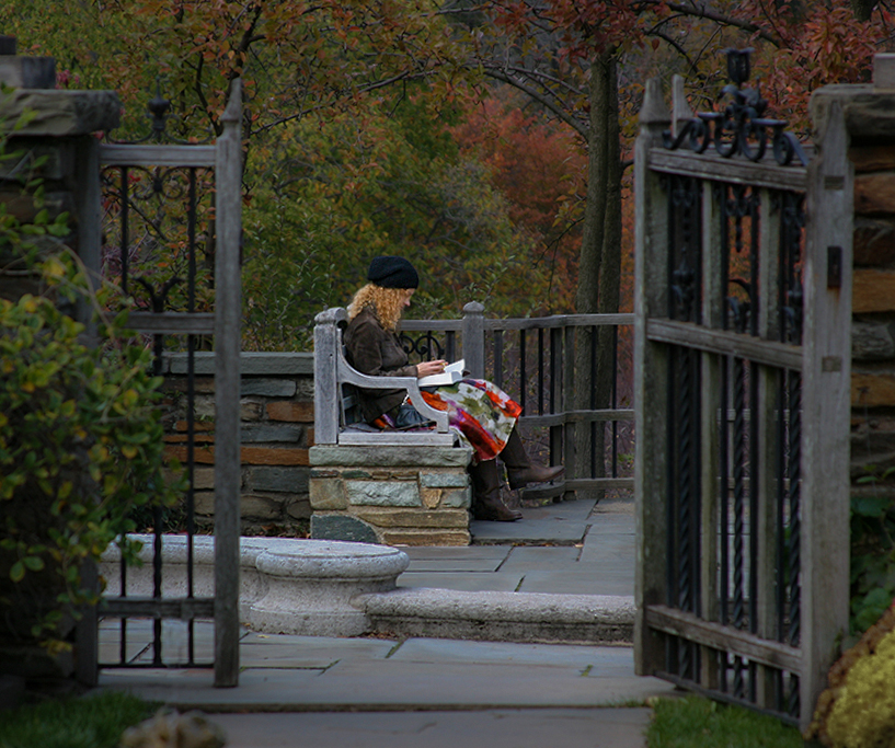
Bob, I completely agree that the image is improved by leaving a bit of room above the gate posts. I played with the lighting quite a bit. My goal was to draw the viewer's eyes to the woman without making it seem too "artificial". Thank you for your input/comments!
|
Apr 22nd |
| 62 |
Apr 21 |
Reply |
Thank you, Bunny. I also found the colors a bit distracting. However, in response to Leah, I tried to recreate the peaceful feeling of the image in color (see above), but I don't think it quite matches the appeal of the monochrome photograph. |
Apr 22nd |
| 62 |
Apr 21 |
Reply |
For you...
|
Apr 13th |
 |
| 62 |
Apr 21 |
Comment |
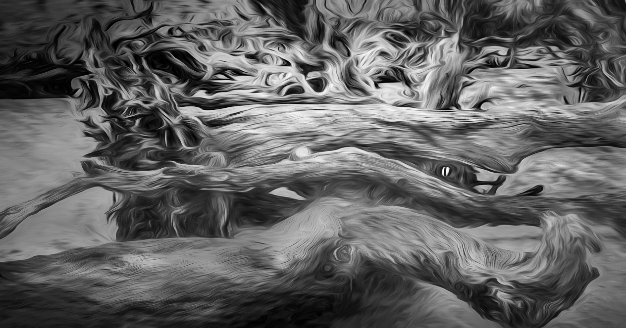
Bob, you've convinced me to look into Topaz Liquid Lines. This is an amazing effect. As Leah and Bunny said, you've turned the driftwood into a wonderful abstract. It's beautiful but also is the kind of image that could cause nightmares. The intertwined tentacles make me feel a bit twingy. Impressive!
Of course, I had to play with the image in Photoshop and Camera Raw. I decided to crop a bit on the left, as LuAnn did... but not quite as much. Then I made lots of adjustments with lighting, texture, and especially contrast. What do you think?
|
Apr 13th |
 |
| 62 |
Apr 21 |
Comment |
I have never been in a dust storm, nor have I seen one first hand. After looking at this image, I plan to continue avoiding them.
It is a fascinating image. At first, I didn't recognize it but a quick glance at the description identified it immediately. I love the range of tones that you have created in your image. So, I decided to try it myself. That's a way that I learn new techniques. Your thoughts?
|
Apr 13th |
 |
| 62 |
Apr 21 |
Reply |
Thank you, Leah. My primary photographic goal is to create images that appeal to me. Having others like my work is certainly a huge bonus when/if that happens. So, for me the whole workflow is important... from initially seeing a potential image, to snapping the shutter and then doing post-processing. And, I've used Photoshop for so many years that the learning curve is a bit less steep now.
When I have time I will attempt to edit the color version of the image to see if it can be as effective as the b&W one.
|
Apr 12th |
| 62 |
Apr 21 |
Reply |
Thank you, Bunny. I suspect that your art background gave you a strong foundation for mastering photography. One of the skills (or inherent talents?) that I am trying to build, is pre-imagining my final image when taking a photograph. For me, this is quite challenging. I think part of the reason for that is the power of Photoshop/Camera Raw. Most of my images change significantly once I begin "playing with them".
BTW, I like your statement, "The only way one knows how to deviate is to understand all the options. Then you can make a conscious artistic choice." It makes sense... Thank you.
|
Apr 12th |
| 62 |
Apr 21 |
Reply |
Thank you, LuAnn. I welcome and appreciate your advice... and respect your opinion. I don't typically think of "the rules" when photographing, but it might be useful to do so. Just because I consider them, certainly doesn't mean that I would be compelled to follow them.
Frankly, I don't enter competitions anymore, though I may change that in the future. I've found that a judge's opinion/input is sometimes useful, but definitely not always. I find it much more helpful to get the thoughts and suggestions of fellow photographers in our study group (and group 5 which I'm also a member of). It's refreshing not to have awards given since I think the goal (at least MY goal) is to improve my photography instead of being better than others. Smiles...
So, I'll continue with the Image Evaluation course.
Thanks again!
|
Apr 11th |
| 62 |
Apr 21 |
Reply |
Thank you, Emil! I spent a fair amount of time editing this photograph. Probably one of the techniques that has helped me most with post-processing is a simple one... After I've "finished", I let it sit for a day or two and then come back and look at it again. Inevitably I find details that need some additional work. |
Apr 10th |
| 62 |
Apr 21 |
Reply |
Thank you, LuAnn. I always appreciate your comments since they contain both detail and excellent constructive input. I agree with increasing the space above the top of the gates a bit. This would also place the woman slightly lower in the image which I think would be beneficial.
You mention the golden ratio. I'm currently taking the Image Evaluation course (which I believe you teach). Much of the course is quite useful. However, I struggle with the emphasis on determining which "rules" and techniques apply to the images I submit for each lesson. I understand that it's good to know the terminology used by photographers. However, I'm not sure how this emphasis will help with my photography or competition judging. Do you have any thoughts about this?
Not sure about the PSA Conference. I'll have to see how the pandemic is doing.
Take care and thank you for your input!
|
Apr 10th |
| 62 |
Apr 21 |
Reply |
Very nice, Israel. I especially like the additional smoke. It makes the bottle of Scotch even more interesting. I'm curious... what technique did you use to add the additional smoke? It worked very well!
|
Apr 8th |
| 62 |
Apr 21 |
Comment |
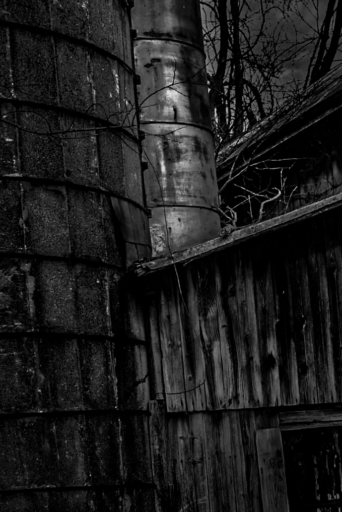
Leah and Emil, you guys are amazing. I love using post processing to change the mood of an image and you're both really skilled at that. I like the original concept of a menacing photograph and I think that slanting the image definitely adds to that feeling. So, I took a stab at it myself. However, I decided to highlight the metal chimney(?), to go really dark (for mood), and to slant to the left.
|
Apr 7th |
 |
| 62 |
Apr 21 |
Comment |
Such an amazing image! I like both the color and the monochrome. However, the monochrome is much more original which really appeals to me. The positioning of the bulb and its shadow is excellent, though I might suggest a bit more space between them and the edge of the image.
The only thing that concerns me is the noise in the photograph. It's a bit more noticeable than usual, especially toward the bottom of the frame. Nonetheless, an excellent and imaginative image.
|
Apr 5th |
| 62 |
Apr 21 |
Comment |
Israel, this is a clever idea for a still life. I think your focus and depth-of-field are outstanding. You've kept the subject(s) in perfect focus and still managed to blur the background which would have been distracting if it were sharp. And, I like how the reflections seem to anchor the photograph. Nice work!
A couple of minor things...
The image appears to have a slight lean to the left and the two sides seem to be cropped a bit tightly, especially the left side.
It would have been interesting to see even more of the cigar smoke. I wonder if it would be possible for the smoke to up around the bottle even more than it does.
|
Apr 5th |
| 62 |
Apr 21 |
Comment |
I love the monochrome version. Your post-processing was excellent! The tonal quality of this image is amazing. And, I really like how the radial leaves pull my attention to the center. Sadly(?), I can't think of any way to improve this photograph!
BTW, Sedums are quite common (and easy to grow) and there are hundreds of types. |
Apr 5th |
7 comments - 9 replies for Group 62
|
13 comments - 12 replies Total
|


